

Many homes with pale walls can feel cold, even if the floors and furniture are thoughtfully chosen. People searching for terracotta room ideas often want a space that feels relaxed and grounded, but worry about making the room feel busy or heavy with too much colour.
The practical aim is to soften sharp edges without clutter or chaos. Choosing the right terracotta tone, limiting how you use it, and setting it against simple, natural textures helps keep a calm feeling. This works especially well for a small bedroom with a blank wall when the room needs warmth but not visual clutter because the space is tight and gets morning light.
The short version: Terracotta room ideas work best when colour is added in small, matte moments, on a single wall, in one rug or pot, balancing calm with warmth. By limiting each space to just one or two terracotta elements, the room feels relaxed instead of crowded.
Key takeaways
- Terracotta in small doses makes a room feel grounded and lived-in, not busy.
- Linen and jute textures tone down bold colour, creating a softer look.
- A single accent wall or one clay pot is enough to anchor a palette.
- Terracotta pairs especially well with cream, rust, and forest green.
- Matte terracotta tiles reduce glare and feel warmer underfoot than polished stone.

Why does terracotta feel calm, not busy?
Terracotta feels calm when it is used in natural, matte finishes and paired with soft neutrals; this keeps colour from shouting for attention. A dull clay finish absorbs glare, helping surfaces look less stark.
Rooms with a lot of white walls can feel flat, while glossy colours bounce light and draw the eye too fast. With terracotta, the surface is often matte. This mutes the look and spreads light gently across the room, even when the sun changes angle through the day.
In a space with simple natural flooring, bare pine, cork, or a relaxed jute rug, terracotta adds weight without the room feeling crowded. The colour sits between red and brown, so it feels less sharp than pure orange or scarlet.
A bare white pot reads colder than a hand-thrown terracotta one beside the sofa. The natural, slightly rough surface absorbs light and dulls the edges, which stops the pot from feeling like visual clutter.
Using terracotta for just one or two main touches, a cushion, planter, or tile border, lets you bring in warmth without adding busyness to a pared-back space.
Where this works best
Terracotta works best in small bedrooms, open living rooms, or rental-friendly spaces where paint is allowed on just one wall. The colour anchors a space without overpowering it.
Bedrooms with little natural light can feel cold, even with soft bedding. Introducing terracotta on a single wall, behind the bed or as a pair of low planters, gives depth and warmth. In an open living and kitchen area, a single terracotta pot with a leafy plant grounds the zone and sets a relaxed tone.
When you walk into a plain rental or a recently decorated flat, the space can read as impersonal. A small terracotta rug or some burnt orange cushions switch up the look, pulling the eye down and around the room, breaking up any sense of sterility.
Avoid using strong terracotta on every surface. Overdoing it, covering most walls or loading up textiles, can make a small room feel heavy and underlit. One accent, set against linen or wood, is enough for most uses.
Placing a clay pot in a low-light corner also works because the colour still glows in shade and doesn’t look dull like a pale or glossy finish might.
Styling and placement
The best way to introduce terracotta in styling is to keep the palette limited, use one main texture, and space pieces apart to avoid clutter. Simple grouping feels more relaxed.
Terracotta comes alive against cream, soft grey, or faded green walls. Unlike bold reds or vivid oranges, terracotta reads earthy and versatile. Pairing a single clay bowl with a linen runner anchors the eye without making a table look crowded.
Furniture with thin wood frames or natural fibres also tones down the strength of the colour. A terracotta cushion on a neutral sofa works best if the fabric is soft, linen or cotton, rather than something shiny or synthetic.
Matte terracotta tiles are easier to keep looking calm because they don’t catch every bit of light. A jute rug under a coffee table helps to ground the space, especially in a room with tall ceilings or a lot of blank wall.
Quick calm checklist:
- Limit to one or two terracotta objects per room for calm.
- Choose matte, textured finishes over glossy or patterned.
- Keep at least two wall colours neutral, cream, white, or pale grey.
- Space pieces out to let them breathe visually.
- Ground colour with tactile materials: jute, linen, wood.
Grouping matters. Two small bowls together feel easier on the eyes than one large, glossy piece that takes over a shelf.
How does terracotta change a bedroom?
A terracotta bedroom feels restful because the colour adds warmth and soaks up harsh light, making the space softer and more private. Bed linens in rust or clay keep the look gentle.
Bedrooms with harsh white walls or very dark floors can be hard to relax in. Adding a terracotta accent wall behind the bed gives a sense of shelter, especially if the rest of the walls are kept neutral. According to Pinterest, terracotta is a popular theme for bedroom design ideas for this exact reason.
Instead of a bright duvet, layering a cream sheet with a terracotta cotton throw at the end of the bed signals warmth without being too bold. Swapping one art print for a round, clay-framed mirror near the window balances the look.
A bare metal lamp reads colder than one made from speckled pottery. Placing a textured ceramic on the nightstand adds weight, so the bedside doesn’t feel lost against a pale wall.
Try a single linen curtain in a burnt orange or earthy rust to filter light softly in the morning. The result is a modern, earthy bedroom that feels private and less visually restless.

What should you pair with terracotta in the living room?
Pair terracotta with pale neutrals, jute rugs, and forest green accents to keep the living room relaxed and grounded. Use a large pot or a soft throw for the best result.
In the living room, a terracotta pot by the window warms up a pale corner, especially when planted with a small olive tree or something soft and leafy. Compared to a metal planter, clay absorbs and reflects less light, this small change stops the corner from feeling harsh or stark.
On a neutral sofa, a terracotta throw breaks up a flat colour without crowding the seat. For rooms with a lot of boxy furniture, rounded ceramics on the table or shelf add a different shape, softening sharp lines.
Unlike a patterned wool rug, a simple flat jute rug grounds terracotta pieces without adding more colour. This mix feels put together but not forced, making the room easy to tidy and pleasant to sit in.
In low-light living rooms, stick with matte finishes and avoid glossy art prints. The colour holds its warmth even in the dark corners, and the textures draw your eye back into the space.
| Element | Best Terracotta Pairing | Alternative |
|---|---|---|
| Sofa | Terracotta linen throw | Velvet cushion |
| Planter | Large matte clay pot | Glossy ceramic |
| Rug | Natural jute rug | Patterned wool rug |
A living room’s feeling changes most when the large pieces stay neutral and only one or two warm accents take the focus. If you want more ideas for soft warmth, see these warm colour schemes.
How can you use terracotta in the kitchen or dining area?
Terracotta bowls, plates, and tile backsplashes bring warmth and a matte finish to kitchen and dining zones, making them easier to use and keep clean. Simple is best.
In the kitchen, a stack of small, hand-thrown terracotta bowls looks cosy and practical on a pale wood shelf. Unlike polished metal or high-gloss ceramics, matte terracotta absorbs glare and hides minor chips or water spots.
A backsplash of unpolished terracotta tile adds warmth to a space often filled with hard, cold materials. Most terracotta tiles are slightly textured, making them less slippery if used on the floor. This surface feels gentler on the eye and underfoot.
Compared to bright, patterned plates, unglazed terracotta dishes set out for daily meals help the table top look less crowded. The earthy tone makes food stand out, but doesn’t compete with greens and creams in the rest of the space.
If you want a stronger link from dining to lounge, a small terracotta planter on the table or windowsill bridges kitchen and living areas, tying colours together across the rooms. This technique appears often in terracotta room ideas shared by modern decorators.
For more ideas to ground a kitchen, browse terracotta home decor combinations that work year-round.
Is there a right way to add terracotta to a bathroom?
Terracotta can make a bathroom feel less clinical by warming the light and softening hard lines; the key is to keep it subtle with a pot or a tile border.
Most bathrooms feel cold, full of white tiles and glass. Just one terracotta pot on the vanity or a small soap dish in burnt orange pulls some of that clinical feel away, especially if the room sees little daylight.
Using matte-finished terracotta tiles for a border or the floor brings a dry warmth that stays true, even with dampness in the air. Unlike glossy tile, which can look streaky and busy, terracotta’s matte absorbs light so the surfaces stay calm.
Towels in cream or rust, a plant in a squat clay pot, and a simple blind or shower curtain in rough linen make the bathroom read more as a quiet ritual space than a utilitarian zone. If the bathroom is small, keep the colour to one or two objects so it doesn’t feel crowded.
For more on how to finish spaces with minimal fuss, try the earthy looks in earthy living rooms and borrow one or two palette ideas.
What tends to hold up with terracotta and natural textures
Reviewing many living spaces and design stories, what stands out is that terracotta and natural textures almost always age well. Matte finishes get recommended again and again for rooms with lots of windows, because they handle changing light without looking dated. Terracotta, unlike trend colours, rarely reads as artificial.
Another pattern: reviewers and decorators point out that natural clay, linen, and jute tend to look better with use. They take on little signs of wear without feeling messy or unkempt. Softened by time, these materials still ground a space when everything else changes seasonally or with a new cushion. Judging by many sources, a rule of thumb is: A terracotta sofa throw works best when the rest of the palette stays pale and muted.
, Mara, Loom & Glow
Common questions
How do you style a room with terracotta?
The best way to style a room with terracotta is to use one or two pieces, like a clay planter or a matte tile border, set against pale walls and natural textures. Avoid crowding the room with too many strong colours. Mix in soft linen or wood to keep the space calm.
What colours work best with terracotta?
Cream, rust, pale green, and soft grey work best with terracotta because they balance the warmth of the clay and keep the palette grounded. Using natural materials like jute or linen alongside these colours makes the whole room feel quieter and more comfortable.
Is terracotta a good colour for a living room?
Terracotta is a very good colour for a living room when used in small areas, like a pot, a throw, or a border on the rug, because it makes the room feel lived-in without looking busy. Limit it to one or two main touches, and keep the rest of the furniture neutral.
Is terracotta still a trend for interiors?
Terracotta remains a strong trend for interiors, especially for people seeking warmth and softness without overwhelming a space. Many designers recommend it for the grounded feeling it gives, according to Pinterest bedroom design trends for 2026. Using matte or textured terracotta keeps the look fresh and relaxed.
Explore more calm combinations inside our Shop The Look .
Shop the Look
A few Nkuku pieces that echo the warm, earthy tone of terracotta without taking over the room.

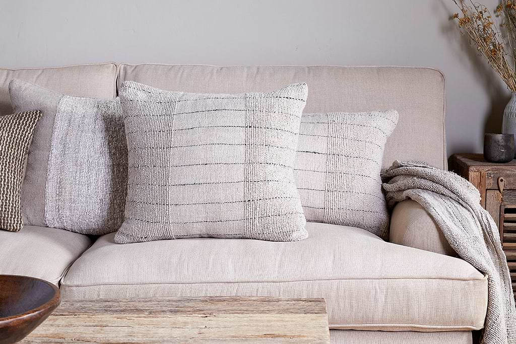
Mayla Cushion Cover
Soft hand-textured cover, instant warmth on linen sofas or chairs.
View at Nkuku →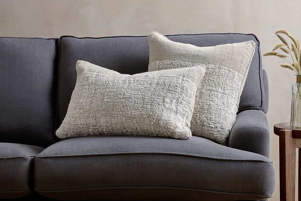
Puli Linen Cushion
Recycled linen in natural, pairs with woven textures and aged wood.
View at Nkuku →Some links above are affiliate links. If you buy through them we may earn a small commission at no extra cost to you. We only suggest pieces we think fit a calm, lived-in home.
Free guide
The Calm Shelf
12 styling ideas to help you compose calm, balanced shelves in natural texture homes.