

Warm living room colour schemes feel calm when you use one main neutral (like sand or cashmere), add just two accent colours, and repeat them throughout the room. This three-colour rule prevents a space from feeling busy or gloomy, even with richer hues like umber or clay. Natural materials such as linen, wool, and jute soften bold shades and keep the room open, while limiting the deepest tones to just one or two places – like a lamp base or basket – preserves airiness and prevents the space from closing in.
Cool neutrals promise calm, but warm living room colour schemes can easily feel muddled or overwhelming if handled with too many tones or finishes. Rooms shift quickly from soft to heavy when too many brown, beige, or rust accents compete, especially in a space with little natural daylight or clutter-prone floors and shelves.
The shift is practical: you’ll see how changing your base and arranging colour (not just adding more of it) makes a space feel larger or more peaceful, even with richer hues. This works especially well in a small apartment living room when you want more warmth, because it lets you add depth without shrinking the space.
The short version: Warm living room colour schemes feel calm when you stick to one main neutral, add only two accents, and repeat them. This method keeps a room from feeling busy or gloomy, even if you use richer shades or natural materials.
Key takeaways
- A warm living room colour scheme works best with one dominant neutral, one secondary colour, and a subtle accent.
- Layering warm neutrals like sand and cashmere adds depth but avoids a cluttered look when you keep the palette tight.
- Natural materials such as linen, wool, and jute soften bold shades and keep a space from looking harsh or dated.
- Light direction changes how warm shades behave—north-facing rooms can benefit from yellow-based warm neutrals (source: Paint & Paper Library).
- What actually makes a colour scheme read as warm (not just brown)?
- Where this works best
- How do you follow the 3 colour rule (and still feel calm)?
- Warm neutrals that don’t look flat or boring
- How to layer browns and umbers without making the room feel darker
- Styling and placement
- How does natural light change how warm colours look?

What actually makes a colour scheme read as warm (not just brown)?
A warm living room colour scheme doesn’t just mean brown—it comes from the undertone of each shade and how you repeat them. If you combine sand, clay, or ochre tones with quiet greys or creams, the room feels richer but not too busy.
In a space with a stone-coloured sofa, adding multiple similar browns usually just looks beige or tan. Introducing a beige with a pink, peach, or golden hint adds visible warmth, even if the room stays light and open. Unlike a chocolate or strong rust, warm neutrals stay soft to the eye and feel less crowded.
Linen curtains or a sisal rug in sand or taupe help the room feel warmer, but softer than a brown leather ottoman would. The effect depends on how you mix light and deep shades alongside paler base colours.
Repeated in wood frames or a jute basket, these warmer hues read intentionally chosen, so the colour isn’t lost in clutter. Small changes, like switching out a grey throw for one in honey or ecru, emphasise the whole palette.
Where this works best
A warm palette works best in rooms with little natural light or shared spaces that feel chilly or flat. Using sand or cashmere instead of crisp white helps a space feel more lived-in but still clear.
Open-plan living rooms, small apartments, and period homes with dark trim benefit from adding soft golds, muted pinks or earthy stones. These shades soften strong lines or offset cool floors and white walls, so the room doesn’t seem hollow.
For renters or those with little time to paint, even changing out white slipcovers or adding cream ceramics can ease a cold-feeling room. Layering different textures—wool, slub linen, thick cotton—folds dimension into a space that often feels too basic with only greys and whites.
Avoid using only mid-browns or deep reds, which can feel heavy in narrow rooms. A bare sofa or unstyled shelf reads colder than one with a single clay bowl or a soft gold cushion. To keep warmth gentle, limit the deepest tone to one or two places—like a wood frame or a textured lamp base.
How do you follow the 3 colour rule (and still feel calm)?
The 3 colour rule means picking one main neutral (walls or large furniture), one warmer secondary (rugs, throws), and a grounding accent (like a clay vase). This structure stops a room from feeling busy.
In most homes, the eye gets lost if there are more than three core colours in a single room. A dominant base—usually a pale sand, stone, or mushroom beige—keeps the space from looking scattered. According to Paint & Paper Library, the Sand and Stone palettes balance this effect well for modern rooms.
The secondary colour—perhaps amber, ochre, or clay—comes in through the rug, cushions, or artwork. Unlike a splashy accent wall, repeating one mid-tone in textiles or pottery ties parts of the room together. A good rule: a living room feels calm if about two-thirds of large surfaces use the main neutral, one-third a secondary, and only a few accents stand out.
Finally, a single deep tone (charcoal, umber, dark gold) appears in a lamp base or a basket. Rather than introducing new shades with every new object, repeat one or two, so every piece links back to the main scheme. A layered neutrals for a small apartment scheme illustrates this trick.
Warm neutrals that don’t look flat or boring
Not all warm neutrals feel the same—yellow-toned sand, pink cashmere, or mushroom beige keep a room interesting while softening the overall look. Picking one foundation shade stops the palette from sliding into beige clichés.
Paint & Paper Library’s Cashmere palette uses yellow-based neutrals, which feel lively without becoming loud. The Stone palette stays classic light beige, never too grey, so it avoids the risk of reading as basic rental white. If you skip these undertones, the room ends up cold or unfinished, even with expensive materials.
Switching out white frames for natural wood or adding a clay planter brings in warmth quietly. Even with a sand palette, brass or aged copper accessories echo those warm notes without tipping the space into heavy-brown territory.
A canvas palette with linen and soft wood works in living rooms that feel short on personality—a warm minimalist living room uses this method to avoid a flat look, while still staying calm and clutter-free.

How to layer browns and umbers without making the room feel darker
Layering browns and umbers works best when you separate deep hues from large surfaces and use them on details instead. This keeps the room from closing in.
In a living room with warm wooden floors, adding dark brown furniture on top quickly looks dense, making the room feel smaller than it is. Instead, layer a single umber throw or an aged-leather cushion on a pale sofa. This contrast lets the eye rest, rather than sinking the overall mood.
Traditional living rooms often use thick velvet in burgundy or chocolate, but in smaller homes, these shades take the light away. Swapping dark velvet for a wool blend, or pairing heavy shades with brighter sand-toned walls, brings ease to the setting. A sand and umber scheme for a north-facing room works, provided you limit the dark to a few strong lines.
Compared to crowding brown-in-brown, grounding deep shades in one spot allows the rest of the room to reflect natural light and read as open. Try a single earthy living room idea: a small clay bowl on a table, set against soft cream cushions and pale walls.
| Approach | Effect on Space | Best Use |
|---|---|---|
| Layered browns on large furniture | Feels heavy, shrinks room | Open-plan, high ceilings |
| Browns only in accents | Keeps airiness, adds warmth | Small siting areas |
| Mix of beige and umber | Depth without clutter | Shared or tight spaces |
Styling and placement
Styling with warm colours means spacing out deeper shades and repeating one or two materials in small doses. The gaps matter as much as the objects themselves.
Clutter grows fastest in living rooms with open shelving, side tables, or too many pillows. Using one main plant pot, one woven basket, and a repeat of linen cushions brings order to groups of objects. If an accent sits directly beside a large block of colour, it can feel abrupt and break the look.
Open shelves feel calm if about two-thirds of their surface is clear, and any storage on display matches one of the three main palette tones in the room. Small changes, like replacing a white lamp shade with sand or cashmere, let the scheme carry across the space without crowding the corners.
Quick calm checklist:
- Repeat the same warm neutral on at least two large elements.
- Add only one strongly coloured accent per side of the room.
- Limit open shelves to one natural basket or bowl per shelf.
- Mix matte pottery with soft fabrics—no shiny finishes next to wood.
- Keep the number of colours to three or fewer for the whole room.
These styling choices work on mantelpieces, bookshelves, window seats, and corners that easily attract clutter. Even in beige living room schemes, a tight palette and steady gaps calm the space.
How does natural light change how warm colours look?
Natural light shifts how warm living room colour schemes behave: north-facing rooms dull muddy browns, but yellow-based neutrals reflect more daylight. The result—well-chosen warm tones can make a dark room feel soft, not dingy.
According to Paint & Paper Library, yellow-based sand and cashmere tones help keep natural light alive even in shaded rooms. In low-light spaces, matte finishes on walls diffuse sunlight, stopping brown or beige from reading as patchy or orange.
South-facing living rooms let you use slightly deeper hues, like mushroom or stone, while avoiding peach or apricot that might look sharp in strong sun. Repeating pale tones on the ceiling or trim helps bounce light around, making a palette of three colours look like more, even in a small apartment.
For rooms with little natural light, skip high-gloss and instead use woven wool throws, canvas, or jute for layering. This effect is seen in warm lighting without lampshades as an extra way to echo your main colour choices.
Often, a living room feels “off” at dusk or on a grey day—a heavy sofa, mismatched throws, or too many wood tones fight for attention. The result is a space that looks unsettled and darker than it needs to be.
A practical shift is to pick one base palette and let supporting pieces echo it, rather than layering warm shades without a plan or anchoring with a single dark accent.
The most common mistake is crowding too many warm tones—rose, rust, ochre, brown, tan—on pillows, baskets, candles, and wall art without a dominant neutral. The room ends up busy, not cosy, and looks smaller, especially in low light. Many homes attempt warmth by adding more deep shades, but this doubles the weight instead of bringing comfort.
When the palette is clear and spaced out, a room feels brighter, cleaner, and genuinely welcoming—even as the sun drops.
Save this idea for later.
What tends to hold up with warm living room colour schemes
Reviewing many living rooms and reader photos, a few patterns stand out. Calm warm colour schemes last longer when the neutral base stays dominant, and accent colours only appear in a couple of well-chosen spots, often textiles or a single lamp base. Decorators often recommend matte wall paints near windows and soft wool throws over leather, since these catch light without adding shiny glare or feeling overworked. What shifts most is the mood—rooms that limit deep hues to baskets or side tables stay lighter and easier to keep clear.
— Mara, Loom & Glow
How do you stop warm colours from making a small room feel cramped?
Layering browns and umbers works best when you separate deep hues from large surfaces and use them on details instead. In a living room with warm wooden floors, adding dark brown furniture quickly looks dense and shrinks the space. Instead, layer a single umber throw or an aged-leather cushion on a pale sofa to create contrast that lets the eye rest. Traditional living rooms often use thick velvet in burgundy or chocolate, but in smaller homes these shades absorb light. Swapping dark velvet for a wool blend, or pairing heavy shades with brighter sand-toned walls, brings ease to the setting. Even in small sitting areas, grounding deep shades in one spot allows the rest of the room to reflect natural light and read as open and peaceful.
Common questions
What are the best warm colours for a living room?
The best warm colours for a living room are sand, cashmere, soft ochre, mushroom beige, and umber brown. Pairing these tones with off-white or pale stone brings quiet colour without clashing. Light gold and blush, as seen in Little Greene’s living room inspiration, also work well for adding depth.
What is the living room colour trend right now?
The living room colour trend right now is layered warm neutrals with a focus on soft sand, cashmere, and canvas palettes. Modern schemes use pale shades as walls or furniture, adding gentle amber, clay, or taupe as accents. The trend moves away from primary colours and bold contrasts.
How do you make a living room look warm and inviting?
To make a living room look warm and inviting, keep the main pieces in sand, beige, or soft clay, and repeat accents in natural materials like linen or wood. Add only one or two strong shades per room. Limit open shelving and use textured ceramics or jute baskets for an organic touch.
What is the 3 colour rule in interior design?
The 3 colour rule in interior design means using one dominant neutral, a secondary warm shade, and a subtle accent colour. Typically, this is about 60% main neutral, 30% secondary, and 10% accent throughout the room. It keeps the space clear, prevents clashing, and helps every piece feel deliberate.
Explore more calm combinations inside our Shop The Look .
Shop the Look
Pieces that layer warmth and texture into a neutral, layered living room.
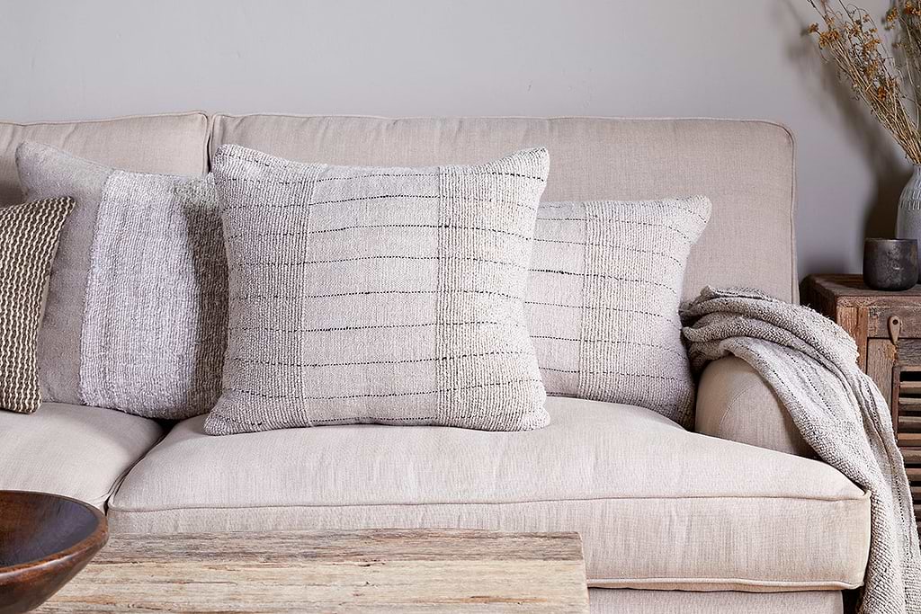
Mayla Cushion Cover
Soft hand-textured cover — instant warmth on linen sofas or chairs.
View at Nkuku →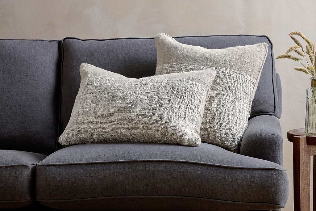
Puli Linen Cushion
Recycled linen in natural — pairs with woven textures and aged wood.
View at Nkuku →
Some links above are affiliate links. If you buy through them we may earn a small commission at no extra cost to you. We only suggest pieces we think fit a calm, lived-in home.
Free guide
The Calm Shelf
12 styling ideas to help you compose calm, balanced shelves in natural texture homes.