

Cream bedroom ideas often sound easy, until real life gets in the way. A rental room with faded carpet, a snug space with little light, or an awkward layout can make even the best plans fall flat. Too many natural textures—linen, jute, wood, rattan—all together can feel chaotic or busy, not calm.
This guide looks closely at how to layer natural materials for a soft result, not clutter. Today you’ll see what to keep, what to swap, and how to organise what you have. This works especially well in a small bedroom when the light is limited because it keeps the space gentle and open rather than crowded and dark.
The short version: Cream bedroom ideas work best when you mix at least three cream tones, layer quiet textures, and anchor the room with one warm natural material. Cream gives a soft background, but how you use jute, linen, and pale woods decides whether the space feels calm or just busy.
Key takeaways
- A layered cream bedroom is softer when you mix at least three cream shades for depth, not just one flat colour.
- Wooden bed frames become the main visual anchor and stop a pale room from fading out.
- Texture works better than pattern for a quiet look, especially in small or low-light spaces.
- Warm lighting highlights the softness of linen and cream walls in the evening.
- A natural material like jute or rattan adds earthy weight, so the room feels grounded not flimsy.

What makes cream work in a bedroom?
Cream works in a bedroom because it reflects light softly and blurs hard shadows, making small or dim rooms feel less sharp and more restful. Strong colour can energise, but cream lowers the visual temperature, so a bedroom winds down more easily at the end of the day.
In a shared bedroom that feels tight or cluttered, adding more cream instantly quiets the walls and floors. Instead of sharp contrasts or busy patterns, the surfaces blend into each other. The most obvious shift is the way harsh lines disappear—window trims, radiator pipes, even a built-in wardrobe sink into the background and stop breaking up the space.
Compared to white, which can look cold at night, cream keeps its warmth all day and softens with lamp light in the evening. This effect becomes clear when you swap out a single bright-white pillow for something wheat-coloured; suddenly the bed feels more welcoming. According to Get Laid Beds, cream bedroom ideas are making a strong comeback because the palette stays cosy as trends shift.
A room done in just grey and white can feel sharp or chilly, but cream acts like a quiet buffer for strong shapes. That means a boxy upholstered headboard or a chunky wood bench doesn’t overpower the room—cream keeps attention on comfort, not lines. Place a woven cream throw across a bed to see this effect in daily use.
How do you layer cream tones for depth?
Layering cream tones gives the room shape without making it busy; using just one solid cream can look flat, but three or more cream shades make the room feel deeper. Adding light oat, bone, and warm ivory in the same room stops the scheme from looking washed out.
A low-light guest bedroom with cream walls can look empty if you don’t mix colours a little. Adding linen bedding with sandy tones, a pale jute rug, and a clay lamp in oatmeal glaze changes how light falls around the room. The effect is like sunlight through fabric—softly uneven, but grounded. Layered cream tones are recommended for softness, not starkness.
If you use only one solid cream shade, the room feels static, more like a rental office than a home. By switching up pillow covers to include bisque and stone, or hanging a neutral macrame on the wall, you get depth even in a small space. Mixing textures counts too: a flat cotton sheet beside a slubby linen blanket draws the eye more gently than a glossy monochrome set.
Unlike pattern, which draws attention, texture reads as calm but keeps interest. The best result comes from pairing natural materials: a jute pendant, a woven basket, pale wood furniture, and a wool or jute rug give a gentle shift in tone. Try layering a cream wool throw over the side of your bed, especially in colder months.
Where this works best
Cream bedroom ideas suit bedrooms with little natural light, small apartments, and rooms with uneven walls, because a soft palette hides flaws and opens up shadowy corners. Busy spaces clear out fastest when cream is paired with simple, natural materials.
In apartments with low ceilings or narrow rooms, heavy patterns or bold colours often make the space feel even tighter. Cream softens the view and can blur away awkward wall angles or clumsy closet doors. For guest rooms or children’s rooms, cream also keeps things neutral for changing tastes—especially useful if you share or rent your space.
Everyday use is simple: a cream backdrop means the same linen bedding goes with most throws and cushions, so it works all year. When natural materials like rattan or light wood are the only accents, it’s easy to swap a rug or basket without the whole room feeling different.
Avoid pairing cream with dark-reds or deep navy in small rooms; these bold contrasts cut the space visually and make the room feel crowded. Instead, add touches of earthy home decor in clay, sand, or honeyed wood. This keeps the cream room calm, yet grounded. In daily life, this is why a simple oak nightstand sits quietly beside a cream bed, instead of pulling too much focus.
How do you choose the right natural materials?
Choose a single main natural material, like jute, rattan, or pale wood, as a quiet anchor; mixing too many at once can look disorganised. Natural material home decor works best when it repeats one or two textures in the room rather than scattering many small items.
A calm bedroom needs order, not clutter, so start with a clear surface. Adding a heavy jute rug under the bed makes a visible anchor—its coarse weave can handle bare feet and dropped items better than a cotton mat. According to Get Laid Beds, a textured wool or jute rug adds both warmth and a sturdy look to a soft palette.
Wooden bed frames in a light tone act as the main focal point without overpowering the scheme. Compared to a white-painted or metal frame, pale wood absorbs and reflects the lamp light differently; it glows rather than shines. If opting for rattan, one statement headboard or chair is enough. More than one woven piece can look mismatched unless you repeat the style or tone elsewhere.
A basket on the wardrobe, a clay bowl on the dresser, and a linen curtain all together can feel disjointed unless you repeat one texture—such as two similar jute items—or keep accessories subtle. Place one main item near the bed or a window, where daily use naturally draws the eye and hand.

Styling and placement
Styling a cream bedroom works best when you group similar textures together and leave most surfaces open; clustering too many objects makes the room feel crowded, not calm. Use one clear anchor piece by the bed and keep other accents simple.
In a practical bedroom, tall lamps and huge vases take up space and pull attention away from the simplicity of the cream palette. Instead, a bedside table with a single ceramic lamp or a woven basket for books keeps the resting area clear. Hard objects—phones, chargers—are hidden out of sight in a rattan lidded box for a cleaner finish.
Spacing matters. A wooden bench at the foot of the bed gives a solid line without looking heavy, especially if wrapped with a soft blanket. Too much decor along the walls makes the eye stop and start; one plant at the window, one print above the bed, and a clean floor make movement easier. A cream room needs more blank space, not more items.
Quick calm checklist:
- Limit to two main natural textures (jute + wood, rattan + linen).
- Keep one clear anchor piece near the bed or window.
- Leave at least half of every surface open; avoid layering objects deeply.
- Repeat one colour in both textiles and decor for cohesion.
- Use natural material home decor—baskets, rugs, trays—over plastics or shiny metals.
A shelf with three items (one woven, one wood, one ceramic) looks fuller than a shelf lined edge to edge with tiny accessories. Place the strongest texture as the visual anchor—the eye settles there—then use smaller objects to balance out blank corners.
| Material | Pros | Where to Use |
|---|---|---|
| Jute | Sturdy, grounding, easy-care | Rug, pendant, baskets |
| Linen | Soft, cooling, light-diffusing | Bedding, throw, cushion cover |
| Wood | Warm, long-lasting, anchors the room | Bed frame, bench, side table |
| Rattan | Airy, adds surface interest | Headboard, chair, small tray |
Let one woven or wood piece stand out while the others retreat; this organises the room without making it look staged or forced.
Which colours pair best with cream?
The best colours to pair with cream in a bedroom are soft greys, sandy taupes, pale honey, and the occasional matte black; these shades ground cream without overwhelming it. Too many strong colours, though, can break the calm effect.
A cream bedroom often shares space with stronger or colder colours—grey flooring, black hardware, pale wood panels. Grey and cream bring a subtle contrast ideal for rental flats, especially where there’s a mix of old and new finishes. According to Dulux, black and white together with cream make a room feel modern and defined, rather than washed out.
Keep main creams as the backdrop; use small accents of charcoal or clay in plant pots, lamp bases, or a framed line drawing. Large dark pieces—like a black side table—can look too harsh. A sandy beige or pale taupe sofa cover works better alongside cream walls, tying in with jute baskets and pale rattan.
Unlike navy or forest green, which can be dramatic or heavy, a muted honey or sun-bleached coral gives just enough warmth to play off the creams and woods. The result is a space that feels settled, not showy. Balance the tones by repeating them in window dressings and throw pillows.
For more inspiration on mixing soft naturals, see neutral bedroom decor and neutral home decor for detailed palettes and styling tips.
What lighting works for a soft cream bedroom?
Warm lighting, like soft white or linen-shaded lamps, flatters cream walls and makes the room feel contained but gentle in the evening. Overly bright or blue-toned lights can make cream tones look plain or yellowed, taking away their softness.
In bedrooms with only one window, daylight fades early. Using layered lighting—table lamps, a shaded overhead, and a low-glow bedside light—keeps the creamy palette looking natural. Warm lighting is recommended to bring out the cosiness of cream and natural textures. A ceramic base topped with a fabric shade works especially well, because it scatters light and hides harsh bulbs.
Pendants made of jute or rattan warm up the top half of the room while adding a tactile feature. Compared to glass or metal fixtures, natural material home decor in lighting gives off a filtered glow, making bedrooms soft from corner to corner. If you already have a bright white bulb, switch it to a warm one; the shift is clear.
Layered lighting also makes details—linen pillowcases, woven wool rugs, even the grain of a wooden bed frame—stand out in the evening. Test this by turning off your overhead light and using just one lamp with a cream or earth-toned shade for wind-down time. For more ideas, explore warm lighting without lampshades for soft, indirect effects.
Most people realise something feels off only after the room is put together. The bed looks right, the rug is down, but somehow the space still feels unsettled or busy. The problem is usually that there are too many textures fighting for attention, or no clear visual anchor. Pulling back to one main natural material or reducing colour contrasts is often the shift that brings the room together, making it feel restful instead of random.
Many homes run into the same problem: too many little decor objects or mismatched textures make the space restless—a room that looks “done” but never feels easy to spend time in. The downside is clear in the evenings, when the bedroom feels heavy or full, rather than a place to unwind. It’s common, especially as the seasons (and our moods) shift.
When you get the layering right, the room feels grounded and soft at once, and it’s easier to keep tidy.
Save this idea for later.
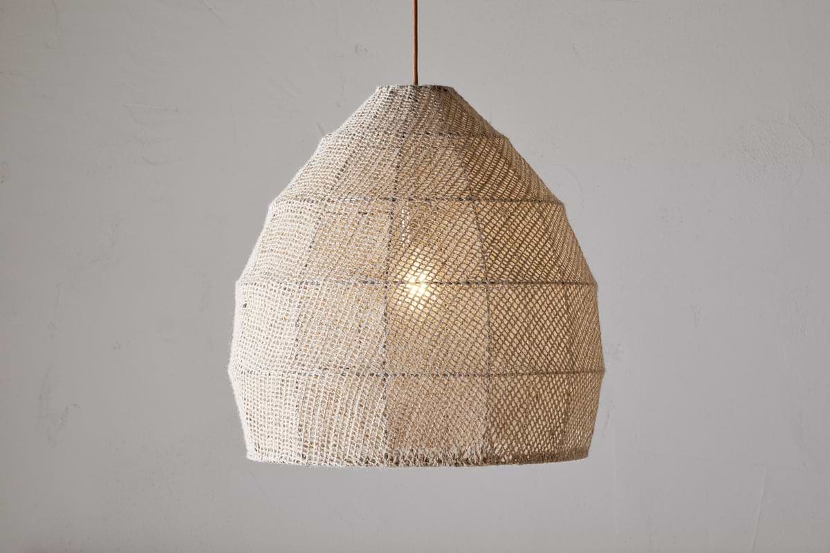
Jahari Woven Jute Pendant – Natural
adds quiet structure and warmth while keeping the room balanced.
What tends to hold up with working with natural textures
A pattern that holds up after reviewing many cream bedrooms is the repeated use of one anchoring texture—usually jute, untreated wood, or thick linen—rather than a collection of different woven accents. Reviewers and designers agree that matte finishes, like a linen shade on a lamp or a bare wood bench, stay easy to care for and look better with age.
Over time, a mix of natural and pale cream tones hides small marks—the kind that show on white bedsheets or glossy plastic. Clay pots and rough-woven rugs are especially forgiving in spaces with pets or children. The strongest rooms almost always keep one big element, like a wooden bed frame or a jute pendant, as the main focus.
— Mara, Loom & Glow
Common questions
What colour goes with cream for a bedroom?
Soft grey, sandy beige, warm taupe, and muted black pair best with cream in a bedroom. These colours give gentle contrast without feeling sharp or busy. Pairing cream with these tones creates a calm, grounded look that works in both small and large bedrooms.
Is cream a good colour for the bedroom?
Cream is an excellent colour for the bedroom because it reflects soft light and helps the room feel calm and restful. Unlike bright white, cream is less stark, hides everyday marks, and combines well with earthy accents and natural materials.
What are the 2026 bedroom trends?
In 2026, bedroom trends include layered cream tones, natural woods, and warm lighting, according to industry guides. Organic textures and simple, slow living decor are also growing. Modern bedrooms highlight wool rugs, woven baskets, and soft, neutral palettes for a grounded feeling.
Which colour is most attractive for a bedroom?
Cream is one of the most attractive bedroom colours because it adapts to many styles and stays warm in all seasons. Soft blues, sage greens, and muted earth tones also remain popular, but cream’s flexibility makes it a favourite among calm bedroom ideas.
Explore more calm combinations inside our Shop The Look .
Shop the Look
Soft textures that deepen the warmth of a cream bedroom.
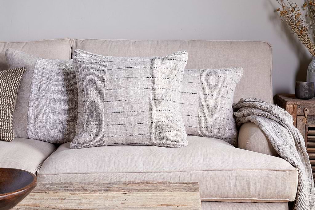
Mayla Cushion Cover
Soft hand-textured cover — instant warmth on linen sofas or chairs.
View at Nkuku →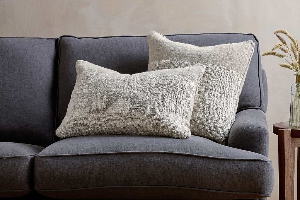
Puli Linen Cushion
Recycled linen in natural — pairs with woven textures and aged wood.
View at Nkuku →Some links above are affiliate links. If you buy through them we may earn a small commission at no extra cost to you. We only suggest pieces we think fit a calm, lived-in home.
Free guide
The Calm Leaf
12 quiet ways to bring dried botanicals, stems, and natural textures into calm spaces.