

Many small homes have slim, dark entryways where bags pile up and stray shoes take over. Deciding which neutral paint actually helps is tough, farrow and ball hallway ideas look inviting in photos, but under hallway lighting, the options can feel all wrong. A warm shade like Elephant’s Breath reads flat, but cool tones like Ammonite risk looking stark in narrow halls.
If you want your hallway to feel more open and welcoming, today’s guide will show you how to read your space and choose the right neutral. This works especially well in small homes when you get midday or muted light in the hallway because it helps you avoid shades that make the space feel pinched or shadowy.
The short version: The best farrow and ball hallway ideas use light neutrals that balance a hallway’s shape and natural light, keeping it welcoming but not flat. Matching your shade to the kind of light and width you have makes the space feel smoother, not crowded or cold.
Key takeaways
- A Farrow & Ball hallway looks best when the paint suits both daylight and low-light conditions.
- Choosing warm or cool neutrals depends on your hallway’s light and the rooms leading off it.
- Deeper colours like Railings or Inchyra Blue soften a larger hall, but shrink small spaces quickly.
- Colour drenching, walls, woodwork and ceiling in one tone, brings subtle, seamless depth.
- Finishes matter: a matte paint handles hallway scuffs better and cuts glare next to light sources.
- Where this works best
- Should a hallway be lighter or darker?
- Which neutral tones look best in a narrow hallway?
- How do warm and cool hallway colours really behave?
- Styling and placement
- What’s the best way to match hallway colours to other rooms?
- Common hallway paint mistakes that undo a good colour choice

Where this works best
Farrow & Ball hallway colours work best in small or narrow spaces with mixed light that need a calm, open look. Neutral palettes suit busy entryways because they hide marks and don’t overpower other rooms.
Hallways in most small homes see little direct sunlight and plenty of foot traffic. You need a paint that softens the feeling of length or tightness, while standing up to occasional scuffs from coats, keys or bags.
Many entryways lead to rooms with different light levels or strong colours. A neutral hallway helps bridge those rooms, so the first impression feels calm but not bland. The best farrow and ball hallway ideas, according to House Beautiful, pay attention to how colours flow from entrance to main living space.
Avoid bright, pure whites in a hallway that faces north or lacks a window. These often look flat, picking up grey shadows or showing every mark, while something like Cornforth White or Skimming Stone hides wear and keeps the space visually soft. Placing those shades near hallway mirrors spreads the light for a calmer look.
When you use these neutrals on both walls and woodwork, the corners blur a little, making even a narrow passage feel more open and less busy.
Should a hallway be lighter or darker?
A hallway almost always looks bigger with a lighter wall paint, but deeper shades suit wider spaces or places needing warmth at night. The amount of daylight and hallway width decide the best option.
Most small halls benefit from lighter neutrals. A pale shade reflects what natural light there is, softening shadows and helping the space not feel hemmed in. The English Home points out that pale hallways look less narrow, especially if the ceiling is painted a matching or slightly lighter tone.
In a space with brighter light or more width, a darker colour like French Gray or Studio Green sets a more cosy mood, especially in the evening. They soak up light, creating a sense of shelter, ideal for wider entries or where warmth matters more than apparent space.
A vanilla white ceiling paired with a dark wall, on the other hand, can make the walls look taller but the hall feel boxier. Contrast shows clearest on a sharp paint line: a softer break, like a continued colour across trims and rails, keeps things easy on the eye.
Using a neutral that leans a little warm, such as Skimming Stone, avoids the cold cast that some pale greys take on in shadowy or north-facing halls.
Which neutral tones look best in a narrow hallway?
Narrow hallways suit midlight neutrals with subtle undertones, like Ammonite or Cornforth White, because these shades don’t highlight shadows and feel open under artificial light.
Compared to a stark white, a slightly off-grey or greige hides the uneven shadow bands found in slim corridors. These paints, according to A Farrow & Ball hallway roundup, include favourites like Skimming Stone, Ammonite and Cornforth White.
If the hallway is dark, neutrals with a warm edge help keep the mood from feeling cold. Ammonite makes the space read cooler and more modern; Elephant’s Breath brings a snugger feel but can look beige in certain lights.
A bare hallway with only Ammonite on walls feels crisper than one with Elephant’s Breath, but the warmth of Elephant’s Breath stops the space from becoming too clinical. Soft furnishings, like a small linen runner or jute basket, help balance whichever tone you pick.
Try Cornforth White in spaces with varying light because it stays more consistent throughout the day and covers scuffs well, making it practical for busy homes.
| Colour | Best for | Feels like |
|---|---|---|
| Ammonite | Slim, modern halls | Cool, light, minimal |
| Elephant’s Breath | Low-light with woodwork | Soft, warm, even |
| Cornforth White | High-traffic, variable light | Neutral, steady, practical |
Choosing these tones for narrow hallway ideas avoids strong contrasts at corners and helps the entry feel airy but not empty.
How do warm and cool hallway colours really behave?
Warm hallway colours like Skimming Stone and Elephant’s Breath make shadowy spaces feel less stark, while cool shades such as Ammonite or Mizzle can help a hall feel fresh but risk reading cold.
The undertone of a paint decides how it acts under changing light. Hallways running east or north get flatter daylight, which can push a cool neutral toward blue or green. A soft warm neutral absorbs what little warmth there is, helping hide shadows, especially near skirting or under a picture rail.
Warm shades like Elephant’s Breath pick up pink or brown tones in artificial light, settling any sharpness that cool neutrals might throw around dusk. By contrast, in a hall already cold and grey, opting for Mizzle or Ammonite can read as too chilly.
Going all-in with a warm neutral throughout trims, frames, and even a small bench stops the hall from having too many visual breaks. Compared to switching between light and dark for trims and wall, this unified approach stays calm and doesn’t highlight uneven walls or shadows.
For ways to soften hard lines and add subtle warmth, pairing a clay bowl or small basket against Skimming Stone, for example, helps natural materials stand out while keeping the background gentle.

Styling and placement
Hallway styling stays freshest with a tight palette, simple shapes, and one tactile element to break up paint without clutter. Understated placement lets the walls set the mood, not the accessories.
Hallways gather clutter fast, extra baskets, too many hooks, random frames. Styling works best when you pick a focus: a low-profile shelf in the same tone as the wall, or a single slim ceramic vase near the door. Adding too much, especially vivid colour, pulls the eye everywhere at once and breaks the sense of flow.
Natural materials, like a jute doormat or linen curtain, soften sharp paint lines and ground the entry. Choosing textures in similar tones as the paint keeps the look layered but avoids chaos. Lighter walls pair well with wooden accents, while deeper shades set off pale woven baskets or brass handles.
Hallway furniture often gets pushed too close to the wall in hope of making more walkway space, but a small gap, even a hand-width, is enough to stop scuffs and shadow bands.
Quick calm checklist:
- Limit hallway palette to 2-3 colours, all soft or muted.
- Anchor one natural object, basket or bowl, away from busy doorways.
- Keep most of the floor space clear, even a thin rug does enough.
- Match hooks and shelf hardware to woodwork, not main wall shade.
- Edit frames or prints down to one grouping, centred at eye height.
A hallway that feels calm and open usually relies on fewer, larger accessories instead of many small objects to keep the space breathing.
What’s the best way to match hallway colours to other rooms?
Matching hallway paint to the rooms it connects creates smooth transitions, ideally using shades that complement living and kitchen colours without clashing or repeating them outright.
Most hallway doors lead onto rooms with distinct moods and natural light, kitchens, living areas, maybe a bath. House Beautiful advises softer, more neutral hallway colours to prevent harsh breaks between rooms. Shades like Shaded White and Cornforth White have just enough pigment to stand mid-way between bolder living room choices and calmer bedrooms.
If the kitchen is green (Mizzle or Pigeon), a neutral like Skimming Stone won’t look muddy from the hall. Where living rooms favour navy or charcoal, a hallway in Ammonite or French Gray acts as a buffer, neither copying nor competing.
In a home with mostly warm woods and pale carpets, using a cool neutral like Ammonite in the hall can feel out of place next to honey or oak. Instead, a soft grey with hint of yellow or taupe, such as Elephant’s Breath, makes the shift feel natural.
Hallways painted with these connecting neutrals keep the space from feeling like a leftover or passage afterthought, everything lines up in the eye as you move through.
Common hallway paint mistakes that undo a good colour choice
The most frequent mistake is choosing a paint colour based on how it looks in someone else’s photo, not how it acts in your own hallway’s light and shape.
Daylight is rarely even, many halls get little natural light and turn cooler as the day goes on. A paint that looks welcoming online, like Cornforth White, can look dingy by evening. Always test swatches at different times of day to see undertones change, whites can slip blue, greys go brown under artificial light.
Sharp contrast between trims, rail, and walls makes a short hallway look even busier, spotlighting every uneven join or scuffed edge. Instead, painting woodwork and walls in one tone (colour drenching) lets corners retract and surfaces blend softly, something The English Home recommends for modern homes.
Glossy finishes reflect hallway lighting and show scuffs faster. Most decorators and paint guides recommend matte or eggshell for entryways, as these finishes shrug off marks and subdue even bright or overhead lights.
Rushing a decision just because a swatch looked “not too dark” on a friend’s wall often leads to a hallway that feels thrown together, not calm or lasting.
What tends to hold up with choosing hallway neutrals
One constant across design guides and feedback is that paint colours always shift under hallway conditions, what looks balanced in morning sun may go flat or yellow beside a lamp or in shade. Reviewers consistently say that Cornforth White is forgiving in homes with changing light, and matte finishes cope well with everyday scuffing and glare. Many decorators recommend starting with a smaller patch and living with it for a week, since lighting reveals hidden undertones as light changes over the hours.
Another pattern is the success of limited palettes and natural materials in halls: a soft neutral, matte finish, and the quiet touch of jute or pale wood anchor the space so it never feels busy, even if the rest of the home shifts in mood or colour with the seasons.
, Mara, Loom & Glow
Common questions
What is the best Farrow & Ball paint colour for a hallway?
The best Farrow & Ball hallway paint is usually a soft neutral like Cornforth White, Ammonite, or Skimming Stone. These tones suit small or large halls, hide scuffs, and feel consistent all day. They also bridge well between rooms with different palettes while looking clean yet not sterile.
What is the most welcoming colour for a hallway?
The most welcoming hallway colour is a warm neutral, something like Elephant’s Breath or Skimming Stone, because it avoids cold undertones and feels gentle under both daylight and lamp light. Lighter shades help the entry appear wider and soften the mood at first glance.
Should a hallway be lighter or darker?
A hallway is usually best kept lighter, especially in smaller homes or those with little daylight. Lighter paints make the space feel less boxed in. Deeper tones work if the area is wide or you want a more intimate atmosphere, but may shrink a narrow hall.
What are the trends for decorating hallways in 2026?
Current trends for 2026 put focus on soft, layered neutrals, often with walls, woodwork, and sometimes even ceilings painted in one tone for a seamless look. Accessories stay minimal, with one or two natural textures. Colour drenching and low-sheen finishes remain popular for subtle, lived-in style.
Explore more calm combinations inside our Shop The Look .
Shop the Look
Three calm pieces that anchor a hallway: a half-moon console for a narrow wall, a clean iron shelf for keys and small objects, and a modest mirror to reflect soft colour.
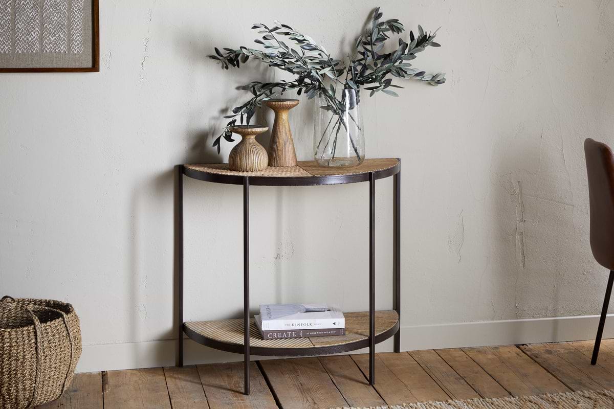
Aasha Console Table
Half-moon silhouette in mango wood; anchors entryways and narrow walls.
View at Nkuku →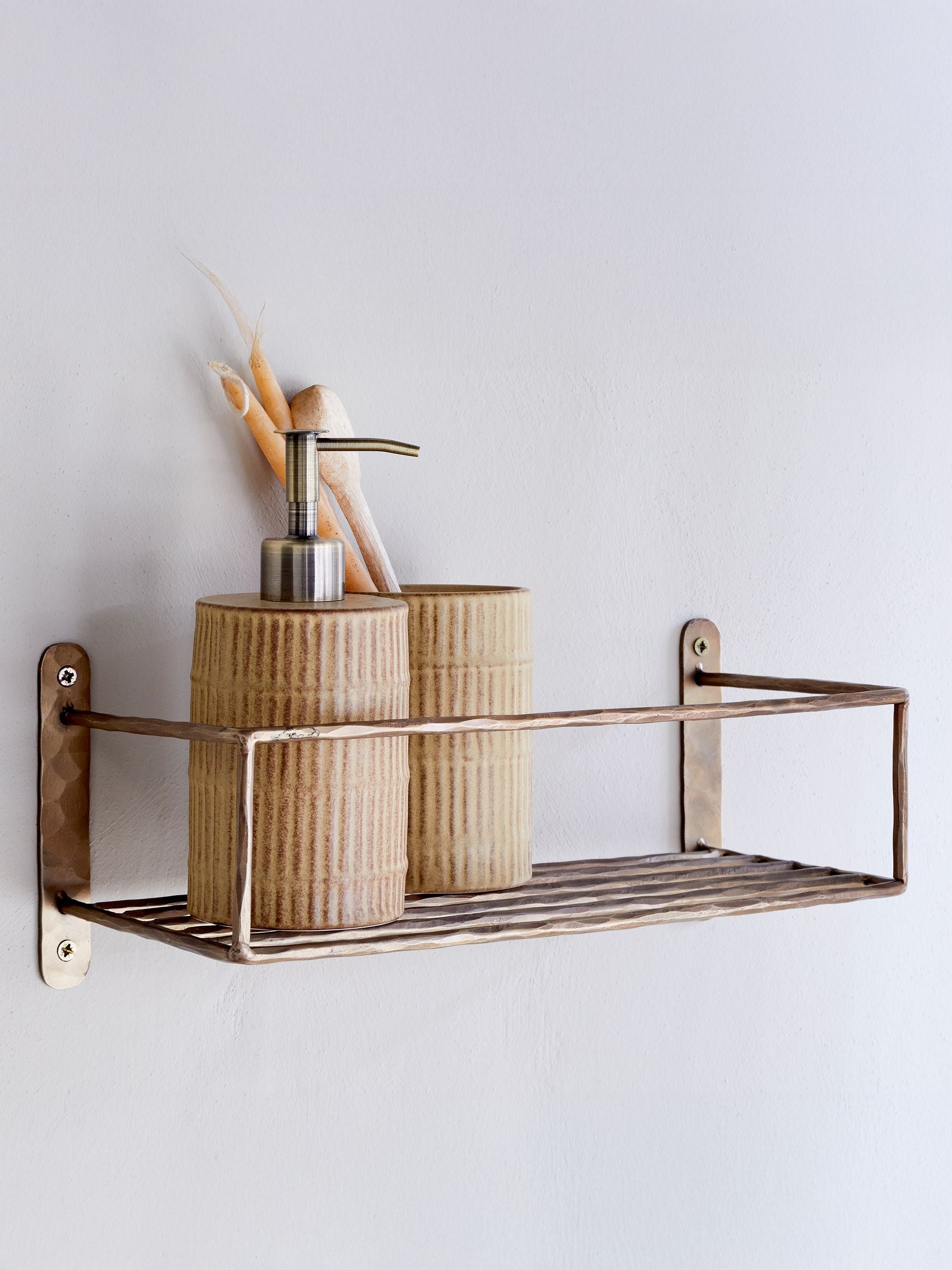
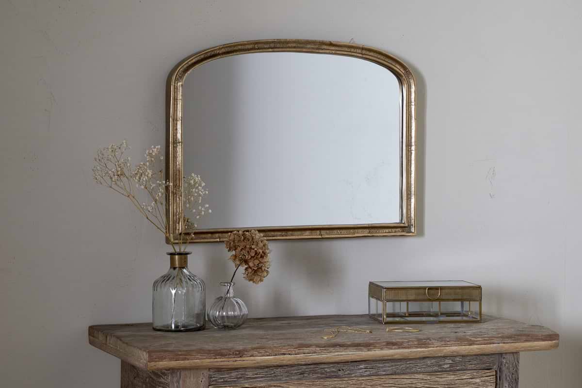
Some links above are affiliate links. If you buy through them we may earn a small commission at no extra cost to you. We only suggest pieces we think fit a calm, lived-in home.
Free guide
The Calm Shelf
12 styling ideas to help you compose calm, balanced shelves in natural texture homes.