
It’s easy for a small room to feel bland or crowded, especially when you want the depth and mood of dark luxury. Rental rules, light-blocking furniture, and busy shelves often make it harder to get that rich, dramatic look without making the space feel boxed in.
Today, you’ll see how to adjust what you already own, where to add new textures, and which pieces to cut so the room feels more grounded and grown-up. This works especially well in a small apartment living room when the walls can’t be repainted because deeper hues and layered textures create a richer sense of depth without adding clutter or closing the space in.
The short version: To create dark luxury in a small room without renovation, anchor one strong texture, a matte-finished piece or plush velvet, against a simplified, monotone base. Limiting the palette and using layered lighting quickly bring depth and calm, even where walls, floors, and fixtures can’t be changed.
Key takeaways
- The dark luxury look relies on a tight palette, matte finishes, and one or two dramatic touches.
- A dark room works best when you layer strong textures with soft lighting from more than one source.
- Velvet, stone, glass, and warm-toned metal are core textures for this look.
- Most renters get drama using statement furniture and accessories, not wall paint.
- Lighting matters more than square footage for mood in small rooms.

What defines dark luxury in a small space?
Dark luxury in a small room means combining deep, muted colors and strong materials with plain, simplified furniture lines. Texture and lighting set the tone more than square footage or cost.
Many people hear “dark luxury” and picture an expensive hotel suite, but the real difference comes from the weight and finish of the surfaces, not from gold fixtures or deep-pile carpets. According to Dark Luxury News, the term came from luxury brands and designers seeking depth and quiet drama, not just high price tags or gloom.
This approach sets a small room apart from just a dark-painted space by relying on a narrow palette: mostly grays, warm browns, or black accents, picked up in thick curtains, stone bowls, or a velvet pillow. Unlike the gothic or maximalist look, dark luxury keeps to a few tones and avoids knick-knacks. A glass vase pulls the eye gently, while too many frame clusters break the effect.
In apartments where paint and fixtures can’t be changed, focusing on heavy, matte finishes (like a blackened oak side table or a charcoal linen slipcover) does more than multiple, lighter patterns. A matte finish softens the way light bounces, making shadows richer and cutting glare from even basic lamps. This difference is why a velvet throw warms a plain sofa when the room needs more depth.
Applying these choices lets a rental space feel finished and dramatic. Add a plush velvet or linen element near a window so it softens the strong daylight, or choose a low, simple bookshelf in black or dark brown to anchor the end of the room.
Where this works best
Dark luxury fits best in small living rooms, bedrooms, or dens with low, indirect light and enough blank wall space to highlight a key object. Rooms with little built-in ornamentation provide the best backdrop.
This approach is strongest in apartments or compact bedrooms where the floor plan is straightforward and there’s one main sitting or sleeping area to ground with a statement piece. Rental rooms with basic white or off-white walls especially benefit, as the contrast between the plain perimeter and richer textures draws attention to chosen pieces, not constraints.
Dark luxury choices suit places where the landlord controls the walls and floors, and even more so, where afternoon or evening light is soft. Here, adding a velvet chair, heavy linen curtain, or black-framed mirror does more to anchor the space than changing wall paint or flooring ever could. This is why dark rooms become standouts when texture does the heavy lifting.
Avoid trying this look in halls or kitchens packed with visual clutter, as the effect can quickly stray into messy or claustrophobic. One dark, deep piece in a busy entryway makes the rest feel heavier by comparison. Instead, save these elements for rooms where the eye can rest on a feature without interruption from shoes, bags, or extra storage bins.
In these spaces, a dramatic textured cushion or weighted curtain in a deep color can signal a grown-up, finished mood. Place your boldest surface where light naturally falls during the day, opposite a window or facing an entry door, for best effect.
How do you use texture to make a small room feel rich?
To make a small room feel rich, combine thick textures, like velvet, stone, and matte-finished wood, while keeping other surfaces clean and simple. Texture carries more weight than pattern or color in tight spaces.
The strongest impact comes from picking two or three heavy textures and repeating them sparingly: one knotted wool rug, a single stone bowl, or a plush pillow in deep green or blue. Most designers agree velvet is the easiest shortcut here, a velvet cushion or small ottoman instantly adds body without needing a full furniture switch.
Unlike shiny synthetic fabrics, these dense, matte-finished materials break up raw light and blend with more affordable linen or cotton. A plain glass table looks cold next to plastic, but the same glass softens the edge of a dark velvet armchair. The contrast matters: combining only slick or hard surfaces can make a room flat, while mixing plush and rough gives depth.
A tight texture palette works because the fewer types you use, the stronger the statement piece becomes. Overdoing with many materials (like leather, chrome, faux fur, and silk all at once) reads as busy and confusing. For renters or small-room dwellers, start by adding a velvet throw to the sofa or swapping a single lampshade for one in black or slate linen. These swaps make the room visually heavier, not cluttered.
Place your main texture focus near where you sit or rest, underfoot, on the bed, or beside the main chair. In small bedrooms, a weighted linen curtain and plush pillow do more to set the mood than new wall art or scattered decor.
Styling and placement
A dark luxury room feels collected and calm when every piece has space around it and is grouped by function, not by color or shape. One focal object should catch the eye, while extras are kept low and simple.
Styling usually trips up in two ways: crowding too many dark objects, or lining them up against every wall. To avoid a cluttered or heavy feeling, pull main pieces in from the walls and keep sightlines open from the doorway. Low furniture, like an ottoman or a sleek bench, doesn’t block the eye the way a tall, bulky sofa might.
Few small rooms have the luxury of extra square footage, so use clear glass or mirrored surfaces to extend the view. Compared to opaque pieces, a smoked glass side table lightens up a reading nook without adding another loud color. A matte finish on shelves makes books and vases stand out but doesn’t glare under lamplight.
Add one standout item, a velvet armchair, a stone bowl, or a framed print in deep tones, and keep supporting surfaces clear. Place smaller accents at different heights so they don’t compete. A small stack of dark-bound books on a coffee table draws less attention than several on every shelf.
Quick calm checklist:
- Use a maximum of three textures per area, velvet, glass, and matte wood work well together.
- Leave some negative space around each key piece (at least a hand’s width) to break up heavy surfaces.
- Keep the palette mostly flat, add just one contrasting accent, not a rainbow of shades.
- Put the boldest object in the main sightline, not in a corner or behind a door.
- Limit decorative extras, one small bowl or lamp per table is enough.
In practice, use a black-framed mirror opposite a window to bounce light and visually double your main texture, or group two objects (like a velvet cushion and a stone dish) on the seat you use most.

Which lighting choices deepen mood, not gloom?
Small rooms feel moody but not gloomy with layered, warm lighting: a central overhead lamp plus at least one or two table, floor or wall lights with soft bulbs set at varying heights.
Lighting is often the difference between dramatic and gloomy. Using only one overhead source, especially with a cold, blue-white bulb, flattens the texture and creates patchy shadows that break the calm. Most decorators suggest layering light: a dimmable ceiling fixture, a simple table lamp at eye height, and a small floor lamp with a warm bulb (around 2700K is common for living areas).
Unlike track lights or very bright LED strips, shaded bulbs in linen or glass drop the glare and add the soft glow that makes luxury rooms feel calm. A bare bulb or exposed filament is harder, but a black, bronze, or smoked glass shade filters the light and softens edges on furniture.
Strategic placement matters more than wattage. Put a table lamp near a deep-toned object, like a black shelf or velvet cushion, and the light bounces gently; placing it on a bare white wall produces harsh contrast. According to Dark Luxury World, a single statement light is enough when anchored by soft finishes on floors and sofa arms.
A dramatic difference appears when you swap cool bulbs for warm ones. Soft, yellow-tinted light is easier on the eyes in the evening and makes wood, stone, and velvet tones come alive, especially in small enclosed rooms or windowless spaces.
How to create dark luxury in a rental or temporary home
Rental or temporary homes get dark luxury through removable textiles, art, and statement accessories, not paint or fixed changes. Weighted curtains, dark slipcovers, and bold lights make the biggest impact.
Most renters want depth and drama without risking a deposit or breaking rules. The best changes are the ones that do not alter walls or permanent fittings: hanging heavy linen curtains, swapping in a velvet or charcoal cotton slipcover, displaying a large framed print, or investing in a black metal floor lamp with a simple dimmer.
Unlike sticky wallpaper or temporary wall panels, these movable pieces travel easily and do not need repairs later. Budget choices like replacing a basic shade with a smoked glass or matte linen fixture work surprisingly well. Even a large, heavy throw in a deep color can change the perceived weight of a bland sofa or bed.
Removable art is another solution: try a small gallery of dark, monochrome prints with thin metal frames. Instead of crowding a gallery wall, group them close on one anchor wall and leave other surfaces nearly bare. Dark aesthetic accessories, like low trays or stone bowls, layer well and can be packed away at the end of a lease.
A table comparison between permanent and temporary upgrades:
| Permanent Features | Temporary Solutions | Notes |
|---|---|---|
| Accent walls | Large dark art, blackout curtains | No painting needed |
| Built-in lighting | Statement lamps, dimmable bulbs | Fits any socket |
| Hard flooring | Matte or shaggy rug | Protects underfoot |
| Custom shelving | Freestanding matte-black bookcase | Easy to move |
Place these key objects where they’ll get the most use or where you see them first: the end of a sofa, by the bed, or facing a main entry, so every visitor feels the room’s depth at once.
A good fit for renters is layering a weighted curtain with a low, plush ottoman near the main window. Use art with removable strips for less wall damage and place mats or trays in stone, wood, or dark glass on top of storage units where possible.
Choosing materials: what not to use in dark luxury rooms
Some common materials, like chrome, thin plastics, and high-shine synthetics, make a room look cold or unfinished when you’re aiming for dark luxury. Stick to matte, heavy, or muted finishes instead.
Rooms slip from “calm and grown-up” to “unfinished rental” quickly with the wrong materials. Chrome, super-shiny glass, and thin, off-the-shelf plastics reflect light in ways that flatten out velvet or heavy linen choices. Compared to a matte black lamp, a chrome one makes every mark stand out, especially in soft light.
Furniture with thin metal legs or shiny surfaces adds to visual noise, not drama. Swapping these for painted wood, blackened steel, or bronze tones quiets things. Matte, dark ceramics do more for setting a calm mood than glossy tiles or busy marbled patterns. Most designers agree on keeping high-gloss to a minimum; even a single matte vase or ceramic tray cuts through glare on basic shelving.
Color temperature also matters. Avoid cool blue-tinted whites and stick to off-whites, browns, and shadows behind key pieces. Check for the main cluster of materials in the room: removing one shiny object can make every other surface look richer. A black linen curtain softens the edge on even the most basic rental blinds.
Small rooms do best limiting every “hard” surface to one or two items, mixing in at least one plush or textured textile. Swapping a clear, shiny side table for a matte black or natural stone top instantly lowers the visual temperature of the whole room. For palette inspiration, see dark colour palettes and keep to those muted tones as your anchor.
At some point, most people stand back, stare at their finished room, and notice one corner that feels oddly flat, maybe shadows collect in a spot they didn’t expect, or a shelf full of shiny decor pulls the eye away from the main piece. The gap is usually not about cost, but about too many competing focal points or unfinished surfaces crowding the view.
The practical shift comes when you limit the number of bold objects in each view and choose just one main texture for the room. Removing extras lets each chosen material really stand out and helps the space look calm, not busy.
A decision moment often happens in the evening, after the third or fourth time the room catches your eye and it feels unsettled, either too dark in one zone or oddly lightless in another. That’s the sign to try moving a lamp, swapping one loud piece for something quieter, or clearing surfaces so the best textures can read.
When most people style for dark luxury at home, the common mistake is crowding too many textures, colors, or accent pieces close together. The effect usually makes the room feel smaller, heavier, and visually noisy, especially at night or under harsh light.
Fixing this with a clearer palette and spacing makes the room read as calm, grown-up, and more comfortable at every hour.
Save this idea for later.
What tends to hold up with dark luxury in small spaces
Reviewing how people style dark, moodier rooms again and again, what stands out is how much mood comes from restraint. The rooms that last, and look rich in person, nearly always keep to a very quiet palette, muted woods, thick cotton or velvet, little in the way of chrome or glare. Matte finishes get recommended over glossy ones by both designers and renters, especially near windows, because they cut harsh reflections and let any warm lamp look softer.
Texture holds the room together. A velvet pillow, a heavy stone orb, or even a black-and-white print can do the heavy lifting in a small space. Designers often note that too many metallics or patterns scatter the eye, while sticking to one or two dense textiles makes affordable furniture and rented units feel finished.
, Mara, Loom & Glow
Common questions
What is dark luxury in interior design?
Dark luxury in interior design means using deep, muted colors and rich textures like velvet, stone, and matte metals to create a feeling of depth and calm. This style is about a close, limited palette with dramatic surfaces and warm lighting. It avoids cluttered patterns and focuses on subtler combinations of weight and finish.
What is the difference between soft luxury and hard luxury for your home?
Soft luxury relies on plush textiles, muted finishes, and warm light, while hard luxury uses glossy stone, sharp metal, and bold contrasts for drama. Both types offer richness, but soft luxury brings warmth and comfort, while hard luxury skews more toward sleek and polished looks. Choose based on which feeling suits your space.
What are the key types or styles of luxury decor?
Key styles of luxury decor include dark luxury, soft luxury, hard luxury, classic elegance, and modern minimal. Each style uses different main materials, like velvet, marble, or steel, and a specific color range. Visual inspiration for these styles is often gathered from sources like Dribbble and studied by designers worldwide.
How do you stop a dark luxury room from feeling oppressive?
Limit the number of dark objects and break up heavy colors with metallics, glass, or neutral textiles to keep a dark luxury room from feeling oppressive. Use soft, warm lighting and make sure each feature has space around it. Keeping some lighter surfaces open helps maintain balance and keeps the room comfortable.
Explore more calm combinations inside our Shop The Look .
Shop the Look
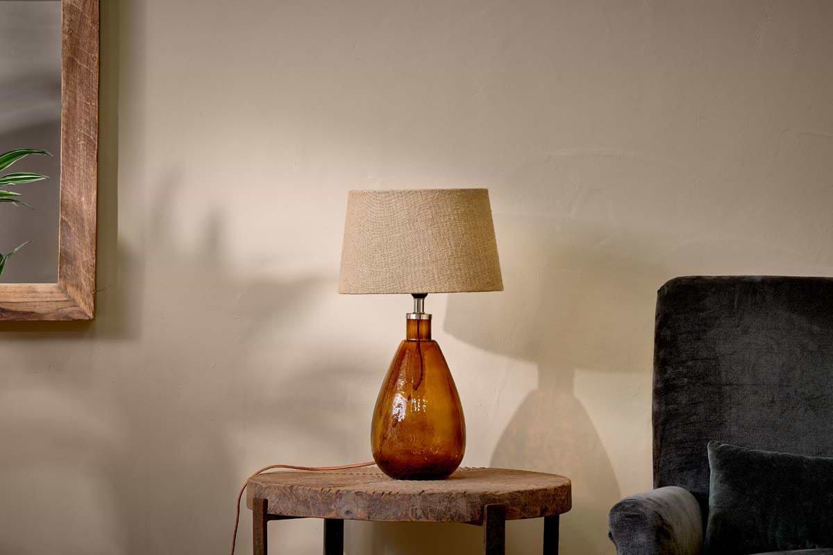
A few pieces that add quiet depth and a sense of warmth to a small dark-toned room.
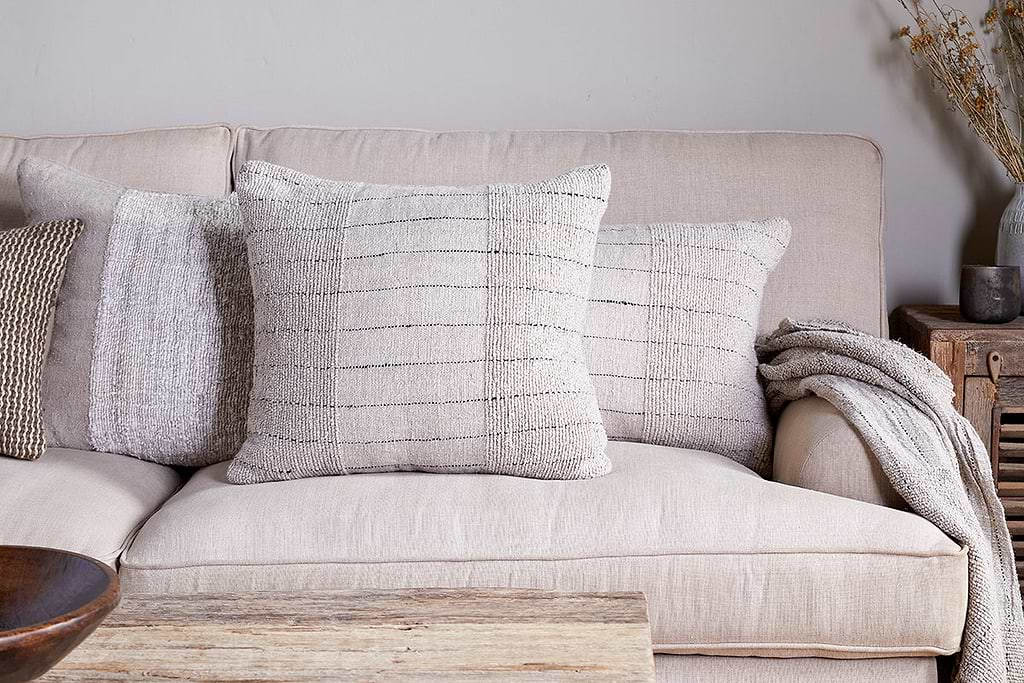
Mayla Cushion Cover
Soft hand-textured cover, instant warmth on linen sofas or chairs.
View at Nkuku →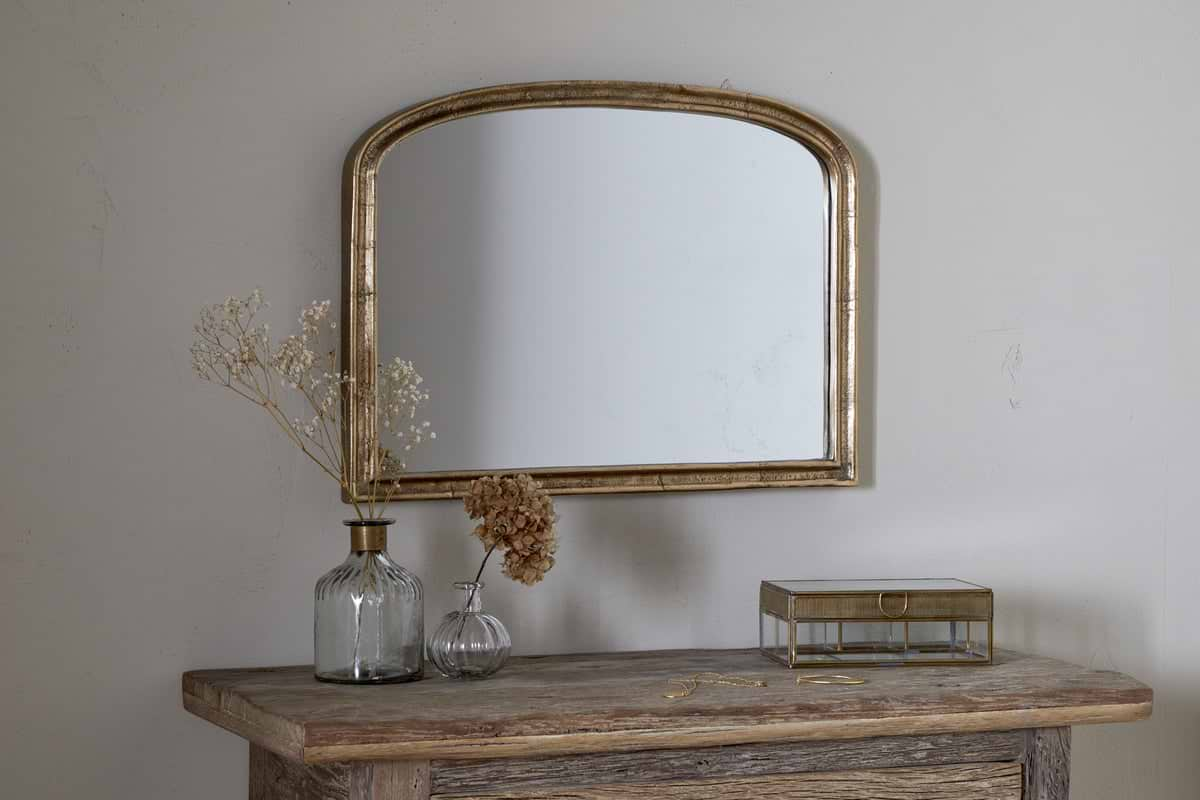
Some links above are affiliate links. If you buy through them we may earn a small commission at no extra cost to you. We only suggest pieces we think fit a calm, lived-in home.
Free guide
The Calm Shelf
12 styling ideas to help you compose calm, balanced shelves in natural texture homes.