

Renters and homeowners alike often find their small bedrooms feel boxed in, partly because the bedroom wall colours add to the sense of cramped space. Off-white can look cold, but bold colours can feel heavy and dark, few people want their bedroom to feel like a utility closet at night or a pale office by morning.
The right choice of paint makes a difference. Today, you’ll see how small shifts in shade and finish open up a bedroom, making it calmer and lighter but never chilly. This works especially well in small bedrooms when natural light is limited because a careful palette brightens low-light corners and makes everything feel softer and more open.
The short version: The best bedroom wall colours for a small space are light neutrals with warm undertones, which reflect light and still feel cosy. Soft greys, creamy whites and gentle blues help a room feel open, not cold, and create a peaceful place to rest.
Key takeaways
- Light, warm-toned wall colours help small bedrooms feel brighter and more spacious.
- Soft grey is a modern alternative to white and still feels warm and restful.
- A void deep, bold colours in tight spaces: these can make rooms feel heavier and smaller.
- Sampling paint at different times of day reveals how colours really look in your room.
- The best palette combines wall colour with bedding, curtains and framed art for a joined-up look.
- The psychology of bedroom wall colours for small spaces
- What makes a bedroom colour feel calm or cosy?
- Where this works best
- How to test bedroom paint colours before you commit
- Styling and placement
- Which wall colours should you approach with caution in a small bedroom?
- Combining your wall colour with the rest of the room

The psychology of bedroom wall colours for small spaces
Bedroom wall colours affect how spacious, restful, and private a room feels; light, soft shades open up small spaces and invite calm. Strong, saturated colours in a small room often feel more intense and distracting, especially after dusk.
Many small bedrooms have few windows, which limits how much daylight reaches the corners. Soft whites and gentle greys reflect available light and, according to Dulux, help the room look larger and less closed-in. Choosing a light palette can reduce the sense of visual clutter in rooms with low ceilings or lots of furniture.
Pale colours also support rest by calming the eye at night. Unlike bright red or deep navy, muted wall colours don’t create harsh shadows even when the bedside lamp is on. A soft grey wall reads quieter and smoother than a cool white, which can sometimes seem clinical.
The most effective bedroom wall colours are those that sit quietly in the background, making the furniture and textiles feel more inviting. This is especially helpful if you use the space for both sleep and work, nothing feels more busy than mismatched paint next to a linen bedspread and a laptop charger on the floor.
What makes a bedroom colour feel calm or cosy?
A calm bedroom colour is one with gentle undertones, soft reflectivity, and minimal visual noise; a cosy colour sits closer to cream, taupe, or blue than bright white or deep black.
Some shades of white can make a bedroom feel stark, particularly in the morning, while soft mid-tones and muted blues support the feeling of “tucked away” relaxation. Fresh Coconut and creamy whites bring warmth that brightens a small bedroom but avoids any greyish chill. Choosing one consistent pale colour on every wall does more to quieten a space than a dark accent wall with bold art.
Pale blue has long been a calming option, especially if you lean towards a restful look, according to DIY.com. Unlike deep blue or navy, a powder blue or light mist shade settles easily with white curtains and soft wool rugs.
A bedroom always feels cosier when the paint absorbs some light, but not so much that the room feels boxed in. Matt or eggshell finishes on walls help by diffusing both daylight and lamplight, avoiding glare that looks cold.
Where this works best
Light, warm-based bedroom wall colours work best in small bedrooms with limited window light or a single main source of daylight.
Rooms with low ceilings, slanted walls, or awkward alcoves benefit most from soft mid-tones. Adding a tone like soft grey or creamy white to a windowless alcove gives edges a softer look. If a wardrobe crowd s one end, gentle colours keep it from looming out into the room.
Painting all four walls in a small bedroom in a pale, creamy white makes erratic furniture, like an uneven dresser or mismatched bedside tables, feel a little more at home. The wall colour evens out sharp contrasts between shadow and sun in early mornings, especially in narrow spaces where sunlight falls at an angle.
Avoid pairing cool white with bright blue in bedrooms without much daylight, as it often looks colder than expected and draws the eye to shade differences on each wall. Use warm white or soft grey to sidestep this chilly finish.
How to test bedroom paint colours before you commit
The easiest way to test bedroom wall colours is with physical paint samples on your walls and digital tools from paint brands like Dulux and Crown.
Most decorators and designers advise testing three shades on the intended wall, next to the window and opposite the main light source. Place the samples on each main surface, including a sloped ceiling if you’re in a loft. The Dulux Colour Visualiser and Crown’s tester pots both help preview how different light levels change the mood in your room.
Paint brands recommend checking the samples at three points in the day: early, mid-day and after sunset, as each light type impacts reflection, shadow, and undertone. Soft grey can read much darker at night than during midday, so what looks fresh in the can may feel a bit too deep by lamp light.
Cheap brushes will leave marks, while a decent sample roller can be cleaned and stored for later touch-ups. Most sample pots cover about one metre squared, just enough for the head of the bed or a tricky corner where a wardrobe meets the wall.

Styling and placement
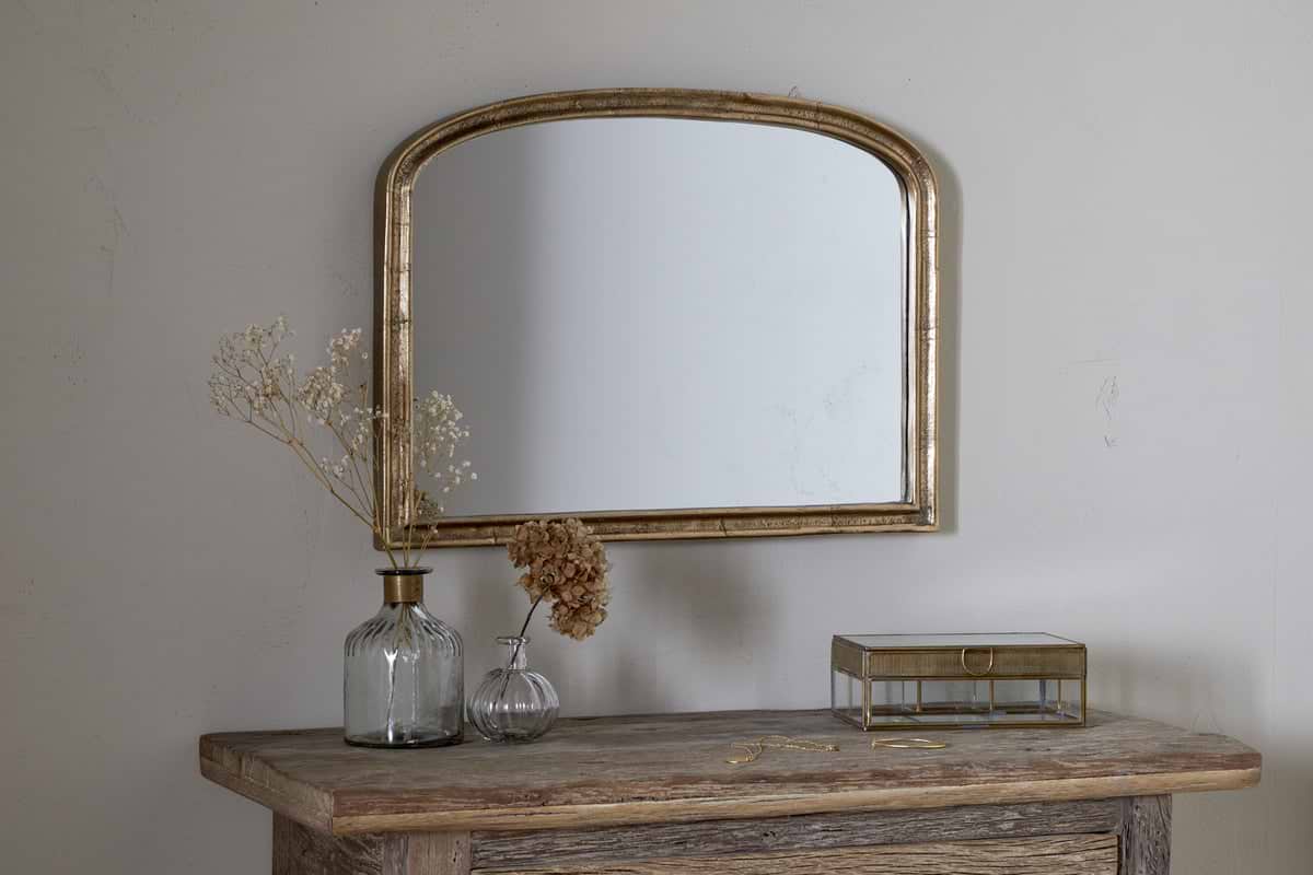
The most calming small bedrooms use a limited palette and anchor the space visually with a single focal item, like a small artwork in a brass frame.
Adding art with a slim frame, such as the Kiko Brass Frame, keeps the eye from bouncing around the room. A small wall mirror or quiet photographic print above the bed works better than a large, heavy painting, especially if the walls are a soft, even colour. Unlike gallery walls, which pull focus, a single framed print calms the space and prevents the walls from feeling busy.
Textiles matter. A linen curtain or wool throw at the foot of the bed echoes the softness of pale paint and softens sharp lines from furniture. Compared to synthetic drapes, natural fabrics add depth, especially when their colours are close to the wall, think off-white sheers against warm grey paint.
Quick calm checklist:
- Use natural textiles: cotton or linen curtains and a single wool rug.
- Anchor the focal wall with one simple framed piece rather than a gallery array.
- Keep bedding, accessories, and wall colour within three hues for a pulled-together look.
- Leave the area around the light switch clear of art for an uncluttered entry.
This styling approach works best for small or narrow bedrooms, where every item is visible at once and one busy spot can tip the balance.
Which wall colours should you approach with caution in a small bedroom?
Deep colours like charcoal, bold blues, and strong reds often make small bedrooms look tighter and busier; soft mid-tones or pastels work better in these spaces.
Darker shades like charcoal and navy can create a cocoon-like mood in larger rooms, but according to Dulux, they risk making small spaces feel compressed and shadowy. Crimson and black are intense on four walls, which may raise the visual “noise” and compete with the rest of your furniture or bedding choices.
Glossy or reflective finishes exaggerate flaws in walls, especially at night when bedside lamps catch every bump. Unlike matt paint, which diffuses soft light, gloss bounces it straight back in small rooms, making imperfections more noticeable.
The table below compares common small bedroom wall colour choices, their advantages, and drawbacks:
| Colour Type | Effect in Small Room | Common Drawback |
|---|---|---|
| Soft grey | Feels modern, open, gentle | Can seem flat in cool daylight |
| Creamy white | Bright and warm | Shows marks easily |
| Charcoal | Cosy, dramatic | Often makes space feel smaller |
| Bold red/blue | Energetic, striking | Creates visual clutter |
To keep a small bedroom from feeling overwhelmed by heavy colour, stick to gentle shades and limit rich accents to the bedding or a single accessory.
Combining your wall colour with the rest of the room
Bedroom wall colours work best when they are close in tone to the bedding, curtains, and main accessories, this avoids harsh contrast and keeps the room feeling joined-up.
Bringing together wall colour, bedsheets, and curtains makes a bedroom feel more expansive. A blue bedroom with grey bedding and off-white drapes looks lighter around the edges and doesn’t break the flow between walls, ceiling, and floor. Bedroom curtains in a matching tone support this soft, layered look.
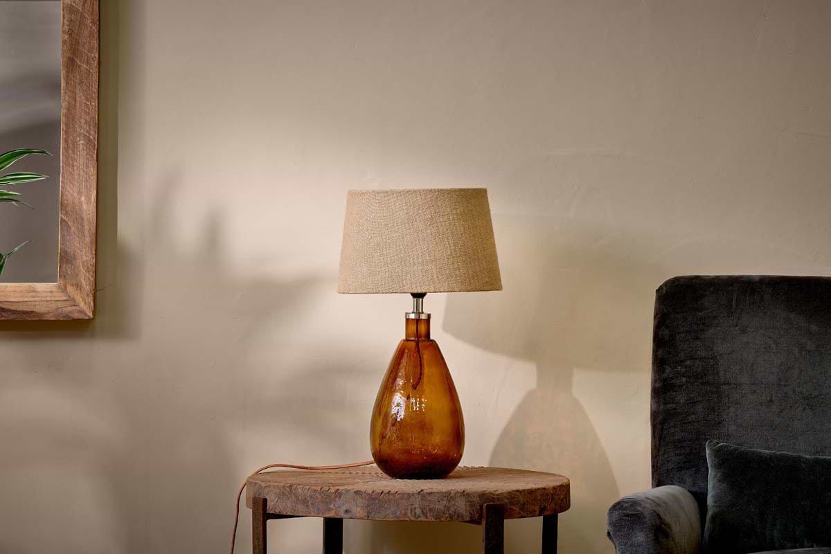
Repeating the main wall colour in two or three key objects, like a clay lamp base, a painted nightstand, or a single cream accent cushion, keeps the palette gentle. A bedroom feels busier when the walls are one colour, the furniture another, and the art a third, bright shade.
Focusing on a limited palette means you spend less time trying to “fix” clashing pieces. If your bedroom is a rental and new paint isn’t allowed, echoing wall tone in bedding or floor cushions still brings the same calm effect as a freshly painted wall. The small bedroom ideas roundup shows this works well even if the walls are just a rental beige.
Many people reach the point in a room refresh when something still feels just a bit “off.” The walls may be a good neutral, but every extra pop of colour makes the whole space feel unsettled. The solution is usually to limit the palette further, making the bedding, curtains, and art work together with the wall paint, or letting one colour tie everything in.
Rooms often become busy because most people layer in colour from bedding, art, or an old rug, forgetting the wall is the backdrop for everything else. By choosing one focal shade and echoing it throughout the space, the room breathes and feels easier to rest in.
It’s common to pick a wall shade that looks good in the tin but feels noisy when the bed, art, and curtains are in place. If the room feels busy or lacking in calm, the main reason is too many hues fighting for attention, especially in a small space.
When you pare things down and let the wall colour do most of the visual work, the bedroom feels larger and lighter around the edges right away.
Save this idea for later.

What tends to hold up with bedroom wall colour choices in small spaces
Across hundreds of bedrooms reviewed, the wall finish and colour make the first, biggest impression, but it’s the subtlety of the undertone that lasts. Soft grey, creamy white, and gentle blue are chosen again and again by decorators for a reason: most small bedrooms look best with colours that stay in the background, softly changing with the light, and never asking for attention.
Matte finishes are recommended for bedrooms because they reduce glare and make walls fade quietly into the background, especially when combined with linen or cotton textiles. Reviewers consistently mention how even a minor undertone shift, from blue-grey to creamy, can nudge a bedroom from sharp to restful. This effect is simple, but makes the entire room feel lighter and more connected.
, Mara, Loom & Glow
Common questions
What is the most calming colour for a bedroom?
The most calming colour for a bedroom is a light neutral with warm undertones, such as soft grey, creamy white, or gentle blue. These colours are recommended for their ability to reflect light and support a restful mood, especially in rooms that lack strong natural sunlight.
What are the best warm colours for bedroom walls?
The best warm colours for bedroom walls are creamy white, light taupe, and soft apricot. These shades give a cosy feeling without making a small bedroom feel closed-in, and they pair easily with most bedding and art choices.
What is the most popular colour for bedroom walls?
The most popular colour for bedroom walls is soft grey, according to paint brands and design guides. Soft grey acts as a neutral, fitting both calm and modern bedrooms, while being less stark than bright white and less heavy than bold hues.
What colours are trending for bedrooms in 2026?
Colours trending for bedrooms in 2026 include gentle greys, creamy whites, and pale sage green. Cool blue and muted peach also appear in designer lists, reflecting the move toward restful, easy-to-style backgrounds that suit small and large spaces alike.
what is the best color for a small bedroom?
The best colours for a small bedroom are light neutrals with warm undertones such as soft greys, creamy whites and gentle blues, which reflect light and help the room feel open and calm without feeling cold. A soft grey reads quieter and smoother than cool white, whilst pale blue with a matt or eggshell finish diffuses light and supports restful relaxation.
Explore more calm combinations inside our Shop The Look .
Shop the Look
Soft accents that ground a pale bedroom and add gentle warmth without visual clutter.
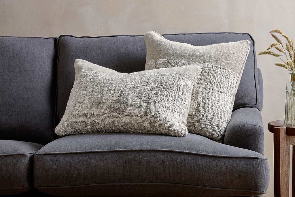
Puli Linen Cushion
Recycled linen in natural, pairs with woven textures and aged wood.
View at Nkuku →Some links above are affiliate links. If you buy through them we may earn a small commission at no extra cost to you. We only suggest pieces we think fit a calm, lived-in home.
Free guide
The Calm Shelf
12 styling ideas to help you compose calm, balanced shelves in natural texture homes.