

Many people try using a dark color palette for their living rooms or bedrooms, only to find the paint or textiles look stark, heavy, or dull once everything is in place. Online images or color pickers can suggest deep greens or charcoals will feel rich, but at home, the shades often shift under real light, and worry sets in about whether the choice will be too much for the room.
This guide shows exactly what to change, what to keep simple, and which materials quietly support a dark color palette at home. This works especially well in a low-light lounge when rental walls can’t be painted because textured fabrics and a smaller accent palette let you set a mood with very little. Today, you’ll see how to avoid common pitfalls and replace trial and error with a confident, steady process.
The short version: The safest way to use a dark color palette at home is to anchor one area with your chosen color and keep background elements pale or muted. You’ll see why light, finish, and placement matter more than screen images, and how to reliably test before you commit.
Key takeaways
- A dark color palette looks best when anchored to one surface or object, not an entire room.
- Lighting changes how every dark shade appears, so test with real paint or fabric samples in the actual space.
- Jewel tones and soft blacks feel richer next to natural textures and off-whites.
- Coolors and Color Hunt show digital palettes, but home materials don’t match screen color codes directly (Coolors and Color).
- Avoid making every wall or surface dark; this can make spaces look smaller and heavier.
- What is a dark colour palette? (Beyond the screen)
- How do you test a dark palette before you commit?
- Where this works best
- Materials that sing in a dark palette (and ones that fall flat)
- Styling and placement
- What makes dark rooms feel calm instead of heavy?
- Which dark palettes work for slow living homes?

What is a dark colour palette? (Beyond the screen)
A dark color palette in a real room means choosing one or two deep shades as an anchor and using soft contrasts to keep the space from feeling flat. Digital palettes often look different on walls because of lighting and texture changes in physical spaces.
In most digital tools like Figma or Pinterest, a “dark theme” is just a set of hex codes that look good on screen, often using a charcoal (#121212) or rich black (#1A1A1A) background with pale text, as shown in Coolors and Color. In your home, materials catch light and shadows differently, and matte finishes soak up more light than glossy ones.
A nursery painted in navy or deep green may seem bold, but textures like thick cotton or brushed wool on window coverings bring in needed softness. Material finishes, matte, satin, rough, or smooth, all shift what “dark” looks like in a real room with changing daylight. Unlike a calm living room, a small hallway painted entirely dark might close in the space instead of making it cozy.
Most digital color pickers don’t preview how your chosen shade behaves on a textured wall or fabric. Instead, they show single-tone swatches on a glowing screen, which often leads to mismatched expectations. In real homes, choose a dark color palette by observing a sample in the actual room and lighting rather than trusting a digital match.
How do you test a dark palette before you commit?
Testing a dark palette works best with real-world samples placed on the wall or surface where you’ll use them. Swatches and fabric pieces give a true sense of how light and shadow change each shade in your home.
A bedroom in a home with east-facing windows gets soft, cool morning light, so a dark teal may end up looking stormy instead of fresh. Holding a card-sized sample against the actual wall, at different times of day, gives you a clearer idea of the effect than any phone screenshot.
Most people try small, paper paint chips once before deciding, but this rarely shows how the color shifts. Putting up a patch of real paint or draping a dark throw over a side chair helps gauge how light, texture, and shadow will interact over time. If you’re using navy, for instance, deeper navy looks softer in heavy cotton than as glossy wall paint.
Unlike digital previews, a real swatch lets you feel the fabric and check for undertones like green or violet that might not show up on screen. According to Material Design’s dark theme design standards, high contrast between shade and background helps make colors legible and balanced. In decorating, this means testing samples in the same space you’ll use them, not just viewing them by artificial light in the store.
Where this works best
A dark color palette works best in rooms where you want quiet, muted energy, think bedrooms, living rooms, or shared entryways with limited natural light. Deep shades add mood where daylight is softer or more limited.
Living rooms with large, north-facing windows often feel cool or stark. Adding a dark color palette on a single accent wall, or with textiles like a black wool rug, soaks up glare and grounds the space. A small apartment’s entry, usually shaded and less cluttered, can take a deep blue or deep taupe as an anchor without overwhelming the whole interior.
Bedroom setups benefit from layering dark linens or velvet headboards against paler walls, which makes the color pop in shadow without making the entire room heavy. Secondary spaces, like a reading nook or under-stair hallway, can use deep green, giving the corners purpose and focus.
Avoid painting every wall dark in tight spaces, especially rooms that face away from daylight. Covering all the surfaces in one color can shrink the space visually and feel claustrophobic. Instead, limit the darkest shades to one wall, an upholstered bench, or a large piece of art. For more inspiration, see dark aesthetic ideas in real homes.
Materials that sing in a dark palette (and ones that fall flat)
Natural materials like wool, linen, and unglazed ceramic bring depth and warmth to a dark palette, while glossy finishes and smooth synthetics often feel out of place. Texture stops deep colors from looking flat or cold.
A living room with a black velvet sofa and stoneware lamp looks richer than one filled with shiny, black glass tables. Wool throws absorb light and feel soft to the touch, offsetting the visual weight of a navy wall. An oiled oak side table gives a quiet break between dark surfaces and pale plaster or linen.
Compared to plastics or reflective metals, which can look harsh or cold, rougher, absorbent materials help a space feel lived-in and calm. A cotton rug in olive or clay grounds a monochromatic palette and breaks up expanses of dark floor. Most decorators agree rough matte finishes work best near windows for softening direct light and cutting glare, according to warm-toned dark palettes research.
Ceramic vases, chunky knit cushions, and woven baskets bring variation and tactile detail when the walls and large furniture are dark. A bare wall painted matte black feels flatter than one with a single linen curtain or a small, rough vase on a floating shelf.

Styling and placement
Styling a room with a dark color palette feels more natural when you pick one key surface or piece as the anchor, then use lighter accents to stop the look turning heavy. Balanced placement keeps the whole space from feeling bottom-heavy.
Too many dark objects in one corner can weigh down a whole space. Instead, pull the deepest color onto a large surface, like a bed frame, a plush ottoman, or a central wall, then leave the rest light, pale, or textured. This keeps the eye moving and avoids making spaces feel boxed in.
Linen curtains in oatmeal or pale grey soften the edges of a navy wall, giving a layered look and helping the palette blend naturally. If your sofa is charcoal, a natural wood coffee table draws the gaze up and stops the seating area feeling sunken. Open shelving works best when you mix one or two dark objects with warm ceramics or woven baskets.
Quick calm checklist:
- Limit the darkest shade to one large anchor (wall, sofa, or rug).
- Layer pale or textured fabrics (linen, wool, textured cotton) around the deepest color.
- Break up surfaces with ceramics or baskets, avoid too many matching dark pieces.
- Keep background walls light if the main object is dark, and vice versa.
- Use matte or low-sheen finishes near windows to minimize glare.
Styling with these rules works especially well in open-plan living rooms and small studios, where using fewer bold elements stops the palette feeling overwhelming. For more arrangement ideas, see calm coffee table inspiration.
What makes dark rooms feel calm instead of heavy?
A dark room feels calm when the darkest shade is paired with soft, natural textures and punctuated by light, open surfaces instead of covering every wall. Letting light move over matte materials keeps the look from feeling closed-off.
Rooms painted top-to-bottom in deep charcoal or navy can feel dense and smaller than they are. Opening up the ceiling or trim in a pale, neutral paint gives a needed break and lets the shadows work with the shape of the room, not against it. A jute basket or clay bowl on a low table brings relief and keeps the palette relaxed.
Unlike a monochromatic approach that uses only dark tones for every surface, mixing in pale linens and plant pots makes a space read as lived-in, not staged. According to dark theme design principles, adding elevation (for example, a pale pendant light against a dark wall) and contrast increases comfort and usability.
Adding light wood or cream tiles above a dark sink helps small bathrooms feel open and balanced, while still borrowing from dark palette ideas. The effect is grounded but not boxy, and practical for everyday routines. For layered inspiration, the warm neutral living gallery has more soft-palette examples.
Which dark palettes work for slow living homes?
The most calming dark palettes for slow living blend one deep anchor shade, like forest green, navy, or smokey taupe, with warm neutrals, textured fibers, and one small accent color. Limiting your palette keeps energy gentle.
For a slow living mood, try Forest Floor (deep green + charcoal + taupe), Midnight Library (navy + cream + brass), or Smoked Clay (terracotta + dark linen + pale stone). These combinations balance richness and softness, steering clear of the cold, sharp contrasts often seen in ultra-modern spaces.
| Palette Name | Main Colors | Accent |
|---|---|---|
| Forest Floor | Deep green, charcoal, taupe | Brushed bronze |
| Midnight Library | Navy, cream, pale wood | Satin brass |
| Smoked Clay | Terracotta, smokey taupe, black | Pale stoneware |
| Charcoal & Linen | Charcoal grey, flax linen, white | Dark brown leather |
| Deep Plum & Stone | Plum, slate, bone | Matte brass |
Compared to bright or flashy color schemes, these calm palettes create a steady background for everyday life and feel grounded over time. Textured materials, chunky knit throws, rough ceramics, or unpolished wood, work with dark shades to stop rooms looking flat. For more beautiful, lived-in lounge ideas, see this collection of dark living room spaces.
Most homeowners feel something is “off” when the balance of dark and light is missing, either the room turns gloomy or the accents feel lost against a sea of charcoal. The shift starts by choosing one main anchor (a wall, piece of furniture, or rug), grounding it with texture, and carefully spacing lighter items nearby to keep the palette restful. This removes the guesswork of chasing perfect color codes and lets your room settle softly around you.
Often, the difference between a calm, well-weighted room and a space that feels busy is just a matter of using too many dark elements side-by-side or leaving every surface empty around a single color. If shelves, walls, and furniture all match the deepest shade, the eye doesn’t know where to rest, and the energy feels both heavy and unfinished. The quiet fix is to pull in lighter textiles, a hand-thrown vase, or a rough-timber surface next to the darkest tone and leave at least half the space visually open. When you make this change, surfaces feel softer and the room slowly becomes more restful for everyday living.
Most people add too many dark pieces at once, then wonder why the room feels crowded or loses focus. Without places for the eye to pause, the effect is closed-off and sometimes even makes a large room feel small. Small switches, like swapping one black table for oak, or breaking up a dark wall with pale art, restore air and lightness. Once the palette is right, every daily routine flows more gently.
Save this idea for later.
What tends to hold up with dark color palettes
Many rooms decorated with deep or moody palettes settle best when at least one surface or object stays pale, rough, or open to natural light. Matte finishes get recommended again and again for wall paints and ceramics, as reviewers note they hide dust and catch less glare than gloss. Velvet, rough linen, and unwaxed wood all keep their depth under changing daylight and are less likely to scuff or look blotchy over time.
Professional decorators and design bloggers consistently say that limiting the most dramatic shade to one surface or main piece helps rooms feel finished, not overdone. Using fewer, stronger textures beats adding more objects, especially in spaces with limited floor area or shared lighting patterns.
, Mara, Loom & Glow
Common questions
What are the main types of colour palettes?
The main types of colour palettes are monochromatic, analogous, complementary, and triadic schemes. Monochromatic uses variations of one color, while complementary pairs colors from opposite sides of the color wheel. These forms work in home design, but you’ll get the calmest look from using just one or two main shades plus a neutral.
What colours work best with a dark base?
Colors that work best with a dark base are soft neutrals like cream, bone, or linen and small accents of brass, olive, or muted coral. These add light and richness. Layering natural materials and textures helps prevent the palette from feeling cold or stark.
How do you choose the right accent colour for a dark palette?
To choose the right accent color for a dark palette, pick a single brighter or metallic tone, like brass, sage, or blush, that stands out without clashing. Test it with fabric or accessory samples before committing, and spread the color in small amounts, such as with ceramics or artwork.
What are the practical steps to create a dark colour palette for a room?
The best way to create a dark colour palette for a room is to start with one deep anchor color for a main surface or object, then layer in softer neutrals and natural materials. Always test your shade on site using real samples. Use lighter colors to break up large dark areas for a livable, slow-living effect.
Explore more calm combinations inside our Shop The Look .
Shop the Look
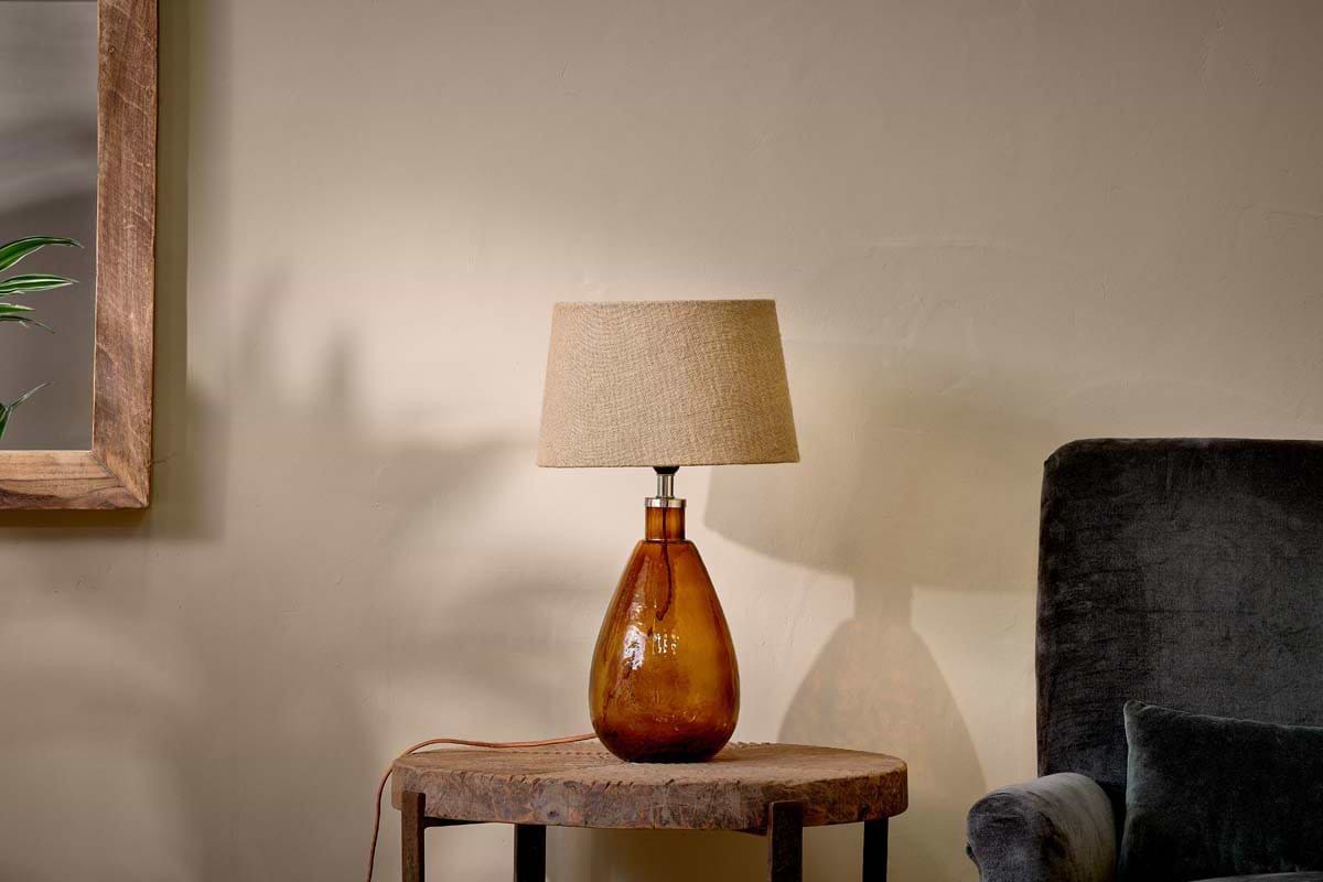
A few Nkuku pieces that feel at ease in a darker room.
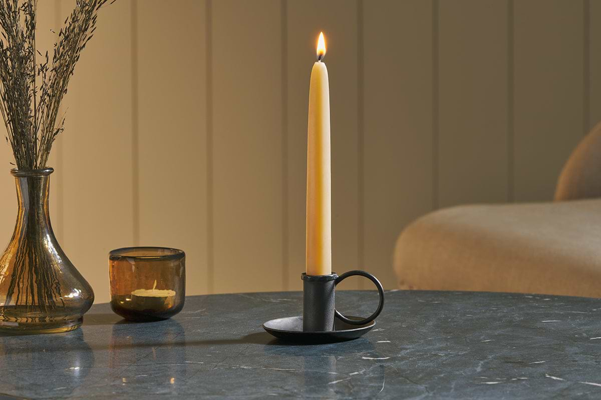
Amri Iron Candlestick
Slender iron with quiet presence, works alone or in clusters of three.
View at Nkuku →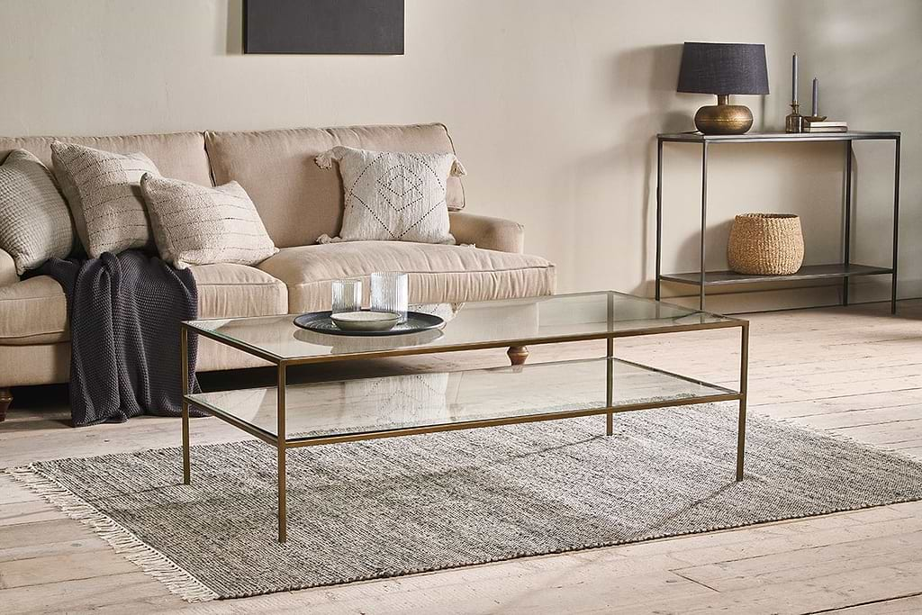
Some links above are affiliate links. If you buy through them we may earn a small commission at no extra cost to you. We only suggest pieces we think fit a calm, lived-in home.
Free guide
The Calm Shelf
12 styling ideas to help you compose calm, balanced shelves in natural texture homes.