

Dark colors for walls can look dramatic in big, bright rooms, yet in a small apartment or a room with low light, most people worry the effect will be heavy or make the space feel closed in. In rental homes or houses with awkward angles, painting everything dark feels risky and hard to reverse.
Today, you’ll find out how to choose the specific shades and finishes that settle visually, not shrink space or crowd your furniture. This works especially well in a small bedroom when the trim is simple and the palette stays calm because the eye sees depth, not clutter.
The short version: Choosing dark colors for walls works in a small room when you use deep greens, navy, or warmer browns with soft finishes and simple, low-contrast furnishings. The right paint avoids a heavy, boxy feel. Try this approach when you want depth and calm, not closed-in darkness.
Key takeaways
- Deep green and navy paints add depth without making a small room look smaller.
- Textured dark walls help soften corners and keep a space from feeling boxy.
- Low-contrast furniture against dark walls calms a busy layout.
- Matte or eggshell finishes hide flaws and avoid harsh reflection.
- Layered lighting keeps dark rooms from feeling flat or dim.
- Why do dark walls sometimes feel calm instead of crowded?
- Where this works best
- How do you pick the right dark shade?
- How does lighting change the feel of a dark room?
- Styling and placement
- What’s the most common mistake with dark paint in small rooms?
- Which dark paint colours hide flaws and still look soft?

Why do dark walls sometimes feel calm instead of crowded?
Dark wall colours make a room feel calm when the finish is matte, the trim is simple, and the decor doesn’t contrast too sharply. Deep, even colours recede and blur edges, making space read as deeper, not smaller.
Many people expect dark paint to shrink a bedroom, but with the right shade, the walls seem to drop away, especially after swapping stark white for a deep green or navy blue. Rooms with awkward nooks or low light often benefit most, because dark paint hides odd corners and stops the eye from hitting sharp boundaries.
Flat finishes, like eggshell or matte, soften the visual impact as they don’t bounce light. A high-gloss finish works very differently: it reflects lamps and sunlight, which breaks up the calm mood and calls attention to uneven walls. According to Homestyler, using dark wall paint in a matte finish helps turn a space into a visually soothing backdrop rather than a statement box.
Unlike a patchy medium grey, a deeply saturated colour folds day and night together so morning shadows and evening lamp glow both feel settled. For a studio apartment or reading nook, this means you can create a cocoon feeling that lasts all day, not just in one kind of light.
In daily life, painting all four walls with a consistent deep shade works best in places where you want to rest, like a bedroom or quiet lounge, especially when clutter is low and window treatments are simple.
Where this works best
Small bedrooms, dens, and north-facing living rooms usually benefit most from deeper wall colours that settle light and hide uneven surfaces. These conditions help dark paint support a restful mood.
Bedrooms and reading nooks in rental homes, especially ones with old trim or low ceilings, often look unfinished with pale paint. Instead of trying to “enlarge” a tight room with bright colour, a dark wall tone absorbs shadow, closes visual clutter, and hides rough trim. That makes it easier to use soft textiles and low-slung bedding without worrying over paint touch-ups.
In a home office or a compact living room, deep, textured paint absorbs the jangle of cords, books, and tech, so the room stays visually calm, unlike a bright wall, which throws every lamp and socket into relief. Smaller spaces with very limited daylight, such as north-facing corners or windowless dens, actually feel less closed in when the walls are low-contrast to each other.
Avoid using almost-black paint in rooms where the only light source is cool overhead, like many interior bathrooms or basic apartment kitchens. The effect can be muddy, and every drip or scratch stands out against the finish. Instead, try a green or brown with a warm undertone, or centre the darkest shade behind a bed or on just one wall.
Applying dark color to full walls works especially well for small bedrooms in rentals, when the original trim is simple (or can be painted) and there are few obstacles on the walls.
How do you pick the right dark shade?
The best dark shades for small rooms are those with a touch of colour or warmth, like olive green, navy, or chocolate brown, instead of pure black or deep grey.
Choosing between deep greens, dark navy, or warmer browns depends on your room’s light, flooring, and main furnishings. A dark colour with a hint of green, like olive or moss, pulls back, making walls seem further away, according to advice on deep green tones.
Navy blue is a safe pick for rooms that already have white trim or light bedding, since it feels crisp at the edges but doesn’t flatten out. Charcoal grey, especially with a warm undertone, is popular for spaces with wood details, but can read as cold if the room never gets direct sun.
Unlike matte black, which is striking but can turn corners into hard shadows, softer browns or rich plums adapt to changing light. They pair well with tan or cream rugs, making the whole palette settle into one visual layer. For a child’s room or a guest space, a single accent wall in a deep colour brings depth without overwhelming, so you can keep the rest of the room light and open.
Use a green with a yellow or olive base for a warm, cocoon feeling in a small bedroom, especially when the morning light is dull or filtered.
How does lighting change the feel of a dark room?
Lighting transforms how dark paint feels, layered, warm lights make deep walls soft, while a single overhead bulb can make dark walls look cold and smaller.
Most small rooms change dramatically with lighting. Daytime glare bounces off a white wall but sinks into a deep colour, so shadows feel softer and less harsh. In rooms with low ceilings, placing floor lamps or shaded bulbs behind furniture adds height and comfort to dark-walled spaces, rather than pulling attention to the ceiling.
Rooms painted in dark shades show flaws and surface texture less, but harsh overhead LEDs make every mark stand out, turning deep navy or chocolate brown almost bluish or grey. Layering warm, diffused lamps, like a small ceramic lamp on a dresser, a reading light on a desk, and a low pendant by the bed, prevents this. The “three-source lighting” guide is especially helpful here: use at least three places for warm light in a dark-painted room to keep it visually open, as explained in our lighting a dark guide.
| Lighting Type | Effect on Dark Walls | Best Placement |
|---|---|---|
| Overhead (Cool LED) | Makes dark colours look flat or harsh | Only with pale trims or art |
| Warm Table Lamp | Adds softness, blends shadows | Near beds or reading chairs |
| Directional Floor Lamp | Highlights texture, shapes corners | Tucked behind furniture |
Compared to a room with just a ceiling fixture, those with two or three smaller lamps can tune the mood from morning to evening, keeping deep shades from feeling heavy or one-note. Try placing table lamps on opposite sides of the room and using dimmers to change the tone through the day.

Styling and placement
A room with dark walls feels more open when the biggest furniture pieces are low and close in colour to the walls, while small, pale accents stay grouped.
Placement matters more with deep shades because dark paint pulls the eye to sharp contrasts and outlines. With a navy wall, a pale sofa looks much lighter, while a walnut or olive-coloured chair blends in. In a small home office with dark charcoal walls, tucking lower bookcases or wood cubes along the longest wall keeps the space from reading as cut up or crowded.
Mixing natural textures, like wool, linen, untreated wood, or a rough jute rug, against flat dark paint adds light scatter and stops the room from looking “blocky.” Unlike glass tables or chrome legs, which pop out in strong contrast, a simple rattan basket or oak bench feels anchored. Any art or mirror hung on a dark surface should be grouped, not scattered, so the wall reads as one panel rather than a patchwork of shapes.
Quick calm checklist:
- Natural textiles: linen, heavy cotton, jute, or wool to soften wall lines.
- Keep larger furniture no more than one shade lighter or darker than the walls.
- Place mirrors or art in grouped arrangements to avoid visual clutter.
- Limit palette to three main tones plus wood or stone elements.
- Use pale accents sparingly (ceramic bowl, plain cushion) for focus.
For small apartments, centering your main seating or bed against the darkest wall and arranging horizontal art just above keeps the wall feeling deep and steady rather than busy.
What’s the most common mistake with dark paint in small rooms?
The main mistake people make is using harsh, high-contrast colours with dark paint, which breaks the space visually and makes the room look smaller.
People often pair deep paint with white or very bright accents, hoping to avoid gloom, but this leads to choppy surfaces, especially in rooms with patchy natural light. Instead of opening the space, the eye is pulled from wall to wall, so everything feels squeezed and busy.
Contrast is the enemy of calm for dark walls in compact spaces. A tan rug or a sand-coloured linen curtain makes a softer transition against deep navy than a stark white trim or a bright graphic pillow. For most rooms, the best trick is to repeat wall colours in the door, skirting, or even lampshades, so the whole space glides together.
Compared to a pale accent wall, a matte black or deep plum panel works better when all trims and main textiles share similar undertones. A room with scattered, bright shapes on dark walls always feels smaller; a room where shades are repeated looks settled. Check our dark living room guide for more calm palettes.
Keep patterns soft and edges blurred to avoid the “busy patchwork” problem, especially in long, narrow rooms.
Which dark paint colours hide flaws and still look soft?
The most forgiving dark paints for small rooms are deep olive green, navy blue, chocolate brown, and warm charcoal grey in either matte or eggshell finish.
Deep green hides both surface dents and trim mistakes better than blue or black, because the eye reads it as a living background. Navy blue covers patched or uneven walls neatly, and according to Homestyler, navy blue is also suggested for kitchens and dining spaces for its calming, classic feel.
Chocolate brown works well for low ceilings, as the colour absorbs the shadow and smooths out spotted plaster. Warm charcoal, picked with a brown base rather than blue, is easier on the eyes in both morning and evening light. Textured dark walls add drama, especially in entryways or hallways, and make every coat or backpack disappear into the background rather than standing out (see textured dark walls for reference).
Unlike gloss finishes, which draw attention to every scuff and edge, a matte coat hides more and needs less upkeep day to day. Most dark paints dry to the touch within an hour, making small updates easier even in a busy household.
In practical use, try deep olive or navy in matte or eggshell for rooms with old walls or trims you can’t replace, especially if the goal is quiet, low-maintenance space.
Shifting to a single deep wall colour, then matching the major trims and furniture tone, is usually the turning point. Once the eye stops hitting against scattered whites or random pale shapes, the whole floorplan settles visually. Instead of patchy brightness and dark corners, the small room feels whole, using texture and repeated hues rather than sharp lines or feature walls.
Most people know something is wrong after painting, the room looks smaller but also busier, or furniture feels “floaty” instead of grounded. The usual culprit is too much colour contrast, with light pieces scattered unevenly. When the light changes, the room reads even patchier, or flaws in the wall become obvious.
A frequent mistake is painting only a single feature wall in a dark tone, leaving the other walls bright, or using bright white on trims and doors. The effect is that all the room’s shapes break apart; things feel “off” at every glance, and calm never quite lands. Fixing this, blending wall, trim, and large furniture closer in colour, reduces clutter and anchors every piece, especially in more compact rooms.
Once the right tone settles in, daily living feels less cluttered, and you stop noticing scuffs or odd angles.
Save this idea for later.
What tends to hold up with dark colors for walls in small rooms
Reviewing a range of small homes and reader rooms, one pattern shows up again and again: matte finishes in deep green, navy, or brown stay consistent across changing light and look calm even when furniture moves. Many decorators call out how dark wall colours help soften awkward angles or unexpected trims by letting those lines “fade” visually, even more than light paint does.
Another observation: textured or subtly varied paint finishes, including eggshell and flat matte, hide small repairs and scuffs better than glossy surfaces, especially when lighting is layered and not too harsh. Soft lighting, simple furniture, and a three-shade limit on textiles keep rooms feeling quiet. The advice sticks for both busy family homes and quiet apartments.
, Mara, Loom & Glow
Common questions
What are the best dark wall colours for a small room?
The best dark wall colours for a small room are deep olive green, navy blue, warm charcoal grey, and chocolate brown. These shades absorb shadows and settle odd angles so the space looks deeper, not smaller. Choose matte or eggshell finishes for a soft, calm effect that hides imperfections.
What colour is replacing grey for interior walls?
Deep green is replacing grey as a go-to wall colour for many modern interiors. It offers warmth and depth while feeling more current and less flat than classic grey. Soft browns and navy blue are also popular alternatives for their relaxing feel.
What are some good dark colour shades that won’t make a room feel smaller?
Deep green, navy blue, and chocolate brown are dark shades that help a room feel expansive rather than crowded. These colours recede from the eye and work best with simple, low-contrast styling. Matte finishes and soft lighting further make the room feel open.
What colours used with dark walls make a room look expensive?
Stone, warm tan, muted brass, and soft cream go well with dark walls to make a space look refined. When paired with matte black, navy, or olive green, these accents keep the palette simple and calm, avoiding the patchy look that comes from harsh contrast.
Explore more calm combinations inside our Shop The Look .
Shop the Look
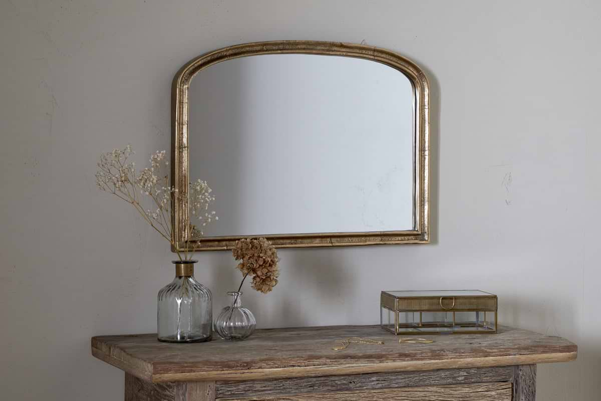
A couple of Nkuku accents that add gentle light and warmth to a dark-walled room.
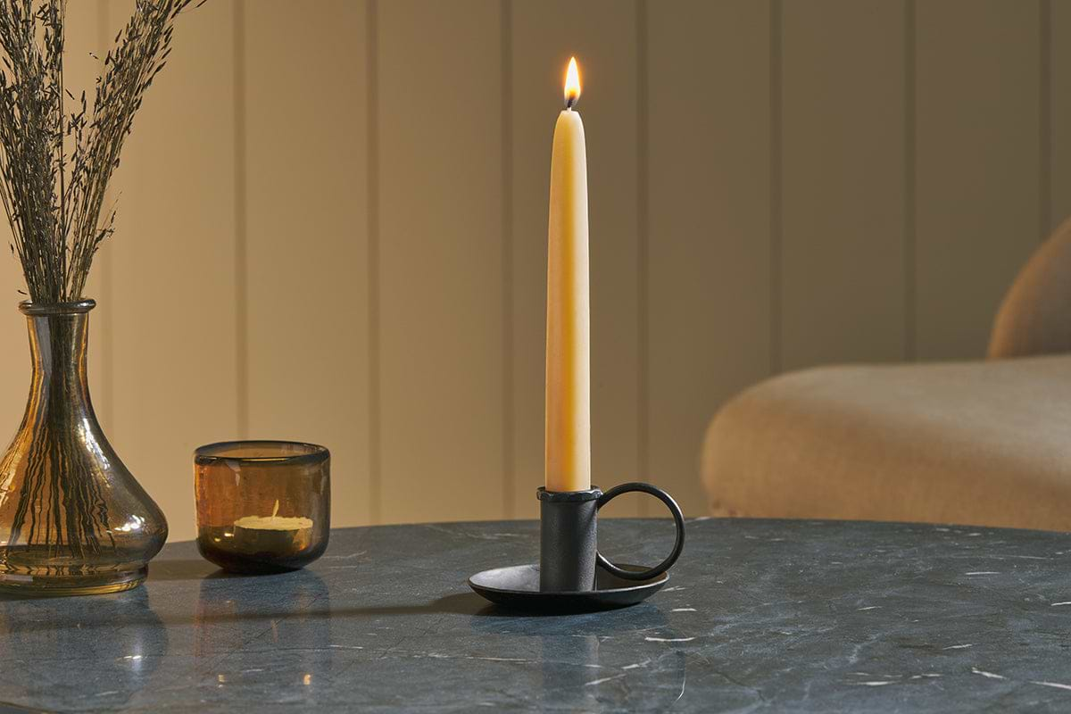
Amri Iron Candlestick
Slender iron with quiet presence, works alone or in clusters of three.
View at Nkuku →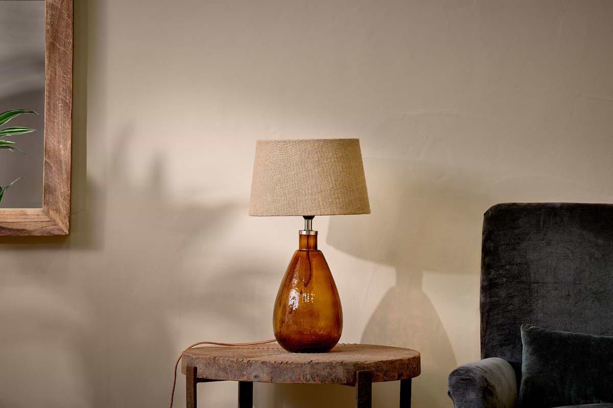
Some links above are affiliate links. If you buy through them we may earn a small commission at no extra cost to you. We only suggest pieces we think fit a calm, lived-in home.
Free guide
The Calm Leaf
12 quiet ways to bring dried botanicals, stems, and natural textures into calm spaces.