

Many people love navy bedroom ideas for the feeling of calm they offer, but in a small bedroom, navy can easily turn heavy or feel boxed-in. If the shade is too dark, or there’s not enough light, the entire room can close in around you. That’s frustrating, especially when all you want is a restful spot after a long day.
By picking the right navy shade and pairing it with natural textures and a few lighter elements, you can keep your bedroom open and peaceful. You’ll see how to get the look you want, what to avoid, and which material changes make a real difference. This works especially well in a small bedroom when you use navy with lighter trim and layered fabrics, because it keeps the space calm but not claustrophobic.
The short version: The best navy bedroom ideas for small spaces use one textured navy accent—like a linen headboard or throw—balanced with light walls, pale wood, and natural fabrics. Add woven baskets or a cream rug to soften navy’s depth, and limit your palette to keep the room inviting rather than closed-in.
Key takeaways
- Natural fabrics and woven storage warm up even the deepest navy blue in a small room.
- Contrast is a reliable tool for lightening navy bedrooms, especially with white or pale wood furniture.
- A navy bedspread or headboard can ground a room without darkening every surface.
- Lighter trims and a single navy feature wall keep bedrooms from feeling boxed in.
- Choosing linen, jute, or rattan adds interest and helps navy look calm (according to Checkatrade).

The problem with navy in a small bedroom
Navy can quickly make a small bedroom feel closed in if the wrong shade or finish is picked. Limiting dark surfaces and pairing navy with natural materials prevents the space from turning cold.
Small bedrooms often come with one window, limited floor area, and not many options for storage. Putting dark paint or heavy navy bedding on every wall can make the space feel more cramped. Many people expect navy to add calm, but instead the room turns heavy, especially without natural daylight or when furniture crowds the edges.
Unlike lighter paint, navy absorbs light and blurs the outline of the room, which can make corners disappear. When you add flat navy curtains or thick blackout blinds, it can feel almost like a box. A bare white ceiling against navy walls can feel jarring instead of restful.
In a busy room with clothes, a cluttered side table, and lots of mixed finishes, navy often reads as cluttered rather than peaceful. Choosing just one navy focal point—such as a simple headboard or small wall section—leaves the rest of the room open, preventing the boxed-in effect. A navy headboard finished in natural linen works because it absorbs some light but still reads softer than painted walls.
Set a navy accent in a clear spot, like at the head of the bed, away from cluttered surfaces or storage. This anchors the room and lets light elements bounce around, helping the space feel more peaceful even when everything else is simple.
How do you pick the right navy shade for a small room?
A navy with a touch of grey or muted blue keeps a small bedroom feeling calm instead of sharp. Matte or linen finishes soften navy’s intensity, especially in low light.
Bedrooms with little natural light need a navy that isn’t too stark or inky. Picking a shade with grey or even a touch of green creates a softer backdrop for other materials. Compared to very dark navy, a muted or chalky navy holds colour but stays gentle.
Glossy, high-shine finishes usually bounce strong shadows around—making navy look colder and harder. Instead, choose a flat paint, linen upholstery, or washed cotton to bring in some texture. A linen headboard or deep navy blanket will reflect a softer, less severe version of the colour. This subtle surface breaks up light and keeps navy gentle instead of dominating the room.
Some people go for a pure navy wall and find it too intense once the furniture and textiles are in place. A common rule: A navy in a matte paint or woven fabric works best when the room lacks big windows, because the colour doesn’t glare but rests easy on the eye. Layering a navy throw over pale bedding lets you see how much depth you want without committing the whole room.
Choosing a shade with enough grey stops navy from feeling “electric” and helps it blend into other colours—especially whites, creams, and warm woods. Stick to shades that look soft in natural light, then test them in all lighting throughout the day before you commit to walls or larger pieces.
Where this works best
Navy works best in small bedrooms with one clear focal point or in rental homes where you want easy updates. Limiting navy to one wall or one piece keeps things feeling open.
Small, low-light bedrooms in apartments or older homes are the spaces where navy can both shine and overwhelm. These rooms might have plain white walls to start, but navy is often brought in through textiles, one feature wall, headboards or even a single armchair.
In a shared home, navy is practical if you want a “grown-up” feel but can’t change every feature. A navy bedspread or pillow in natural fabric offers calm, especially if walls and curtains are pale. In open-plan spaces or lofts, keep navy to just the sleeping area so the darkness doesn’t seep out to the whole room. The effect is more subtle, especially if the navy textile has a weave or fringe that breaks up the colour.
Avoid painting every wall navy in a small bedroom. When navy takes over, it closes in the edges and shrinks the apparent size, especially at night. One navy accent, like a blanket at the foot of the bed, lets you enjoy the richness without shutting out light. Instead of matching navy across all your storage and textiles, contrast with painted wood furniture or a single jute rug for better balance.
Try navy in spaces that lack built-in storage. A navy basket or bench by the bed creates a spot for books or throws, and feels less bulky than a painted chest or full set of navy furniture.
How do you layer textures so navy doesn’t feel heavy?
Pairing navy with linen, jute, pale wood and soft rugs keeps the look balanced and calm. Partially covering a navy wall with pale curtains or layered bedding breaks up large blocks of colour.
In bedrooms with smooth white furniture, a single navy surface can look harsh unless there’s something woven or tactile nearby. A linen curtain or oversized waffle blanket pulls light and dark together. Instead of placing navy side by side with other flat darks, break up the tone using cane, rattan, or unfinished wood. These have texture that draws the eye but do not compete for attention.
This works because textures scatter light and offer warmth, making navy less formal and less cold (according to Checkatrade). A navy wall by itself can feel stark, but add a jute basket or cotton throw, and the depth is softened almost at once. Compared to a plastic or slick finish, natural fibres or unfinished wood create a gentle surface break that’s friendly to the eye.
A wool rug or soft bench cushion stops navy flooring or bedding from feeling flat. Even a single natural lampshade or low vase can help. Rugged textures—like chunky knits or raw silk—work especially well in bedrooms where there isn’t much natural sunlight, since they don’t absorb all the brightness.
Use navy on pieces you touch and notice daily—throws, cushions, a basket—not just painted surfaces. Layering these with white linen or a pale wooden tray adds immediate softness to the overall look, and helps the color blend rather than dominate.

What colours pair well with navy blue in a bedroom?
Navy blue pairs best with cream, white, warm grey, and soft ochre in the bedroom. Warm woods, blush, or pale pink also help navy feel less cool and flat.
Pairing navy with light, natural shades keeps things calm. Bright white, cream, and light oak are classic partners, recommended for their ability to lift and break up the richness of navy (see contrast is a key technique in navy bedroom ideas). Mixing in warm greys or a little muted gold adds just enough variation to prevent the palette feeling two-tone or harsh.
Pale pink, blush, or ochre accents—such as a velvet cushion, a glazed pot, or a throw—break up the darkness. These are subtle enough to keep the mood quiet, but colourful enough to feel inviting rather than cold. Navy pairs well with warm grey for tonal harmony in a bedroom (according to Feather & Black).
Unlike pairing navy with only black, which can look too hard, adding creams and soft pinks looks modern and gentle. Mixing patterns—stripes, small florals—brings in a hint of contrast without feeling busy.
Put white furniture or a warm wooden bench next to navy bedding for instant balance. Even one or two pale ceramic objects on a navy shelf will lighten the overall look, keeping the feeling peaceful rather than shadowy.
Styling and placement
A navy accent works best when kept to a single area, set off with lighter surroundings and a clear space beside it. Too much navy packed together feels heavy.
Placement matters more in a small bedroom than anywhere else. When storage, textiles, and surfaces all compete, the result is clutter. Instead of loading every corner with dark colours, anchor navy in one spot—like behind the bed, over a single chair, or in storage baskets along the wall. This helps the eye settle, and makes the rest of the room feel spacious.
Spacing is a practical trick. Separating navy elements from each other, with light walls, rugs, or curtains between, prevents the palette from looking busy. A navy basket on the floor and a navy headboard on the other side of the room won’t clash if there’s pale wood or linen in the middle. If all the navy sits together—like wall, bedding, and rug—the area closes in.
Compared to a single navy accent, multiple mismatched navy pieces make a room feel scrappy. Choose one “hero” piece—a bedspread, an accent wall, or a chair—and let that be the dark anchor for the space.
Quick calm checklist:
- Choose one main navy focal point (headboard, wall, or blanket), not scattered accents.
- Use natural materials—linen, jute, rattan—beside navy, not gloss or plastic.
- Keep navy and white in big blocks; avoid mixing too many shades in small objects.
- Leave open floor and wall space for light to reflect back.
- Balance navy with pale wood and warm neutrals.
Try grouping navy pieces with plant pots, baskets, or a pale curtain within arm’s reach. This keeps the look tied together and ensures navy feels restful, never crowded.
How do you light a navy bedroom to keep it restful?
Soft, diffused lighting keeps navy from feeling flat or cold in a bedroom. Pale lampshades, wall sconces, and a bit of natural light all help navy surfaces stay gentle.
Navy can look rich and inviting with enough light—but one overhead bulb or relying on small windows leaves the room shadowy. Go for two or three low light sources around the room, like bedside lamps with pale linen shades or a small table lamp on a shelf. These spread the light out, softening deep colour blocks.
Use pale or off-white lampshades. They bounce light out into the room instead of pulling it down to the surface, which happens with dark shades. Even a warm LED string behind the headboard or a small sconce above a reading nook can open up the shadows.
Metallic accents lift navy by reflecting light. A brass lamp, brushed gold knob, or mirror can break up the heaviness. Unlike chrome or black, warmer metals give a subtle shine without feeling cold. Small, pale wall mirrors placed across from windows or lamps also reflect just enough light to make even a tiny bedroom feel wider.
In a rental or space with poor daylight, a light woven lampshade hangs gently over a navy chair and keeps the entire colour palette feeling alive, not blanketed in shadow. The combination is especially practical for rooms with no natural light.
The moment this usually feels “off” is after everything is set up and you realise the room feels heavy, not calm. The navy looks good on its own, but the textures are too flat, or all the dark elements are grouped together. Light isn’t bouncing well, and the space no longer feels like an escape.
Many people assume adding navy will calm a room, but end up layering multiple navy pieces or burying them in clutter. The result is a bedroom that feels cramped or unfinished, not peaceful. It matters because what you see when you first wake up or walk in sets the mood for the rest of your day.
Once you choose one navy anchor and build around it with textured, pale layers, the room stays open and welcoming.
Save this idea for later.
What tends to hold up with navy in small bedrooms
Rooms that feel most peaceful with navy tend to use the colour as a grounding accent, not a backdrop for every wall. Reviewers and designers keep coming back to this point: textures really matter. Matte paint, linen fabrics, and natural baskets help navy feel lived-in, not formal.
Matte surfaces are less likely to show streaks and fingerprints—something that stands out much more on deep colours, especially after a few months. Woven rugs and jute baskets soften navy’s formality and bring lightness, especially in rented spaces or small city bedrooms. A simple linen headboard or cotton blanket works better in most homes than a dark wall, partly because it’s easy to move or update later.
— Mara, Loom & Glow
Common questions
What colour goes with navy in a bedroom?
The best colours to pair with navy in a bedroom are cream, white, warm grey, blush, and pale wood. These soften navy’s richness and provide clear, gentle contrast. Gold or muted brass accents also add warmth without overpowering the colour scheme.
Is navy a good colour for a bedroom?
Navy is a good colour for a bedroom if used selectively and balanced with pale or textured elements. Navy can create a cosy and romantic atmosphere (according to Feather & Black) and helps some people fall asleep more easily. Keep navy in one area, not on every surface, for best results.
What colour bedding looks good with navy blue walls?
The best bedding for navy blue walls is usually white, cream, light grey, or soft natural fabrics. These colours reflect light and soften navy’s depth, making the room feel brighter and larger. Adding a textured throw or natural cushion helps tie the palette together.
How do I brighten a navy bedroom?
To brighten a navy bedroom, use multiple light sources such as bedside lamps with pale shades, mirrors, and textured light fabrics. Place metallic accents or pale rugs by dark surfaces for instant lift. Limit navy to one area and surround it with white, cream, or warm neutrals for maximum effect.
Explore more calm combinations inside our Shop The Look .
Shop the Look
Nkuku textures and pieces that ground a navy bedroom with warmth and calm.
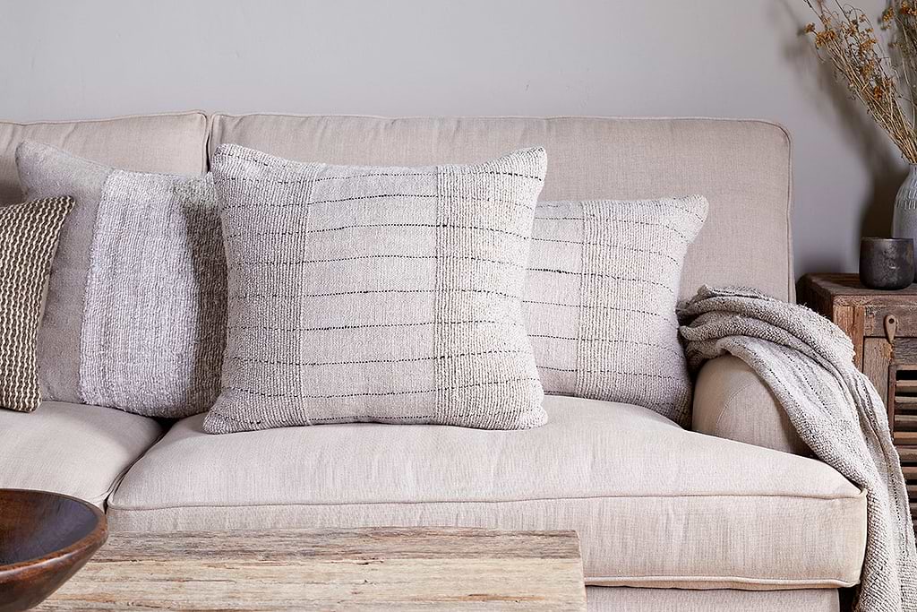
Mayla Cushion Cover
Soft hand-textured cover — instant warmth on linen sofas or chairs.
View at Nkuku →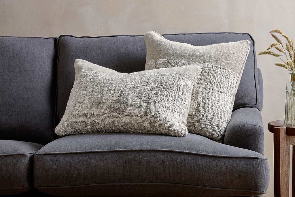
Puli Linen Cushion
Recycled linen in natural — pairs with woven textures and aged wood.
View at Nkuku →
Some links above are affiliate links. If you buy through them we may earn a small commission at no extra cost to you. We only suggest pieces we think fit a calm, lived-in home.
Free guide
The Calm Shelf
12 styling ideas to help you compose calm, balanced shelves in natural texture homes.