

It starts with too many finds. Buying home decorative items one at a time, each a small delight, creates a shelf, table, or wall that feels restless instead of peaceful. A crowded tray on a coffee table, unrelated prints in a hallway, clusters of vases or baskets in mismatched patterns: these all add up to a busy look that pulls the eye in too many directions at once.
Today, you’ll see how to step back, simplify, and refocus so every decorative piece works as part of a calm, tonal grouping. The goal is to help you choose, often also to remove, so what remains is easy on the eyes and fits your home. This works especially well in small living rooms when you need visual rest because too many details in a small volume make the whole space feel smaller and unsettled.
The short version: You create calm in a room by grouping home decorative items by material, tone, and purpose, not by filling every surface. Even a tight space can feel softer and more open when you repeat similar textures and tones and let surfaces breathe between objects.
Key takeaways
- A collection of home decorative items stays calm if you keep to one main material type per surface.
- Using neutral tones blends objects into their backgrounds and reduces visual noise.
- Repeating the same shape or color in two or three spots makes a room feel pulled-together.
- Most floating shelves are deep enough for a framed photo and a small vase or bowl, not both.
- According to Next, wall art, vases, mirrors, and faux plants are the core decorative accessories for most homes.

The problem with buying decorative items one at a time
Buying home decorative items piece by piece usually leads to clashing colors, clunky patterns, and surfaces that never settle. Stopping to see the whole room first keeps each purchase from fighting everything else.
It’s easy to bring home a vase from one shop, a candle holder from another, and a bold print online. Over time, these add up to a surface that feels choppy or crowded. Every shelf or tabletop starts to look busy instead of peaceful.
Most people run into this in their main living room. A new cushion clashes with throws from last winter; planters each in a different style sit close together, making the windowsill look busier instead of finished.
Unlike a matched set, a collection made by impulse often has no linking idea. The eye hops from bright to dull, from glass to wood to metal, until the room feels full but not calm. A woven Nkomi Basket in natural grass, for example, settles the look by repeating texture in an easy spot.
Grouping by shape, tone, or purpose, not by purchase date, solves most of this. A shelf lined with baskets of different fibers can feel loud, while twin baskets or bowls made from similar natural materials seem steady and soft.
A space that gets changed every season will feel different from one anchored by the same materials. If you buy for a need instead of a look, the room grows in too many directions at once. A home feels quieter when its decorative items share at least one trait.
You notice this most on surfaces that catch daily use, an entryway console, the coffee table, open shelving in a dining nook. Leaving more blank space, or sticking to one or two materials, keeps these from turning into drop zones for anything with nowhere else to go.
How do you choose a palette that actually works?
Start with one main soft neutral and one accent material, then repeat their tones across your home decorative items. Two or three related colors are enough for shelves, sideboards, or walls to look calm.
Most calm rooms use a neutral color as their base, a pale oak shelf, off-white wall, or soft grey rug, and then add only one or two accent colors in gentle shades. A marble bowl and a jute tray both draw on pale natural roots, letting them sit quietly together.
If every object brings its own color into a small space, the room feels choppy. Instead, blend objects into their surface: a beige clay vase on a wooden shelf, white-washed frames on a pale wall, a light linen runner under smooth ceramic bowls. The connection is color as much as purpose.
Unlike a single bold pop, repeating a soft color (from table lamp base to picture frame to planter) helps the eye rest. IKEA’s decoration category groups items by function and material to simplify these decisions, from frames and plant stands to picture ledges in warm woods and off-whites.
Light matters. Rooms that get little sun benefit from a steady, light palette, pale woods, white ceramics, sand-colored jars, while open-plan layouts can hold a bit more dark or textured material as long as you repeat it more than once. If you layer marble on marble, keep them similar in color and polish for calm instead of contrast.
Grouping objects by how light hits them is one trick that decorators often use. Matte ceramic softens glare, while clear glass or polished metal throws highlights. A shelf or ledge feels quieter when you mostly stick to matte or unpolished objects, and add reflective surfaces only for a gentle lift.
A palette works best when it flows from one surface to the next, repeating the same family of neutral colors or mixing soft woods with cotton, linen, or unglazed clay. The difference between too many colors and just a few is immediately visible on a crowded shelf or busy dresser.
Where this works best
Groupings of similar home decorative items work best in small apartments, rental flats, or any space with open shelves and little storage, since every object is on show.
Open-plan living areas, studios, and small bedrooms make every item count. When shelves have no doors and counters hold everyday things, the need for calm and unity becomes more obvious. Unlike a private den, an open kitchen/living space can’t hide busy details. Repeating materials like seagrass, clay, or linen on exposed ledges eases the look.
In a windowless hallway or a narrow entryway, there’s rarely room for lots of display. Placing just two items, like a smooth wooden bowl and a matte ceramic vase, settles the whole surface. Trailing faux plants or dried stems in a single color add height without taking over.
Avoid filling every ledge, tray, or wall spot. Too much on view makes a small kitchen feel even tighter, while in a shared workspace, scattered objects can distract or wear at you by day’s end. Leaving space is key: “A sideboard works best when at least two-thirds is left clear.”
Look for areas where the need to store things and the need to feel calm meet. A floating shelf above a sofa, a bench in the entry, a small spot by the bed. In each, fewer items, grouped by tone or feel, do more than a parade of mismatched finds.
Rental-friendly displays, shelves that rest on brackets, hooks for baskets, trays on tables, make editing easier. If you move, the group can move with you. Choose items that don’t need wall holes or costly fixes.
Keeping the calm is easier in spaces where light is steady. Avoid dark alcoves or windowless corners for your main display, since objects here look heavier and dust stands out.
Wall art that doesn’t shout
Wall art looks calm when its colors, subject, and size repeat one or two elements already in the room, rather than fighting them for attention.
In many homes, the biggest surface is the wall behind a sofa or the head of the bed. One loud print, hung alone, can make the whole room about that piece. Instead, pick art with a gentle palette, abstract lines in soft neutrals, textured shapes in beige or off-white, that picks up the tones of furniture or soft furnishings.
Still lifes, soft landscapes, or textural abstracts in wood or linen frames add subtlety. Matching the frame to another surface, the wood of a shelf, the edge of a mirror, the leg of a table, quietly links the art to the room’s other objects.
Unlike gallery walls with dozens of styles, two or three coordinated pieces spaced apart give the eye a place to rest. Hang art so that the midpoint sits roughly at eye level for most adults; studies show this feels most natural, according to Next, whose categories highlight calm, accessible wall displays.
Glass-fronted frames catch the light; swap to a matte acrylic or single-panel wood frame where you want less glare. Textured canvas or linen wraps also keep the reflection down and give a hand-touched feel.
Art on a ledge or picture shelf is easy to reorganize or swap out when you want a quieter effect. If you choose two pieces of different sizes, let the lighter or smaller one sit in front, overlapping by just a touch, it keeps the display from reading flat.
Gallery walls work in larger, light-rich rooms but tend to overwhelm narrow hallways or small bedrooms. Give each piece space to breathe, linking their tones for a more peaceful effect than a jumble of color and story.

Styling and placement
A group of decorative items feels calm when spaced apart, limited to two or three cohesive materials, and given at least one empty spot per surface.
Most surfaces, sideboards, consoles, even windowsills, quickly become home to too many small objects. A classic mistake is lining up vases, candles, or trays so close that none stand out. Instead, create one visual anchor (a basket, fluted vase, or bowl), then add only one or two soft accessories nearby.
If the surface is narrow, go vertical. A tall vessel in a pale tone next to a low lidded box draws the eye upwards and sideways, adding quiet structure. Compared to filling the space edge-to-edge, leaving half the depth clear feels more intentional and restful.
Grouping by odd numbers (three pieces: bowl, vase, and object) has a long design tradition. Yet, what calms a busy corner best is not so much the number as the relationship: matching materials and hues. If one piece is a pale ribbed ceramic, echo a similar finish in the frame of a print above.
Quick calm checklist:
- Choose two or three materials, such as glass, clay, or woven grass, per surface.
- Leave open space around each object, at least as wide as the item itself.
- Repeat one neutral palette across the surface (whites, soft woods, pale stone).
- Make one item a clear anchor, basket, sculpture, or large bowl; the rest should support.
- If your room gets little sun, use more matte finishes; glossy objects call more attention in low light.
A shallow tray on a coffee table can corral smaller pieces so the table stays clear. A narrow console benefits from a tall lamp or sculpture on one end, with open space beside it. On floating shelves, a single woven item, like the Nkomi Basket, draws focus without crowding flimsy ornaments.
Refining styling and placement means looking at each group of objects from different angles and noticing how their shapes and finishes shift with movement and daylight.
If display feels busy, remove one object and space the rest a little farther apart. The room should breathe with you. A wooden bowl or soft-edged tray gives weight; a pale vase or ribbed glass catches the light softly.
Should you use faux plants and natural materials together?
Pairing faux plants with baskets or vessels in real wood, clay, or seagrass balances the softness of green with weight and texture, as long as the palette stays light and natural.
Greenery is everywhere in inspirations and mood boards, but real plants struggle in low light or in spaces with tricky temperature swings. A cluster of faux eucalyptus or dried grasses can provide a sense of movement and color, especially in a rental or shaded living room.
Unlike plastic leaves in deep glossy green, softer faux foliage reads calmer, especially in pale sage, dusty olive, or beige tones. Matching the foliage to its holder matters: a simple faux stem in a ribbed vase or a linen-wrapped pot sits quietly, while flashy glass containers can feel out of place among earthy materials.
John Lewis lists house plants and clocks as decorative accessories, both serve visual and practical roles. A faux trailing plant in a canvas-wrapped pot beside a real wooden clock does the same work as a bouquet in a vase: softening edges and drawing the eye, but without upkeep.
Compared to grouping only real plants, mixing faux with natural materials lets you add green without worrying about sun, water, or soil. Dried stems in matte ceramic last even in a north-facing entryway or a busy kitchen. The key is repeating neutral tones and subtle textures, not going for the most realistic plastic shine.
For renters or those away from home often, faux and dried options free up time while keeping shelves and window ledges visually calm. Update the display with the seasons, a cotton stem in winter, pampas grass in summer, without changing holders or buying new containers.
The best effect comes from pairing faux greens with baskets, bowls, or trays in tactile materials. A small woven tray on a bedside, holding both a small plant and your wristwatch, introduces quiet softness where a clutter of personal items might have been.
What makes an object add calm instead of clutter?
An object adds calm when its color, material, or shape matches other items nearby, or when it acts as a loose anchor on an open surface.
Ornaments, sculptures, bowls, and trays are especially easy to overdo. The shelf in a living room, console in an entry, or kitchen corner can all take one tactile object, like a fluted marble bowl from Olivia’s, or a hand-thrown mug set next to a matching vase. The calm comes from the family resemblance between each piece.
Compared to mixing sharp and round shapes, sticking to curves or softly squared forms makes a group look easy and connected. Instead of filling the tray with a mix of objects, pick two that echo each other, a candle and a glass paperweight, a matte vase and a wood bowl.
Melody Maison’s categories highlight the range: trays, candle holders, planters, clocks, shelves. All of these can add noise if too busy, or add calm if each links to a color, shape, or finish already somewhere else in the room. A ribbed glass vase next to a smooth one, both in pale neutrals, pulls the table together.
Mirrors work much the same way. Unlike small scattered ones, a single round or gently arched mirror, hung near other rounded forms, softens the whole corner. “A mirror works best when it bounces natural light across part of the room, not just reflects clutter.”
If a bowl or vessel holds something useful, keys by the door, remotes in the living room, it prevents objects from spreading across surfaces. Even organizers become part of the design by sticking to a single finish or palette.
What gives calm, in the end, is a shared palette, a common material, and enough room to breathe. One or two objects per display, linked in tone and finish, change a busy room into one that feels good to come home to.
What tends to hold up with styling calm displays
Rooms feel easiest on the eye when decorative items group by material and give each other space. After looking through reader questions and hundreds of product reviews, the same points come up: matte wood and pale ceramics rarely go wrong; shiny metallic objects or glass need careful placement near windows to avoid glare.
Decorators repeatedly recommend anchoring a shelf or surface with one sturdy object, letting smaller finds work around it. Woven baskets and natural-fiber trays draw hands and eyes the most, especially with gentle edges. A group that blends into the background stands the test of time, as colors stay soft and the eye never tires.
, Mara, Loom & Glow
Common questions
What are the most popular types of home decorative items?
The most popular types of home decorative items include wall art, vases, ornaments, faux plants, and mirrors. Shelves, trays, and candle holders are widely used for layering depth and function in main rooms. Most big retailers break these categories down for easy mixing and matching at home.
What are some affordable home decorative items?
Affordable home decorative items often include glass or ceramic vases, small trinket trays, picture frames, faux plants, and printed wall art. Stores such as IKEA and Melody Maison carry these at a wide range of accessible price points, making small design updates budget-friendly and low-risk.
Where can I find unique decorative items for my home?
You can find unique decorative items for your home at specialty shops, local makers’ markets, and online at places like Olivia’s and John Lewis. Sourcing from independent artists or brands with small runs brings textures and shapes that feel truly individual and fresh, outside the mass-market look.
What are the top 10 home decor items?
The top 10 home decor items commonly include vases, wall art, mirrors, candle holders, bowls, trays, sculptures, picture frames, clocks, and faux plants. These items appear in almost every style guide and product category, offering lots of room for layering and personal touches in any space.
Explore more calm combinations inside our Shop The Look .
Shop the Look
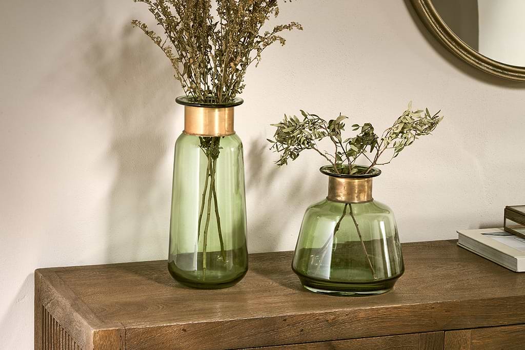
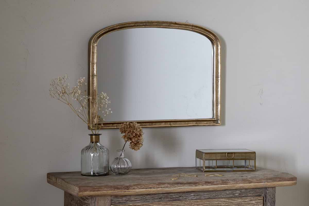
These three pieces-a soft vase, a small mirror and a simple iron candlestick-anchor a calm collection without overwhelming it.
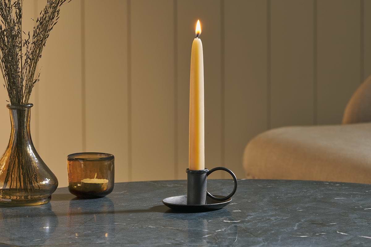
Amri Iron Candlestick
Slender iron with quiet presence, works alone or in clusters of three.
View at Nkuku →Some links above are affiliate links. If you buy through them we may earn a small commission at no extra cost to you. We only suggest pieces we think fit a calm, lived-in home.
Free guide
The Calm Shelf
12 styling ideas to help you compose calm, balanced shelves in natural texture homes.