

Neutral living room ideas often look easy online, but most small apartments or rented rooms feel anything but calm once real clutter, low light, and awkward layouts set in. Cool grey walls, pale sofas, and blank floors can make the space feel cold or empty instead of soft and cosy, especially if you can’t change flooring or lighting.
Today, you’ll make a few small changes, removing or moving specific pieces, anchoring with texture, and picking a limited palette, to create a space that feels relaxed and warm. This works especially well for a calm small room when storage is tight because the right colour and material choices reduce visual noise and help the eye rest.
The short version: The best neutral living room ideas use warm undertones, matte texture, and natural materials to avoid that cold, stark look. By layering jute, linen, and oak with a few well-placed accents, small and busy spaces can feel connected, calm, and welcoming.

Why do some neutral living rooms feel cold?
A living room in only pale grey or white without texture or warmth will almost always feel empty and flat. Adding even one warm beige or a textured rug makes the whole space feel softer and more lived-in.
In a small flat with white walls and a grey sofa, you may find the room looks fresh at first, but it quickly starts to feel unwelcoming. Most rental spaces default to these cool tones because they’re safe, but they strip out the feeling of warmth people want for relaxation.
The real problem comes from too many cool shades in one place. When every large piece, from the curtains to the rug, reads icy or blue-based, the eye misses anything to ground it. Warm neutrals carry just a hint of red, which softens the mood, even when the palette stays simple.
A bare concrete table or an all-grey throw looks colder than a woven basket or oak bowl, even in the same light. Swapping one thing for a touch of warmth changes the character of the whole area, making it feel more like home. Try a single oatmeal cushion or a clay lamp for an instant fix that works in any small room.
Where this works best
Neutral living room ideas suit small apartments, low-light areas, or open-plan spaces that need a sense of calm. These principles solve problems for any space that feels busy or disconnected.
Any lounge with limited square footage or furniture that’s forced against the walls can benefit from a cohesive warm neutral approach. Tight entryways, apartments without much natural light, and rented homes with existing hard flooring all work better when the visual palette is under control.
For daily life, this means fewer distractions, no jarring colour contrasts, and nothing heavy blocking walkways. You might have one main window and need daylight to bounce around gently without glare; warm oatmeals, soft taupes, and creamy linens bounce light more kindly than bright whites.
Avoid using these principles in spaces that demand bold personality or need a specific functional pop, like a playroom or a kitchen with glossy cabinets. Busy family zones, where muddy hands or sticky spills are common, often call for washable colour, not delicate neutrals.
How do you choose warm neutrals that aren’t boring?
Warm neutrals like greige, oatmeal, and taupe build a palette that stays interesting but restful. You need a mix of undertones and a focus on texture, not just a sea of beige.
Most small room decor fails when every wall and piece is the same flat shade. Instead of layering three near-identical beiges, work in at least one undertone with a trace of warmth, a taupe sofa, a jute rug, or a throw in toasted oatmeal. This quiet variation keeps things looking alive and welcoming.
The “new neutrals” avoid chilly greys in favour of hues that carry a touch of clay or brown. Jute rugs and linen covers help, because their fibres catch light differently at every angle, so the room never feels flat. When the undertone in your main pieces reflects a bit of pink or red, the space can sit empty and still feel friendly.
Compared to rooms where paint and sofa are pure cool grey, warm-backed neutrals always feel more relaxed. Small space ideas work here because natural and textural pieces like rattan or oak keep things calm, without any risk of blandness. Try pairing a soft taupe floor basket with a clay bowl on the coffee table.
Styling and placement
Group in threes, leave space, and keep main surfaces mostly clear. Rugs, baskets, and curtains should anchor, not crowd, the room.
In most small living rooms, every corner ends up being used for storage, sitting, or display. Keeping a warm minimalist living room means editing out extras and sticking with a few tactile basics. A good jute basket runs about $20, $40 in most shops, using just one or two keeps the area grounded, without tipping into clutter.
If you place too many small objects, shelves and side tables get busy fast. Instead, lead the eye with one main item per site: a mango wood tray on a stool, a linen cushion grouping on the sofa, a tall vase of pampas grass in a bare corner. Negative space between these anchors makes small rooms feel like they breathe.
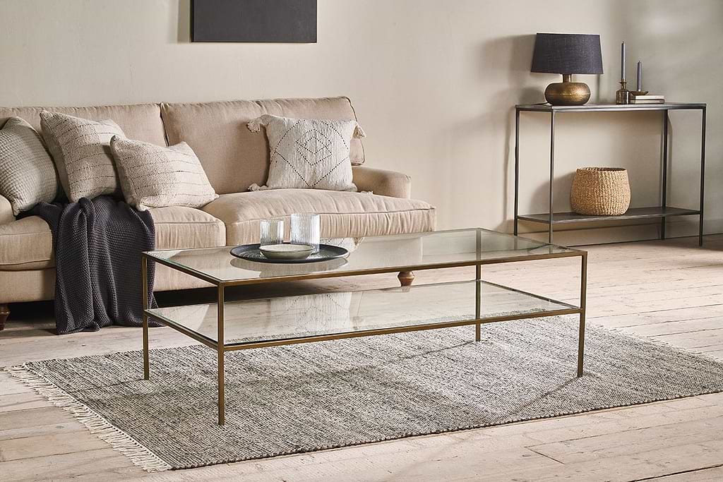
Unlike shelves filled edge-to-edge with books or trinkets, a single piece in a natural material lets texture and light do the work. Place a soft rug under the coffee table and let at least two-thirds of its border show, this keeps the surface open, not crowded.
Quick calm checklist:
- Choose linen, wool, or thick cotton for throws and curtains.
- Allow space around furniture, keep floor and walls at least part visible.
- Limit palette: no more than three main neutrals in fabric and large items.
- Anchor one spot with a basket, wood tray, or textured vase.
- Use negative space: don’t fill every shelf or corner.

How do you add texture to a neutral palette?
Texture turns simple neutrals into something cosy and layered, not plain or empty. Mixing jute, wool, and wood means the eye can rest without the room reading as blank.
In small rooms, it’s easy to avoid colour but forget about feel. A sofa covered in flat cotton plus curtain panels in poly-blend leaves the eye bored and the mood chilly. Layer a waffle-knit wool throw over a linen sofa arm, or a jute rug beneath your coffee table, and the change is instant.
Designers say texture is essential to bring a beige or neutral living room to life, so the palette reads layered rather than flat ([source]). A wool ottoman softens sharp lines; a rattan basket by the sofa handles throws or books and lends quiet movement. Most floating shelves sit about 25-30 cm deep, this gives just enough room for a clay bowl, stacked books, and negative space.
Compared to plastic boxes or shiny metal, textured natural materials stay visually quiet and absorb light in a soft way. This is friendly for apartments with little daylight or harsh overhead bulbs, it tames glare and brings even bland rental furniture into balance.
What’s the best way to use accent colours in neutrals?
One or two accented pieces, like green, soft black, or clay, bring depth without tipping the room into busy. Keep the main surfaces neutral and let small items pull the eye.
Many living rooms lose their calm when too many pops of colour land on cushions, books, or art. The eye jumps from item to item, and the scheme stops working as a whole. In a calm small room, limit accent colours to just a plant, a black tray, or a single piece of art, groups of three at most.
Warm neutrals such as sand and terracotta-toned shades bring a grounding, cosy quality to a living room ([source]). Instead of using bright blue or yellow, anchor the room with one green branch in a pale vase, or a soft clay pot beside oatmeal throws.
A basketful of books in mixed covers looks heavier than a single leafy plant against a blank wall. This is a trick borrowed from warm minimalist style, each accent stands out, but never feels loud.
Give your room one focal point
A single anchor, like a large framed print, low sideboard, or standout vase, pulls the space together so everything else can stay subtle.
Most apartment decor ideas fall flat not from the palette itself, but from having no visual resting spot. Too many small items mean the eye keeps moving, never settling. A focal point pulls together the calm feeling you’re after, so the rest of the furniture can stay simple.
Choose your anchor: a framed piece of soft-toned art above the sofa, a chunky oak side table, or a large jute basket beside your armchair. Layering neutral walls with natural textures, like pampas grass, wooden shelving, and woven baskets, adds depth and warmth to the whole scheme ([source]).
In a calm small room, one big piece makes a stronger impact than several little ones. For a rental, try a tall vase of pampas or a standing lamp with a linen shade as your anchor. Unlike art hung at random or shelves packed tight, this single highlight makes the space feel intentional and connected.
What tends to hold up with warming up neutral living rooms
Looking across hundreds of photos and reader polls, one pattern stands out: neutral palettes work best when different textures are used together but not crowded. Reviewers of jute rugs almost always mention how they wear well in busy homes yet hide dust better than thinner flatweaves. Decorators often say that linen and wool, especially, help absorb light and break up the hard look of walls or floors.
Matte finishes get recommended again and again for shelves or baskets near bright windows, because they don’t catch glare the way glossy pieces do. There’s something about a single, tactile anchor, a woven stool, for example, that makes an apartment feel softer, even when little else changes.
, Mara, Loom & Glow
Common questions
Why do neutral living rooms sometimes feel cold instead of warm?
A living room in only pale grey or white without texture or warmth will almost always feel empty and flat. The real problem comes from too many cool shades in one place.
What materials help create warmth in a neutral living room?
The best neutral living room ideas use warm undertones, matte texture, and natural materials to avoid that cold, stark look. By layering jute, linen, and oak with a few well-placed accents, small and busy spaces can feel connected, calm, and welcoming.
How should you arrange furniture and objects in a small neutral living room?
Group in threes, leave space, and keep main surfaces mostly clear. Negative space between these anchors makes small rooms feel like they breathe.
Which neutral colours work best for avoiding a bland appearance?
Warm neutrals like greige, oatmeal, and taupe build a palette that stays interesting but restful. Instead of layering three near-identical beiges, work in at least one undertone with a trace of warmth-a taupe sofa, a jute rug, or a throw in toasted oatmeal.
Explore more calm combinations inside our Shop The Look .
Shop the Look
Pieces that ground a warm neutral room without weight.
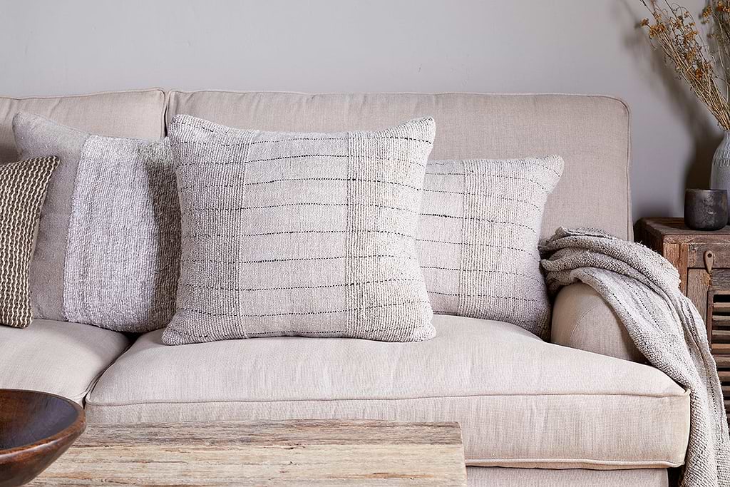
Mayla Cushion Cover
Soft hand-textured cover, instant warmth on linen sofas or chairs.
View at Nkuku →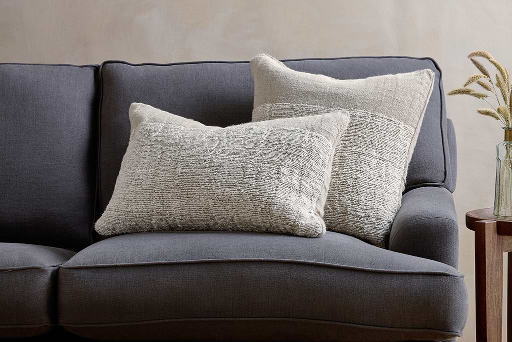
Puli Linen Cushion
Recycled linen in natural, pairs with woven textures and aged wood.
View at Nkuku →Some links above are affiliate links. If you buy through them we may earn a small commission at no extra cost to you. We only suggest pieces we think fit a calm, lived-in home.
Free guide
The Calm Shelf
12 styling ideas to help you compose calm, balanced shelves in natural texture homes.