

If you’ve ever tried painting a green room in a British home, you may have seen the colour shift unexpectedly. That gentle sage or olive green on the paint card can look cold, muddy, or washed out by midday, especially in low or north-facing light.
The outcome is within reach if you know where typical mistakes creep in. This guide will help you choose a green that works with British light, not against it. This works especially well in period dining rooms when painted walls catch little direct sun because softer, warmer shades keep the feeling relaxed and welcoming.
The short version: The best way to create a green room that looks calm in British light is to choose a muted, warm-toned green matched to your room’s direction and daylight. A limited, nature-inspired palette and a few natural materials add softness that keeps the space feeling steady even on gloomy days.
Key takeaways
- A green room feels softer in British homes when the paint has a yellow, brown, or grey undertone.
- North-facing rooms work with greens that lean warm or muddy, not icy or mint.
- Matching greens on walls and textiles stops small spaces feeling boxed in or busy.
- Plants like Snake Plant and ZZ Plant tolerate low light and central heating without fuss.
- UK brands like Farrow & Ball or Little Greene offer reliable muted greens for these conditions.

What is a green room in British homes?
A green room in British decor means a space painted or furnished in green that feels fresh without looking stark, even in muted daylight. The best rooms keep to one or two undertones and avoid sharp contrasts, which helps every green look consistent year-round.
In Britain, “green room” doesn’t mean a celebrity waiting lounge or reference the film ‘Green Room’; it’s about using green as a colour base for liveable rooms that look calm all day. A home office, bedroom, or dining room can become a green room if the shade is chosen for more than just the paint card effect.
Unlike pure emerald green (which may read harsh or almost blue in cloudy weather), softer greens like sage or olive usually sit quietly against British skies. A room that feels calm in summer can shift to cold or disjointed in winter if the undertone isn’t right.
The cause is simple: British daylight, often soft or overcast, mutes vivid greens and exaggerates cold tones, which can make a cheerful test patch look sad by teatime. Choosing a green that’s slightly muddier or leans yellow helps anchor the colour in the room, especially when natural wood or rattan are part of the palette.
Setting the green room against lived-in textures—a jute rug, a wool throw, or a clay lamp—keeps the look consistent through the seasons and stops the space feeling static.
Which green paint works in north-facing rooms?
Muted mid-greens with a touch of yellow or grey work best in north-facing rooms because they stop the space feeling cold or shadowed. Applying the same tone to woodwork or shelving stops harsh contrasts from breaking up small walls.
North-facing rooms in the UK often receive thin, indirect sunlight for most of the year, which can drain energy from paint colours. Here, the usual mistake is reaching for a clear or minty green, which looks fresh under shop lights but turns icy or clinical at home. “Green Smoke” from Farrow & Ball or “Vert de Terre” by Little Greene both offer a warm backbone that resists looking sad on short days.
The effect works because these greens bring enough yellow or brown to keep a steady base, even as daylight shifts. A wall painted in “Breakfast Room Green” feels lighter in weak sun than pure forest green, which can go flat by late afternoon.
Compared to pale mint or hospital green (which can feel sharp and cold), these deeper, slightly muddy greens rest quietly and support oak, flax, or brass without looking dull. Paint trims or skirting in the same or a step darker tone to give a simple, wrapped edge to the room.
In a north-facing bedroom, this trick stops the walls from looking boxed in, even if you use chunky linens or heavy blackout curtains in the same colour group. Matching the green gently across wall and textile keeps lines from feeling cropped and makes the room easier to live with all year.
Where this works best
Living rooms, bedrooms, and small dining areas suit muted green walls because these rooms need calm even when daylight is uneven. Leaning into the room’s limits instead of fighting them keeps green looking inviting.
In older British homes, small sitting rooms with low ceilings or deep window alcoves can swallow bright colours and make whites look harsh. Green in these rooms softens boxy corners and blends coved ceilings with crowded mantelpieces. Rentals and new builds with awkward single windows also see the benefit, because a consistent green makes mismatched furniture recede, reducing visual “noise.”
This approach applies to hallways as well. Corridors, landings, and spaces leading off a main lounge rarely get much sun and usually cast odd blue shadows in photos. Muted green, especially with grey or brown in the mix, reads as stable. Using one grounding green avoids a jumpy, broken flow through the house.
Avoid picking pure, clear greens for spots with very low light. In a basement guest room or a windowless nook, sharp greens pull attention to shadows and amplify awkward corners. A room with patchy light looks steadier when the shade is muddier, and surfaces show gentle wear (like weathered timber frames or clay planters).
Welcoming a green room in a small TV den or utility space isn’t about cheer; it’s about simplicity. Even a single blanket or table runner in a repeated green can cover clashing details and slow the feel of the room.
How do you avoid green looking cold or flat?
Warming up a green room means choosing greens with yellow, brown, or grey undertones and pairing them with at least one natural-textured object. Mixing sharp white with mint green is the fastest way to get a cold, thin look.
The most common cause of a cold green room in the UK is picking a colour straight from the tester pot, painted against white, then committing to it without seeing it change through a full day. The solution is to test on more than one wall, with wood or fabric nearby, so undertones show clearly at different hours.
Unlike a room in southern Europe, which can handle bright, blue-greens and lots of white, British homes need at least one soft, absorbing surface: think a wool rug, basket, or thick woven curtain. A window ledge with stone or matte ceramic plant pots stops green feeling hollow. Even the best green paint feels flat if the rest of the room has only glossy finishes and smooth plastics.
The effect happens because textured surfaces, especially pale, rough wood or linen, catch the low sun’s sideways light differently than perfectly smooth painted walls. A jute basket warms a bare shelf by adding depth and breaking up the visual chill. In a low-light living room, this works better than adding extra lamps or metallic objects that can reflect coolness back onto the green.

Compared to a scheme that relies on synthetic fabrics and tight piles, natural textiles and unvarnished finishes keep a green room from feeling thin in the morning and heavy at night. Using a tightly limited material palette—like just linen, jute, and stone—means each surface supports the others and prevents cold spots near windows or radiators.
In practice, even switching synthetic cushions for those made of unbleached linen makes afternoon light look gentler and more golden on green backgrounds.
Styling and placement
Green walls need editing more than filling—one or two plant pots, a woven stool, and a wooden bowl are all that’s needed. Keeping nearby colours within a tight range stops the room feeling busy.
Placement and palette are the key difference between a green room that feels intentional and one that feels thrown together. Too many plant varieties, or sharply contrasting cushions, make even the best wall colour fade into the background. Repeating shades—like sage, olive, or moss—on both wall and textile softens abrupt edges.
A common mistake is crowding small shelving units with busy collections or prints that fight the green. Instead of stacking books vertically, lay a few flat, then add a small, low-maintenance plant like a ZZ Plant. A tray that repeats the wall green or brown grounds the shelf without sacrificing space.
Compared to a room where every surface is filled, open space does more for a calm result. One plain bench or spare-top sideboard has more visual effect than three small pieces with different finishes. Clean sightlines, not multiple stylistic “zones,” make a green room feel natural and uncluttered.
Quick calm checklist:
- Pick one core green, repeat in textiles or art
- Limit visible materials to 2–3 (linen, jute, clay)
- Leave shelves at least half empty for breathing room
- Anchor each vertical surface with one textural piece
Applying these rules in a small dining room or rental lounge takes less time than constant re-styling and avoids decision fatigue later on.
Which UK paint brands get green right?
UK paint brands Farrow & Ball, Little Greene, and Lick all offer green shades that suit British homes because they formulate for soft or uneven light. Picking one of their muted greens is safer than guessing from a digital swatch.
Most British brands include at least one green made specifically for overcast conditions or low sun. Farrow & Ball’s “Green Smoke” is a popular choice for bedrooms and kitchens—quiet, faded, warm. “Breakfast Room Green” sits right for dining spaces, never sharp. Little Greene’s “Vert de Terre” (a green-grey) is softer than classic apple green and covers awkward corners well, while “Portland Stone” (although technically a neutral) fits next to sage or olive on woodwork.
Lick, a newer name, gets attention for their simplified palette that works with British rental constraints. “Green 02” and “Green 05” both carry warmth even in short daylight. Testing these shades with sample pots on more than one wall (morning and evening) shows how they hold together when light is patchy or electric lighting is in use.
According to the venue ‘Green Room’ in Leeds, “urban oasis” green finishes can help blur the line between inside and outside, especially when plants or rough materials are used. If cost is a concern, most sample pots run under £5, so trialling two or three is practical even in a small space.
| Brand | Recommended Green | Where it Works Best |
|---|---|---|
| Farrow & Ball | Green Smoke, Breakfast Room Green | Bedrooms, kitchens, soft south light |
| Little Greene | Vert de Terre, Portland Stone | Hallways, north-facing, paired with stone |
| Lick | Green 02, Green 05 | Small living rooms, rentals, patchy light |
When picking, always try the colour near woodwork and fabrics used in the room, ideally alongside other natural materials like stone or jute baskets. This stops surprises after painting.
How can plants support a green room in British light?
Plants with broad, waxy leaves—such as Snake Plant and ZZ Plant—cope best with British light and dry indoor air, giving life without fuss. Picking too many delicate or thirsty varieties usually ends in droopy stems and mess.
Most British homes swing between drafts and central heating, which stresses common plants. Snake Plant and ZZ Plant are both low-fuss and grow well even placed on a windowsill with only patchy daylight. The Peace Lily manages well in corners with only occasional sun and can handle short spells of dry air near a radiator—its leaves only brown when left in strong current for too long.
Low-light tolerant plants work because they store water in thick leaves and roots, surviving forgotten waterings and dry spells, which makes them suitable for busy homes. Unlike ferns or palms, which often drop fronds and make green rooms look untidy by December, these robust choices keep their shape with little help.
For a simple palette, stick to one or two plant types and repeat them at different heights: ZZ Plant on a sideboard, Snake Plant on the floor, Peace Lily tucked into a matte white pot by the sofa. This kind of repetition feels soothing and tidy.
In small rooms, a single tall plant, such as a Snake Plant in a basket, draws the eye upward and adds texture without taking over the floor. For more expert tips, read how to layer textures in a room.
Adding low-maintenance plants in plain pots by key sightlines—like the end of a dining table or near an entryway—keeps the mood steady, not busy, even on the darkest winter days.
Most people only spot the mismatch after moving furniture back and noticing the green doesn’t look like it did on the paint tester. A sense of restlessness grows as you try new accessories, but the room remains unsettled through both sunny and grey spells.
The shift happens as soon as you simplify: pick one green with a warm, soft undertone, match it in a few textiles or plant pots, and keep materials honest and rough to the touch.
This clears visual clutter and means even a single morning or evening lamp is enough to make the room feel steady.
Busy open storage, too many shades of green, and synthetic, shiny cushions are the usual culprits. The downside is a room that always feels half-finished or “buzzy,” so the space doesn’t support calm evenings or easy mornings. Fixing this means you relax, mess is easier to manage, and the room feels easier to live in. Save this idea for later.
What tends to hold up with green rooms in British light
Across many British homes, lighter, softer green paints get recommended repeatedly—reviewers describe how colours like sage or olive don’t shift as much in grey or low sun. Matching natural textures to these greens seems to be the fix most decorators mention for keeping spaces from feeling chilly.
Matte finishes often come up, especially for shelving by windows, because they catch less glare than glossy surfaces and stop reflections from making greens look off. Even reviewers of “urban oasis” venues reference the role of plants and rough materials in tying light, wall colour, and flooring together.
— Mara, Loom & Glow
Common questions
What does a green room mean in home decor?
A green room in home decor describes a space painted or styled mainly in green, designed to feel fresh and restful. Typically, soft greens work best in homes with muted light. The term comes from theatre, but in homes, it’s all about layering green with calm textures and honest materials.
What are the best green paint colours for a dark room?
The best green paint colours for a dark room are warm, muted greens like sage, olive, or green-grey. Pure or icy greens may appear harsh or flat in low light. Brands such as Farrow & Ball (“Green Smoke”) and Little Greene (“Vert de Terre”) are commonly recommended for these conditions.
What does a Green Room mean?
A Green Room traditionally refers to the waiting area for performers before a show, but in homes, it means a space where green dominates the palette. In the UK, it is linked more to calm, absorbent decor than to theatres. This distinction helps avoid confusion with the film ‘Green Room’.
Is The Green Room worth watching?
The film ‘Green Room’ is a suspense thriller rated R with a 1 hour 35 minute runtime and a 6.9/10 on IMDb. It has been well received for its tense plot and performances. Viewers interested in drama and suspense often find it worthwhile. Learn more in The 2015 film entry.
Explore more calm combinations inside our Shop The Look .
Shop the Look
A few Nkuku pieces that suit a calm, natural green room.
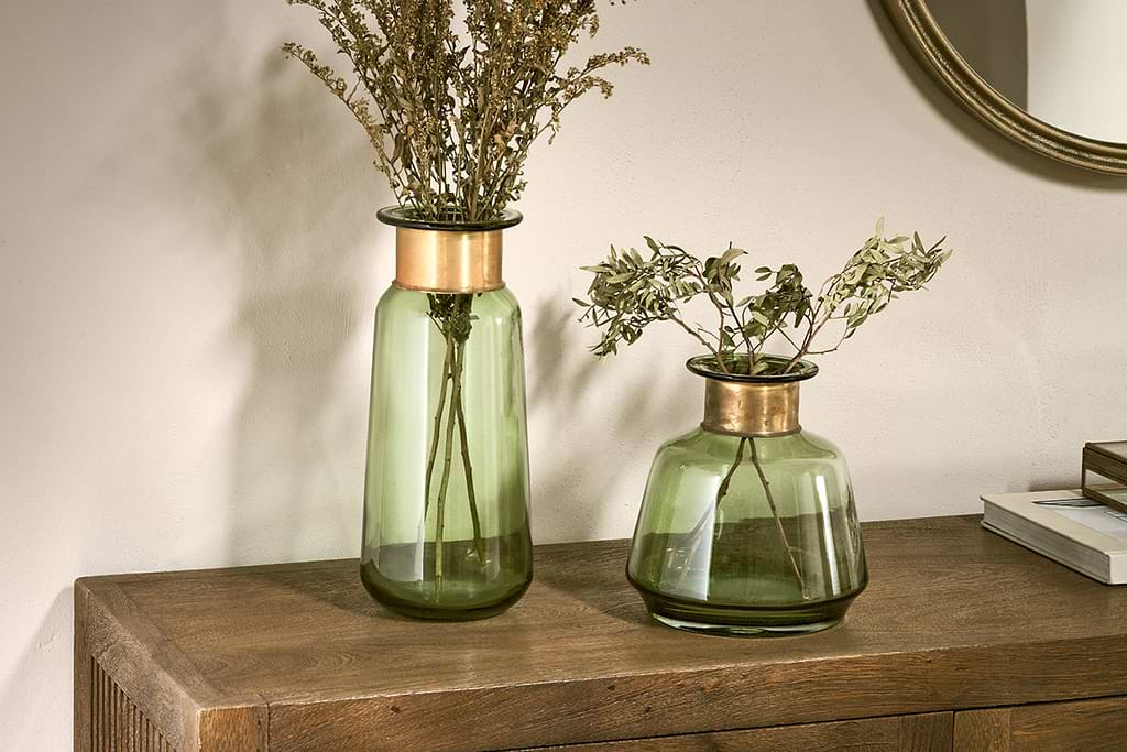
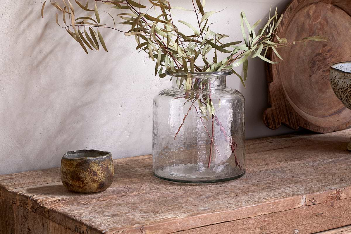
Akra Recycled Glass Vase
Clear cylindrical glass, pairs with stems or sits empty as a quiet accent.
View at Nkuku →Some links above are affiliate links. If you buy through them we may earn a small commission at no extra cost to you. We only suggest pieces we think fit a calm, lived-in home.
Free guide
The Calm Shelf
12 styling ideas to help you compose calm, balanced shelves in natural texture homes.