

Natural bedroom decor can sometimes feel messy rather than settled. A mix of jute rugs, linen throws, rattan lights and wood frames sounds calm in theory, but on the floor and shelves, it can turn busy. Baskets jumble, cushions pile, and the room feels off, not peaceful.
This guide walks through how to layer natural materials and neutral hues so the bedroom feels calm and clear, not like a shop display. This works especially well in a small apartment bedroom when you have limited daylight because softer textures and earth tones help everything read quieter. If you know what to leave out and what to group, it stays restful.
The short version: The simplest natural bedroom decor uses just a few natural textures and a close color palette, so the room feels clear, not cluttered. Stick to one or two focal materials, repeat them, and keep colors soft and close together for the calmest result.
- Where this works best
- How do you combine jute, linen, rattan and wood without looking crowded?
- Should your walls or floor be the anchor?
- Why are some “neutral” rooms still busy?
- Styling and placement
- What makes an earthy color palette stay calm?
- How do you add woven home decor and plants without losing clarity?

Where this works best
Natural bedroom decor works best in rooms with softer daylight and little ornament. Fewer distractions let the textures stand out without making the room look fussy.
Bedrooms with low light or one window take well to natural textures because these materials soften flat light. In small or shared spaces, piling on patterns or too many colors can look busy, but keeping to a few woven and wood pieces settles the room.
Using a jute rug under the bed, linen bedding, and a rattan pendant gives the room an earthy look. Wood frames and a single stone tray add another touch, so there’s enough detail without feeling packed.
Avoid mixing very dark wood, bold basket patterns and lots of plant pots in a small bedroom. The visual weight can make the space look chopped up. In rooms with low ceilings or pale walls, a soft rug and one woven lamp are enough to keep it relaxed.
How do you combine jute, linen, rattan and wood without looking crowded?
Pick one dominant material and use it more than the others. Limit extra details so every texture can be seen clearly and nothing has to compete for attention.
If you put a jute rug at the foot of the bed, use linen for the bedding, then choose either wood or rattan as an accent. A single rattan chair, for example, works because it stands out among mostly linen and jute surfaces.
Mixing every natural material in equal amounts can look scattered. A bedroom needs a visual order. Limiting the number of strong textures lets the eye rest on each one, instead of trying to sort shapes and weaves across every corner.
A rattan basket on a wooden shelf feels neater than two baskets and three wood knickknacks crammed together. Repeating one material in different spots, like linen cushions and a linen curtain, has more calm than having all different weaves.
A wool rug reads heavier than a jute one, so using linen and jute for most of the surfaces keeps the mood lighter, especially in a tight bedroom. This is a simple way to keep organic home decor from fighting itself.
For bedrooms with an open shelf, use one main basket and leave space on each side. This keeps patterns and lines from building visual noise.
Should your walls or floor be the anchor?
Use either the wall color or the floor material to ground the rest of the natural decor. This gives a starting point for texture and color choices in a small bedroom.
White or clay-colored walls keep the space looking clear if you want to add woven headboards or a patterned rug. On the other hand, wood or cork floors work best with pale linen bedding and only a little extra pattern in the pillows.
Anchoring with a pale wall works in apartments and rooms with little light. It reflects soft daylight onto jute and wood, so the space reads less flat. When the floor is deep brown, rattan planter stands and woven lampshades help blend the dark base with lighter pieces.
A room with a glossy floor picks up light and can compete with rough textures like a jute rug or a thick linen curtain. Compared to pairing everything matte, a shiny floor works only if the rest is kept low-key and very simple.
When placing a bed, keep the connection to the floor calm by using a rug that matches the main tone of the walls or throws. This anchors the eye without sharp color breaks.
Why are some “neutral” rooms still busy?
A neutral palette alone isn’t enough, texture, contrast, and clutter make a difference. Fewer surface changes and repeating one or two materials keep neutral bedroom decor looking restful.
Some bedrooms use cream and tan on everything but still look unsettled. Too many pillow shapes, a stack of books, or shiny metals can bring in lines and spots that interrupt the calm.
For many, it’s the contrast between shiny and matt, or sparkly and rough, that makes neutrals look busy. Skipping glossy finishes and sticking with wool, stone, and plain linen avoids glare and hard edges that break a gentle look. This matches what many designers recommend for a calm bedroom environment.
Having three different beige paints on the wall can look fussier than a single soft white. An oak shelf with pale linen and one ceramic bowl reads simpler than a jumble of neutral planters and mismatched baskets.
The best way to keep neutral home decor ideas clear is to repeat a texture, such as two linen cushions and a throw, rather than mixing one of everything.

Styling and placement
Grouping pieces by type and giving them space avoids clutter. Place key textures where daylight hits so they read as calm, not as background noise.
On the bedside table, leaving only a clay bowl, a simple lamp, and one cotton napkin lets the surface breathe. A shelf with three items, wooden box, small basket, linen photo album, gives each texture room to show.
In a small room, too many low pieces spread around the floor make the space feel unfinished. Putting the largest basket under a bench or at the foot of the bed lets the eyes scan the room without stopping at every corner. Compared to mixing high and low baskets, stacking them brings a heavy look.
Natural light shows texture. Placing a linen cushion against a window seat makes the weave catch the light, which can add quiet richness without any flashy color. For renters, props like a single hanging rattan pendant or soft linen curtain make a change that’s not permanent but shifts the feeling of the room right away.
Quick calm checklist:
- Pick 2 main materials (like linen and jute) and repeat them for bedding, cushions, and baskets.
- Leave at least half a shelf or side table free for negative space.
- Keep to earthy tones, off-white, sand, straw, wood, soft clay.
- Group small items in a bowl or tray so they don’t scatter across the surface.
- Place key woven home decor by the window or near a lamp for softer light.
Use these steps for any bedroom that feels off in the morning. It’s easiest to keep the room tidy this way.
For small-space decorating, keeping surfaces clear and soft textures grouped lets bedrooms double as reading nooks or work zones. Small-space decorating guides often suggest tray or basket systems to maintain a sense of calm.
What makes an earthy color palette stay calm?
Using shades close together in depth keeps the room steady. Choose warm whites, soft tan, and muted clay so nothing jumps out at the eye.
When colors sit too far apart, like sand next to coal black, the bedroom picks up more energy. Close tones keep every material reading as background, not as a point of action.
A stack of off-white and natural linen cushions on a beige bed keeps the look settled. Pulling in a jute rug and wood accent tray sticks to gentle browns and creams. Most color experts agree these combinations work because they reflect and absorb daylight more softly than bright hues. How color works supports this reasoning.
Pale stone looks softer than shiny polished marble, and unvarnished oak feels less striking than dark walnut. This makes it simple to build an earthy home decor scheme that isn’t cold, especially when you double up woven baskets in corners or repeat one clay lamp.
Keeping a palette of three colors (such as sand, off-white, and honey) is easier to manage than mixing many tans and grays. The effect is a bedroom that looks finished, not pieced together from leftovers.
The calming effect of soft, natural color tones lasts longest when new decor follows the same palette, when you add to the room later, stick to close shades or a repeating base color.
How do you add woven home decor and plants without losing clarity?
Match the material of planters with other surfaces, and keep plant sizes moderate so greenery sits as a calm accent instead of taking over.
Add just one basket planter to a corner, and echo that texture on another item such as a rattan tray on the side table. Too many basket shapes or plant sizes make the room feel overdone and start to crowd the edges.
Choosing drought-tolerant houseplants for bedrooms limits the need for messy watering or bunches of pots on windowsills. According to caring for houseplants, slow-growing varietals demand less rearranging and cut down on visual clutter.
Compared to mixing clay, plastic, and metal pots, using just clay and basket planters keeps things looking tidy. Placing a single tall plant by the window and a small trailing vine on a shelf works better than crowding three or four different pots in one spot.
An earth-toned linen curtain behind the plants helps leaf patterns blend into the background, keeping the focus soft. To finish, anchor with a low rattan stool or a compact jute rug near the door.
In bedrooms that already have a lot of wood, start with one woven planter and build up only if the space is still quiet, stop before it looks full.
Most people feel a small sense of relief once the main materials and colors repeat in a natural bedroom. The improvement comes from deciding on a lead material and repeating it instead of adding more types, or simply taking out what distracts from the room’s base tone.
There’s a turning point: after you swap one too many textures or pile on baskets, the room stops feeling right. You notice the eye jumps all around, or your favorite lamp disappears against busy bedding. That’s when editing materials, rather than adding, solves the core issue.
Too many bedrooms miss the mark by layering every neutral or natural material at once. Stacks of linen, oversized jute rugs, several baskets and mixed wood grains pile up fast. The room reads cluttered more than earthy. Instead, repeating one or two textures and keeping other surfaces free lets the best pieces shine and keeps the look calm. Once you pare back, the space feels lighter. Save this idea for later.
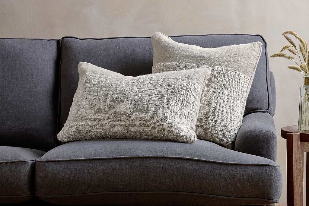
Puli Recycled Linen Cushion Cover – Natural
adds quiet structure and warmth while keeping the room balanced.
What tends to hold up with natural material home decor
Reviewing many bedrooms and reader photos, a clear pattern pops up: too much variety in baskets or rapid shifts from pale to dark woods make even natural textures feel jarring. Reviewers often describe the best results when they repeat a texture or stick to three main hues. Matte finishes also prevent glare and let daylight bring out the feel of woven home decor without harsh spots. Most editors and stylists come back to the same principle, use less, group by material, and let pawed, woven, or slubbed pieces age naturally over time.
, Mara, Loom & Glow
Common questions
How can I combine jute, linen, rattan and wood without making my bedroom look crowded?
Pick one dominant material and use it more than the others. Limit extra details so every texture can be seen clearly and nothing has to compete for attention.
Should I anchor my natural bedroom decor with wall colour or flooring?
Use either the wall color or the floor material to ground the rest of the natural decor. This gives a starting point for texture and color choices in a small bedroom.
Why do some neutral bedrooms still look busy?
A neutral palette alone isn’t enough-texture, contrast, and clutter make a difference. Fewer surface changes and repeating one or two materials keep neutral bedroom decor looking restful.
What’s the best way to style a small bedroom shelf with natural decor?
For bedrooms with an open shelf, use one main basket and leave space on each side. This keeps patterns and lines from building visual noise.
Explore more calm combinations inside our Shop The Look .
Shop the Look
Natural materials and warm wood join soft linen to anchor a bedroom that feels grounded and alive.
Puli Linen Cushion
Recycled linen in natural, pairs with woven textures and aged wood.
View at Nkuku →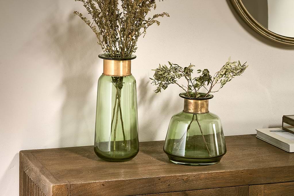
Some links above are affiliate links. If you buy through them we may earn a small commission at no extra cost to you. We only suggest pieces we think fit a calm, lived-in home.
Free guide
The Calm Leaf
12 quiet ways to bring dried botanicals, stems, and natural textures into calm spaces.