

It’s common to choose a grey wall plaque because a plain neutral room can end up looking flat and a little anonymous. The effect often happens in spaces where everything stays the same tone, walls, sofa, rugs, even the art, so you lose visual interest, even when the room is calm and tidy.
The answer is not more colour, but the right texture and material detail. Today, you’ll learn how to pick a grey wall plaque that stands out, not by adding colour, but through finish and shape. This works especially well in a neutral living room when you want interest without fuss because textured surfaces add dimension while keeping the palette calm.
The short version: A grey wall plaque breaks up a flat room by adding texture and shape, without changing the colour palette. This small shift makes a neutral space feel deeper and more deliberate, keeping it calm but giving the eye something to rest on.
Key takeaways
- A grey wall plaque adds depth through texture instead of colour change.
- Ceramic and plaster surfaces catch light softly and break up blank walls.
- Stoneware and metal plaques look best as a single accent in quiet rooms.
- Retailers like DIY.com let you filter wall art by colour for a cleaner search.
- Most minimalist rooms benefit from at least one focal plaque to avoid looking empty.
- Why a grey wall plaque works in a calm space
- How to choose the right material for your grey plaque
- Where this works best
- What’s the problem with adding colour in a neutral room?
- Styling and placement
- How do you avoid a dull or heavy look with a grey plaque?
- 10 grey wall plaques that add texture without colour

Why a grey wall plaque works in a calm space
A grey wall plaque gives subtle interest without calling attention to itself, making it an ideal choice for a room where calm matters most. Texture and gentle contrast keep monochrome walls from looking blank or unfinished.
A living room built around light walls and soft grey upholstery can start to feel one-note, especially after the first rush of calm wears off. Without a break in surface or shape, the eye has nowhere to land and the room risks looking unfinished no matter how tidy you keep it.
Adding a grey wall plaque brings in real depth. Unlike a bright print or bold canvas, a textured plaque pulls the eye with just a shift of shade or surface. Even something as subtle as a plaster circle or ribbed ceramic can make a wall feel grounded and finished.
When all the surfaces in a room share the exact tone, it reads like a default instead of a choice. The right plaque introduces a gentle break: soft light on stoneware, a curved edge, an imperfection in finish. These small tactile shifts make a room feel designed, not just filled. Hang a stoneware disc or a pressed botanical relief above a plain sofa to see the effect at work.
How to choose the right material for your grey plaque
Grey wall plaques come in clay, plaster, stoneware, and metal, each adds a different feel. Think about what makes sense for your wall: ceramic softens, stoneware grounds, metal punctuates.
Plaster has a matte finish that diffuses light softly and doesn’t reflect, so it keeps things quiet. In a room with a lot of windows, a plaster plaque won’t catch glare the way glass or glossy canvases do.
Ceramic works well above a console or in a hallway, especially when the surface is rippled or hand-thrown, each mark and dimple stops a wall from looking too stiff. According to Dunelm’s wall art experts, many buyers choose ceramic and plaster plaques because they add shape without competing with muted walls.
Metal works in small amounts. A charcoal iron plaque stands out as a single accent. Compared to a room filled with metal frames, one large iron shape draws attention and looks more thoughtful. Hang a single metal or stoneware piece as a focal point instead of scattering many smaller accents.
Where this works best
A grey wall plaque works best in living rooms or bedrooms where neutral tones risk becoming flat. Plaques break up sameness and make soft spaces feel more layered.
Rooms that tend to look bland, living rooms with pale walls, bedrooms with stone-grey bedding, hallways with no windows, benefit most when there’s a tactile piece on the wall. In a small apartment, a single grey wall plaque gives interest that doesn’t overwhelm or shrink the room.
A plaque above a sideboard can anchor a dining area, especially when the furniture and walls are close in colour. For renters or homes with brick or concrete walls, lightweight plaster plaques are safer to hang and suit almost any restriction.
Avoid matching a stone plaque to an actual stone wall. Instead of adding interest, it can get lost or look accidental. Instead, pick a plaster or ceramic finish for contrast, placing it on a painted or plastered wall for clear separation. In these spaces, a matte plaque stands out just enough and avoids the heavy look that an ornate framed print can bring.
What’s the problem with adding colour in a neutral room?
Adding a bold or colourful accent to a neutral room can disrupt the calm and make the palette feel cluttered. Texture in grey lets you keep focus without introducing noise.
Neutral rooms, especially greys, creams, and stone, can quickly lose their calm if one accent brings in a sharp colour. A bright cushion or print steals all the focus and breaks the flow, making every other piece seem plain in comparison.
Most designers agree that consistency lets small details stand out. Instead of a navy or mustard art print, a textured grey plaque gives new shape and surface without spoiling the muted calm. The eye notices shadow, curve, and tactile detail without distraction. According to Amazon search results, grey wall decor outnumbers any one colour by volume, proof that many people are looking for options that keep the peace.
A room with only smooth, blank surfaces feels sterile. But when you shift to a rough or ribbed plaque, the mood changes. Place a stoneware circle near a linen curtain, and the whole wall becomes softer, while still free from colour noise.

Styling and placement
A grey wall plaque works best as a single anchor or a simple set; placement should give it space, not crowd it with other decor. Keep surrounding surfaces quiet and let texture do the work.
Above a sofa or bed, let the plaque hang on its own, at eye level or just above. Too high and it floats; too low and it competes with the furniture. If you have a narrow hallway, one plaque at the end draws the eye through and pulls focus.
Compared to a shelf cluttered with frames, one stone or ceramic form feels intentional. A shelf or sideboard benefits from one tactile plaque and just a couple of useful things, a clay bowl, a woven basket, so there’s space to see the edges and shadows.
Quick calm checklist:
- Choose matte or hand-finished materials (plaster, stoneware, rough ceramic).
- Place the plaque alone, or with one small object below, to avoid crowding.
- Stick to one or two shades of grey; don’t mix in brown or white frames.
- Hang at eye level, away from direct sunlight that causes glare.
- Anchor on a blank section of wall for maximum impact.
A wall that was once featureless now holds a piece that anchors the whole room, without looking busy or competing with existing furniture.
How do you avoid a dull or heavy look with a grey plaque?
A grey wall plaque avoids looking dull by featuring an interesting surface, like ribbed ceramic or hand-shaped plaster, so light and shadow keep it lively. One strong piece works better than many weak accents.
Many neutral rooms start strong but lose their appeal when too many small grey pieces are scattered around. Unlike a gallery wall filled with similar tones, a single plaque draws the eye and feels grounded, not cluttered.
The tactile detail does the work. Plaster plaques with uneven edges, ceramic with thumb marks, or concrete with light dimples keep the look from going flat. According to Etsy listings for grey art, most buyers mix rough finishes and plain walls for best effect.
If your plaque feels heavy, it might be the size. Go for something substantial but not oversized, large enough to hold its own, small enough not to overpower the furniture below. A well-chosen plaque in a matte material provides focal weight without visual overload.
Even a simple retrofit, swapping out several small prints for one grey textured plaque, can make a room feel calmer and more grown-up. The shift is subtle, but decisive.
10 grey wall plaques that add texture without colour
The best grey wall plaques use texture to create calm depth: stoneware, plaster, ceramic, and metal all change how light and shade work on your walls. Here are 10 reliable choices.
Textured stoneware disc plaque: Stoneware’s raw surface absorbs light and shows every slip of the hand. Place above a side table to anchor the space.
Minimalist plaster geometric plaque: Picked for its chalky finish, a geometric shape keeps lines crisp without adding weight. Works in entryways or above a shelf.
Hand-thrown ceramic ripple plaque: Rippled clay brings movement to a flat wall. One of these beside a linen curtain softens a hard room.
Grey concrete abstract wall sculpture: Slightly heavier, but adds raw, cool texture behind a seating nook.
Forged iron silhouette plaque: A simple iron outline feels graphic, not aggressive. Try it in a hallway for a strong pull.
Pressed botanical relief in grey plaster: Fine leaves or grasses cast in plaster make a gentle, subtle mark, especially near natural light.
Poured resin wave plaque: A smooth, slightly reflective badge makes a tiny room feel more open. Use sparingly to avoid sheen overload.
Sanded marble crescent plaque: Subtle veins and cool touch bring a luxury note to a bedroom wall.
Matte faience radiating plaque: Faded, chalky ceramic with raised ridges to bring pattern without print. Sits nicely above a wood cabinet.
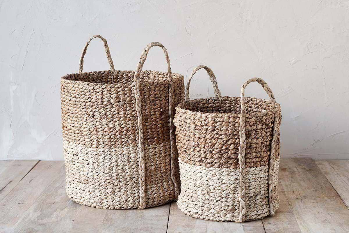
Handwoven grey basket plaque: Softens echoey spaces. The Nkomi Basket is one option which shows how a tactile natural fibre works against a painted wall.
| Material | Texture | Best Placement |
|---|---|---|
| Stoneware | Matte, raw | Above low cabinets |
| Plaster | Chalky, light-absorbing | Bedroom wall |
| Ceramic | Ribbed, imperfect | Hallway |
| Metal | Smooth or ridged, cool | Small accents |
| Resin | Slightly reflective | Bright corner |
| Basket (woven fibre) | Soft, tactile | Echo-prone wall |
A room that formerly felt blank and unanchored now has an intended focal point, but stays soft and quiet.
There is a moment, often once furniture and walls are plainly in place, when something about the room feels unresolved. The pieces are nice, the palette is right, but the whole feels “off”, almost as if nothing grounds the space or draws the eye. Most homes miss this step because it’s tempting to stop at calm, thinking less is always better, but empty walls quickly tip from serene to dull. Addressing texture at this stage makes a lasting difference.
Making a clear decision to anchor one wall with texture, not print, not new colour, keeps things simple but makes the rest of the room feel thought out. Often, one plaque with a tactile finish is enough.
The most common problem is hanging a plaque that is too small or too similar to the wall, making it disappear instead of adding weight. Some rooms stack small pieces or overfill shelves, trying to create interest, but this leads to noise and a cluttered look. The room doesn’t feel better; it feels busier.
Once you pick the right scale and surface, the wall reads as finished and the whole room looks calmer. The difference becomes obvious every day.
Save this idea for later.
What tends to hold up with texture for neutral rooms
From seeing many projects and reader photos, texture stands out as the safest way to keep neutral rooms from falling flat. Professional reviewers point to matte and hand-finished surfaces, especially plaster or hand-thrown ceramic, as the choices that seem to age best, staying steady as trends shift. Matte finishes get recommended again and again for areas with sunlight, since they diffuse glare and keep the mood gentle. In nearly every case, a single, well-placed tactile plaque holds attention better than a wall filled with prints or frames. It lets the room stay both quiet and visually interesting.
, Mara, Loom & Glow
Common questions
Why does a grey wall plaque work in a calm space?
A grey wall plaque gives subtle interest without calling attention to itself, making it an ideal choice for a room where calm matters most. Texture and gentle contrast keep monochrome walls from looking blank or unfinished.
How do I choose the right material for my grey wall plaque?
Plaster has a matte finish that diffuses light softly and doesn’t reflect, so it keeps things quiet.
Where does a grey wall plaque work best?
A grey wall plaque works best in living rooms or bedrooms where neutral tones risk becoming flat. Plaques break up sameness and make soft spaces feel more layered.
What’s the problem with adding colour in a neutral room?
Adding a bold or colourful accent to a neutral room can disrupt the calm and make the palette feel cluttered. Texture in grey lets you keep focus without introducing noise.
Explore more calm combinations inside our Shop The Look .
Shop the Look
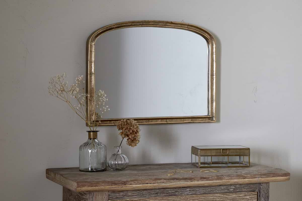
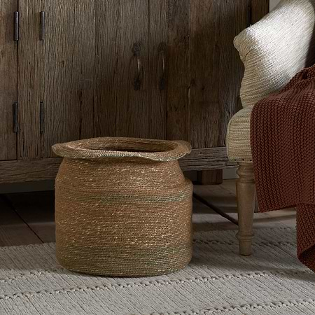
A few Nkuku pieces that layer quiet texture around a grey wall plaque.
Some links above are affiliate links. If you buy through them we may earn a small commission at no extra cost to you. We only suggest pieces we think fit a calm, lived-in home.
Free guide
The Calm Shelf
12 styling ideas to help you compose calm, balanced shelves in natural texture homes.