

A farrow and ball north facing room can feel chilly or flat, even with tidy furnishing. The cool light from a north window often mutes colour and exaggerates any undertone, making some shades look dull or harsh. Many renters and owners live with this and feel stuck, especially when old paint choices linger or daylight is short.
If you need a room to feel more inviting, choosing the right paint colour can make a real difference. Today, you’ll find what to pick, what to avoid, and exactly how to test farrow and ball colours in your own space. This works especially well for a small bedroom with low natural light when you want to keep things calm because a warmer tone helps soften shadows and brings focus to your favourite piece.
The short version: Farrow and ball north facing room colours work best when you pick warm undertones and test them in real daylight to avoid a cold look. Warm neutrals and subtle darker shades create calm where morning light never brightens the walls. One small shift in paint colour changes how a whole room feels.
Key takeaways
- A farrow and ball north facing room always reads cooler than a south-facing one, so warm paint shades work better.
- Paint colours with a yellow or red base soften cool daylight and prevent a room from looking blue or flat.
- Skimming Stone and Charleston Gray are recommended warm neutrals for north-facing rooms, according to Rintoul Holt.
- Large colour test patches are more reliable than small cards in a low-light space.
- Natural textures and limited palettes keep north rooms from looking busy or crowded.

The north-facing light problem: cool shadows, warm undertones
A north-facing room receives mostly indirect, cool daylight, which makes many paint colours appear colder than expected. Using paint with yellow or red undertones helps these spaces feel less bleak.
Morning or evening, a bedroom facing north never quite catches the sun. Clothes look duller, and white walls turn greyish, even with the lights on. Nothing feels sharp or warm.
Colour plays differently here than in other rooms. Any blue, green, or even purple undertone jumps forward, making the space look more severe. Instead of a gentle neutral, you might see walls that look faintly clinical. Warmth in paint is not just about shade; it is about how the pigment responds to this kind of light.
Choosing a paint with a yellow, pink, or soft brown base can cut through those blue shadows. A surface that picks up a little warmth feels more restful and less stark. Pale neutrals from Farrow and Ball marked as warm, or any shade with a hint of red or ochre, often look right.
Unlike a south-facing room, which flatters most neutrals, a north window makes a cool grey harsh; a cream or warmer sand shade brings out depth and texture in bedding, curtains, and rugs.
Testing paint swatches on all four walls helps you see which colours hold up against the flat, cool northern daylight.
How do you choose warm neutrals for a north-facing room?
Warm neutral paint for a north-facing room usually has a touch of yellow or red in the base, which stops the walls from looking cold. These shades create a gentle background that softens everything in view.
A common worry is that anything beige will feel dated, or a true taupe will verge on brown. Farrow and Ball names like Skimming Stone or Charleston Gray are widely recommended because their hint of warm pink or yellow balances cold daylight, according to Rintoul Holt. These shades never turn purple or blue as the day goes on.
Every surface in the room reflects a little light, so something with a red base (like a clay bowl) brings more comfort to the eyes. If you go lighter, choose a cream or putty. Darker neutrals, with a bit of brown or brick in them, can keep the room grounded even when the weather outside is grey.
Compared to pure greys, warm neutrals have a depth that changes only subtly as the daylight shifts. A throw in natural linen or a jute rug looks more at home against these backgrounds.
To catch the nuance, paint two large patches: one near the window and one in the darkest spot. Wait until daylight is at its weakest; that’s when you’ll notice if a shade feels too cool.
How to test paint colours in a north-facing room
Testing paint colours in a north-facing room means painting large sample squares on two walls and observing at morning, noon, and dusk. Small colour cards will not show true results in dim light.
Ordering free colour cards from Farrow and Ball is a good first step, but the paper swatches rarely match the painted wall. North-facing rooms need a bigger test to account for flat daylight and changing weather.
Paint one patch near the window, another in the farthest corner. Use two coats for accuracy. Three times a day, morning, midday, and evening, notice if the colour holds warmth or if it seems to retreat.
Unlike bright rooms, this approach helps prevent surprises. Pale tan might vanish entirely while a dark, warm grey shows up richer. Choosing a time when the sky is overcast can further test whether the shade goes muddy or stays soft.
| Test Method | What You See | Practical Tip |
|---|---|---|
| Colour card | Small area, easy to misjudge undertone | Good for initial sorting |
| Large wall patch | True to finished look, shows undertones | Always use in main rooms |
| Test at three times | Checks for unexpected coolness | Essential for north-facing spaces |
Testing this way takes a bit more time, but a farrow and ball north facing room always rewards careful sampling over quick guesses.
Where this works best
North-facing colours work best in bedrooms, living rooms, and home offices where natural light is weak and you want a soft, restful feel. These tones can change how you experience the space each day.
A small den or bedroom cut off from sunlight often feels smaller than it is. Warm Farrow and Ball shades suit any room that risks feeling closed-in or dim, especially where you read, sleep, or take quiet time. Even a hallway with one north window can benefit from a gentle neutral or darker warm grey on the walls.
Bedrooms see the biggest shift. A cooler paint can wake you with blue light, but Skimming Stone or Charleston Gray makes textiles stand out and reduces the glare from artificial bulbs.
Avoid using a pure white or blue-grey in sitting areas with a north aspect. These colours look pale and flat, exaggerating every hard edge in the room. Instead, use a soft warm shade, then layer in a natural-texture throw or wooden tray to add weight and comfort.
Warm neutrals also hold up well in rooms where storage pieces sit against the wall. Baskets, boxes, and open shelves all look less stark when backed by these colours. The effect is far from dramatic, the edges soften and the room seems steadier.

What to avoid in a north-facing room
Avoid cool whites, clean greys, and any shade with a blue or green undertone in north-facing rooms, as they make the space colder and less inviting. Warm-based colours give much better results.
Pale whites might look crisp in a sunny kitchen, but in the cool light of a north window, they show every shadow and mark. Any colour with a blue undertone can make your bedspread or art look washed-out or starkly modern, which rarely suits a lived-in room.
Greys with even a hint of green or blue create a distance from soft textures. Unlike a linen in a wheat shade, a greyed-out background can feel flat, especially by morning.
Columns or trim painted in the same cold white as the ceiling pull the eye away from objects in the room, making clutter stand out. A warmer base, even for these details, helps keep the feel more measured and unified.
Compared to living rooms with west sun, a farrow and ball north facing room loses depth if the colours are too sharply cool. Neutral palettes that veer toward taupe, sand, or muted yellow reflect light more gently.
If you can, avoid using more than two strong accent shades in such a space. Keeping the palette simple lets soft surfaces and handcrafted objects become the focus.
Styling and placement
Styling a north-facing room with warm paint starts by limiting your palette and repeating natural textures for a collected look. Wood, linen, and woven baskets work especially well against these backgrounds.
When the walls are soft and slightly warm, every surface, wooden side table, seeded glass vase, stands out without looking busy. Avoid crowding with too many bright cushions or artwork. One quietly textured piece, like a wool throw, anchors a low bed or lounge chair.
Placement matters. A large rug with browns or muted gold shades grounds the room. Bookshelves look softer with a jute basket in view or with the books grouped in small clusters. Using fewer colours but richer materials is the best way to avoid a cluttered feeling.
A neutral, calm living space works best when shelves and surfaces repeat just one or two textures.
Quick calm checklist:
- Stick to one warm neutral on the walls and repeat the same two wood tones in furniture.
- Choose plain linen curtains or shades instead of printed fabric for softness along the window.
- Leave at least half of every shelf surface empty to avoid looking crowded.
- Keep all accent objects in soft shapes, like shallow clay bowls or round baskets.
- Limit bright accent textiles (for example, no more than one colourful cushion per armchair).
Main surfaces in a farrow and ball north facing room work best when you use understated, textured pieces and keep display objects to a small, edited group.
Are there alternatives to Farrow and Ball?
Other paint brands offer warm neutrals and gentle blues that work in north-facing rooms, including Little Greene’s Smalt. Always check undertone and try a sample beside your intended fabric and wood colours.
Little Greene is often mentioned alongside Farrow and Ball for north-facing rooms. Smalt, from their range, gives a deep blue-grey that stays warm enough by day, according to Rintoul Holt. Fired Earth and Dulux also have gentle neutrals but tend to feel a little creamier, which may fit older buildings or period features.
When testing brands, always compare a small area of your main shade against the other surfaces in the room. Painted samples side-by-side are often more revealing than catalogue images.
Unlike Farrow and Ball, which uses a chalky, matte finish, other brands may have a slight sheen. For north-facing rooms, a matte finish is less reflective and looks better beside textured textiles. A cosier room comes from picking finishes and colours that read warm, not just in paint but in every object that sits in the daylight.
When one paint feels “off” beside your favourite oak chair, try the next warmest swatch. Three or four attempts are common before the right balance appears.
Sometimes you stand back and realise the wall colour almost works, but the room feels incomplete or unsettled. This happens more in north-facing rooms, where the light changes everything once furniture moves in. The turning point comes when you focus on one or two anchor pieces and let the rest of the space go quiet, choosing a single, trusted paint, or repeating a calm texture, until the eye has somewhere to land.
The consistent result reported by reviewers and decorators is that Skimming Stone and Charleston Gray from Farrow and Ball hold their warmth through dull afternoons and in artificial light at night, fixing the flatness many rooms develop. Choosing a matte finish also draws less attention to the paint itself and more to the things you love, fabric, baskets, even the grain of a simple oak table. Details like these hint at calm without cluttering the view.
Mara, Loom & Glow
Common questions
What colour should I paint my east facing bedroom?
Soft blushes, gentle yellows, and off-whites with a warm base are best for east facing bedrooms. Morning light is cool but quickly warms, so staying away from pure greys and bright whites helps the room feel welcoming. Always test your colour in both early and late daylight before deciding.
What are the most popular Farrow and Ball colours?
Skimming Stone, Charleston Gray, and Cornforth White are among the most popular Farrow and Ball colours. Their subtle undertones fit a wide range of rooms and offer a calm, settled feel. These shades work well alone or as backdrops for warmer accent pieces and simple textures.
What colours are good for small bedrooms?
Warm neutrals, soft blushes, or gentle greys are good choices for small bedrooms. Light paint makes a room seem bigger, but a touch of warmth in the shade keeps the space from looking flat. Textured bedding and fewer decorative items also help relax the eye.
What are the trendy bedroom colours for 2026?
Earthy pinks, muted greens, and gentle tan shades are expected to be trendy bedroom colours for 2026. Soft, undramatic contrasts and calm background tones will stay popular as people choose more relaxed, natural finishes. The trend is moving away from sharp whites and very cool blues.
Explore more calm combinations inside our Shop The Look .
Shop the Look
A few warm, low-level pieces that suit a north-facing room.
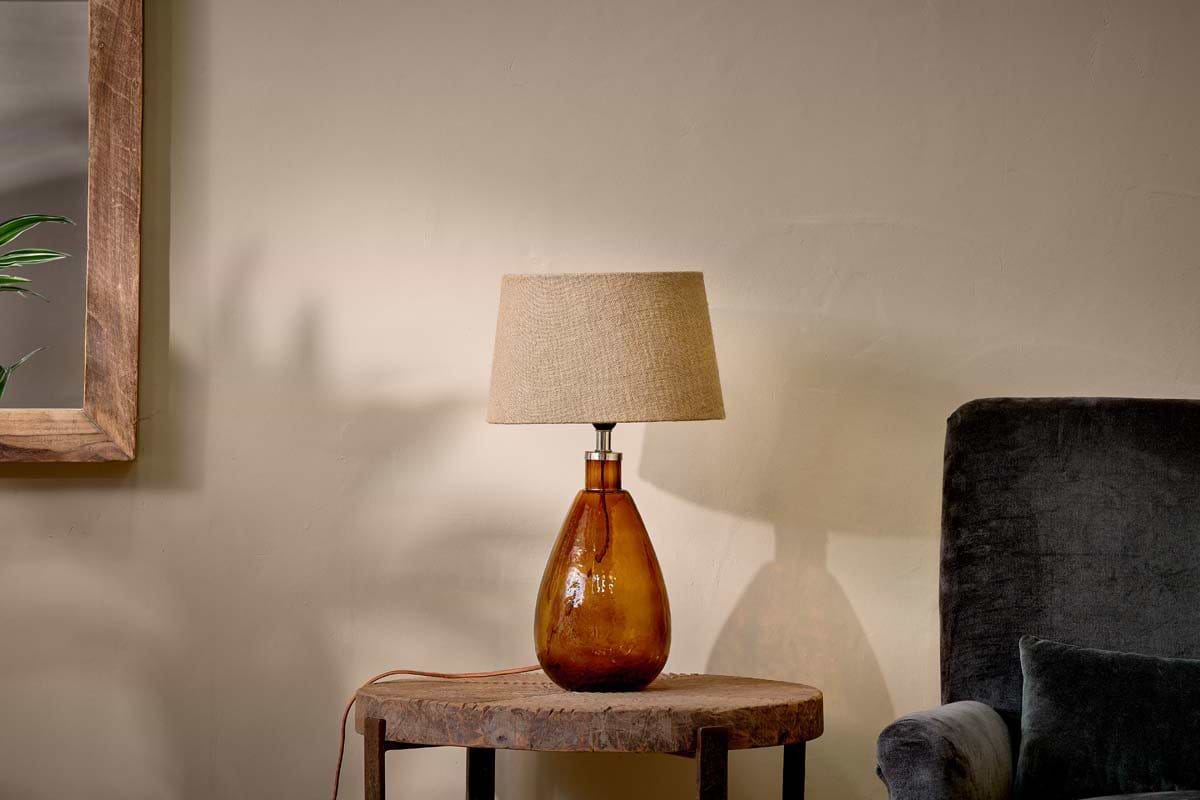
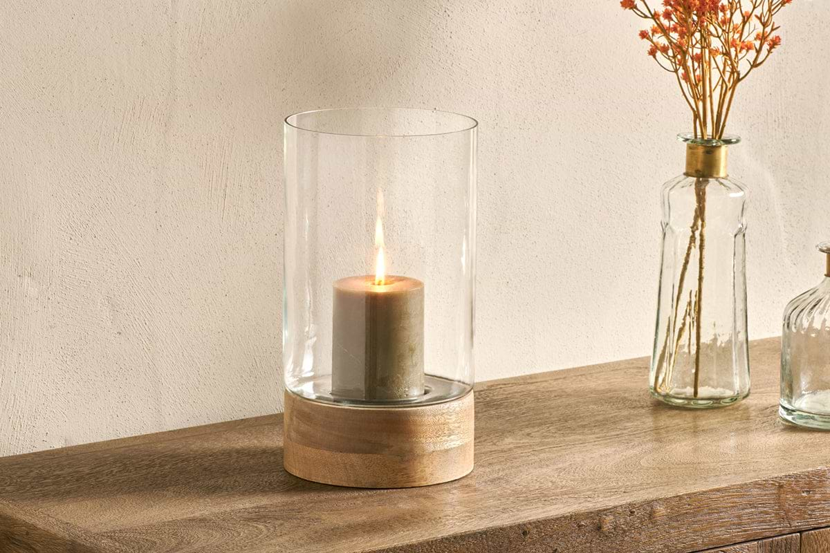
Idha Hurricane Lantern
Straight-sided glass, for candles indoors or sheltered patios.
View at Nkuku →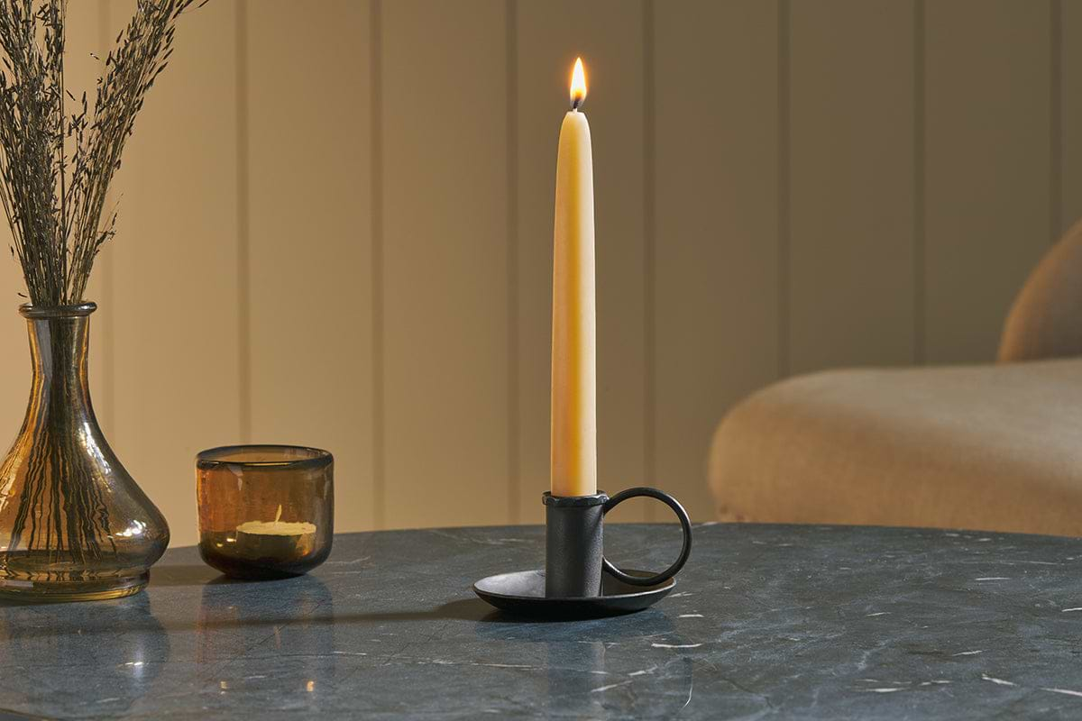
Amri Iron Candlestick
Slender iron with quiet presence, works alone or in clusters of three.
View at Nkuku →Some links above are affiliate links. If you buy through them we may earn a small commission at no extra cost to you. We only suggest pieces we think fit a calm, lived-in home.
Free guide
The Calm Shelf
12 styling ideas to help you compose calm, balanced shelves in natural texture homes.