

Several rooms feel heavy during late afternoon or just before the sun comes up. Streamlined storage can only do so much when the corners stay shadowy or the ceiling throws a harsh glare. Many guides talk about lamps and bulbs, but most do not explain how dark light design solves the real problem: the mix of shadow and brightness, not just more light everywhere.
Today, you will learn how to use dark light design at home without buying a bag of new lamps. You will see what to remove, what to rearrange, and how to make natural surfaces work for you. This works especially well in a small sitting room when low light collects in the corners because too much brightness in one spot makes the rest feel even more closed in.
The short version: Dark light design means balancing areas of gentle shadow with points of brightness to avoid a harsh or flat look in your home. Instead of piling on lamps, use natural materials and strategic placement to make your space feel calm and purposeful.
Key takeaways
- Dark light design for homes creates calm by blending soft shadows and focused highlights.
- Natural materials like light oak and linen help bounce ambient light without glare.
- One reflective surface works better than several smaller lights for layering brightness.
- Matching wall and light colors often leads to a flat look rather than a relaxed mood.
- Simple moves like shifting a mirror or choosing sheer curtains change the whole feel of a space.
- Is dark light design just for commercial spaces?
- Where this works best
- How do you balance brightness and shadow in a small room?
- Styling and placement
- Why does a single reflective surface help more than extra lights?
- What materials actually pull light forward?
- How to avoid a heavy or gloomy look with natural palettes

Is dark light design just for commercial spaces?
Dark light design is practiced by companies like Darklight Design in large buildings, but the method suits homes just as well. You do not need specialist fixtures to put these ideas to work.
The term “dark light design” usually brings up commercial projects or office buildings, since Dark Light Design (an architectural practice) brings this approach to big spaces. Yet, the technique adapts easily in a flat or cottage where bulbs alone often leave corners harsh or dim.
In most homes, simple choices make the difference: the position of a linen curtain, the angle of a mirror, the use of a low glazed bowl on a plain table. These choices use the same principles that bigger projects follow, soft contrast, not constant brightness everywhere.
The main contrast is that offices hide their light sources and focus on visual comfort for many people at once. At home, the aim is visual rest, the kind that sinks in after work or sets a mood for an early morning. A paper lantern in a bedroom and a brushed metal sconce in a lobby both rely on the same core idea, directing brightness where you want it, never everywhere at once. Place a single linen lamp near the seating area and the rest of the room falls gently to shadow, making fabrics and walls feel relaxed rather than stark. The approach fits best in lived-in spaces where flat, harsh light only brings out dust and clutter.
Where this works best
Dark light design works best in rooms with awkward corners, low ceilings or a mix of daylight and shadow; these spaces need balance, not extra brightness. Use the natural structure of the room to set where you want the eye to land.
Bedrooms with boxy wardrobes, living rooms with deep window sills, and small kitchens without much daylight all benefit. A home office in a spare room, especially one with one or two smaller windows, often feels flat if lit up wall to wall. Instead, a glass lamp by the desk and a woven basket under a shelf invite attention in different ways.
In daily use, moving a small table lamp to the back corner, or running a length of sheer linen along the window, makes a clear change. Light collects softly where you sit, while frames and ceramics catch flecks of daylight. A dull alcove can be lifted just by resting a single piece of pale oak to pull out the ambient light that is there.
Avoid treating open-plan spaces the same way as smaller enclosed rooms. Matching the same type of lamp and brightness everywhere can make a flat, lifeless tone, especially if your furniture is all in similar colours. Instead of a box store solution, wall-to-wall downlights, focus on spacing objects and light sources so that each zone holds its own warmth and shadow. Place a mirror opposite a window or pick up surface shine with a clay vase near your reading chair; this lightens a dark area more than switching on a new bulb.
How do you balance brightness and shadow in a small room?
Balancing brightness and shadow in a small room means using focused highlights and letting some areas fall gently into quiet. This changes the feel from cluttered to calm with no need for bright overhead fixtures.
In apartments or narrow bedrooms, too many bright points destroy the feel of rest. If the lamp lights up everything, the result is flat and often draws attention to storage piles or wall marks you want to hide, not show. Bringing in a softly woven lampshade near a reading chair or angling a mirror across from a window creates a clear focal point, letting the rest fade gently into shadow.
A good rule of thumb is that a room works best when the main source of brightness sits offset from the centre, giving the walls and shelves a place to recede. This depth is lost when every lamp sits at the same height or brightness. Unlike simple layer-upon-layer lighting guides, households with children or shared work spaces need flexible shade and bounce, not more glow.
Compared to rooms that blast light evenly, these spaces feel more pleasant because the focus rests on softer transitions. A bare bulb in a hall leaves the corners forgotten, but a shaded lamp by a shoe rack or a light oak bench creates soft pools. Open shelves are no longer hard-edged, and even old parquet surfaces look cared for. Place the lamp so it points across the busiest part of the room, and let a single bare wall carry shadow to put the focus on what matters.
Styling and placement
Styling and placement in dark light design is about simple groupings: a reflective tray on a sideboard, linen at the window, or a single plant by the wall. The trick is to limit visual noise.
To style a room for calm, group objects to pull eye movement naturally, not force it. Place glass, pale wood or glazed surfaces near the main light. Use linen to soften bright sources and avoid hard plastics that catch the eye. Keep storage baskets low and use open tops to catch any ambient glow.
Pile-ons rarely work. One clay bowl on a bench does more than three stacked side tables. Instead of matching all patterns or wood tones, mix one bold surface with quieter areas. A jute rug with a weak stripe sits well with natural linen, but not next to a patterned lampshade, keeping the palette grounded. If the room is mostly white and pale, use a small bit of black or dark brown: a candleholder or a slate tray. This anchors the eye and keeps the light from feeling washed out.
Quick calm checklist:
- Pick one main focal surface (like a sideboard, bench or mantel) and limit display to three items.
- Use natural fibres, linen, wool, jute, to filter or scatter light softly.
- Mix one reflective surface (glass, lightly brushed metal) with mostly matte woods or ceramics.
- Keep about two-thirds of each shelf, bench or table empty for breathing room.
- Restrict colours to two main base tones, plus one accent (clay, oak, pale grey work for many).
By following the simple trick of working with a tight group then giving empty space around it, the room reads as steady and not busy. In rooms that get used all day, place the main source of brightness near where you first come in, so the shift from shadow to light feels gentle. In a rental, a thin linen curtain, a runner of light wood and one well-placed mirror can all be rolled back or shifted if needed.

Why does a single reflective surface help more than extra lights?
A single reflective surface, like a mirror or shined metal tray, bounces existing light and deepens shadows, making contrast feel intentional. This often looks better than scattering many smaller lights around.
Consider a console in the hallway: standing a mirror in line with the window does more for brightness than setting up several lamps. The difference is that reflective surfaces pull and spread what light is already there, filling dark corners in a way that even a strong bulb cannot. Mirrors, glass bowls, or smooth ceramics placed across from windows or lamps create small flashes of light that move with the time of day.
Unlike adding a row of plug-in lights, which can tangle shelving and draw the eye to cords, a mirror works in silence, no heat, no extra power needed. A brushed steel tray on an oak console or a ribbed glass vase in the corner achieves the same thing. The result is that light seems more natural and the room avoids the cluttered look of stacked lights. Place your main reflective piece where the natural or lamp light already collects, not opposite a blank wall. The space deepens without feeling closed-in, and everyday items, shoes, keys, even a pile of books, catch some of that easy brightness.
| Reflective Surface | Single Lamp | Multiple Lamps |
|---|---|---|
| Natural bounce | Direct, fixed light | Overbright, less contrast |
| No wires needed | Needs power/placement | More visible hardware |
| Avoids glare | Prone to harsh spots | Flat, scattered look |
This approach works especially well in a narrow hallway, a galley kitchen, or a tight sitting room, making the area feel open and lived-in rather than busy with equipment.
What materials actually pull light forward?
Materials that pull light forward include light oak, pale linen, washed cotton, and soft ceramics because they reflect and diffuse brightness without gleam. These surface types highlight shadow and texture.
A set of shelves made from light oak shelves often brighten a low-light corner without the coldness that metal or glass alone bring. Oak has an open grain, so daylight, even if faint, spreads across it and seems to deepen both highlights and shadows.
Linen, especially unbleached, catches sun or lamplight with a soft, even glow. Hanging linen curtains or using a natural linen runner on a table will draw out what light is already present while gently breaking up hard contrast. Compared to polyester or tight-weave cotton, which can read as flat or shiny, linen both filters and scatters light. A soft ceramic bowl or an untreated stone tray works the same way. Place them on shelves to catch glimmers from nearby glass without catching a hard shine.
Unlike dark shiny woods or thick velvets, which can pull a room down, sticking with these materials helps the space feel lighter and more open. If your space does run to heavier wood or thick rug, balance it by stacking a linen cushion or letting a single unglazed ceramic piece sit in the direct line of a lamp. Use these natural surfaces to break up long stretches of sameness and to keep the feeling relaxed.
A room with mostly light-reflecting materials needs fewer intense lighting sources, and keeps morning and evening transition smooth. Place soft textiles or bare pale wood in the main “landing zone” for the eye (the first place you look as you enter) and shadows around the rest will read as gentle, not severe.
How to avoid a heavy or gloomy look with natural palettes
Avoiding a heavy or gloomy look starts with cutting down on too many dark or similar-toned surfaces and opening sightlines with gaps. Room for shadow makes the rest of the color come alive.
In rooms where walls, curtains or floors all share similar dark shades, shadow can make the whole setting feel smaller and more closed in. Remove dense, dark textiles that block what light comes in, trade thick blackout curtains for a layer of pale linen. If the palette is too matchy, there is nothing to break up the block, which feels visually heavy. Bringing in one or two lighter elements, a pale stool, a cream clay pot, a thin glass lamp, draws the eye and breaks up the mass.
Unlike open white spaces, all-dark palettes need contrast to show off their strengths. Even a small surface in light oak turns shadow from gloom into depth, especially beside matte-black or navy blue walls. For renters who cannot paint, this means swapping in loose runners and moveable pieces that brighten pockets without breaking up the whole scheme. See more in dark bedroom ideas for easy rental swaps that gently filter light.
If you have a soft grey wall, a single warm brown basket, and a pale wool throw, the trio softens the impact and keeps the space open. You do not need to add white everywhere, just one lighter accent does the job. Leaving shelves partly bare and using negative space helps ambient brightness stand out against natural tones. Place lighter accents at eye level for the strongest effect, and group the rest loosely to let light and shadow bring focus without visual noise.
A moment comes when the room feels busy or somehow “off”, when every surface seems to compete, or when shadows gather in corners that feel overlooked. The eye bounces from lamp to lamp or shelf to shelf, never resting. This is usually the point where most homes get stuck: a sense of visual noise, not calm.
The practical shift is to pick one main focal point for brightness, clear visual clutter around it, and use only one surface to reflect or scatter that light. Once you try this, the room softens; clutter disappears into gentle shadow while textures stand out quietly.
Many homes make the mistake of adding more and more lamps or using bright, harsh bulbs in every corner, hoping to fix darkness. Instead, this often creates a busy look, throws uneven highlights on walls, and makes small spaces feel noisy. Rooms read as unfinished or oddly heavy, even after tidy-up time. Set aside the urge to add: let empty space and soft materials do the work. Once the right balance is found, the main living area feels calmer, focused, and easy to relax into. Save this idea for later.
Why some choices last in lighting and styling
Some materials and arrangements work year after year because they fit with how real houses are actually lived in. Reviewers time and again praise linen and open-grained wood for staying good-looking even as light changes with the seasons. Decorators often recommend matte finishes on shelving or window ledges, since glossy surfaces can catch glare and feel harsh, especially in rooms with variable daylight.
Both homes and small shops benefit from spacing out reflective pieces rather than clustering them, which matches a pattern professionals see in calm, residential spaces. Neutral natural materials mute clutter and help small rooms feel controlled without looking empty. Placement, not bulk or cost, makes the difference for most people over the long run.
Mara, Loom & Glow
Common questions
Do you need special fixtures for dark light design at home?
No. The approach relies on placement rather than equipment: one warm light source, a reflective surface such as a mirror or a metal tray to carry it, and calm materials around it. The lamps and bulbs you already own are usually enough to try it.
Which rooms suit dark light design best?
Rooms with awkward corners, low ceilings or a mix of daylight and shadow, such as narrow bedrooms, living rooms with deep window sills and small hallways. These spaces gain more from balance than from extra brightness.
Will adding more lamps fix a dark room?
Often it makes things worse. Lamps or bright bulbs in every corner throw uneven highlights on the walls and make a small room feel busy. One well-placed light, with the clutter cleared from around it, usually gives a calmer result.
How do you stop a dark colour scheme from feeling gloomy?
Avoid letting walls, curtains and floors share the same dark shade, and leave gaps that open up sightlines. Pale, matte materials such as light oak, linen and washed cotton reflect light softly without glare, so the darker areas read as intentional rather than heavy.
Explore more calm combinations inside our Shop The Look .
Shop the Look
A few Nkuku pieces that work beautifully in a darker, layered room.
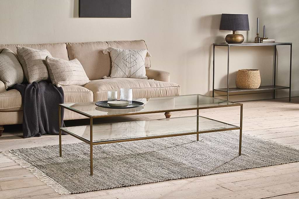
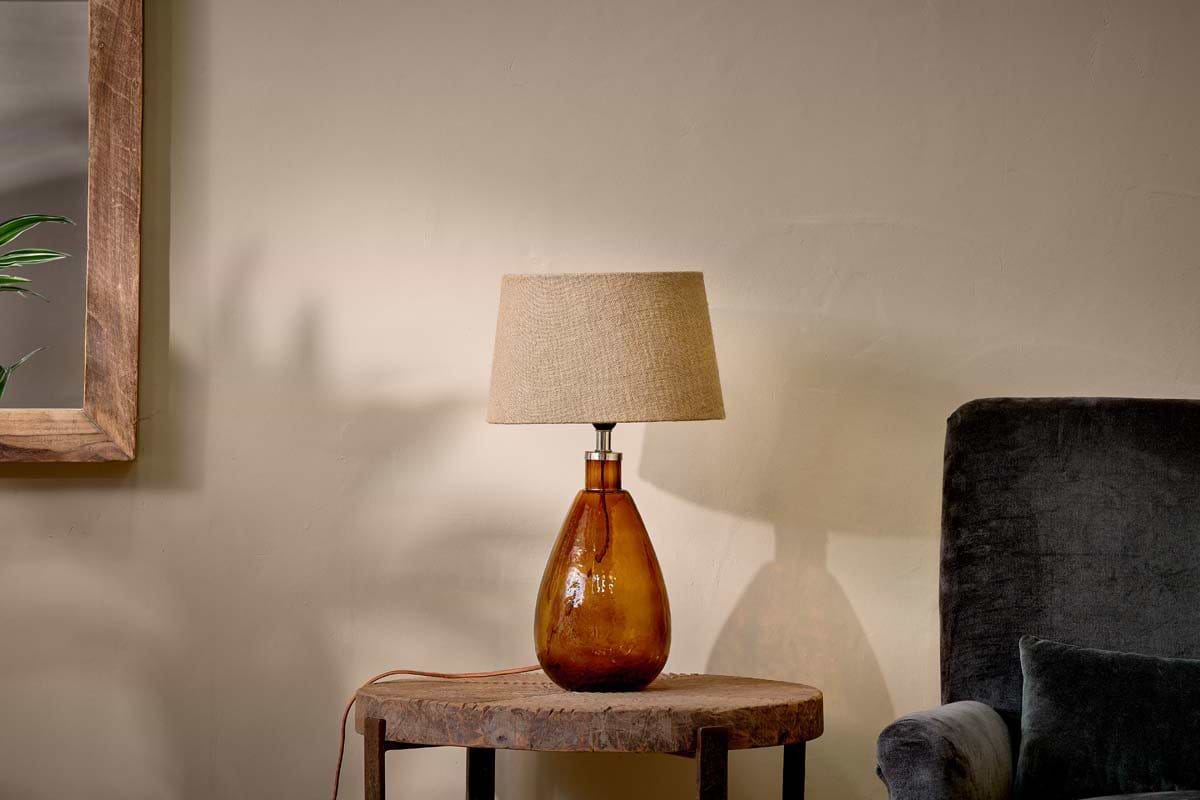
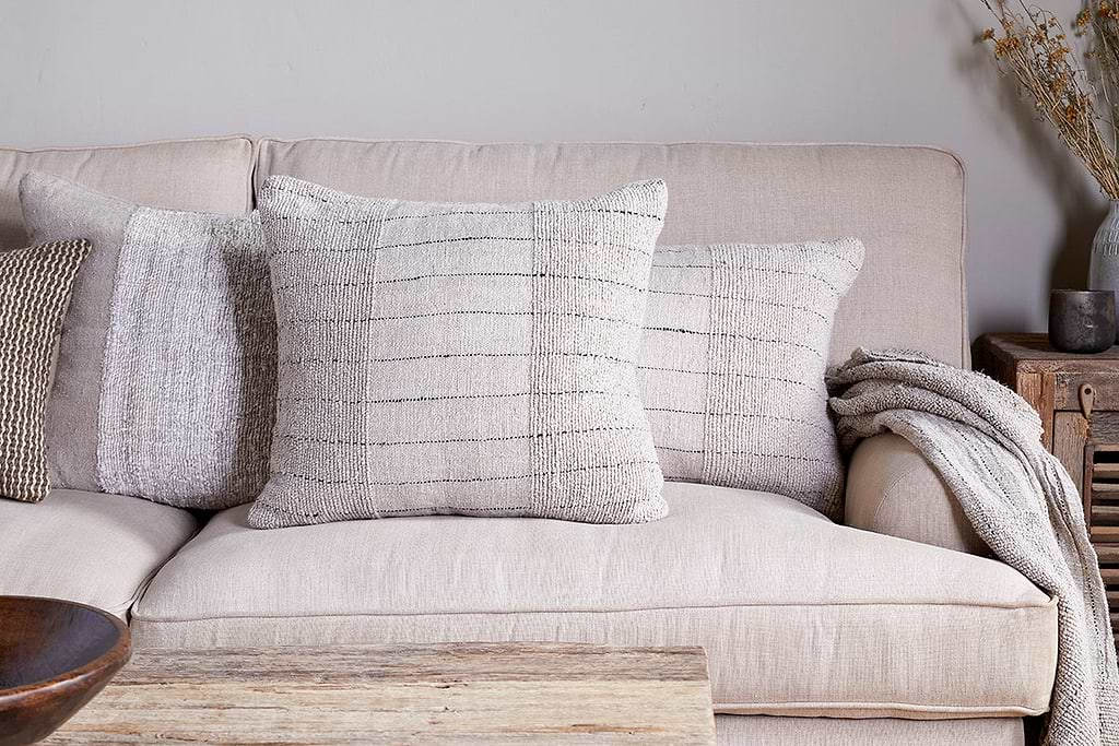
Mayla Cushion Cover
Soft hand-textured cover, instant warmth on linen sofas or chairs.
View at Nkuku →Some links above are affiliate links. If you buy through them we may earn a small commission at no extra cost to you. We only suggest pieces we think fit a calm, lived-in home.
Free guide
The Calm Shelf
12 styling ideas to help you compose calm, balanced shelves in natural texture homes.