

Awkward alcoves, too-short windows, and old radiators can make it hard to get a room to feel pulled together. When you try to create a dark eco mood, the details matter even more—jars and stray cables show up sharply, and flat walls swallow up daylight. Many end up with a space that feels more like a storage room than a retreat.
This is about using what you already have, removing what distracts, and choosing the right touch of natural materials. Today, you will learn which elements to strip away, how to pick and place what stays, and what makes the difference. This works especially well for a small living room with low light when you simplify the palette and bring in soft textures because the space reads warmer and more finished.
The short version: A dark eco room uses moody colours and raw materials like wood, stone, and linen to make a restful, grounded home. Thoughtful choices in colour and texture help plain spaces feel intentional and relaxed. Small changes to palette and placement keep the mood calm instead of heavy.
Key takeaways
- A dark eco room always needs balance between deep tones and natural texture.
- Linen, jute, reclaimed wood, and stone soften a dark palette and catch the eye without clutter.
- Low, warm lighting stops a moody room from looking cold.
- Reflective surfaces like matte ceramics can subtly break up heavy areas.
- Most floating shelves in dark eco spaces leave at least two-thirds clear for airiness.

What is a dark eco interior and why does it work?
A dark eco interior layers earthy colours and natural materials to create a strong but gentle mood. Solid woods, honest textiles, and muted stone ground the space while giving it warmth.
People often try moody walls or dark furniture thinking it will feel sophisticated, but without balance, the results become boxy or stark. A dark eco look blends practical elements: deep green, charcoal, and umber next to the real feel of linen, wool, and raw timber. The room feels calm but lived-in, not staged.
In a long, narrow hallway, a single bench in unfinished wood softens hard lines. A slate-grey wall behind it lets the grain show through, pulling the eye while staying purposeful. The difference is texture; a plain painted wall looks flat compared to one hung with a woven basket or a small clay pot with trailing thyme.
Unlike a trend based only on colour, dark eco is grounded in materials that keep comfort at the centre. Deep shades paired with tactile surfaces stop things feeling closed off. A ceramic dish on a shelf quiets the look where rows of glasses would fight for attention.
The whole approach is creditable to how DARK ECO LTD defines the style: solid, natural basics with deep, toned-down colours that stay restful as the light changes across a day.
How do you pick the best dark colours for a calming mood?
Dark eco colour palettes use paints and textiles that are muted rather than jet-black. Deep green, warm charcoal, and soil-brown make a room feel steady, not cold.
When rooms have little natural light, standard black or navy can cast shadows that look blue-grey or flat. Instead, using greens mixed with sand, or off-black with red or brown undertones, pulls warmth from even northern-facing windows. Most eco brands recommend starting with a mid-depth shade tested on one area and checking it at both midday and dusk to avoid sudden surprises.
If you grab a standard tester and paint a whole wall quickly, you risk the space feeling more “cave-like” than inviting. Instead, one panel painted with a dark yet warm hue lets you see how fabrics and woods behave beside it. A velvet cushion in peat or bark colours will soften the impact more than a crisp navy.
Compared to high-contrast trends, rooms stay gentler when the palette stays to three or so hues, each in slightly different textures (a painted dado, woollen rug, matte plant pot). Most designers suggest the largest areas—walls and the biggest furniture—stay in the richest shade, with paler, natural materials as breaks.
This pattern holds up best for renters working with existing floors, since it’s less jarring than painting every surface and lets the space change as tenants come and go.
Essential natural materials for a moody space
A dark eco room works best when you pick sturdy natural materials like reclaimed wood and linen that keep the look relaxed and never plastic.
Raw and reclaimed wood is the real anchor. An open-grain shelf or coffee table wears in nicely, showing nicks and marks without looking worn out. Unlike laminate, which scratches to reveal white, real wood in a dark room just grows softer and less sharp with age. Even a secondhand piece with some knocks reads more welcoming than a gloss finish.
Linen, jute, and wool textiles throw light in different ways across the day. A heavy flax curtain holds its shape but stays breezy. On plain floors, a simple braided jute rug gives extra detail near a sofa or bed. Compared to synthetic mixes, these materials breathe— keeping the space from feeling stuffy, especially in smaller rooms with tighter layouts.
Stone, terracotta, and ceramic catch the eye without sparkle. A short stack of rough plates or a pot for utensils adds a little shine, but the surfaces stay soft to the touch. A bare shelf reads colder than one with even a single stone bowl to break up the expanse.
When you lean on these materials, the room takes on weight in a grounded way, with nothing feeling temporary or throwaway. The look has enough grit that it stays inviting instead of slipping into staged minimalism.
Where this works best
Dark eco interiors suit living rooms, bedrooms, or any spot with limited natural light and too many awkward angles. The approach fits best where comfort matters.
Living rooms in older flats, shared bedrooms, or small city kitchens are good ground for a moody natural look. Here, old pipes or tall radiators can break up wall space and make traditional decorating tricky. Using deep, earthy tones calms these interruptions so nothing fights for attention, and materials like raw wood and thick linen turn hard lines softer.
On a day off, moving one piece of dark-stained wood into the corner and swapping a thin curtain for a linen panel changes the mood. A rough terracotta vessel for wooden spoons replaces clattering enamel and makes a worktop feel less busy. Compared to matching sets of shiny plastic or metal, this ruffled, slow approach gives more breathing room.
Avoid placing every dark element together in the centre of a room or pushing all natural accents to the far sides. This mismatch splits the visual plane and makes the area read chopped up or unfinished. Instead, let one focal spot—like a reclaimed wood bench under the window—set the tone, with one wall treated deeper and small pottery or woven touches spaced throughout.
For more inspiration on small spaces, see dark bedroom ideas for rental-friendly tips and cosier sleep zones.

How can you keep the room from feeling heavy?
A dark eco room should feel restful, not pressing, so leave more empty space and break up deep tones with soft, matte finishes.
In many homes, the urge is to fill out a dark corner with storage or art, but this can quickly feel boxed in. If there’s a deep green wall behind the sofa, leaving the area above it spare—with just a chunky knit draped casually—lets shadows and light move naturally. A clean matte plant pot, instead of a shiny black stand, adds another layer without pulling attention to itself.
Unlike a gallery wall, which tends to shrink a room under visual clutter, a single sculptural light or hand-thrown vessel reads as deliberate. Most stylists agree it’s better to leave two-thirds of a floating shelf open than to fill it up; this prevents heavy colours from closing in, especially once the sun sets.
The effect is practical. With less crowding, household routines flow better too—no tight sidestepping around extra tables or baskets. When surfaces are easy to wipe or dust, keeping the space feeling fresh becomes emptier and simpler to maintain.
For ways to brighten a moody space, read how to lighten a dark area using subtle uplighting and off-white accents.
Styling and placement
A dark eco room comes together when every item is given space and most surfaces are left at least partly open.
Start with the largest piece— maybe a low, solid wood table or a deep wool sofa— and let it set the mood. Spread softer elements like linen throws, jute baskets or notched clay dishes through the corners and along ledges. Pull all pieces clear of the walls if possible; a bit of open floor between items makes everything feel less blocky.
Compared to the clutter of layered prints or collections, picking fewer, bolder objects in honest finishes always reads calmer. Place stools or extra seats low to the ground. A narrow room feels wider when items are grouped by tone rather than lined up in rows of contrasting colours.
Light matters too. Position table lamps so the light falls softly onto clay and wood, not just onto walls. A single lit spot near a reading chair or in a dining nook makes real use feel considered and not just for photos.
Quick calm checklist:
- Limit the main palette to three grounded shades (deep green, charcoal, warm brown)
- Leave two-thirds of shelf or tabletop surfaces clear
- Place one standout piece—bench, jug, bowl—at a natural focal line (window, entry, bed end)
- Group items by material and keep hard lines broken with textile or matte ceramic
For a helpful contrast chart, here’s a simple comparison:
| Material | Effect in Dark Eco Room | Best Placement |
|---|---|---|
| Raw/Reclaimed Wood | Adds texture and warmth | Benches, shelves, coffee tables |
| Linen/Jute/Wool | Softens hard corners and absorbs sound | Curtains, rugs, throws |
| Stone/Ceramic/Terracotta | Breaks up deep colour with weight | Pots, vessels, serving ware |
With these rules, the room feels open but anchored. Each material offers a reason for being placed where it is, not just to fill a gap.
How should you layer lighting in a dark eco room?
Layered, low lighting makes dark eco spaces feel restful instead of dim. Warm-toned lamps placed near wood or terracotta soften edges and avoid harsh pools of white.
A dark eco room comes alive at dusk. If every light is overhead, the space goes flat and detail melts away. Instead, a mix of two to three lamps—such as a linen-shaded table lamp, one ceramic sconce, and a small candle or salt lamp—lets you shift the mood as needed. Most designers agree that a single warm light source at eye level is best for evening calm, especially with deep wall colours and thick curtains.
Reflective surfaces help. A matte ceramic lamp bounces just enough of the glow around without glare; the opposite would be a glass or metal finish, which throws back too much light and flattens texture. Stone side tables or naked walnut tops will glow quietly in amber lamplight, compared to a high-gloss coffee table that reads cold.
Avoid line-of-sight to bare bulbs, which can undo a soft scheme in an instant. Shield with a woven shade or frosted glass. Test each setup across the day’s changes; natural light moves fast in autumn and winter, so a spot that feels cozy in the evening may need a little brightening at midday to keep from tipping dingy.
To dig deeper into deeper looks, see dark aesthetics and check how other textured spaces use layered light.
Many reach a point after painting, when the new wall colour settles and suddenly something is still off. The furniture looks heavier than imagined. Corners feel busy, and the storage baskets look lost against the deep background.
Often, the mistake is placing all textured pieces together or overdressing shelves. Too many small objects or unmatched tones make the room read unsettled and cluttered instead of calm. Ignoring placement and scale makes even the best materials lose their effect.
Simplifying the palette and anchoring one main piece gives the whole space a clear pause and makes each item stand out in its own right.
Save this idea for later.
What always lasts in slow, moody interiors
Rooms made with real natural materials show marks and change with time, but reviewers so often prefer them even as scratches or fading appear. Matte finishes near windows are especially reliable: decorators often suggest them because they cut harsh reflections and make deep colours look softer across a full day.
Linen and wool get better after washing, losing stiffness but staying crisp and useful. The look doesn’t rush; it’s shaped day by day, with the best pieces proving themselves through yearly seasons and changing habits. Simple hardware and grounded colours always seem to work, even when owners shift furniture or move to new homes.
Mara, Loom & Glow
Explore more calm combinations inside our Shop The Look .
Shop the Look
A few Nkuku pieces that add warmth and texture to a darker, natural room.
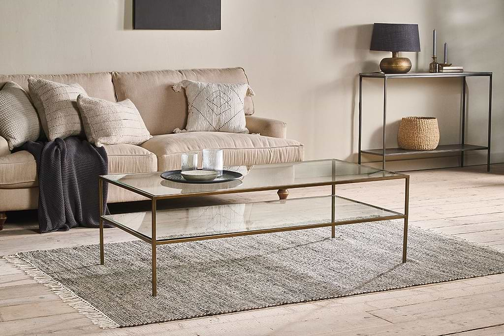
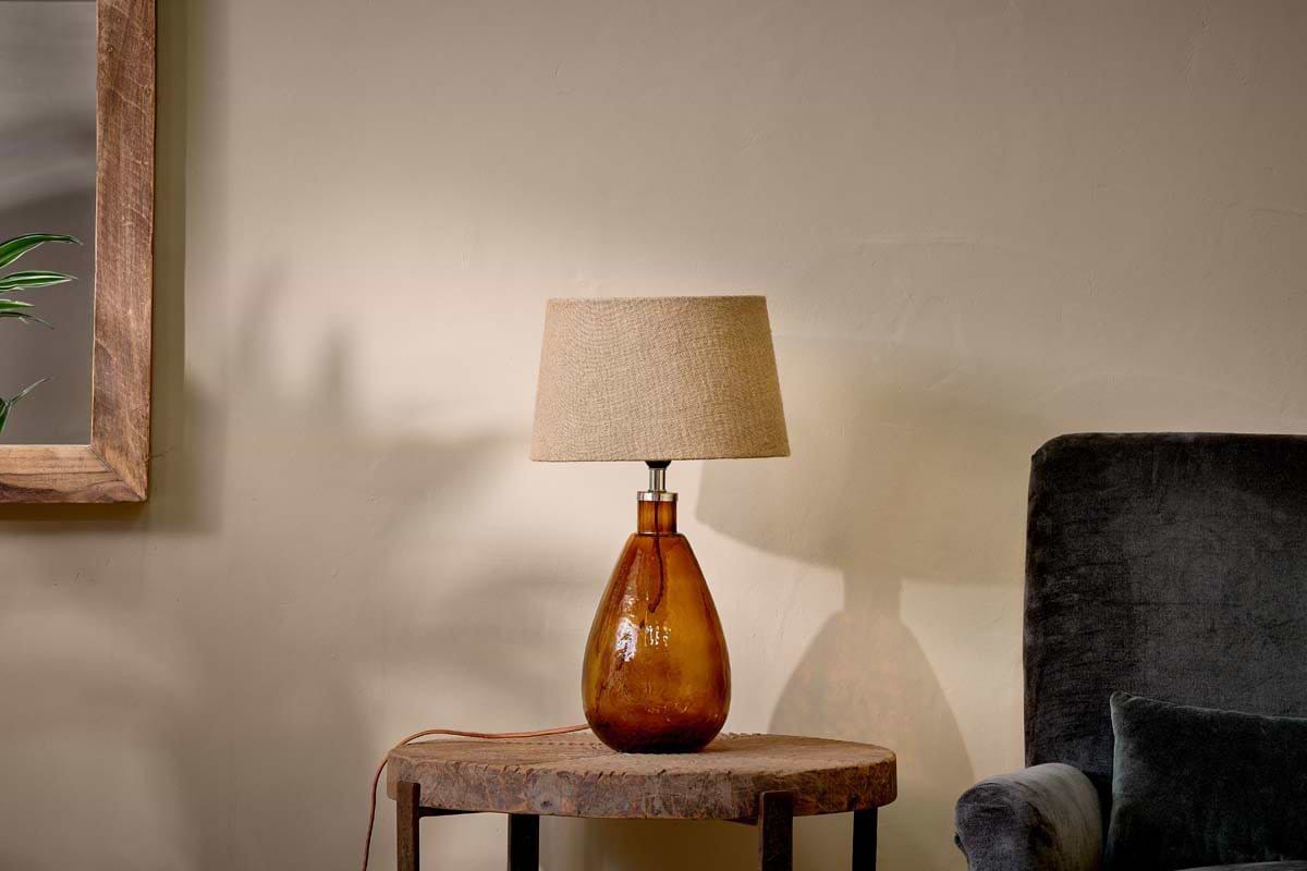
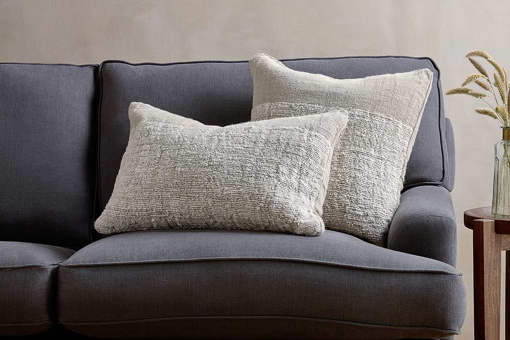
Puli Linen Cushion
Recycled linen in natural, pairs with woven textures and aged wood.
View at Nkuku →Some links above are affiliate links. If you buy through them we may earn a small commission at no extra cost to you. We only suggest pieces we think fit a calm, lived-in home.
Free guide
The Calm Shelf
12 styling ideas to help you compose calm, balanced shelves in natural texture homes.