

Many sideboard styling ideas you see online never seem to work out the same way at home. Most people end up with a surface that’s either too bare and awkward, or so crowded it collects dust and distractions. Even picking a few objects can make the whole sideboard feel lost if the rest of the space is out of sync.
This guide offers a clear method for turning any sideboard, buffet, or console from a mixed-up surface into a grounded focal point. You’ll see how to pare down, anchor a main item, repeat just one or two materials, and allow enough blank space for every piece to read. This works especially well in a small apartment hallway when you need storage without making the wall feel cramped, because a lighter touch draws the eye through the space.
The short version: Sideboard styling ideas work best when you start with one strong anchor, repeat no more than two main materials, and leave a third of the surface clear. This lets every object feel purposeful and keeps the room from looking cluttered or empty.
Key takeaways
- A sideboard that runs about two-thirds the wall’s length looks balanced and anchors a room without dominating.
- Grouping objects by material rather than color keeps the look calm and natural.
- Negative space around key decor pieces is as important as the objects themselves.
- Natural textures like wicker, linen, and matte ceramics soften heavy sideboard lines.
- Styling guidelines can turn a cluttered surface into a focal point, according to Evelyn Lily Interiors.

Why do some sideboards feel empty or cluttered?
A sideboard can look awkward when decorations are spread out without purpose or the room’s other pieces fight for attention. Consistent groupings and clear space make it feel settled.
Many sideboards start off with a row of small objects pushed to the back, hoping to fill up the length. This “lining up” makes each item feel smaller, so the whole piece fades into the wall. If you add too many things, it soon feels like a dumping ground.
On the other hand, a sideboard with only one or two items, like a single vase, tends to look cold, especially if the rest of the room is full. The problem is not the sideboard, but how its placement and decoration connect (or disconnect) to the rest of the space.
Unlike a bookcase or open shelving, a sideboard is low and horizontal. Instead of crowding the top or leaving it blank, try an arrangement with one dominant object and smaller accents grouped close. A large woven basket, for example, can ground one end, while a stack of books and a bowl carry subtle weight near the other. This makes it more intentional.
Placing a tray in the center is a simple way to break up a bare run and control smaller pieces. On most sideboards, strong verticals like a tall lamp or plant work well if there is enough blank wall above. Spread objects too far apart and the eye skips; group them and the space reads quieter. A sideboard works best when objects relate in size and spacing, and empty areas are respected.
Where this works best
Sideboard styling works best in spaces where visual traffic is low and the wall behind can frame your arrangement. Avoid blocking walkways or piling on in already busy rooms.
Sideboards, buffets, and consoles fit naturally in living rooms, behind dining tables, or along open hallway walls. Low light spots or narrow corridors are better for soft, matte finishes and lighter materials. If you have a wide, bare wall, a sideboard can anchor the visual flow, especially when the storage itself is needed for daily life.
It’s easier to create a calm focal point where background noise is minimal. A living room with a simple sofa and plain rug gives a quiet sideboard room to stand out. In dining rooms, skip the overload of bar tools and go for a small stack of ceramic plates or a tall stem arrangement, less visual clutter makes the whole zone feel easier to live with.
Avoid putting a bulky, dark sideboard in a compact space packed tight with chairs or art already on the walls. Too many focal points close together will make any surface look out of place or crowded. Hold back in tight spots and let one accent pull the weight.
How do you choose a sideboard that fits your room?
Choose a sideboard the same color depth as your walls or flooring for a softer fit, and size it to cover about two-thirds the wall’s length for balance.
Wood, painted, or rattan, material matters less than how the piece sits in the bigger picture. If the floor is dark, pick a mid-tone or light sideboard to keep the base feeling gentle. For all-white rooms, raw wood or a cane-front buffet gives some life without looking busy.
Proportion is the key. According to Aura Modern Home, a sideboard that covers roughly two-thirds the available wall creates structure, but doesn’t overpower. Too small and it floats; too large and it blocks flow. Pale wood and white paint feel lighter compared to high-gloss or saturated hues, and a dark cabinet with a plinth can read visually heavier even at the same size.
Look out for styles with simple lines and minimal hardware if you want the decor above to shine. Rounded corners or a top edge in thick oak can add weight, keep this in mind when adding your decor, as you may need less on top. Wood grain patterns and woven cane fronts add texture that stands out, but avoid heavy grain if the room is already full of visual details.
What is the rule of visual weight and proportion?
Visual weight comes from shape, color, and material, not size alone, so use at least one substantial object to ground lighter groupings and keep the top quiet.
On a long sideboard beneath a bare wall, a tall stone lamp or wide planter can “anchor” one side; smaller objects like candles or small jars then balance out the extra space. An object looks heavier when it is both taller and a few tones darker than the surface it sits on. Glass and ceramics read lighter, metal reads colder, and woven baskets draw the eye but feel softer.
Compared to a cluster of small collectibles, a single large piece, like a handled basket or a bold art print, brings more calm. Grouping three lightweight items in a tray, bowl, or on a short stack of books stops them from feeling lost.
Negative space is active. If the entire top is filled, the eye jumps, and the room looks unsettled. But when you leave a wide space between groups, it gives a resting line, which makes even simple objects count more. Grouping items by size, one larger anchor, a medium accent, and one or two very small details, keeps the arrangement looking grounded without feeling forced.

Styling and placement
Place your tallest object first, then arrange smaller items close together with space left on at least one side; always leave some breathing room to make each item visible.
Begin with one focal item, like a table lamp, chunky vase, or a lidded basket. Set it on one side or just off-center. Add stacks, books or trays, at the opposite end, then tuck in a small plant or a bowl for keys between. Keeping items in physical contact (like a bowl stacked on books, or a candle beside a pot) builds a group that reads as a unit rather than clutter.
Allow at least one-third of the overall surface clear, move objects down so a patch of the surface is open. This approach draws the eye smoothly from one spot to another without abrupt stops. Too many pieces fight for space and the surface loses meaning.
Quick calm checklist:
- Pick no more than three main objects plus a tray or a basket.
- Repeat a key material, wood, ceramic, or woven fiber, at least twice.
- Keep the color palette tight: two main shades, one accent.
- Leave at least a third of the top clear for visual rest.
- Ground groups toward the edge or corner, not the exact center.
This method works well on buffets behind sofas, sideboards facing an entry bench, or consoles along a hallway. Moving items closer rather than spreading them apart will always make the composition calmer and easier to maintain.
How do you use texture without adding clutter?
Soft textures like matte ceramic, unfinished wood, and woven baskets add interest without noise when used sparingly and layered in only one or two spots.
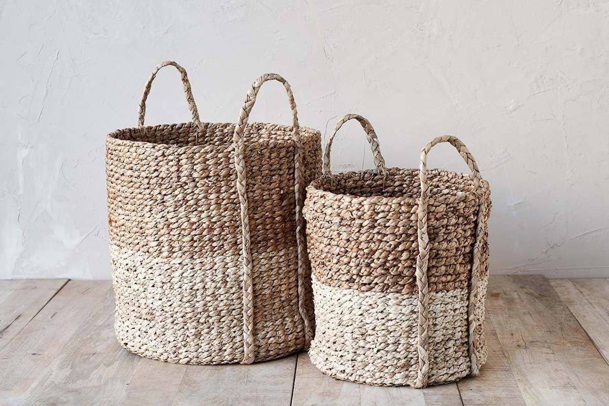
Unlike glass or metal, which catch every mark, matte materials look clean for longer and light doesn’t glare off them. Woven baskets such as the Nkomi Basket bring warm, loose texture, softening the flatness of polished surfaces. Placing just one or two different textures on a sideboard means each holds its own place, rather than clashing.
Try a clay bowl beside a smooth, hardcover book stack, or rest a linen napkin in a tray under a few favorite small objects. Compared to rows of framed photos or shiny vases, simple texture looks “intentional” without the work.
One repeated material draws every object together. For example, if you have a console with a rattan panel, echo that texture with a basket or a set of woven coasters further down the top. Avoid mixing rough and glossy too closely, let one texture set the tone, then repeat once in a subtle way nearby.
For more basket ideas, check woven basket storage for practical examples. This is especially useful if you want a place to drop keys at the entry or corral loose odds and ends without adding mess.
10 sideboard styling ideas for a calm, collected look
Ten sideboard styling ideas that focus on restraint, simple texture, and allowing pieces to breathe will always read collected and calm.
1. Use a low, wide basket (like the Nkomi Basket) to hold magazines or extra napkins, let handles hang out for an accessible feel.
2. Place a single, sculptural lamp to anchor the left or right edge, keeping the shade at eye level against the wall for quiet light.
3. Group three matte ceramic vases of different heights in a close triangle, all in neutral tones.
4. Lean one piece of framed art, off-center, with a small plant in front, it makes a “sheltered cove” that draws the glance back in.
5. Stack two hardcover books in muted covers near the edge and top with a clay bowl for keys or clips.
6. Set a shallow woven tray on one side, with a cluster of essentials like candles or a linen napkin roll inside.
7. Use biophilic touches, a single trailing pothos or pea plant, easy to keep and soft against sharper lines.
8. Place one or two objects with subtle pattern, a hand-turned bowl or spotted ceramic mug, mixed with plain pieces.
9. For a reading area or dining zone, build a “library wall”: stack books horizontally and vertically, add a small lamp, but always leave some section empty.
10. If you want one color accent, pick a natural green or ochre and repeat it just once, in a leaf, a print, or woven detail.
Arrange these ideas lightly. Switching out only one or two accents can quickly reset the feeling of the whole sideboard. If you have open shelves nearby, echo the same material or color on both for flow, a concept shared in this simple shelf styling formula.
Most people notice something feels “off” after they keep walking past the sideboard, either their things pile up and swallow the surface, or the emptiness stands out and nothing feels finished. This feeling is subtle but persistent; a quiet itch that nags every time you put mail down or try to set a vase just so.
It’s usually when you step back, pause, and try to see the sideboard as part of the whole room that you notice what’s not working, a piece pokes out awkwardly, or everything feels too tight and busy, or space is wasted and the eye drifts. This is the moment to shift from collecting things for the top to setting clear visual rules instead. Choose one anchor material or dominant shape, edit down, and use open space as deliberately as the objects themselves.
Many homes end up with sideboards as “dump zones”, a spot for keys, mail, and odd mugs, because it’s easier to add than to edit. The downside is a room that feels noisy, restless, or always just a bit untidy, no matter how often you tidy up. Most of the time, minor clutter or too many mismatched objects compete for attention, and the actual sideboard surface disappears under distractions.
When you get the balance right, the room feels clearer, softer, and easier to clean and live with.
Save this idea for later.
What tends to hold up with calm sideboard styling
Over time, rooms that work best with a styled sideboard use fewer, larger pieces and stay within a simple palette or repeat a texture. Reviewer feedback as well as decorator guides often mention that matte finishes on ceramics and baskets are actually less likely to look dusty and catch glare than glossy or heavy metallics, especially near windows.
Another pattern is that people who reset their surfaces every season, or even once every few months, tend to keep the look fresh with less clutter. Following broad guidelines, such as proportion and negative space, is what most stylists recommend rather than strict rules about exactly what to buy.
, Mara, Loom & Glow
Common questions
What looks good on a sideboard?
Matched pairs or grouped objects, such as a lamp on one side, a basket or low bowl on the other, and a small grouping of books, look good on a sideboard. Mixing textures like matte ceramics, wood, and one soft plant adds interest. Leaving plenty of empty space helps each item catch the eye.
What should I put on top of a sideboard?
The best sideboard tops usually include one anchor (like a lamp or a large vessel), a tray or bowl for small items, and something with natural texture such as a woven basket. Grouping items and repeating materials keeps the arrangement grounded, while avoiding too many objects makes the top easier to clean and maintain.
What are some good ideas for decorating a sideboard?
Start with one strong piece, such as framed art or a statement vase, then add items in pairs or trios for balance. Repeat one or two key materials and echo a palette from the room. Using negative space is as important as the objects for a composed, less busy look.
How to dress the top of a sideboard?
Dress the top by anchoring one end with a taller object, then grouping smaller pieces together and leaving a clear section open. Stacking objects like books or placing a tray brings order, and natural materials like woven fiber or clay reduce visual distraction. Rotate accents each season to keep the look relaxed.
Explore more calm combinations inside our Shop The Look .
Shop the Look
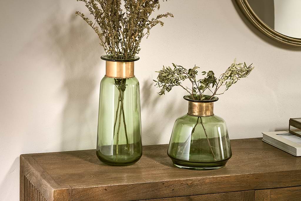
A few Nkuku pieces that anchor a calm, collected sideboard.
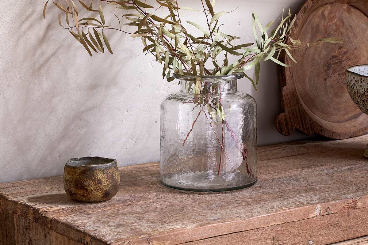
Akra Recycled Glass Vase
Clear cylindrical glass, pairs with stems or sits empty as a quiet accent.
View at Nkuku →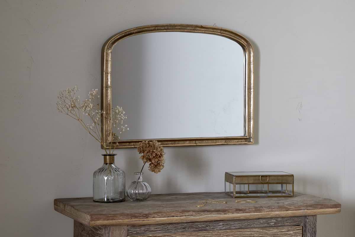
Some links above are affiliate links. If you buy through them we may earn a small commission at no extra cost to you. We only suggest pieces we think fit a calm, lived-in home.
Free guide
The Calm Shelf
12 styling ideas to help you compose calm, balanced shelves in natural texture homes.