

Open shelves and tabletops often wind up as clutter magnets, making ceramic vase styling feel harder than it is. A jumbled mix of linen, jute, wood and ceramics can look busy on a shelf, even if you love every piece. This keeps spaces feeling restless instead of calm.
Today you’ll see how to use just one or two quiet ceramic shapes to anchor your natural material home decor, limit the palette, and avoid accidental chaos. This works especially well in a small hallway when storage is tight because fewer, calmer accents make every surface feel tidy and finished.
The short version: Ceramic vase styling means choosing the right size, finish and placement so a vase stands out calmly, not as clutter. With a few sensible rules for proportion and grouping, shelves and tables look ordered instead of busy.

Where this works best
Ceramic vases work on surfaces that attract clutter, like shelves, bedside tables, and console tables, because they pull focus and set a tidy anchor point for everything else.
Living rooms, bedrooms and hallways all benefit when shelf or table surfaces feel less like drop zones. Narrow hallways that collect bits and pieces, or living room units packed with books or picture frames, can look calmer if you add a single matte vase in a soft neutral.
In everyday use, a ribbed stoneware vase tucked onto a bedside or a single tall vase at the end of a console clears visual noise without making the room feel empty. Instead of filling every spot, let a soft, matte shape break up books and baskets, especially when natural material home decor starts to compete for attention.
Avoid pairing busy, patterned vases alongside rattan, jute or mango wood, surfaces with strong texture need a plain ceramic to make them feel settled, not crowded. If a shelf feels heavy, remove a smaller object and give the vase more room.
To keep open shelving from looking cluttered, use a ceramic vase as a visual pause between textured pieces. This works on narrow bookcases, bathroom shelves, or as a simple replacement for extra candles.
How do you choose the right ceramic vase for your shelf?
Pick a vase shape and finish that fits the space and stands out quietly: matte, rounded or textured styles look softer and blend with woven home decor better than glossy, bold ones.
Shelves with different heights need vases with the right neck and size. A wide-neck vase eats up more space, while a slim, tall stoneware vase fills an empty spot without being bulky. Openings that are too wide want a lot of stems, so for everyday, a narrow neck is easier to style with a single branch.
Matte glaze or ribbed finishes work better in rooms with a lot of sunlight or bright paint. Glossy vases reflect light in a way that competes with other objects and can make a simple shelf feel busy. Choosing organic home decor pieces with smooth edges keeps each piece from fighting for attention.
Unlike colorful glass or metal, a low-profile ceramic vase, especially in off-white or warm earth tones, plays well with rattan or jute without feeling mismatched. This is especially true for shelf styling where you want calm, subtle impact, not a bold statement.
Use a medium stoneware or hand-thrown terracotta style for open shelving in the kitchen; pair with wood bowls or a rattan tray for a soft transition.
What can you put in a ceramic vase besides fresh flowers?
Dried stems, seed heads, and even a single branch add natural shape and fill out a ceramic vase so it never looks empty. You can also leave some vases bare as a sculptural accent.
When flowers aren’t practical, like in low-light rooms or when you want slow living decor with near-zero maintenance, choose dried pampas, eucalyptus, bunny tails or willow to fill out the shape. These keep your vase styled for months and work with both neutral home decor ideas and busier, organic palettes.
Layering stones, pebbles or a handful of sand in the bottom holds light stems upright and adds subtle texture, as suggested in this guide to decorative vase ideas. The extra weight steadies taller vases, especially on high shelves or window ledges.
Compared to glass or metal vessels, stoneware and ceramic vases work well left empty because they read as finished on their own. Leaving one or two vases bare creates softer transitions between zones with more woven or wood elements.
In a hallway, fill a ribbed vase with dried grasses or a sculpted branch for an easy entryway focal point, or leave a bud vase unfilled on a busy kitchen shelf for a restful moment.
Styling and placement
Put the vase where the eye naturally lands first: at the end, in the middle, or above a key piece like an armchair. Spacing and palette matter as much as the shape itself.
On a long shelf, start by placing the largest vase off-center and keeping the area clear on either side. This draws the eye to the spot you want and avoids a crowded look. For console table styling, let the vase anchor one end and keep other objects in a similar color family or material type.
Spacing is the difference between calm and chaos. Leaving about two-thirds of a surface open lets the shape stand out; too many items close together make the area feel too busy. Use a similar logic when styling a bedside table or mantelpiece, one main vase, a book stack, and maybe a small tray are usually enough.
Instead of mixing many colors, group vases and other objects in the same warm neutral palette, soft whites, beige, light grey or unglazed tan. This approach works for any small apartment or shared living space where visual noise can add up fast.
Quick calm checklist:
- Stick to 2-3 natural materials in one spot (ceramic, rattan, wood).
- Leave at least half the surface clear around the vase.
- Keep everything in one warm neutral or soft earthy colour range.
- Let one item (the vase) be tallest to set the focal balance.
Try this formula on your living room bookcase or a shared hallway shelf, notice how even a single matte vase changes the mood of the whole area.

How do you group ceramic vases without clutter?
Odd-numbered groupings, especially three vases in different heights, look natural and collected instead of forced. Vary size, but keep to one palette for order.
Grouping vases in threes is a tip decorators reach for again and again, because the rule of three creates a focal area that doesn’t feel crowded or staged. A set of three textured vases gives an open shelf or low console a collected look, especially when placed close but not touching.
Each vase should be a different height, but stick to a shared color or finish. Too much variation breaks the flow. Instead of alternating every material, pick one accent texture (like ribbed or grooved) and let the group read as a quiet block.
Unlike pairs, which look like bookends, grouped trios work better in corners or above low furniture where other objects could clash. Keep other materials, woven bowls, wood trays, recycled glass, nearby but not mixed in with the vases themselves.
Try three ceramic vases on an open kitchen shelf, stair landing, or entry console. Give the tallest the middle spot if possible, and layer in small dried stems or a single eucalyptus branch.
How do you keep natural materials from clashing?
Start with one calm anchor, a ceramic vase, and repeat just one or two contrasting textures like jute or rattan. A single clear shape keeps wood, weave, and linen from fighting for attention.
When you love natural material home decor but shelves look messy, limit how many textures show. A stoneware vase sets a neutral pause, so a jute basket or a rattan tray right beside it doesn’t look like a jumble. Too many small items, rattan coaster, mango wood frame, woven coasters, compete with each other instead of resting the eye.
The best approach: use one material for larger surfaces (a jute rug, a wooden console), then place a ceramic vase and only one or two woven accessories nearby. Compared to crowded clusters, repeating a single shape creates clear “zones”, wood in one corner, textile in another, ceramic as the anchor.
Most designers agree that a neutral anchor piece is the fastest way to avoid chaos in mixed-material rooms. It keeps the overall palette calm and stops clashing before it starts.
Use this approach near the end of a mantelpiece or atop a small chest where many materials need to share space.
What makes a shelf arrangement look balanced?
Keep stems or branches in ceramic vases about one and a half times as tall as the vase itself. Most surfaces look calmest when about two-thirds of the space stays open.
Proportion is the main thing that separates an organized shelf from one that feels off. A vase reads as balanced when filled stems reach about one and a half times its height; too many or too few look either top-heavy or empty.
Spacing matters as much as size. A well-styled shelf will have negative space around the vase, with just a couple books or a tray next to it. Unlike arrangements where every inch is filled, this approach helps every object breathe, making the vase the quiet focal point.
Instead of crowding several pieces together, give your main vase the most room and keep other items small or low. A shelf goes from cluttered to calm simply by giving each object its own “zone.”
Try this the next time your living room shelving feels overfilled: remove one accessory, give your vase more space, and see how it shifts the overall feel.
What tends to hold up with ceramic vase styling
Most reviews suggest that the best ceramic vase styling comes from using matte or raw finishes, especially in rooms with daylight. Shelves with ribbed vases in pale stoneware don’t catch sharp reflections the way a glossy finish does, so they keep surfaces feeling soft. Decorators regularly repeat this advice for open-plan areas and white-painted rooms.
Pattern shows up too: single vases or trios in one warm neutral color consistently outlast trends, staying restful and practical as surrounding furniture or accent colors change. Keeping a shelf half-clear and repeating just one texture alongside the ceramic shape proves durable in shared spaces and busy homes.
, Mara, Loom & Glow
Common questions
How do you style a ceramic vase without flowers?
The simplest way to style a ceramic vase without flowers is to fill it with dried stems, leaves, or a sculptural branch. You can also leave it empty as a modern accent, especially if the shape or glaze is interesting to look at.
What can you put in a ceramic vase besides fresh flowers?
Dried stems such as pampas, bunny tails or eucalyptus, as well as simple twigs or grass, all work well in ceramic vases. For added interest, layer the base with stones or sand to hold these items. Many vases also look purposeful left empty or paired with faux foliage.
How tall should the stems be compared to the vase?
The best rule is to keep stems about one and a half times the height of the vase. This means a small arrangement still reads balanced and never looks awkward. Overly tall stems can tip the look out of proportion, while too-short ones leave the vase looking unfinished.
Do ceramic vases look better in odd numbers or pairs?
Grouping ceramic vases in odd numbers, such as three in different heights, tends to look more natural and collected than pairs. Odd-number arrangements keep the surface from feeling too rigid, and let each vase stand out while still working together as a subtle focal point.
Explore more calm combinations inside our Shop The Look .
Shop the Look
Two quiet glass and ceramic vessels that read as considered focal points on any shelf.
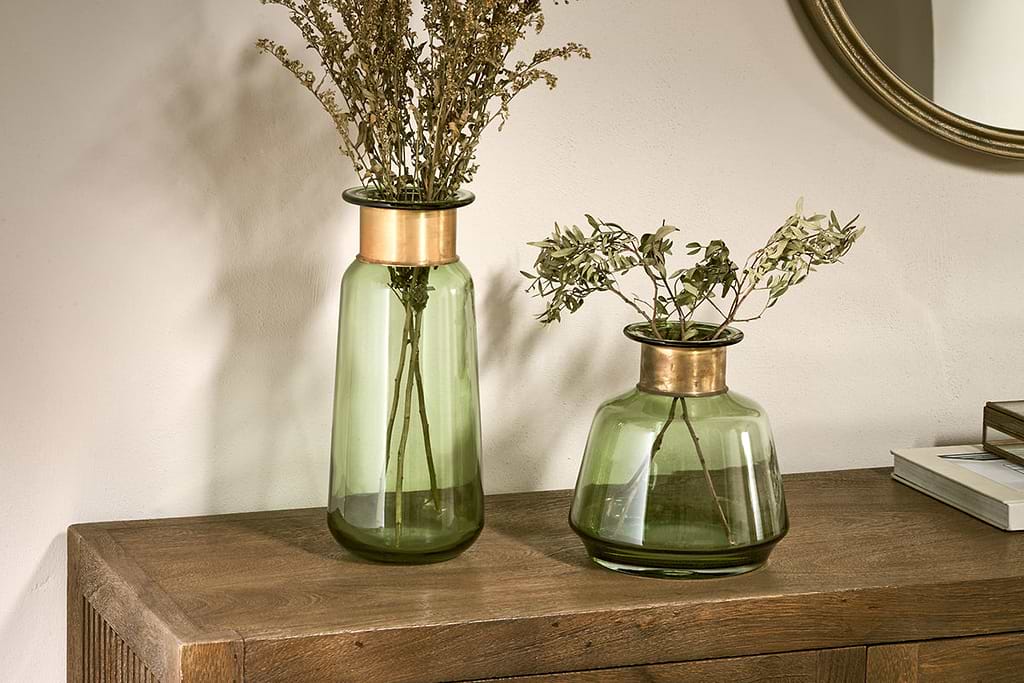
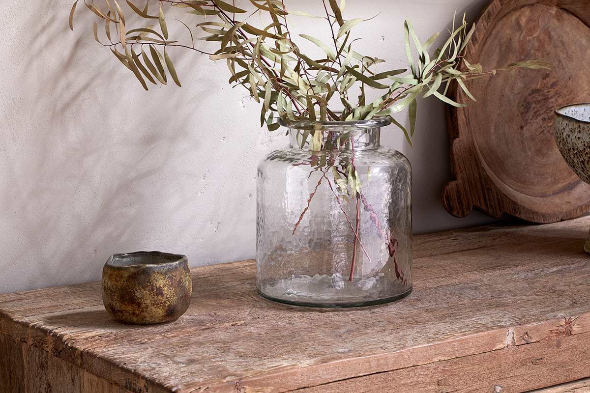
Akra Recycled Glass Vase
Clear cylindrical glass, pairs with stems or sits empty as a quiet accent.
View at Nkuku →Some links above are affiliate links. If you buy through them we may earn a small commission at no extra cost to you. We only suggest pieces we think fit a calm, lived-in home.
Free guide
The Calm Leaf
12 quiet ways to bring dried botanicals, stems, and natural textures into calm spaces.