

Many Pinterest boards show airy, soft rooms, but real homes often struggle with visual noise. Most small living room colour ideas don’t account for everyday mess, limited light, or the mix of furniture left from past moves. It’s easy for even light, neutral rooms to feel cramped if the colour palette drifts or features compete for attention.
This guide shares simple ways to choose and use calm colours for small living rooms, so you see an immediate difference. You’ll learn which tones open a space, which schemes avoid coldness, and a practical approach to palette, paint testing, and accent placement. This works especially well for a small apartment living room when nothing feels quite settled because a simple, steady colour story cuts both clutter and stress.
The short version: The best small living room colour ideas start with a soft, low-contrast palette and one or two anchoring accents to calm the whole room. One core scheme, a simple accent, and clean placement work together to open the space and make it easier to live slowly.
Key takeaways
- Small living room colour ideas work best when you keep the palette very simple and repeat just one or two accent colours.
- Light, muted tones—especially soft whites and warm neutrals—reflect more light and make a small room feel bigger.
- Using one grounding accent, such as sage or terracotta, adds depth without making the room busy or heavy.
- Testing paint colours in your own light gives a much more reliable result than relying on a paint chip.
- A large, light rug softens edges and brings visible calm to a busy space, according to Dulux.
- The problem is not the size: it’s colour noise
- How do light colours make a small living room feel bigger?
- Where this works best
- Why are warm neutrals better than cold ones in small rooms?
- How do you choose one accent without overpowering the room?
- Styling and placement
- How to test colour and spot undertones before painting

The problem is not the size: it’s colour noise
Too many competing colours, not too little floor space, makes a small living room feel restless and crowded. A controlled, repeating palette quietly anchors the room.
Most small living rooms are packed with stories—a mix of hand-me-down sofas, new throws, artwork collected bit by bit. The clutter isn’t always in things; it’s often in the colour. A room may have three types of beige and four blue hints before you even notice, scattered across throws, lampshades, and prints.
Choosing a few soft, layered colours—rather than grabbing whatever’s at hand—helps the eye rest. Low-contrast groupings, such as mushroom beige with natural linen and ash wood, blend together and blur edges that would otherwise stand out and break up the space.
Unlike a wide-open living area, where bold contrast feels deliberate, a smaller room quickly looks busy if the palette jumps too much. Sticking with gentle transitions draws less attention to individual pieces, so the walls seem to recede and the space opens up visually.
A calm room lets you notice small things—a book left out, a fresh mug on the table—without those things feeling messy. Try starting with your largest furniture piece, matching other key items to its tone, and letting everything else fade back.
How do light colours make a small living room feel bigger?
Light, muted colours reflect more sunlight, which makes walls and objects seem farther apart than they are. These shades also blur hard lines that can shrink a room visually.
In a narrow space with one window, paint colours do a lot of heavy lifting in how a room feels. Light, soft shades bounce available light farther, especially off walls and larger surfaces. This creates a sense of depth that helps a small room feel more open.
Using an off-white shade with blue undertones makes a room seem larger, especially when paired with light wood floors or furniture. The pale tones catch daylight, while the blue tint cools things subtly and gives more options for muted accent colours.
A deep colour on every wall can make edges feel closer. Compared to a consistent light background with soft contrasts, it tends to box the space in. Stick to muted whites, warm flax, or buff greys if you want reflections to work in your favour, especially in rooms with limited light or odd shapes.
The effect is quiet—you don’t notice the wall colour right away, but the room feels less cramped after the change. Choose paint with a matte finish to cut glare and give soft, even reflections rather than shiny patches.
Where this works best
Simple, low-contrast palettes make the biggest difference in rooms that double up—such as a small flat’s living area or a rented lounge with awkward corners. These spaces often need calm the most.
Small open-plan living rooms, rental spaces with different wall colours, and shared family rooms often end up with a clash of tones and furniture. Unlike larger rooms, small spaces can’t spread out competing looks. That’s why choosing a calm, limited colour story works best here: there’s nowhere for odd shades or styles to hide.
In practice, apply this approach wherever the floorplan blurs—where dining, work, and lounging happen in one zone. A repeat of gentle tones, with only one or two subtle contrasts, helps each use blend in quietly rather than pulling attention.
Avoid matching pale walls with stark black, chrome, or glossy primary-colour accents in small rooms. That jump in contrast tends to fragment the space—your eyes hop from point to point, which highlights scale and corners. Stick with woods, stone, soft pale rugs, and perhaps a single feature piece in a muted shade for continuity.
This method helps not just with how things look, but with how you use the space—making it easier to tidy and giving daily life a gentle flow.
Why are warm neutrals better than cold ones in small rooms?
Warm neutrals—such as mushroom, beige, or gentle taupe—bring a soft, settled quality to a small room, avoiding the cold or stark look some pale colours create.
Rooms with little natural light or north-facing windows often look flat or chilly when painted with cool whites or greys. Warm neutrals, on the other hand, gently hold what light there is, casting a subtle glow instead of blueish shadow.
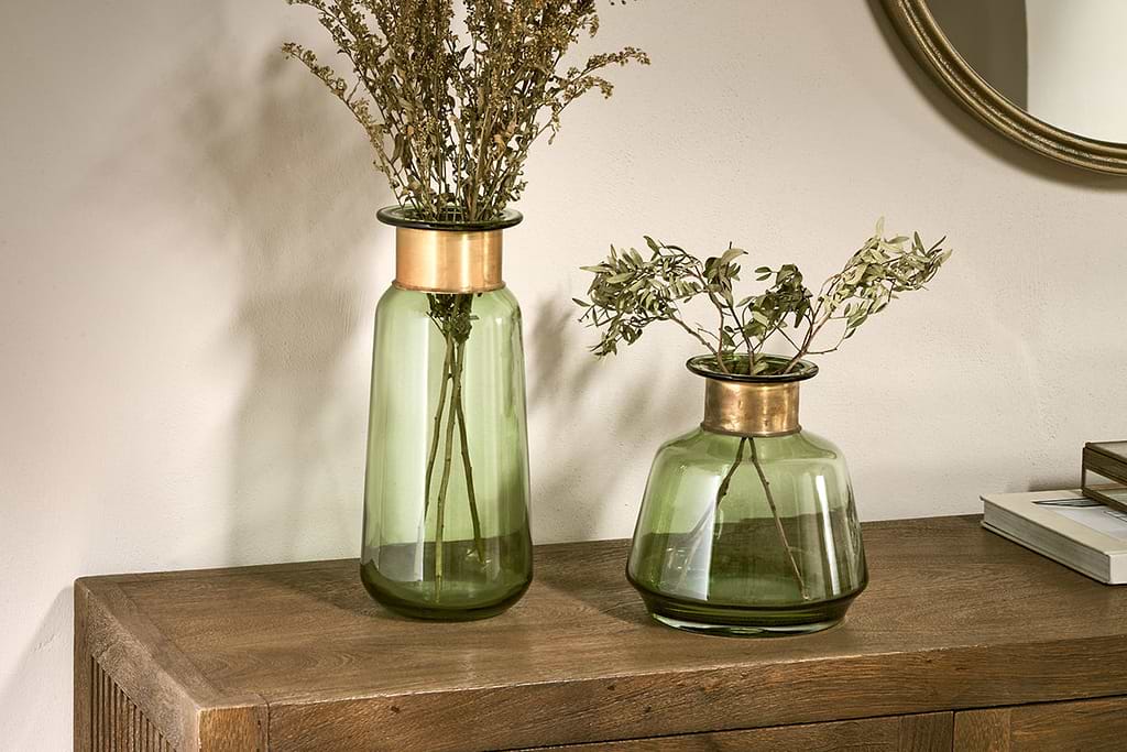
Materials matter here. A mushroom beige wall with sandy linen cushions and a smooth clay vase feels warmer than an all-grey scheme. Neutral schemes for living rooms typically use gentle beige and umber alongside pale wood or cane for this reason: the colours mimic sunlight and natural stone, not just paint charts.
Compared to blueish-grey or blank white, even a small patch of warm taupe brings visible softness under low light. These shades are a strong choice for anyone drawn to a slow living home look—day or night, the space feels less stark and more gentle.
In daily life, this means you notice less glare and fewer harsh lines—so evenings reading or quiet mornings both feel easier on the eyes.

How do you choose one accent without overpowering the room?
One strong accent—like sage, terracotta, or muted pink—draws the eye gently when repeated two or three times, never all across the room. This keeps the scheme calm and grounded.
Many worry that accent colours will take over a small room, but the key is scale and repetition. Instead of adding many soft things in different shades, select one feature—say, a sage pillow, a clay planter, or a painted side table—and quietly echo that tone, letting other items fade into the background.
Compared to using several bold accents at once (navy here, mustard there), repeating just one calm colour builds quiet strength. Johnstone’s suggests soft neutral and white paints for most of the space, and one gentle accent like a touch of sage or a bare pink to add interest without weight.
If you like, balance the single accent with a natural element—a wooden bowl, a wool rug—so the highlight doesn’t feel out of place. This is especially helpful for those interested in mindful home decor that stays easy to live with. Try bringing in the accent as a moveable object first (a blanket, a lamp) before painting, to see how it fits the room on a quiet day.
A strong accent in the wrong place draws focus and can easily make the room feel smaller or chaotic. Make sure to keep that anchor grounded—ideally low in the space and echoed elsewhere in very small ways.
Styling and placement
The placement of both colour and object determines how calm or cluttered your living room looks. Fewer, larger zones of colour almost always read as more peaceful than many little splashes.
Start with the main wall or the largest rug in the room—this will anchor your chosen scheme. Furniture grouped with a shared undertone or two helps blur join lines, making the room feel continuous. Breaks in the flow, such as dark end tables or sharply different frames, grab the eye and make the area look chopped into pieces.
Soft furnishings matter just as much. A single large, light rug grounds the seating area, with just hints of your accent repeated close by (think a basket or two, an earthenware bowl on a coffee table). Adding a large cosy rug, according to Dulux, noticeably boosts softness in small room schemes with lots of hard surfaces.
Compared to filling every surface, a minimal arrangement with just two or three main colours always looks calmer. One grouped stack of books or a woven tray next to seating does more than scattered small objects in every corner.
Quick calm checklist:
- Keep the main palette to three colours or fewer (mixed whites, a warm neutral, and one accent).
- Situate larger tones on walls, floors, and the sofa; use accent colours only for soft pieces or art.
- Use natural materials—linen, jute, clay, and pale wood all work together without adding noise.
- Fill at least half of visible surfaces with negative space: don’t load every shelf.
- Let only one item in each sightline be the main focus (one large vase, one colourful cushion).
Apply these choices by arranging your seating around that main anchor item or area. Place accent pieces close to the centre, not scattered, for a more grounded, calm home aesthetic in daily life.
How to test colour and spot undertones before painting
Testing colour in your actual room light always beats relying on a paint strip or a phone screen. Undertones become obvious only when next to your furnishings and natural daylight.
If you’ve ever chosen a white or grey that felt perfect at the shop but odd at home, undertones are likely the cause. The shade changes with your actual sunlight, flooring, and nearby soft furnishings—appearing warmer, colder, or unexpectedly tinted as light conditions shift over the day.
Most paint brands recommend applying tester patches to at least two walls—ideally, one near a window and one farther in. Wait until midday and again at dusk, as these times often expose subtle colour shifts. Once you’ve settled on a shade, our paint calculator shows exactly how many litres you’ll need for the room. Tikkurila lists white, grey, blue, green, pink, orange, brown and yellow all as workable families, but each reacts differently to your room’s features.
Compared to picking from a chart, painting a patch on your true wall gives far more control. A soft grey with a blue undertone might feel sharp set against a warm wood floor but can read as cool and airy next to pale stone. Always check the look with your favourite vase or throw set nearby before making the final call.
Take one slow day to try patches, then sit with the colours through morning and evening light. You will usually spot right away which version actually feels right for your intentional living home—comfortable and easy, rather than forced or staged.
Many notice the room feels subtly off before they can name the reason. Often it comes down to which colour ties the main pieces together, quietly settling the eye. The shift happens with that first conscious palette choice—the decision to match wall, rug, and a main object, instead of letting extra colours float around the room. Suddenly, the room feels less tense, more at ease. People tend to linger, and everyday chores or quiet afternoons start to flow together more gently.
Still, the mistake most often is too many colours at once or one odd, too-bold accent that pulls the eye in every photo. The room feels a bit unfinished or oddly busy no matter how much you move things around, so it never truly settles. The change happens when you pick a grounding neutral and keep accent colours sparing. Save this idea for later.
What tends to hold up with small living room colour ideas
From reviewing countless room schemes, some patterns stand out. Most calm, successful small living rooms share a strong commitment to soft, limited colours. Reviewers often mention how a barely-there warm tone (like gentle beige or pale taupe) steadily handles changes in light or furniture better than a brilliant white. It stays forgiving even as seasons and natural light shift.
Decorators consistently recommend testing testers on all main walls, not just one: a warm shade can read cool on a north-facing wall, but the same paint may appear cosy in an alcove. Matte finishes get recommended again and again for rooms with shifting daylight, because glossy paint tends to amplify hard lines and glare, even in slow home ideas styles.
For accent colours, the rule that survives—one bold, earthy tone, used sparingly and repeated twice—remains the one that most readers find easiest to live with season after season.
— Mara, Loom & Glow
Common questions
What is the best colour for a small living room?
The best colour for a small living room is a soft, light neutral such as muted white, gentle beige, or pale taupe. These shades increase reflected light and help blur sharp edges, making the room feel more open and calm. Warm neutrals especially bring comfort and suit a slow living home.
What colours look good in a small room?
Colours that look good in a small room include off-white, soft grey, pale green, and mushroom beige according to both Dulux and Tikkurila. These muted tones pair well with natural materials for a calm, understated scheme that doesn’t overwhelm. One grounding accent colour, used sparingly, can also work well.
What colour is replacing beige?
The colours replacing beige are gentle taupe and mushroom, along with soft warm greys. These shades still work as warm neutrals but offer a slightly fresher and more modern base tone. They keep the room feeling settled and give more wall depth than bland cream or crisp white.
What colours make a small living room look bigger?
Light, muted shades such as off-white with blue undertones, pale greys, and soft beige make a small living room look bigger, as noted by Tikkurila. Using a consistent light palette across large surfaces reflects natural light and visually expands the walls. Limiting contrast helps the room appear more continuous.
Explore more calm combinations inside our Shop The Look .
Shop the Look
Pieces in soft natural tones that echo the calm palette you're building.
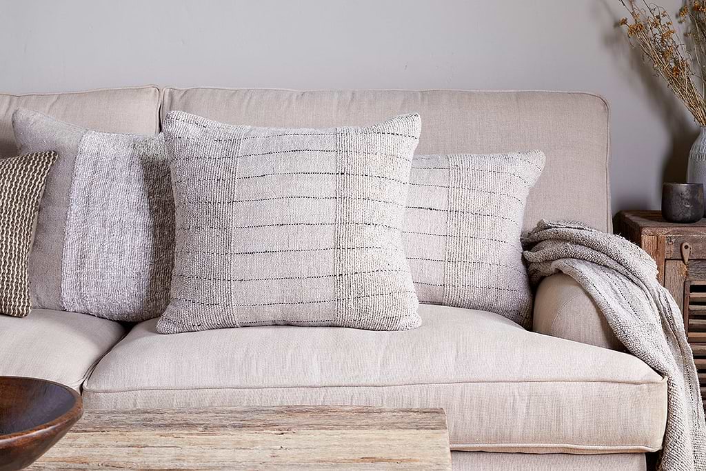
Mayla Cushion Cover
Soft hand-textured cover — instant warmth on linen sofas or chairs.
View at Nkuku →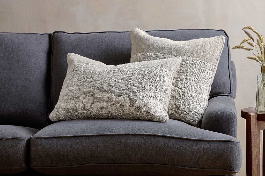
Puli Linen Cushion
Recycled linen in natural — pairs with woven textures and aged wood.
View at Nkuku →Some links above are affiliate links. If you buy through them we may earn a small commission at no extra cost to you. We only suggest pieces we think fit a calm, lived-in home.
Free guide
The Calm Shelf
12 styling ideas to help you compose calm, balanced shelves in natural texture homes.