

Most beige living room ideas look easy on Pinterest, but at home, the effect often comes out bland or cluttered instead of calm. The problem is usually too many light neutrals fighting each other, or rough textures that look busy instead of pulled together. This can be true even in small apartments or family living rooms with open shelves and everyday mess, where a store-styled palette falls apart as soon as real belongings and practical storage land in the space.
Today, you’ll see what actually stops a beige living room from feeling flat. You’ll find rules that make mixing jute, linen, wood, and rattan work, without losing the practical warmth you want. This works especially well in a shared, low-light lounge when you pick anchor materials first because the room always feels welcoming, even as the day changes or seasons shift.
The short version: The easiest way to make beige living room ideas feel warm and layered instead of flat is to combine at least three shades of neutral with one strong natural texture. Mixing in jute, linen, and wood in careful order creates calm instead of clutter. These grounding moves change the room’s feel right away.
Key takeaways
- Layering three or more close neutral shades keeps a beige living room from feeling cold or unfinished.
- A single natural material used in more than one place makes the palette work for everyday living.
- Soft upholstery holds warmth better than plain smooth cotton, especially for larger pieces like sofas.
- Adding a warm light source helps beige and taupe shades read as welcoming, not washed out or bland.
- Pattern and deep accent colours work best in small, repeated doses rather than across the full room.

Why do most beige living rooms feel flat?
Most beige living rooms look flat because they rely on a single shade or texture, making everything blur together under certain light. Changing this means layering neutrals and using material contrast.
Many living rooms start with beige paint or a simple neutral sofa and then stop. The eye finds nothing to catch on, especially as daylight shifts or lamps go on at night. Instead of feeling calm, the room just seems faded or blank.
A sofa in flat cotton off-white will look cold against bare walls, especially in the late afternoon. Adding one texture, like boucle cushions, changes little if everything else matches too closely. A linen curtain or a woven rug can ground the space and makes beige feel more lived-in and tactile.
The difference between a finished and unfinished beige room shows up in photos and real lighting. One that has just paint and one big sofa can feel half-done, while repeating natural textures in a few spots makes the room feel hands-on and pulled together.
Unlike dark, single-tone rooms, beige only pops when there’s a shift in both colour and surface: soft upholstery, woven jute, and at least one wooden piece.
How many neutrals can you mix before it looks busy?
Layering three to four shades of beige, cream, and taupe will feel rich and calm, while five or more often starts to look patchy or accidental. The limit is mainly about contrast, not counting colours.
In a small apartment, bringing in too many shades, say, greige, sand, vanilla, and caramel, all at once across sofa, rug, curtains, and throws, pulls the room out of focus. This patchwork stops the soft lines you want from coming through and adds a muddled quality that can look almost as restless as bright colour.
The Spruce’s roundup suggests grouping beiges and taupes purposefully, letting one shade lead on the biggest surface and using others smaller or as detail. The main reason this works is that soft, close shades blur the seams, while high-contrast or random jumps between similar neutrals break up the flow (The Spruce’s roundup).
A cotton sofa in deep taupe looks most grounded with cream walls and a jute rug in a wheatier tone underneath. Compared to layering too many “almost similar” neutrals, building up just three creates the feeling the room belongs together.
| Number of Main Neutrals | Room Effect | Best Use Case |
|---|---|---|
| One | Flat, blank, unfinished | Rarely works outside modern gloss or minimal spaces |
| Three | Layered, soft, calm | Recommended for living rooms seeking warmth |
| Five or more | Patchy, busy, disconnected | Works only with clear pattern or bold accenting |
A living room with just two close neutrals can feel safe but stiff, while five can feel everywhere and nowhere at once. Stick to three dominant shades for a balanced result.
Where this works best
Layered beige and warm neutrals work best in shared, medium-light living rooms where the layout stays open but needs softness and cohesion. Neutral home decor shines when daily life brings movement and mess.
Rooms that get mixed daylight, or need to pull double-duty as both family lounge and work space, feel stable when all the big surfaces stay within a close neutral range. In a smooth-floored apartment or a setting with minimal built-in furniture, a jute rug and a sandy-toned sofa anchor the palette even when chairs, storage baskets, and toys change or move daily.
Avoid sharp, stark contrasts, like black metal or pure white plastic, that break up the visual flow. These small interruptions pull the eye away from the main, soft, earthy tones and make the room look busy instead of relaxed. This is especially noticeable near windows, where strong sun throws hard shadows.
Soft layering with linen on windows, a boucle throw on the sofa, and a pale mango wood coffee table works in everyday layouts. These materials hide the bumps and scuffs of daily life better than a single flat cream painted wall, which can show every mark or scratch.
Compared to a bold patterned rug, a woven jute at the foot of the sofa lets the rest of the furnishing breathe, especially where children and pets come through.
How do you use natural materials without causing chaos?
Natural material home decor works best when one anchor texture, like jute or linen, leads, and smaller accents repeat that texture elsewhere. This strategy organizes the look while still letting the room feel relaxed.
Bringing in many “organic” accents at once, rattan trays, clay vases, driftwood art, jute rug, linen throws, sounds good but often makes a living room look like a shop (or even feel scratchy). Selecting one hero texture, then echoing its warmth in practical pieces (baskets, planters, a lampshade), creates order and depth.
For example, place a jute rug underfoot and repeat straw or jute in a low basket beside the sofa. Then use a linen or cotton for window dressing and pillows. The layers read as natural and comfortable but not thrown together.
Allowing gaps of smooth cream wall or flat upholstery in between these layers is key, as this gives space for each natural material to show its texture in changing light. Compared to bare boards with nothing to soften them, a short wool pile or linen curtain cuts the echo and visually warms the room.

Styling and placement
A calm, grounded living room layout uses anchored materials in key spots, under the main seating, behind the sofa, or in shelves, without overfilling corners or stacking too many elements.
Start with the largest, most practical surface: usually the rug or sofa. Place a jute, wool, or boucle rug square with the longest wall, tucking at least the front feet of the sofa into it. Hang linen curtains wider than the window frame for softness, letting natural light spill around the edges.
Shelves and side tables work best with “weight low, air above,” so baskets and wooden boxes tuck underneath, while lighter objects, like clay bowls or a stack of beige books, sit higher. A single strong accent, such as a dark green ceramic or a rust cushion, breaks sameness and adds a focal point, as shown in IKEA’s example beige living room.
Avoid cramming too many objects on open surfaces. One resting place per visible shelf or tabletop reads as considered, not empty. Instead of multiple patterns on every cushion, keep print to a single dot or low-contrast graphic for softness.
Quick calm checklist:
- Pick one main material to repeat twice, jute rug, jute basket.
- Keep all large surfaces (walls, sofa, floor) within three close shades of beige or taupe.
- Limit visible patterns to one accent per group (e.g. cushions or throws).
- Balance every “heavier” element, like a wooden table, with an adjacent open or light space.
- Place the brightest or darkest object where it grounds the view, on a low shelf or coffee table.
A living room shelf organized this way changes from clutter-catcher to soft display: a beige book pile, one dark mug, a low rattan tray, spaced cleanly apart.
How should you light a beige living room?
Beige living rooms always look warmer under one main lamp with a soft, amber bulb rather than several bright, cool white spotlights. Lighting affects how textures and undertones read at night.
Low light in most rental living rooms makes beige look dingy or even grey if you rely on ceiling fixtures only. Swapping to a natural woven or rattan shade softens edges and throws gentle, patterned shadows around the room’s seating area.
For corners or reading nooks, choose a small table lamp or wall sconce finished in wood or muted metal instead of harsh chrome. According to Furniture Choice specifically, warm lighting is a separate step, not just a “nice to have”, for beige living room ideas. The difference feels clearest in rooms with big windows by day but dull, flat light after sunset.
A room with a single, large Dia Jute Lampshade – Natural changes instantly from cold to welcoming, even before any new decor lands. A bare metal lamp, by contrast, tips the whole neutral scheme toward an office or waiting room feel.
Position one strong light source in the main gathering spot. This approach lets beige and cream textures show their detail, while keeping the rest of the palette soft and not washed out.
How to avoid common mistakes with a neutral room
Neutral home decor ideas fall flat when every surface matches too closely, or when contrast is added in too many places at once. Using one accent per zone works best for calm rooms.
In many homes, the “all beige” approach starts out clean but ends up with every throw, cushion, and vase matching too closely. This uniform look often feels visually thin or even cold. On the other end, adding every popular accent, rust, sage green, black metal, at once makes the design jumpy.
The best fix is a clear anchor: ground the room with three beige or taupe shades, then use a single deep accent or material in just one or two spots. A shelf with all pale books reads colder than one with one dark or wooden anchor, as shown in neutral shelf styling guides.
Most decorators recommend keeping about two-thirds of open shelving clear to stop the room closing in on itself. A common mistake is packing all surface space, breaking the effect of neutral, breathable style.
Compared to rooms with accent colour scattered everywhere, a space with three neat neutrals and one accent feels steady and easy to live in.
At some point, many people notice their beige living room feels unsettled or slightly off, even after matching sofa and walls. The practical shift comes when you assign a clear “main” texture and no more than three shades, adding a single focus accent if needed. The room feels quiet, not blank.
Many homes keep layering beige on beige, hoping one more cushion or throw will fill the gap, but this tends to flatten the space. The difference appears when you make one natural texture an anchor, then let the room breathe with open areas and one small accent. A beige living room is hardest to finish when every surface tries to matter equally.
When the main elements fall into place, the sensation shifts. Softer light, three repeated shade anchors, and space between textures let real life, throws left out, an open book, a basket of toys, blend without ruining the mood. The couch looks more inviting, and you relax into the room, not just in it.
Clutter often sneaks back in: too many baskets, extra patterns, mismatched wood stains, or every surface covered in “organizing” trays and objects. The space looks busy or heavy, especially by evening.
The feeling improves when you scale back patterns, pull out excess objects, and use only one main neutral and material per view. The result is a room that calms rather than competes with real life.
Save this idea for later.
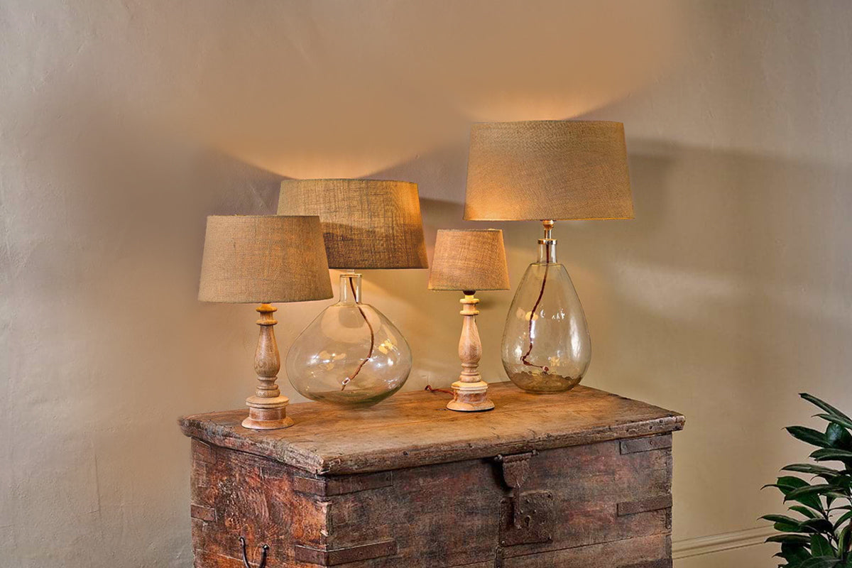
Dia Jute Lampshade – Natural
adds quiet structure and warmth while keeping the room balanced.
What tends to hold up with natural material home decor
Across rooms styled with beige, taupe, and sand tones, the biggest difference usually comes from repeating a strong texture more than once, like jute underfoot and again in a basket or lamp. Reviewers and stylists often point out that matte and woven surfaces stay visually warm even when sunlight moves, while high-gloss or plastic finishes look out of place in warm neutral rooms.
Most guides now separate “layering neutrals” from “adding natural materials,” recognising that each step changes how the palette works in daily life, especially with pets, kids, or frequent use. A sofa upholstered in anything other than plain cotton or polyester seems to hold up longer to wear and marks, according to several long-form décor features.
, Mara, Loom & Glow
Common questions
What colours go well with a beige living room?
Warm neutrals like taupe, cream, and greige pair especially well with a beige living room. Deep greens, clay reds, and gentle rusts also complement beige without overpowering it. These colours work as small accents, think cushions or vases, while the main palette stays soft and calming.
Which colour best complements beige?
Deep forest green is widely recognised as a colour that best complements beige. It adds contrast and groundedness to an otherwise pale, neutral room. Rust, mocha, and even a muted blue can work in small amounts for a hint of depth.
What colour is replacing beige in 2026?
According to trend forecasts, Mocha Mousse, a mid-brown shade, will begin to replace traditional beige in 2026 as a main neutral colour. This tone offers more depth while still matching wood and woven home decor, without losing the gentle effect of beige.
How do you make a beige living room pop?
Small doses of deep accent colours, such as forest green or rust, help make a beige living room pop. Introducing textured materials like jute or linen and placing a single patterned cushion or throw can also add interest. These touches create energy without overwhelming the palette.
Explore more calm combinations inside our Shop The Look .
Shop the Look
Pieces in warm wood and natural linen that deepen a beige room without adding visual noise.
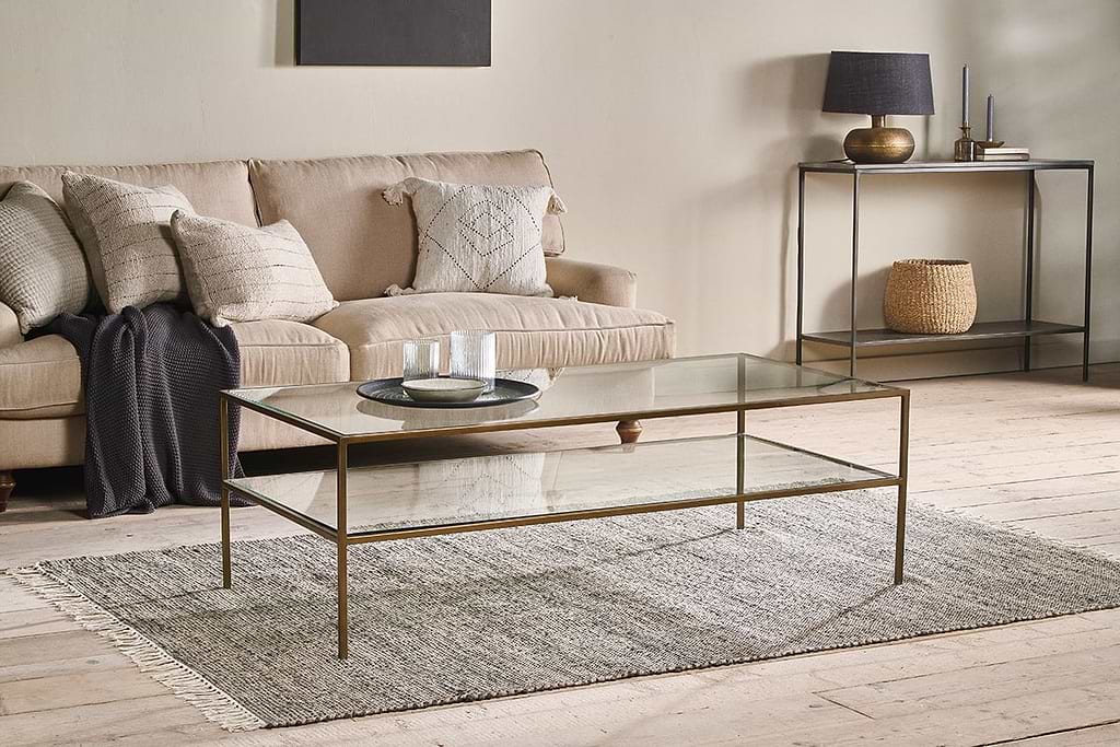
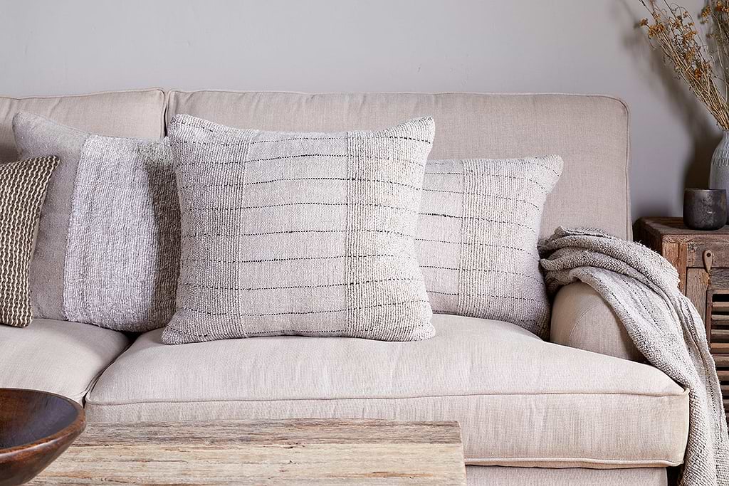
Mayla Cushion Cover
Soft hand-textured cover, instant warmth on linen sofas or chairs.
View at Nkuku →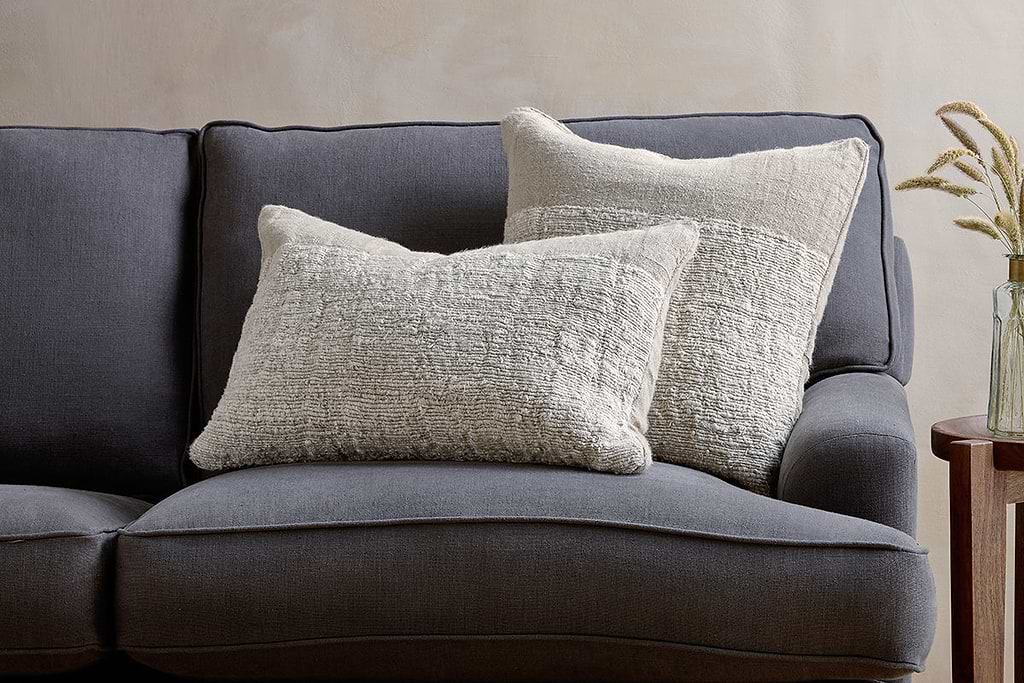
Puli Linen Cushion
Recycled linen in natural, pairs with woven textures and aged wood.
View at Nkuku →Some links above are affiliate links. If you buy through them we may earn a small commission at no extra cost to you. We only suggest pieces we think fit a calm, lived-in home.
Free guide
The Calm Leaf
12 quiet ways to bring dried botanicals, stems, and natural textures into calm spaces.