

You ask yourself what to put on living room shelves each time you glance at them, but the answer never feels obvious. You’re not looking for more storage—you just don’t want the shelves to look like a catch-all or a leftover afterthought. Bright spines, old candles, the odd photo frame: too much out, yet the shelves seem emptier, but not calm.
Today’s guide is about landing on a plan that looks intentional and feels calmer each morning. You’ll see what to keep, what to move, how to group things, and a simple way to stop the shelf from swallowing the room’s energy. This works especially well in a small living room when shelves spill into view from the kitchen or entry because it reins in mess without hiding life.
The short version: The best answer to what to put on living room shelves is to choose a handful of grouped objects—one statement piece, two smaller accents, and a natural element per shelf—to keep things clear and balanced. This stops shelves from reading like storage and quietly changes the feel of the whole space.
Key takeaways
- A living room shelf looks calmest when most of the surface is open, not fully loaded with objects.
- The rule of three—one large and two small items—keeps groups from feeling crowded or busy.
- Adding a single plant or woven basket brings texture and a break from hard lines.
- Consistent colour choices across shelf objects help the room feel grounded and quiet.
- Most floating shelves sit about 25–30 cm deep, allowing for objects to layer without overhanging (source: John Lewis’s shelf styling guide).

Why do living room shelves look cluttered so easily?
Living room shelves look cluttered when they’re loaded with many small, unrelated items or things that don’t share a clear group. Leaving open space and repeating colour or shape pulls everything into line.
A small open shelf near the sofa often picks up odd books, chargers, photo prints, and gifts. Instead of tying things together, this scatter makes the room feel busier than it is. When every shelf is different in colour and mood, it draws attention in too many directions at once.
The beauty of grouped, repeating objects is how they quiet down that mixed energy. For example, two clay bowls set beside one plant read as a choice, not storage overflow, and the space between lets each item stand out. If you try to make every shelf a display, the room ends up feeling top-heavy and hard to sit in.
Unlike a cabinet with doors, open shelving makes every decision visible. Even a strong piece like a carved wood box can get lost among a crowd of nearly-the-same objects. Grouping fewer objects by size and colour makes the whole shelf read as one unit and pulls the eye gently from space to space. Try starting with only three items per shelf and leave gaps on either side for a cleaner look.
Where this works best
Styling shelves with a tighter group, a low palette, and room to breathe works best in shared spaces like small living rooms, large open-plan rooms, and narrow entryways. Open shelves are meant to be seen close up and from different angles, so a calm, repeating arrangement quietly fits wherever people gather.
Small apartments with minimal wall storage need every surface to work without feeling packed. Open shelving by the television or above a radiator draws attention if cluttered, but becomes part of the room when objects line up visually. Even in a growing family’s shared living room, grouping helps toys and odd items fade into the background if you repeat baskets and limit colours.
This kind of shelf styling works for low-light corners, too, where fewer objects catch the limited daylight and show a mix of textures without casting a heavy shadow. If you have floating shelves in a hallway, holding to one plant, a small stack of books, and a round stone tray keeps the eye moving without blocking sightlines.
Avoid styling open shelves in rooms that already feel full or have a strong pattern (like busy wallpaper) directly behind them. The shelves will disappear into the noise, making every item read as extra. In these cases, clearing off most objects and using one larger vase or basket gives the shelf a chance to stand out in a quieter way.
How do you actually group objects on a shelf?
Grouping objects on a shelf is about keeping to a focused cluster—usually three—with related size, shape, or colour, leaving the rest of the shelf clear. This stops the row from feeling like a line-up and gives the eye a single area to settle.
A mix of two low bowls and a taller vase in the same colour range sits quietly together, even when the rest of the shelf is empty. According to The Living House’s interior design tips, the rule of three works for shelf accessories and stops the arrangement from looking busy.
In a small space with dark wood shelving, three objects—a woven basket, a marble coaster stack, and one taper candle—work better than a row of small items. Groups of three feel full but not loaded, and keeping the tallest in the back offers a sense of depth.
If you put five or more unrelated things together, the group starts to spread out and looks like misplaced storage. A well-made group of three draws attention, but gives the shelf breathing room. Unlike spacing everything evenly, clustering to one side and leaving the rest clear makes the shelf look intentional and refined.
Books and magazines: making them look styled
To style books and magazines on living room shelves, stack fewer than you store elsewhere, keep to face-out covers or spines in similar tones, and break dense rows with open space or a single object. This makes books a visual anchor, not just storage.
Most living rooms end up with books stacked or tilted out of habit. Instead, try placing a small stack flat to anchor one end of the shelf, and then drop in a clay or wooden object on top to soften sharp corners. According to The Beauty Revival’s method, adding one object for height—like a vase or short plant—keeps the books from crowding the look.
On a built-in bookcase, shift from full rows to partial stacks. Keep the number of displayed books low, focusing on covers and spines in muted, repeating shades. A bare shelf can feel cold compared to a line of magazines with a linen-wrapped box or a simple bowl at the end.
If you find yourself filling every gap, leave about one-quarter of the shelf empty. That gap makes each book and object stand out instead of blending into a wall of covers. Rotating out seasonal magazines or children’s books every few weeks keeps the shelf fresh and busy edges at bay.

Styling and placement
Good styling and placement mean letting objects vary in height, using negative space, and focusing on anchors like baskets or bowls at the ends of shelves. This keeps things from slipping into a flat or scattered look.
Start with one group per shelf—maybe a jute basket in the centre, or a stack of three books on the left—and leave the rest open. Anchoring the ends with a heavier object, like a round bowl or closed container, catches the eye. In open shelving, pulling the tallest piece to one side instead of centring it gives the shelf a softer visual flow.
Unlike lining up same-height items, mixing tall and short pieces adds interest and keeps the eye from bouncing along a straight line. A tall clay vase on one side, with smaller accents beside it, reads as considered rather than random. Let colour and size repeat across shelves for a balanced look.
Quick calm checklist:
- One group of up to three objects per shelf (e.g., bowl, basket, short vase)
- Leave at least a third of the shelf clear at either end
- Repeat one material, such as woven or ceramic, across all shelves
- Stick to two or three main colours in all objects shown
- Place one natural item (plant, stone, wood) per shelf for warmth
Following a clear checklist keeps shelf styling simple in shared spaces or rental homes, where you want the look to work even with everyday use.
How do you choose a statement object—and how many?
Choose one statement object per shelf—something with size or texture, like a sculptural vase, large basket, or art piece—to anchor the eye and give every shelf a single focus. More than one per shelf can feel like visual competition.
The strongest statement objects are those that feel weighty and different from others on the same shelf. A single tall jug, a wide ceramic bowl, or a chunky candle pillar holds the eye and sets the character for the shelf. Next currently lists a wide wall shelving unit at £599 and a smaller wave shelf for under £30, showing that even different shelf scales call for only one statement piece at a time (Next currently lists these options).
In open shelving above a desk, try one big object at one end and let the rest fade back—a vase or plant with broad leaves works. Unlike a long row of frames or tiny trinkets, a single strong object makes the shelf read as deliberate. On bookcases, mass-market resin ornaments can crowd the effect; natural textures like stone or clay hold up better visually.
Pick a statement object that feels solid but not oversized for the shelf’s depth. If you notice the shelf sags or the item overhangs, swap for something lighter. The right statement piece gives the eye one place to rest, even in the busiest room.
What to leave off your shelves (and why)
Leave off items that distract—old chargers, packaging, faded paperwork, and anything that pulls colour away from your main palette. Avoiding clutter lets each shelf feel considered and stops practical items from drawing the eye.
In busy living rooms, shelves quickly fill with old mail, TV remotes, and toys that don’t match. These objects look out of place because they break the colour and shape rhythm of the shelf. Removing them once a week and moving daily-use items to a basket beneath keeps the shelf open for things you actually want to look at.
Unlike a sideboard that hides clutter behind a door, open shelves always show what’s out. Leaving off sharp plastic containers, tangled wires, and brightly branded items helps calm the look. A good rule: if you wouldn’t put it on a coffee table, leave it off the shelf.
Keep fragile objects up high, out of reach from kids or pets. Anything that can topple or get splashed fits better elsewhere. Regularly edit out seasonal or broken decorations so that what’s left feels fresh and simple.
At some point, you notice that even after dusting and shifting things around, your shelves still look unsettled. The line between finished and cluttered is hard to spot until you step back and something feels off—too many colours, or nothing tying the pieces together.
The practical shift is to pick one design anchor: either a strict colour group, a repeated material, or setting every shelf with three carefully sized objects and leaving the rest clear.
Most of us fall into the same everyday trap—adding more objects to fill space, but finding things just look more crowded. Shelves lose their shape, and the room picks up a restless energy that isn’t easy to unwind at the end of the day. If the space looks full but lacks a point of calm, the room feels busy and unfinished for its size.
Once you fix it, the room looks larger and so does your shelf—every object can be seen and appreciated, and the whole wall feels easier to live with.
Save this idea for later.
What tends to hold up with shelf styling
Plain, muted materials—like stone, pale wood, and soft-woven baskets—tend to stay in style for years and can handle daily handling or dust better than glossy, painted ornaments. Reviewers point out that natural textures keep their appeal even as trends shift and rooms fill with new shapes and uses. Several decorators note that matte finishes work especially well near windows because they avoid harsh glare at midday.
Grouping in threes is a recurring pattern seen across shelf guides and retailer displays for a reason: it keeps things grounded without making the shelf feel spare. Setting a clear plan—one strong object, two lowers, and plenty of space—is usually all it takes to avoid crowding and display only what you actually want to see.
— Mara, Loom & Glow
Common questions
What is the 3-5-7 rule of decorating shelves?
The 3-5-7 rule of decorating shelves is a visual grouping principle where you arrange items in odd numbers—groups of 3, 5, or 7—to create balance and keep arrangements from looking rigid. Odd numbers pull the eye comfortably, giving clusters a relaxed structure compared to even-numbered groupings. Larger numbers like five or seven suit longer shelves or mantels.
How do I make my living room shelves look nice?
To make living room shelves look nice, group similar objects, keep plenty of space between them, and choose a tight colour palette. Mix taller and shorter pieces and break up books with natural accents like a plant or a stone bowl. Using the same materials in multiple spots keeps the look cohesive.
How do you decorate open shelves in a living room?
Decorate open shelves in a living room by clustering objects, keeping most of the shelf open, and repeating shapes or colours from shelf to shelf. Insert one statement object per shelf and use natural textures for warmth. Avoid overloading shelves, as too many items make the space feel busy instead of relaxed.
What is the general rule of thumb for decorating shelves?
The general rule of thumb for decorating shelves is to use the rule of three—one main object, two accents, and plenty of negative space around the group. This principle, recommended by professional guides like The Living House’s, stops shelves from feeling crowded and highlights each chosen object.
Explore more calm combinations inside our Shop The Look .
Shop the Look
Three calm objects that work as quiet focal points without crowding a shelf.
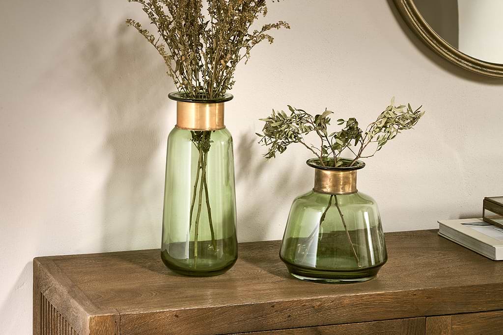
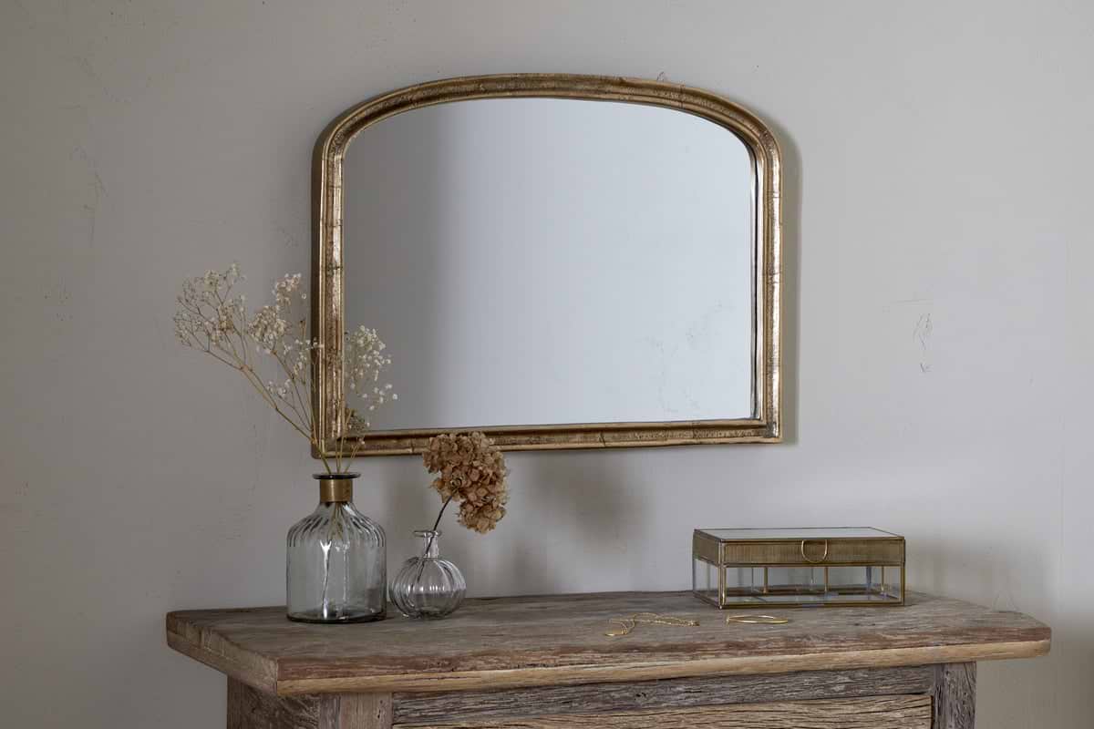
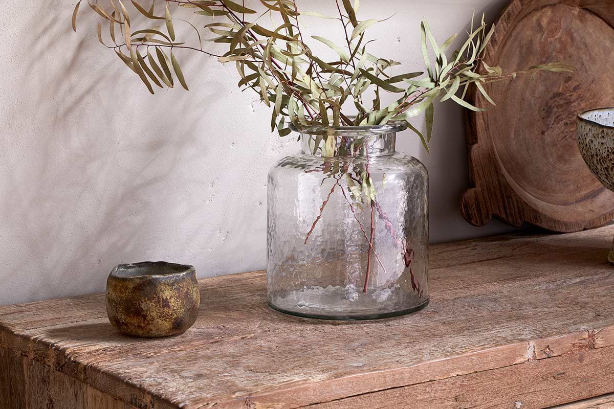
Akra Recycled Glass Vase
Clear cylindrical glass — pairs with stems or sits empty as a quiet accent.
View at Nkuku →Some links above are affiliate links. If you buy through them we may earn a small commission at no extra cost to you. We only suggest pieces we think fit a calm, lived-in home.
Free guide
The Calm Shelf
12 styling ideas to help you compose calm, balanced shelves in natural texture homes.