

Many homes chase the grey aesthetic to find calm, but end up looking cold or unfinished. Light can make grey walls feel flat, and too many shades turn a room busy instead of welcoming.
This guide shows practical ways to layer warm greys in real rooms, soften what feels harsh, and choose fewer, better materials for a warmer look. This works especially well in a small apartment living room when you use simple window coverings because the soft layers help the space feel settled instead of exposed.
The short version: The easiest way to achieve a warm grey aesthetic is by mixing three or four natural grey shades across fabrics and wood, then bringing in one natural-fibre rug. A few careful choices reduce clutter and make the room feel inviting, not sterile, without major redecorating.
Key takeaways
- A grey aesthetic looks warm when you add greige, taupe, and charcoal tones with natural textures.
- Most rooms appear softer with at least one light-filtering linen curtain.
- Natural-fibre rugs break up cold floor colour and absorb sound.
- An oversized light source with a warm bulb is better than three small lamps for a calming effect.

The problem with grey aesthetic inspiration boards
Grey aesthetic inspiration boards often look peaceful online but leave homes feeling cold because they miss the detail of how textures, light, and depth work together in real rooms.
Most people start a makeover by collecting images from Pinterest or saving grey aesthetic inspiration boards. These online images are beautifully staged but usually stripped of clutter and real-life needs, making it hard to copy the look without losing comfort or warmth.
Rooms copied exactly from boards can feel empty or harsh. The soft focus and blurred edges you see in grey aesthetic imagery come from careful light choices and layers that hide hard lines, not from painting everything the same shade.
Unlike inspiration boards, real homes need storage, places to sit, and materials that stand up to daily use. If you only follow pictures, the space can end up more like an empty stage than a lived-in room. Small tweaks, like switching plastic storage for a rough jute basket, change the feeling straight away, one feels stark, the other grounded.
Start by picking out the textures and natural details that the online images suggest, skipping the urge to match everything perfectly.
How do you decode which grey you actually need?
Choosing the right grey depends on light, floor colour, and how you want the room to feel each day, not just on the paint chip or Pinterest pin.
North-facing rooms, those that get cool daylight, make blue-toned greys look even colder on the walls, while stone or greige (a warm-grey beige) looks softer and less stark. In a rental bedroom with closed blinds, a taupe grey bedding makes the whole space warmer under artificial light.
A palette that leans on greige works because it blurs the line between grey and beige, making a living area feel less clinical without adding obvious colour. If the space feels flat, adding a single deep charcoal cushion helps anchor the tone and stops the look from floating away.
Unlike pale or icy greys, taupe and greige hide marks and work across seasons. Test a sample on foam board and move it around the room if you want to see how it plays with morning and evening light. These subtle differences in undertone matter day to day; for example, a bright white shelf near a grey wall pulls the eye, breaking the flow of a sleepy reading nook.
The best way to decode the right grey is to hold samples near your main light source and next to wood or linen you already own, seeing which feels like a background and which draws attention.
Where this works best
Layered warm greys are most reliable in high-use rooms or compact spaces where soft surfaces and simple storage keep the feeling calm and finished.
Open-plan living rooms with shared sofa and dining space often feel scattered. A consistent grey palette, spread across curtains, a rug, and two or three small objects, makes the area feel tied together. Low light bedrooms especially benefit from warm grey, where cold hues can turn dim light gloomy instead of restful.
In small entryways, a single piece like a concrete-grey bench softens the effect of hard floors and gives an anchor point. Rental kitchens with awkward bins or appliances fade into the background with a soft greige wall colour, hiding the joins and making mismatched details less jarring.
Avoid layering too many dark greys in a windowless space, dark charcoal on every wall makes a narrow hallway feel even tighter, instead of cocooned. Instead, limit the deepest grey to one piece and use lighter shades for large surfaces. This shift gives visual breathing room and keeps the look quiet, not heavy.
The rule of thumb: A grey palette works best when you balance one feature piece with two light-reflecting surfaces nearby.
Which natural materials make grey cosy?
Grey rooms feel cosy when you add natural materials with texture, such as linen, unfinished wood, and natural-fibre rugs, each breaking up coolness in their own way.
Linen curtains filter morning light and make the wall colour look warmer. Compared to a blank window, even a thin linen panel softens the edges and adds depth that plain paint can’t match. Most decorators recommend linen for rented spaces because it looks neat without much ironing and fades gently over time instead of yellowing.
Unfinished oak or beech, think stools, picture frames or a side table, pulls out the warmth in greige and pale taupe walls. A smooth plastic tray on the same shelf would look harder and barely visible, where wood grain adds a quiet presence. Unfinished wood is especially useful near windows, as it stays cooler to the touch than most metal or composite boards.
Natural fibre rugs, such as jute and sisal, break up large floor areas, absorb echo, and contrast with flat grey tile or painted boards. Most standard jute runners are under $80, and they dry quickly after a spill, making them workable for busy homes according to many designer roundups.
Placing a jute or wool rug near the sofa keeps the main seating area looking separate from thoroughfares, and stops a long room from feeling like a corridor.

How do you build a grey palette that isn’t flat?
A grey palette feels full when you mix warm and cool tones, vary surface texture, and repeat key colours across three objects or layers.
Start with three shades: a warm base like greige, a mid-toned taupe-grey, and a dark anchor like charcoal in one spot. If the whole room feels pale, adding one small dark feature pulls everything together. A wool ottoman or deep grey planter can do the job without extra clutter.
Texture is the main difference between a flat and a warm finish. Layering a rough basket or stoneware vase in a similar tone as the sofa or wall keeps the scheme restrained. Compared to high-gloss accessories, matte finishes hide dust and reflect less light, making the space feel settled.
If you are working with what you have, try grouping three objects of different shapes but similar grey tones on a shelf. A big mistake is spreading similar items across the room, which makes the eye jump and the palette feel less deliberate. Place them close together, the space around them will read clearer.
Most decorators advise keeping the main grey in a space to about half or two-thirds of what you see, a rug or sofa, not every surface. Keeping some warmth in each zone helps the palette work season after season, and lets you swap a cushion or vase when the mood shifts.
Styling and placement
A grey room looks finished when you limit your palette, anchor one focal object, and bring in texture right where you want the eye to settle.
Start by choosing just two or three tones (for example, greige, light taupe, and charcoal) so the space doesn’t read as busy. A linen or wool cushion set in the darkest shade can be the single anchor for a bed or sofa, while light grey curtains and smaller accessories keep the rest soft.
Placement is about stopping the eye in places you want to rest. If the view from the sofa crosses a jute rug and then meets a pale taupe wall, the room feels broader, but if there’s a tangle of varied throws, the focus disappears. The simplest fix is one bold cushion or lamp, then repeating a similar grey in nearby small decor, a clay bowl, a wooden tray, a cotton throw.
Compared to crowding a shelf edge-to-edge, leaving two-thirds of it empty makes every object look intentional and less cramped, according to most stylists. Visual weight comes from spacing, not the number of things.
Quick calm checklist:
- Few but strong textures, linen, wool, rough clay, jute
- Keep two-thirds of horizontal surfaces clear
- No more than three shades mixed in one room
- Anchor with one large object in a deep grey or charcoal
Bringing in these limits clears clutter and lets each piece add to the whole, rather than scatter the eye.
Common mistakes with a grey aesthetic
Many rooms miss the mark by matching every shade exactly or ignoring the need for warm light sources, which turns the scheme sterile or heavy.
The most common error is using only cool, blue-tinted greys, which makes the space feel like an office instead of a home. A living room with white lampshades and no natural textures can end up feeling blank, no matter how many soft furnishings you add.
Matching sofa, rug, curtains, and walls too closely may look neat at first, but the effect is more hotel than home. Instead of matching, use one warm light source, like a single oversized floor lamp with a linen shade, which can do more to soften the mood than lining up multiple smaller lights.
If you want to avoid the sterile effect, skip shiny objects and bring in finish variation, matte pottery alongside a rough wool throw does more for atmosphere than a dozen coordinated accessories. A space always feels more inviting when the layers repeat textures, not just colours.
Most beginners fill the space with small grey objects, but the effect is busy instead of calm. Limit yourself to three to five substantial pieces, keeping the rest of the view simple and uncluttered.
Most people realise something is off when the room looks tidy but somehow not restful, a feeling that lingers even after cleaning or rearranging. They notice the grey looks dull, the corners feel empty, or the furniture seems to float instead of settle. This feeling usually comes from too many similar, cool tones or from missing a single “grounding” feature.
The real shift happens when you simplify the palette to three tones and repeat one texture in more than one area, suddenly, the space feels complete and easy to maintain.
Many homes miss the calming effect of layered greys by crowding in too many shades or using glossy, cold materials. The downside is a room that ends up heavy, or looks busy even when everything is tidy. It matters because the first impression is either cold order or relaxed simplicity, and most homes want the latter today.
Once you get the palette and one anchor piece right, the rest of the styling feels easier, fewer things, clearer blocks of colour, less clutter to move each week.
Save this idea for later.
Materials and choices that still look good years later
Linen, unfinished wood, and soft natural-fibre rugs are the three materials that reviewers repeatedly find reliable for layering with grey. They mellow over time, hiding small marks, and don’t date as trends shift. Matte finishes get recommended again and again for shelves near windows, because they don’t catch glare the way a glossy tray does.
A pattern in advice from decorators is clear: repeating one or two textures, not just colours, helps rooms stay comfortable and avoid the flat, staged look. The best spaces keep their appeal because they balance calm with enough detail that the room feels lived in and still easy to update.
Mara, Loom & Glow
Common questions
How do you make a grey room feel warm?
The best way to make a grey room feel warm is to layer soft textures like linen, wool, and unfinished wood with warm grey and taupe tones. Adding a large rug, warm light bulbs, and a few natural materials keeps the space inviting and avoids it feeling flat or cold.
What colours go with a grey aesthetic?
The most natural matches for a grey aesthetic are greige, taupe, cream, and muted blues. Deep green, blush, and soft gold also work as accents when used sparingly. Stick to one or two accent shades for a calm effect, and keep larger items in neutral, textured tones.
What is the difference between greige and grey?
Greige is a mix of grey and beige, so it feels warmer than traditional blue or cool-toned greys. It hides marks better and softens strong daylight. Regular grey is more neutral or cool, which can make a room look sharper but also harder if used on every surface.
Which materials soften a grey colour scheme?
Linen, raw wood, and natural-fibre rugs are the top three materials that soften a grey colour scheme. Their textures break up flat surfaces and absorb light differently, making the space look and feel less sharp. These materials are recommended for large elements like curtains or rugs.
Explore more calm combinations inside our Shop The Look .
Shop the Look
A few quiet pieces that bring soft texture and gentle light to a warm grey room.
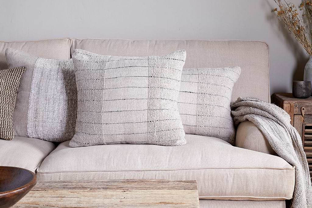
Mayla Cushion Cover
Soft hand-textured cover, instant warmth on linen sofas or chairs.
View at Nkuku →
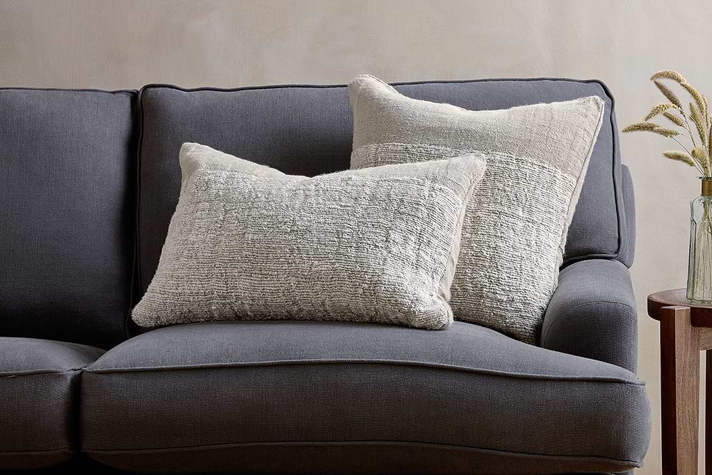
Puli Linen Cushion
Recycled linen in natural, pairs with woven textures and aged wood.
View at Nkuku →Some links above are affiliate links. If you buy through them we may earn a small commission at no extra cost to you. We only suggest pieces we think fit a calm, lived-in home.
Free guide
The Calm Shelf
12 styling ideas to help you compose calm, balanced shelves in natural texture homes.