

Many living rooms never feel quite steady, and often the trouble starts on the walls. A flat beige or cold white throws shadows that make clutter stand out and corners look busy. A grey wallpaper living room draws less attention to mess, but the wrong shade can feel chilly or heavy, especially around low light and narrow floors.
Today, you can find a grey tone that feels soft and natural, anchors your room, and does not close it in. We’ll look at how to choose a shade that fits your light, match it to your best furniture, and skip what drags a room down. This works especially well in a small apartment living room when you have uneven daylight because the right grey makes everything settle down and blends edges in a way plain paint cannot.
The short version: The best grey wallpaper living room shades are soft, mid-toned, and slightly warm for most homes. Matching your grey to your room’s daylight and texture keeps things calming instead of stark or cold. The right wallpaper shade sets a gentle stage for colours, baskets, and wood to look their best.
Key takeaways
- Grey wallpaper with a warm undertone keeps a living room feeling relaxed instead of icy or somber.
- A light grey wallpaper opens up small, shaded spaces, letting more sunlight bounce off the walls.
- Textured and patterned grey wallpapers add depth and reduce marks showing up over time.
- Most brands let you order wallpaper samples to test shades before you buy, according to Dunelm categorises grey.
- Neutral-coloured sofas, wooden accents, and woven baskets anchor a grey wallpaper living room best.

Why does grey wallpaper work for living rooms?
Grey wallpaper works for living rooms because it doesn’t pull the eye, lets furniture and textures stand out, and helps blend corners that feel busy.
Many living rooms collect too much, remote controls, books, baskets, toys. A strong wall colour can make this mess feel worse. A gentle grey, with a hint of warmth, lets things fade back, especially in a shared family space or rental where storage is tight.
A mid-toned grey hides marks and shadows that would show on a lighter paint. It brings out woven baskets, wood grains, and linen throws, giving them a job and making clutter feel less sharp. Unlike stark white, which draws attention to every edge, grey creates a soft frame for other materials.
In open plan rooms, a consistent grey wallpaper living room helps one space lead gently into the next. The wall colour recedes, letting fabrics and artwork take over. A brick effect wallpaper or soft linen texture adds even more depth without shouting for attention. The effect is a room that feels relaxed, not overloaded.
Choosing the right shade of grey for your light
The right grey shade matches the way daylight hits your room; a warm grey softens north light, while a cool grey stops sun-drenched corners from feeling yellow.
Flat, north-facing rooms stay cold with the wrong wallpaper. A warm grey, one with a touch of taupe, mushroom, or cream, takes the edge off blue daylight so the space doesn’t feel drab. South-facing spaces, on the other hand, can handle a truer grey or even a light charcoal, which brings out wood and brass tones.
If your living room window faces another building or a narrow alley, there’s rarely much sunlight. Dark or charcoal shades make this worse by soaking up what small light enters. Instead, look for a soft, barely-grey paper; this opens up the space and feels easy on tired eyes.
A shade that looks right on a sample can look much darker on four walls. Brands like Wallpaper-uk.com lists over four hundred greys, so testing a swatch on your sunniest and darkest wall first makes a big difference. In most cases, a soft mid-grey fits best in spaces where both morning and evening light comes in.
Where this works best
Grey wallpaper works best in living rooms with mixed furniture and open shelves because it supports both light and dark pieces without crowding them.
Open-plan flats and small rental living rooms often mix old sofas, new shelves, and colourful rugs. A warm, light grey paper underpins all of these, making second-hand finds look at home. The room feels easier to navigate and less fragmented.
If windows are small or sit high, go lighter. Pale grey adds space around a low sofa or a cluster of baskets in a window bay, keeping the mood soft and fresh. In rooms with stone floors or concrete, a richer, textured grey wallpaper cuts the chill from below and anchors things without dragging the space down.
Avoid pairing dark grey wallpaper with black furniture or glossy TVs: it can come across dim, especially at night. Instead, use woven or wooden baskets, like the Nkomi Basket, to break up solid surfaces and give the walls something to play off. This softens the finish and works well in homes with lots of open storage or floating shelves.
Grey wallpaper textures and patterns for visual depth
Textured or patterned grey wallpaper adds depth, breaks up bare stretches, and hides small marks better than plain paper.
Flat paint shows every bump and scuff, but a linen-texture wallpaper disguises scuffs and softens harsh sunlight. Textures such as grasscloth, subtle brick effect, or even a faint wood grain give a wall movement, which is especially useful in large modern living rooms.
Many brands now offer geometric prints, leaf trails, and even metallics in grey. These patterns read almost solid from across the room but add a quiet detail as you get closer. Unlike heavy floral or damask wallpapers, which can close a room in, a light geometric or a soft faux-linen stays practical and fresh.
According to World of Wallpaper, you can find grey wallpaper in brick, glitter, and textured styles, making it easier to match your storage pieces or wall art. A wallpaper that feels tactile but not fussy softens the sense of many objects jostling for space, especially open bins and baskets.

How do you pair grey wallpaper with furniture and decor?
Grey wallpaper pairs best with warm woods, matte black or brass, chunky knits, and woven baskets because these materials bring out the depth in the wall colour.
Sofas in oatmeal or soft beige, paired with thick, natural wood coffee tables, get a boost against light to mid-grey backgrounds. Woven baskets add a lived-in ease that shop-like shelving cannot quite reach. A bare shelf reads colder than one with a single woven basket, clay pot, or folded throw.
Rattan lights, unglazed ceramics, and linen curtains settle into a grey wallpaper living room. Each material catches the light differently, so even when the wall is all one shade, the room feels layered and full. Unlike gloss or glass furniture, which can bounce light in harsh wedges, matte and soft items keep the look quiet.
Pale wood, warm metals, and muted green or clay tones work well together. The eye moves softly from wall to basket to rug, creating a gentle movement, never a sharp line. For more pairing inspiration, see earthy living room ideas or warm living room colour schemes.
Styling and placement
The simplest styling for grey wallpaper uses clear surfaces, one or two large baskets, and a cap on the number of colours and patterns in the room.
Start by placing storage baskets or a woven tray near your main seating. These break up the flatness of a long wall and buffer any clutter. Wood-framed mirrors bounce light but also add a soft blur so the wallpaper sets a base rather than acting as a focus. A single art piece or woven wall hanging adds a quiet anchor without making the grey feel cold or flat.
Keep upholstery and storage in three to four shades: one light, one mid-tone, one deeper support, plus a touch of black or brass. Neutral rugs, wooden legs, and linen cushions blend in best, while a stray blue or green pillow brings a nudge of colour without fighting for attention.
Unlike many loud feature walls, a calm grey backdrop gives you more freedom to change pillows or move baskets season to season. A darker wallpaper can handle chunkier furniture, but lighter greys are better if your shelving is open and storage visible, everything feels lighter, less busy. For another subtle look, browse our warm minimalist living room ideas.
Quick calm checklist:
- Stick to a base palette: one grey, plus two complementary neutrals (beige, cream, taupe).
- Anchor at least one area with natural material, a linen curtain, wooden coffee table, or large basket.
- Keep art and objects simple: one bold piece or two to three small, unframed works per wall.
- Allow clear surface space so the wall and objects can “breathe.”
- Balance hard lines (bookcase, TV console) with soft elements like throws or a rattan stool.
What should you check before buying grey wallpaper?
Check samples of your shortlist at different times of day, and always confirm the surface can resist marks, especially if you have open shelving or children.
Most brands let you order small samples for a few pounds, which makes decisions more obvious. Wallpaper-uk.com stocks a wide range, including washable and peel & stick types. Removable papers are better for rentals or fast projects, while heavy woven or linen-finish papers hide wall bumps and last through more wear.
Graham Brown sells designs like ‘Glasshouse Soft Grey’ or ‘Wild Flower Shadow,’ which, combined with a washable coating, help the wall shrug off everyday smudges. Peel and stick wallpaper is easier to reposition, but can shift in humidity. If your room is sunny part of the day and chilly the rest, stick with traditional papers, these hold up longer in rooms where heat and damp battle it out.
For shoppers in the UK, most brands now promise delivery within about a week or so, so waiting for a sample before buying a full roll is worth the pause. Always double-check if your chosen wallpaper is classed as washable, especially where baskets or benches might scuff the walls.
What tends to hold up with grey wallpaper in living rooms
Grey wallpaper remains a steady pick because it works in both bright and shadowed corners. Patterns with a slight weave or linen finish tend to outlast smooth papers near high-traffic areas, as reviewers often mention that light surface texture disguises marks from baskets and hands. Many decorators recommend testing samples side by side on every wall to judge how warm or cold the room actually feels throughout the day, especially before committing to a bold shadow or light grey on all walls. Calm, mid-tone greys have a reputation for working year after year, even after changes in furniture and colour trends.
, Mara, Loom & Glow
Common questions
What colours go best with grey wallpaper in a living room?
Warm neutrals like taupe, beige, cream, plus natural woods, muted greens, and soft terracotta go best with grey wallpaper in a living room. These tones soften the wall colour and prevent the space from feeling cold. Adding textures like jute, linen, and clay rounds out the look.
Is grey wallpaper a good idea for a living room?
Grey wallpaper is a good idea for a living room when you want a calm, adaptable base that works across different furniture and lighting. A soft, slightly warm grey helps the room feel settled. Always test samples first to make sure the shade fits your light and floor coverings.
What type of wallpaper is currently fashionable for a living room?
Textured and patterned wallpapers with a gentle touch, such as linen effect, geometric prints, and subtle botanicals, are currently fashionable for living rooms. Soft mid-greys, taupe-greys, and those with a faint metallic or stone effect lead trends right now. Practical, easy-clean finishes are especially popular in busy homes.
What are the current trends in wallpaper design?
Current trends in wallpaper design include tactile textures, nature-inspired prints, and calm, neutral palettes. Many brands feature peel & stick or washable wallpapers, suitable for renters and families. Greys remain popular because they mix easily with wood, basketry, and woven fabrics used in modern living spaces.
Explore more calm combinations inside our Shop The Look .
Shop the Look
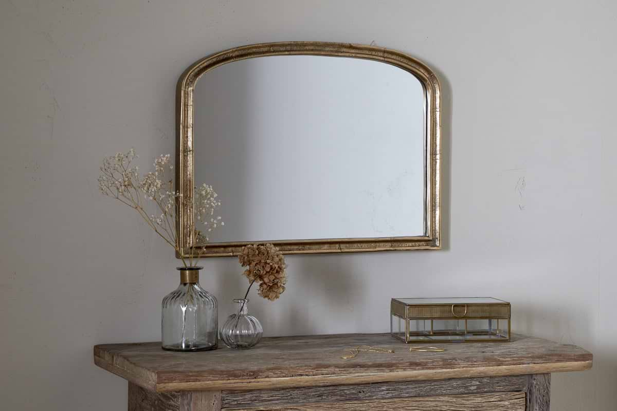
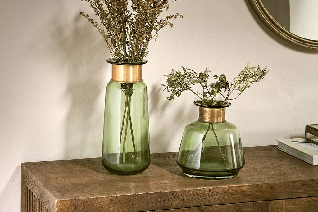
A few Nkuku pieces that bring soft texture and quiet warmth to a grey-papered living room.
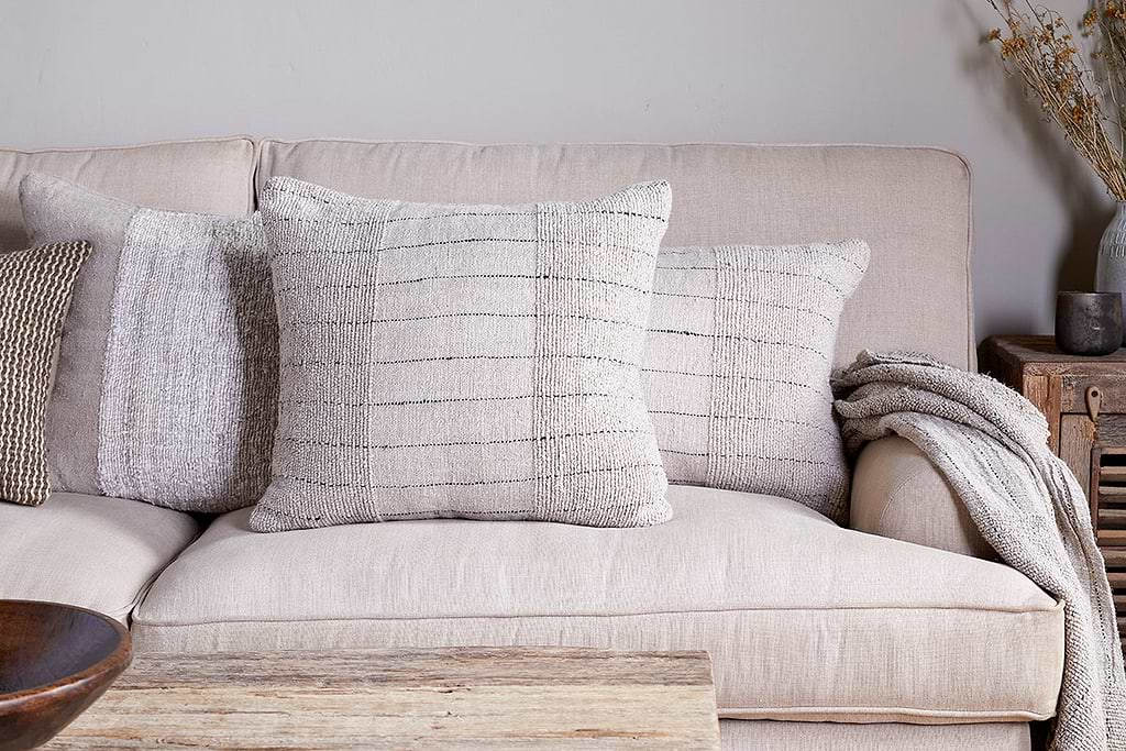
Mayla Cushion Cover
Soft hand-textured cover, instant warmth on linen sofas or chairs.
View at Nkuku →Some links above are affiliate links. If you buy through them we may earn a small commission at no extra cost to you. We only suggest pieces we think fit a calm, lived-in home.
Free guide
The Calm Shelf
12 styling ideas to help you compose calm, balanced shelves in natural texture homes.