

In many neutral homes, adding colour feels risky. Plain walls, flat light, small living areas, a splash of a strong tone can worry even the most confident decorator. Dark orange curtains seem bold, and the thought of them crowding a room or tipping things toward clutter is a common concern.
Yet a warm palette doesn’t have to mean chaos. With the right fabric, placement, and some gentle editing, you can use colour to bring in comfort, not confusion. This works especially well in a rental living room with flat white walls when nothing else defines the space, because the right choice brings quiet warmth without fuss.
The short version: Dark orange curtains warm up a plain space without making it feel crowded when you use lightweight fabrics and keep the rest minimal. The key is to limit extra patterns, choose natural fibres, and let the colour anchor one simple feature.
Key takeaways
- Dark orange curtains work best when the fabric is lightweight and the palette is kept neutral in the rest of the room.
- Linen and cotton are calmer for small spaces than heavy velvet or thick polyester.
- Pairing dark orange with pale walls and simple wood furniture keeps a room from feeling crowded.
- Most shops, like Dunelm, offer nearly a hundred orange curtain styles, including eyelet and pencil pleat headers.
- Adding a natural material, such as a woven basket, helps balance strong colour and soften sharp edges.
- Why does dark orange work in warm, minimalist spaces?
- How do you choose the right fabric for dark orange curtains?
- Where this works best
- How do you match dark orange curtains to wall colour?
- Styling and placement
- What header style should you pick for calm windows?
- How does fabric weight change the mood of small spaces?

Why does dark orange work in warm, minimalist spaces?
Dark orange curtains add warmth without clutter when the room’s other features stay simple and the main colour is used only once.
Some rooms feel cold, even when clean, if everything is pale or grey. A single accent, like burnt orange or terracotta curtains, quickly softens that sharp look and draws the eye in. Unlike a busy pattern or rows of trinkets, a solid curtain in a warm tone grounds the space quietly.
Neutral sofas and wool rugs do little to anchor a rental living room when there is nothing on the windows. The glow from strong-coloured fabric pulls the space together, especially in low light or with sheer walls. This is why decorators recommend a single warm element as an anchor, one “hero” that balances without competing for attention.
A beige room can feel flat or unfinished if every surface is the same tone. Bringing in a single, saturated item, like dark orange curtains, creates purpose. The room becomes a little more layered, but never heavy. Use this approach in rooms with simple furniture and no other bright hues.
How do you choose the right fabric for dark orange curtains?
Linen and light cotton in dark orange calm a space, while thick velvet or shiny polyester make a window feel busier and heavier.
Fabric changes how colour reads. Linen lets light pass through and gives dark orange a softer, airier look, which is especially helpful in small lounges or bedrooms. Velvet, on the other hand, deepens the shade and draws more focus, best in big or shadowy rooms where warmth matters more than space.
According to retailers like Next, most orange blackout and thermal curtains now come in brushed herringbone, cotton, or linen blends. These textures work to break up strong colour and add gentle movement, instead of creating a stiff wall at the window.
Polyester is common and budget-friendly but often feels slick, which can make the colour read louder. While blackout lining is practical for bedrooms, pairing it with a textured top fabric such as cotton or a woven blend helps keep things relaxed and grounded. Try lightweight linen in sunny rooms, and save velvet for deeper corners or homes needing extra warmth.
Where this works best
Dark orange curtains work best in living rooms and bedrooms with pale walls and plenty of simple light wood or white furniture.
Rooms with limited space, flat light, or plain white walls benefit the most. Small apartments that lack natural features or built-in character need one strong accent to prevent the area from feeling bland. Using this colour on the window draws focus without proper commitment, easy to change, powerful when left alone.
Practical homes, such as rentals and furnished flats, often have to work with fixed wall colours. Here, swapping in a pair of dark orange curtains is less permanent than painting or replacing major furniture. The visual impact is real, while the disruption is minimal. Try them on large windows where there’s enough natural light to bring out the orange and soften any shadows.
Avoid pairing dark orange curtains with dark walls or strongly patterned bedding in the same room. These combinations can close in space quickly. Instead, use them where the rest of the room is kept simple, white or cream walls, plain floors, a simple rug, maybe a basket or clay lamp as quiet partners.
How do you match dark orange curtains to wall colour?
Dark orange curtains work with off-white, pale grey, or warm beige walls, but look crowded if set against deep blue or dark brown paint.
If the goal is calm rather than contrast, pick curtain colours a few shades warmer than the wall. Two light neutrals, like pale beige and warm terracotta, sit quietly together, so the orange does not shout. This works best in spaces that already have a lot of daylight, where the contrast stays soft and easy on the eyes.
Unlike pairing dark orange curtains with another bold shade (navy, charcoal), setting them by soft white or light stone helps the room stay open. Shadows along the fabric will deepen the tone naturally, giving the window more interest without crowding the senses. This is why so many plain, pale-walled homes benefit from a single strong accent at the window.
If everything in the room is neutral, adding one depth note, burnt orange, clay, or rust, prevents the space from floating away. The curtain’s colour grounds the room, which is especially helpful above pale wood or wool texture. For added calm, pick mattes or slubbed finishes over gloss and avoid fussy trims.

Styling and placement
The calmest rooms use dark orange curtains on only one wall, keep furniture light, and repeat texture with a basket or linen on the opposite side.
Placement makes a difference. If curtains are the only strong colour, place them on the biggest or brightest window to centre the focus. Keep the nearby decor light and simple, avoid clustering bold cushions, throws, or art right next to the window. Unlike shelves that allow for small objects, a window needs the open space around it more than anything.
To avoid a heavy look, use just one or two warm accents elsewhere such as a clay vase or a woven basket. Dark orange asks for partners that feel rooted, linen, light oak, matte ceramics. Try pairing the curtain with a single other warm-toned object on the other side of the room, far enough that things do not clump together or compete visually.
Painted or white walls will absorb the extra colour easily, but rooms with dark floors or deep-toned furniture call for moderation. If the palette already feels busy, scale back, remove one pattern or replace a bold rug with something quieter. A dark orange curtain draws the eye, so keep the rest of the room pared down for balance.
Quick calm checklist:
- Choose one natural material, linen, jute, or cotton, as your main accent.
- Limit bold colours to just curtains and one or two small extras (basket, lamp, or bowl).
- Keep curtain placement to one wall or window for focus.
- Balance the room’s palette by pairing warm tones with pale or matt finishes nearby.
- Let at least half of surfaces, tabletop, floor, shelf, remain clear or lightly styled.
What header style should you pick for calm windows?
Pencil pleat and eyelet headers keep dark orange curtains looking neat, while pinch pleat adds structure in rooms that feel too casual.
Header type changes the mood. Pencil pleat styles read softer and more casual, while eyelet curtains glide smoothly and hang in clean folds. This works well for renters who change curtains often or for windows that get opened a lot. According to Dunelm, eyelet and pencil pleat headers are the most common for orange curtains and fit most standard poles.
Pinch pleat options look more formal, with crisp folds that hold their shape. They suit traditional homes or larger windows, but can feel a little stiff in a small or simple room. Unlike casual wave or eyelet styles, pinch pleats add extra visual lines, which may change the room’s balance, best used in spaces needing a sense of order.
If the goal is minimal upkeep, choose eyelets or pencil pleats for easier washing and rehanging. Lined options block light better, but always check that the fold or pleat style works with your window size. This gives the window structure without making it the only thing you see.
| Header Type | Look & Feel | Best Room |
|---|---|---|
| Pencil pleat | Relaxed, gentle folds | Living room, bedroom |
| Eyelet | Modern, neat drape | Rental, small apartment |
| Pinch pleat | Structured, tailored | Formal lounge, tall windows |
How does fabric weight change the mood of small spaces?
Lightweight curtain fabric lets more air and daylight in, making dark orange less dominant and keeping small rooms from feeling closed in.
In small living rooms where air and light are precious, a heavy velvet curtain blocks both, not just the view, but the feeling of open space. Lighter fabrics, like unlined linen or soft cotton, filter sunlight and give the colour a gentle, hazy edge. Compared to thick polyester or full blackout, these options are friendlier to rooms with little extra square footage.
Shops like Curtains-2-Go offer some orange curtains with free blackout lining, but light, unlined panels often suit minimalist homes best. Thermal curtains keep heat in but can add weight to the window, so choose these if you need insulation more than openness, such as for a north-facing bedroom.
Heavy fabrics trap air and catch more dust, which matters in busy households or small apartments where windows open often. If you want the feeling of air and space, pick a lighter weave and skip thick linings where possible. A room reads calmer when the curtain moves and flows, not when it hangs stiffly from corner to corner.
What tends to hold up with using strong colour and natural materials
Rooms that feel warm tend to use fewer colours and let natural textures do the heavy lifting. Reviewers often notice that linen dark orange curtains cast a soft glow but never close in a space, no matter how strong the colour. On the other hand, shiny polyester fabrics or glossy paint finishes can pull too much attention, especially when daylight shifts through the day.
Decorators consistently suggest a limited palette, one strong colour, two or three light neutrals, and a natural texture or two. Matte finishes get recommended again and again near windows, because they don’t catch glare like a gloss or heavy velvet. A simple, woven storage piece like the Nkomi Basket can help keep things grounded too.
, Mara, Loom & Glow
Common questions
What colours work well with dark orange curtains?
Pale neutrals like off-white, warm beige, nude pink, and light grey work well with dark orange curtains. These shades calm the look so the orange adds warmth rather than noise. Natural wood, cream, or soft brown accessories also help connect the colour back to the rest of the room.
Should your curtains be lighter or darker than your walls?
Curtains can be lighter or darker than your walls, but for a relaxed effect, darker curtains with pale walls look more open and easy on the eye. This helps the colour stand out without feeling busy. Avoid strong contrast if the space is very small.
What does the term ‘orange curtain’ refer to?
The term ‘orange curtain’ means any window panel where orange is the main colour, ranging from light apricot to burnt orange or terracotta. The fabric, header style, and lining can all vary. Some designs mix orange with neutrals or warm browns for a softer impact.
What are the current trends for curtains?
Current curtain trends include soft, natural textures like linen, simple pleat headings, and warm colours such as burnt orange and soft clay. Layering plain curtains with sheer panels is also popular. Many choose blackout or thermal options for comfort and restful sleep.
Explore more calm combinations inside our Shop The Look .
Shop the Look
A few Nkuku pieces that deepen the warmth of dark orange tones.
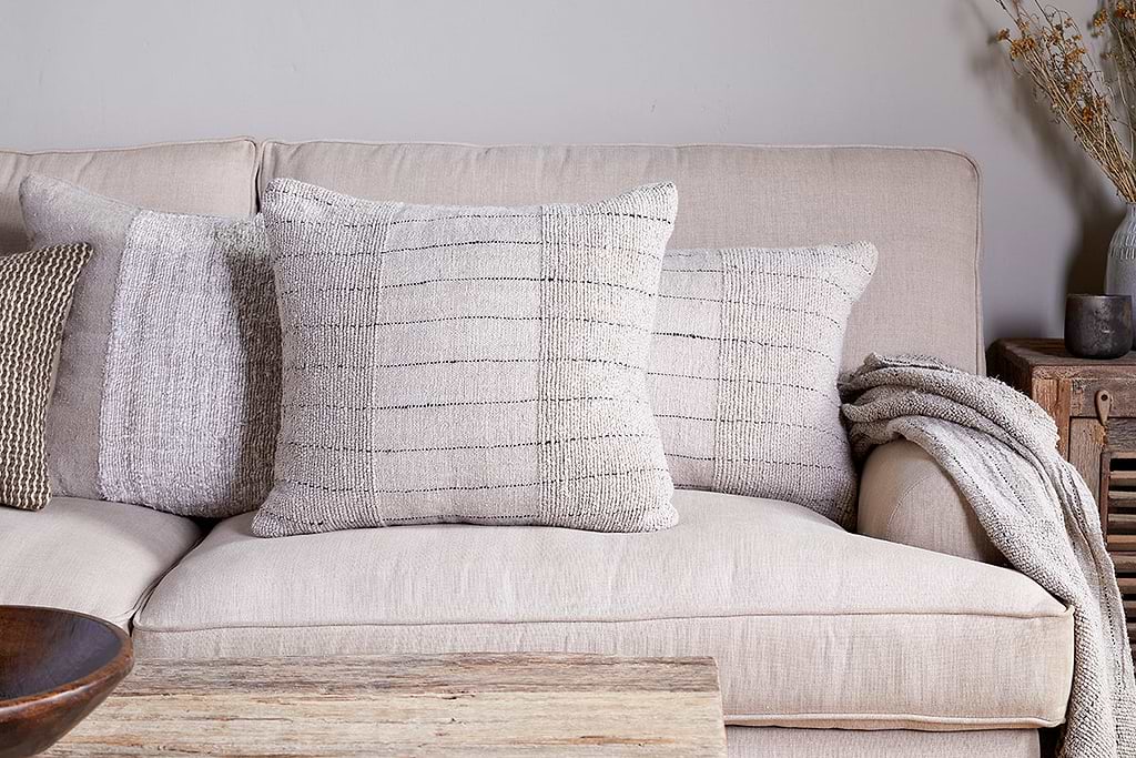
Mayla Cushion Cover
Soft hand-textured cover, instant warmth on linen sofas or chairs.
View at Nkuku →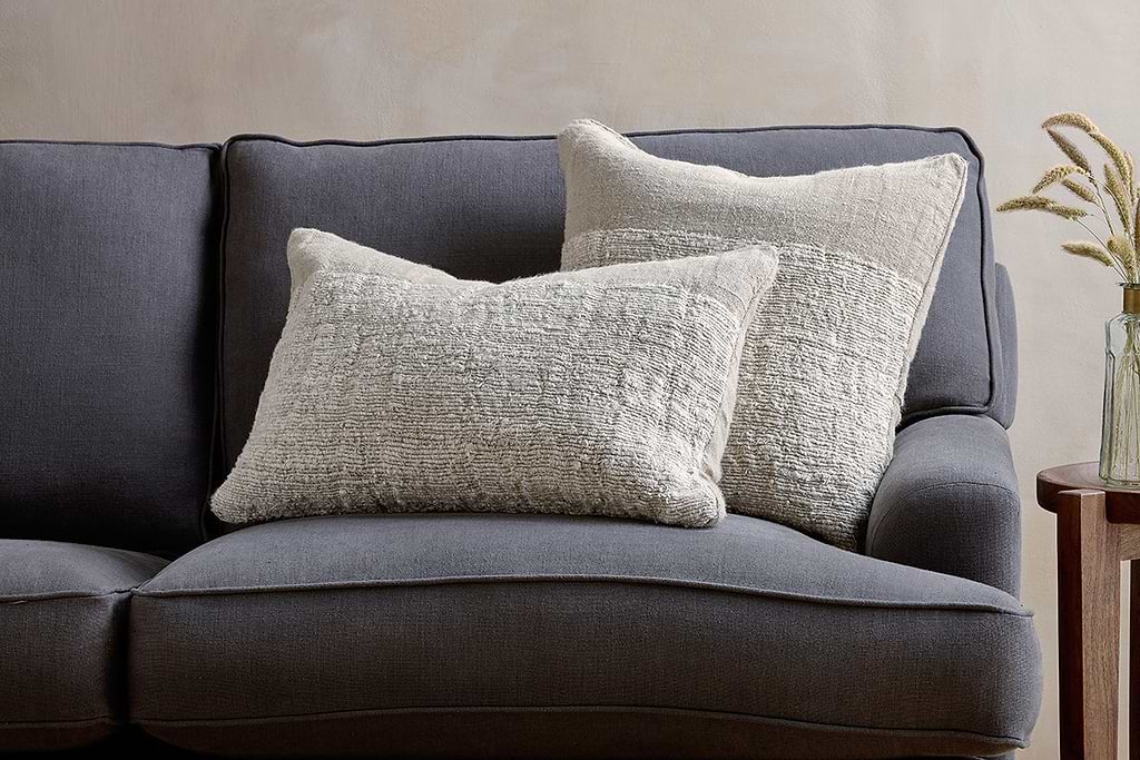
Puli Linen Cushion
Recycled linen in natural, pairs with woven textures and aged wood.
View at Nkuku →Some links above are affiliate links. If you buy through them we may earn a small commission at no extra cost to you. We only suggest pieces we think fit a calm, lived-in home.
Free guide
The Calm Shelf
12 styling ideas to help you compose calm, balanced shelves in natural texture homes.