
Black and white is the easiest scheme to choose and one of the hardest to make comfortable. Get the proportions wrong and a monochrome living room reads as a showroom: correct, high contrast, and nobody wants to sit in it.
The fix is almost never a third colour. It is deciding which of the two dominates, and then doing the work in texture rather than in more contrast. Below are the principles, then twelve ideas you can apply to a room you already own.
The problem with black and white living rooms
Monochrome design uses varying shades of a single colour family, usually black, white and the greys between them. On a screen that reads as crisp. In a room it can read as cold, because pure black against pure white is the highest contrast the eye can process, and high contrast is tiring in a space where you intend to relax.
The second problem is flatness. Remove colour and you remove one of the two things that give a room depth. Unless texture takes over that job, the room looks like a drawing of itself.
The core principles of monochrome design
The 60-30-10 rule for black and white spaces
Sixty per cent dominant, thirty per cent secondary, ten per cent accent. In a monochrome room the accent is not a colour, it is a material: brass, oak, jute, marble or leather. Keeping the accent to a tenth of the room is what stops the scheme becoming a pattern.
Texture is your secret weapon
Bouclé, wool, linen, matt ceramic, aged wood and brushed metal all sit in the same two colours and behave completely differently under light. A white room with five white textures has more depth than a white room with a black feature wall. This is the single most useful thing to know about monochrome.
How to choose the dominant colour
Let the light decide. A room that gets good daylight can carry black as the dominant and stay comfortable. A north-facing or small room should be white-dominant with black used as a line, not a mass. If you are unsure, white-dominant is the reversible choice.
12 black and white living room ideas
1. Go bright and airy with white
White walls, white or pale upholstery, and black restricted to frames, legs and hardware. It is the safest version and the one that suits a smaller room. The discipline is in keeping the black thin: a black line around a room reads as sharp, a black block reads as heavy.
2. Contrast black with cream or off-white
Swapping brilliant white for cream, chalk or bone lowers the contrast without changing the scheme. It is the quickest way to make a monochrome room feel warmer, and it costs nothing extra when you are painting anyway. Our neutral living room notes go further on which off-whites hold up in low light.
3. Soften the look with curves
Monochrome amplifies shape, because there is no colour to distract from it. A curved sofa, a round mirror, an arched floor lamp or a circular coffee table breaks the grid that black and white schemes naturally fall into.
4. Layer black and white décor
Layering black and white pieces is the key technique for adding depth to a monochrome scheme. In practice that means the same two colours repeating at different scales: a large rug, medium cushions, small ceramics. Repetition at three scales reads as considered; the same thing at one scale reads as matching.
5. Use black to sharpen a light room
Painting a fireplace black sharpens and defines a light living room, and the same trick works on window frames, a single alcove or the interior of a bookcase. You are drawing a line around the room’s best feature rather than adding an object.
6. Anchor the room with one white statement piece
A white leather sofa can be the standout centrepiece of a monochrome living room, and it works because it is the one thing in the room that is both large and pale. If a white sofa is impractical, the same role can be played by a pale bouclé armchair or a large white rug.
7. Bring calm with Japandi style
Japandi takes monochrome down to charcoal and warm off-white, then adds light timber and paper shades. It is the most liveable version of black and white because the wood carries the warmth that the palette gives up. Our Japandi living room guide covers the proportions in detail.
8. Add rustic character with natural materials
A reclaimed timber coffee table, a jute rug, or a rough linen throw give a monochrome scheme the irregularity it lacks. Natural materials are not an accent colour, so they do not break the rule, but they do break the flatness.
9. Use pattern in one place only
Stripes, checks and geometric rugs all live happily in black and white, and all of them stop working when there are two of them. Choose the floor or the cushions, not both.
10. Keep the lighting warm
Cool-white bulbs in a black and white room produce something close to office light. Warm bulbs at around 2700K, placed low, are what turn the scheme from graphic to comfortable. This matters more here than in any coloured scheme, because there is no warm pigment to compensate.
11. Let art be the only complexity
In a room with two colours, one large piece of art carries more weight than it would anywhere else. Black and white photography is the obvious choice; a single piece with muted colour is the more interesting one, because it becomes the accent without needing a scheme of its own.
12. Leave the grey out if it is not doing anything
Grey is meant to be the bridge between black and white, but most monochrome rooms that feel flat have too much of it in the middle range. Removing mid-grey and letting the room sit at the two ends, with material warmth between them, is often the change that finally makes it work. Our warm minimalist living room guide applies the same logic to a softer palette.
How to warm the room without adding colour
Four moves, in order of effect: change the bulbs to warm, add one large natural-fibre rug, introduce timber at seating height, and swap any shiny black for matt. Each is reversible and none of them compromises the scheme. If after all four the room still reads cold, the issue is usually that black is dominant in a space that does not have the daylight for it. There is more on making a low-contrast room feel comfortable in our cozy living room notes.
Common questions
What colour goes with a black and white living room?
The materials work better than the colours: brass, oak, jute and leather all add warmth without breaking the scheme. If you do want a colour, choose one and keep it to about a tenth of the room. Deep green, oxblood and ochre all sit well against black and white; pastels tend to look accidental.
How do you warm up a black and white living room?
Start with warm bulbs at roughly 2700K, then add a large natural-fibre rug, then timber at seating height, then replace any high-gloss black with a matt finish. Swapping brilliant white for cream or chalk lowers the contrast further and costs nothing if you are already painting.
What is the best accent for a black and white room?
A material rather than a colour. Aged brass and light oak are the two most reliable, because both are warm and neither competes for attention. Keep the accent at around ten per cent of what you can see, and use it in at least two places so it reads as a choice.
What is the three-colour rule in interior design?
It is the convention of limiting a room to one dominant colour at roughly sixty per cent, one secondary at thirty, and one accent at ten. In a monochrome room the three are usually white, black and a warm material, which is why the material choice carries so much weight.
Shop the Look
Monochrome pieces that hold texture and presence without breaking the calm.
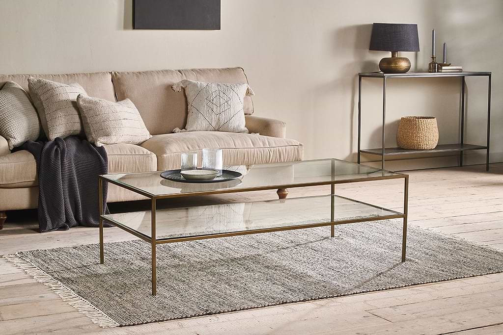
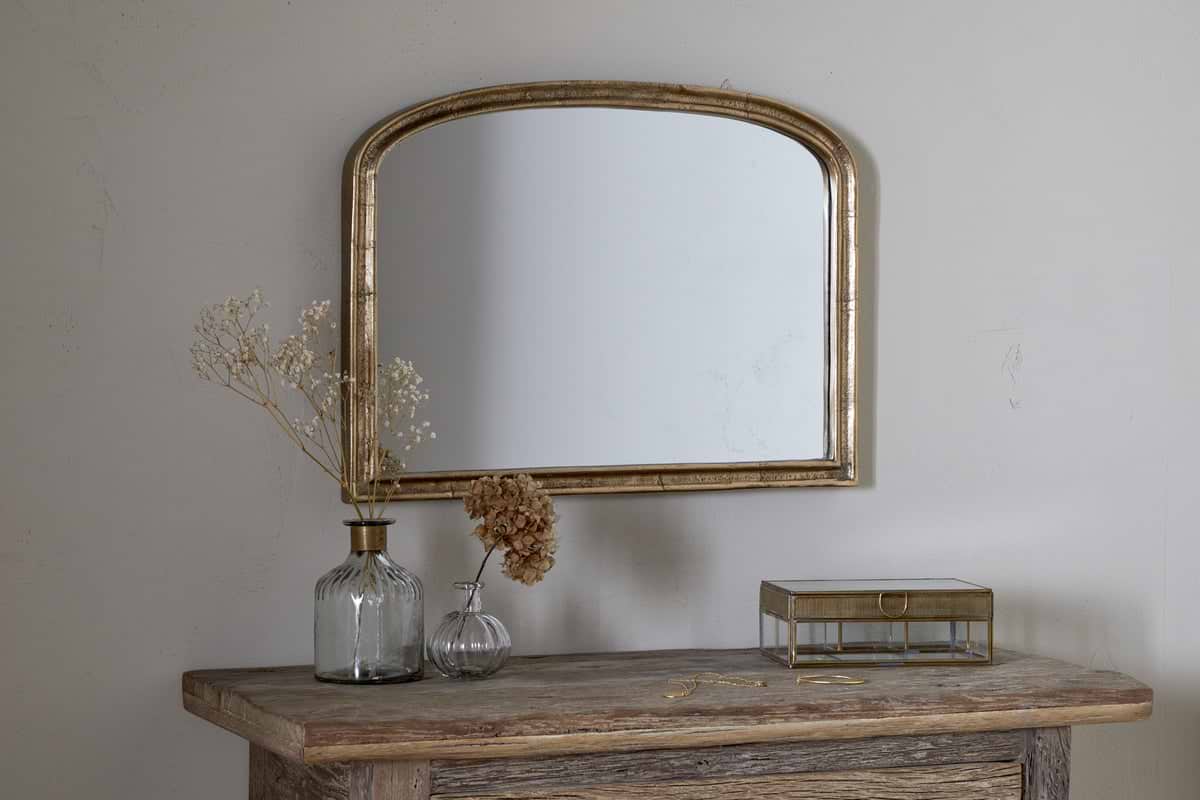
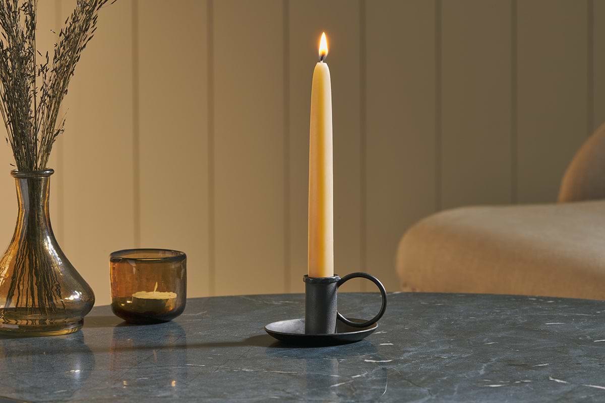
Amri Iron Candlestick
Slender iron with quiet presence, works alone or in clusters of three.
View at Nkuku →Some links above are affiliate links. If you buy through them we may earn a small commission at no extra cost to you. We only suggest pieces we think fit a calm, lived-in home.
Free guide
The Calm Shelf
12 styling ideas to help you compose calm, balanced shelves in natural texture homes.