

Bedroom feature wall ideas focus on using a single, calm colour or subtle natural texture directly behind the bed to add visual interest without overwhelming the space. The calmest colours are muted greens, warm taupes, and earthy terracottas, which absorb light softly and keep the room restful. To avoid a busy look, limit décor to one central art piece or shelf and repeat the wall colour in soft furnishings like cushions or a lamp shade. These quiet accent walls work especially well in small bedrooms or rooms with limited natural light.
Many people try bedroom feature wall ideas hoping to add interest but end up with a wall that feels loud or out of sync with the rest of the room. It’s common for bold colours or busy prints to fight with bedding and furniture, leaving the space unsettled.
The calmest rooms start with a simpler plan: choosing one shade, limiting contrast, and working with soft finishes. This works especially well in bedrooms with limited natural light or shared walls because gentle colours won’t overpower and help the space feel settled. Today, you’ll see how to pick, place, and style a soothing feature wall, without giving up comfort or your own style.
The short version: The best bedroom feature wall ideas in calm colours use muted paint or natural texture behind the bed for quiet depth, not drama. Picking a restrained palette and focusing on one area lets the room feel restful, not distracted, even in small spaces.
Key takeaways
- A feature wall behind the bed anchors the room without overwhelming smaller bedrooms or low-light spaces.
- Muted greens, warm taupes, and earthy terracotta provide depth and interest while keeping the space restful, according to Dulux.
- Bedrooms look calmer when the feature wall colour repeats in soft furnishings or accessories nearby.
- Natural textures like limewash or raw wood add visual quiet and mask daily scuffs better than glossy paint.
- The most successful accent walls keep the pattern simple and avoid busy gallery displays directly above the bed.
- Where this works best
- What is the calmest colour for a bedroom feature wall?
- How do you keep a feature wall from looking busy?
- Restful finishes: paint, wallpaper, or texture?
- Styling and placement
- What can you do if your bedroom is too small for a feature wall?
- Single art vs gallery wall: what works behind a bed?

Where this works best
A feature wall painted or papered in a soft colour works best behind the bed, especially in bedrooms with limited space or low natural light.
Small bedrooms, narrow city flats, and even shared spaces benefit most from subtle bedroom feature wall ideas. Instead of bright patterns that fight for attention, a gentle shade or texture behind the bed helps the room feel purposefully finished and less cluttered.
In a rental bedroom, painting just the wall behind the headboard means less commitment and less time spent prepping or switching. Many people find that only the headboard wall draws the eye anyway, so by focusing there, you avoid the room feeling overworked or busy elsewhere.
Avoid placing a feature wall on a side wall with full shelving or across from the main window, as both arrangements can weigh down a room, pulling focus away from the calm sleeping area. Bedrooms often feel choppy rather than restful when the accent wall faces the bed instead of sitting behind it, making the wall’s colour or texture the very last thing you see before you rest.
Anchoring a quiet feature wall directly behind the bed can make even the smallest bedroom look more considered, while leaving other walls calm and open.
What is the calmest colour for a bedroom feature wall?
Sage green, soft taupe, and muted terracotta are widely recommended as the calmest colours for a bedroom feature wall, according to Dulux and other paint guides.
Muted tones like gentle sage, clay-ish terracotta, or dusty taupe absorb light without making a room feel dark. Unlike sharp whites or deep blues, these colours hold shadows softly, keeping the mood quiet. Popular bedroom feature wall ideas for 2020 focused on just these shades, earthy enough for interest, soft enough to feel like background.
A pale green such as Dulux’s Tranquil Dawn was picked for its calming, barely-there quality that does not clash with natural wood or plain bedding. Green bedroom feature walls especially suit low-light rooms because they never look harsh or muddy as dusk falls.
Compared to yellows or strong grey, a chalky taupe or warm clay stops the wall from becoming the main event. Bedrooms feel lighter and less cluttered when you avoid sudden contrasts or change in finish. These shades are easy to repeat with textiles or decor, such as a linen throw, a cotton lamp shade, or a clay plant pot, so the colour never stands alone.
Pick a soft, shadowy colour for your headboard wall if your main worry is making the room feel calm after dark.
How do you keep a feature wall from looking busy?
A bedroom feature wall stays calm when you use one colour or a very subtle pattern, limit wall décor, and repeat the main shade elsewhere in the room.
Overdone accent walls can easily feel cluttered, especially in smaller rooms. Putting up multiple frames, bright artwork, or heavy shelves all at once turns the wall into a noticeboard rather than a backdrop for sleep. It’s better to choose one visual focus, such as a single shelf or picture, and let the colour be the feature.
Repeating the main wall colour in accessories makes everything feel connected. For example, if the wall is sage, echo it in throw pillows or a ceramic lamp. Unlike a gallery wall with different frames and styles, this steady repetition soothes the eye and lets the wall colour blend in, rather than pop out.
The wall behind your bed works as a backdrop because the headboard covers part of it, muting any strong pattern. If you want texture but worry about it looking too busy, pick a fine-patterned wallpaper or a light touch of wood panelling, less is more here. A bedroom feels less heavy when half the wall is left blank, or when décor rests at bed height and doesn’t climb upward.
Less on the wall means less visual clutter at bedtime. Try one piece of art, one linen cushion, and space between objects for a cleaner look.
Restful finishes: paint, wallpaper, or texture?
Paint gives the gentlest, most flexible finish for a bedroom feature wall, while wallpaper and wood panelling add texture but draw more attention.
Painted accent walls made with a matte or eggshell finish feel soft to the touch and show less glare. These finishes are less likely to show fingerprints or dust, making them a practical choice for the wall right behind the bed. Unlike glossy or semi-gloss, they do not bounce light, so shadows sit softly rather than looking patchy.
Wallpaper with a subtle, large-scale print, such as a classic green William Morris pattern with white blooms, gives the wall some movement without creating visual noise. Smaller, busy prints or metallic finishes look busy fast in close quarters.
Wood panelling or textured plaster can hide little marks and wear, adding a natural feel that works especially well in bedrooms decorated with plant pots or linen. Compared to painted drywall, these finishes take more work to install and swap, but they forgive everyday scuffs better and grow softer over time as they pick up a natural patina.
Choosing a matte painted finish behind the bed keeps the look soft and quiet, but if you want just a hint of texture, try adding a tactile object like a woven basket on a shelf above the headboard.

Styling and placement
A feature wall looks most natural when the main colour sits directly behind the headboard and décor is minimal and well-spaced.
The calmest arrangement puts the feature wall as a backdrop for the bed. Lay the bed so the painted or textured wall anchors it from head to foot; avoid placing heavy objects or multiple lights above. One art piece at the centre, or a floating shelf with a single vase, gives structure without fuss.
Leaving blank space above the headboard helps the wall colour do its job, too much décor puts the eye on clutter, not calm surface. If you have a window nearby, let light bounce onto the feature wall by using sheer curtains or a linen panel in a near-match colour. Soft shadows and pale contrast make the wall feel more spacious, never crowded.
Line up bedding or throw pillows to echo the feature wall’s main colour. Compared to stark white or all-grey, picking up the same shade in a lamp or pillow ties the look together. A smart rule: a feature wall works best when the items in front of it don’t fight for attention.
Quick calm checklist:
- Keep large art or shelves centred and sparse above the bed.
- Use bedding or cushions in a matching or softer version of your feature wall colour.
- Stick to two or three restful materials: cotton, linen, matte paint, or light wood.
- Limit the feature wall to one: avoid repeating colour blocks elsewhere in the room.
- Space items on shelves; leave about two-thirds clear for airiness.
When you follow these principles, the feature wall feels steady and quiet no matter the bedroom size or light.
What can you do if your bedroom is too small for a feature wall?
If a feature wall feels too strong for a small bedroom, a half-painted headboard effect or a colour-drenched alcove can give depth without crowding the space.
Some bedrooms barely fit more than a bed and a narrow walkway. In these rooms, a whole painted wall might enclose the space too much. Instead, painting only the lower half of the wall behind the bed, known as the half-headboard trick, draws the eye gently and leaves the upper space open. This balances the anchor you want without shrinking the walls in.
If your layout includes a nook, alcove or recess, colour-drenching just the indented area with a soft tone can make the bed area feel like its own zone. This works especially well where built-ins, shelves, or wardrobes already carve out the wall, so the colour helps clarify rather than close off. Rental apartments with odd shapes often benefit from this focused splash of colour.
Compared to full-wall wallpaper or a broad block of paint, these small-scale treatments keep calm by never overwhelming the lines of the bedroom. The top of the wall or ceiling stays pale, letting the limited colour read as subtle detail, not the main statement.
Try a painted band two handspans higher than the headboard, or paint inside a niche, even a touch of sage green or a clay pink grounds the bed in a gentle way.
Single art vs gallery wall: what works behind a bed?
A single art piece or soft textile above the bed supports a calm feature wall, while a gallery wall tends to look cluttered in bedrooms.
One large painting, photograph, or textile panel feels restful because it anchors the whole wall without adding busy lines or mixed colours. Bedrooms usually have little room for extra storage or fussy styling, so a lone piece of art keeps the look direct and focused.
Placing several small frames or objects above the bed, a traditional gallery wall approach, can make the space feel unsettled, especially in a tight room. Each extra shape or shade draws the eye, breaking the line of the headboard and competing with bedding, lamps, or shelves. Compared to a single work, galleries tend to make the feature wall the busiest spot in the bedroom.
Softening the display with a textile banner, unframed art, or lightweight tapestry adds texture without the clatter of glass and heavy frames. Some people use a shelf with only one or two objects, such as a small clay bowl or a trailing plant. This signals the wall’s quiet purpose without adding to the room’s noise.
If you’re using a painted feature wall in a calm colour, let one strong piece of art or one low shelf do the rest of the talking.
What tends to hold up with bedroom feature wall ideas
Muted accent colours and simple textures consistently outlast passing trends. Green feature walls, as noted by plenty of designers and paint guides like Dulux, rarely go out of style because they can shift with different bedding or lamps. Matte finishes are almost always used behind beds for their gentle feel and ability to hide dust or finger marks better than gloss.
Reviewing dozens of bedrooms, patterns come through: single-colour feature walls in sage or taupe rarely get changed out, while gallery walls and loud prints tend to get swapped for simpler, quieter backdrops. The most lasting materials, like linen and soft wood, develop gentle wear and become softer over time, not fussier. Accessories in repeated colours bring everything together in a way that rests easy, year after year.
, Mara, Loom & Glow
Common questions
What wall should be a feature wall in a bedroom?
The wall behind the headboard is the most effective spot for a feature wall in a bedroom. This area naturally becomes the room’s focal point and doesn’t compete with windows or doors. Choosing this wall lets you add colour or texture while keeping the rest of the room feeling open.
Are feature walls still fashionable?
Feature walls remain popular, especially when done in muted or natural colours. The key difference from past trends is a focus on subtlety and depth, not statement patterns or bold contrasts. Many decorators now favour calm, solid colours or gentle texture behind the bed for a softer look.
What is the best wall décor for a bedroom?
A single large artwork, a woven textile, or a floating shelf with simple objects is the best décor for a bedroom wall. Minimal displays help a sleeping space feel restful instead of crowded. Choosing matching materials and coordinated colours brings a quiet finish to the room.
How do you choose a colour for a bedroom feature wall?
Choose a bedroom feature wall colour by picking a muted, restful shade that suits your bedding and light levels. Sage green, warm taupe, and soft terracotta are highly recommended by leading decorators. Light and natural finishes are easier to layer with accessories throughout the year.
Explore more calm combinations inside our Shop The Look .
Shop the Look
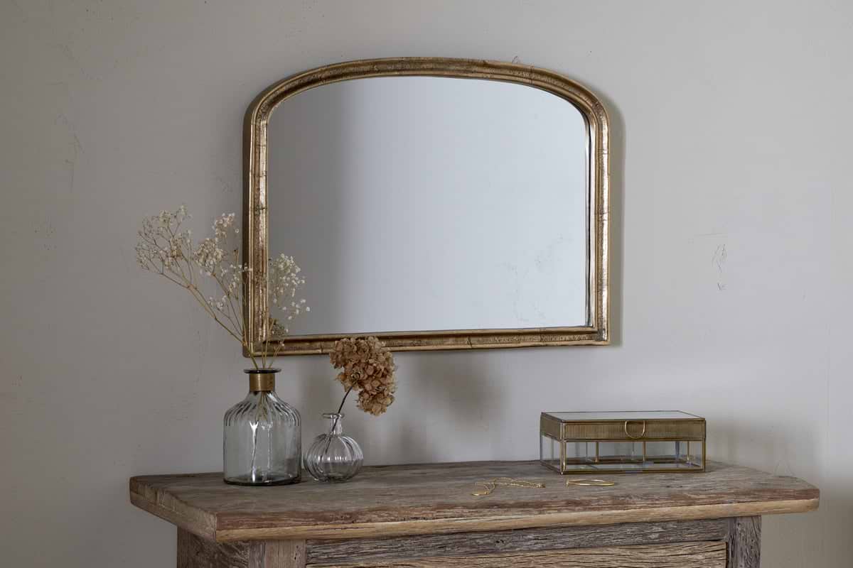
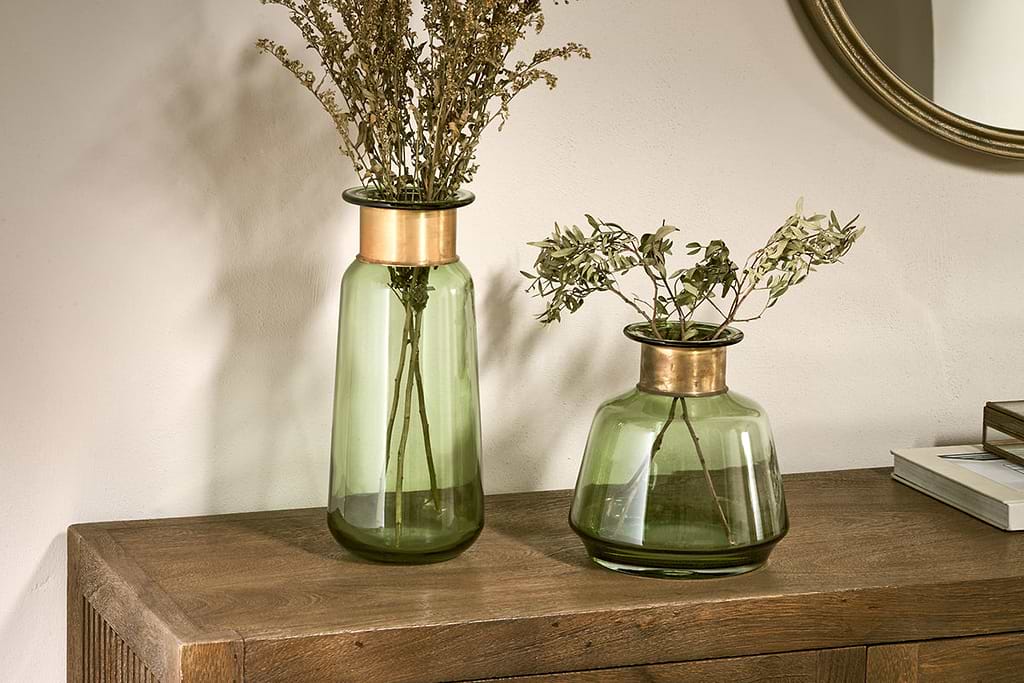
Understated Nkuku accents that complement a calm feature wall without competing for attention.
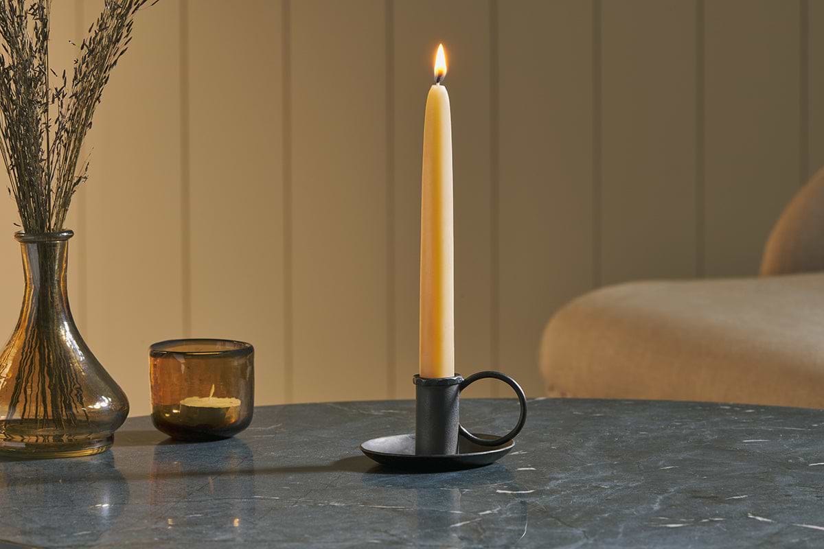
Amri Iron Candlestick
Slender iron with quiet presence, works alone or in clusters of three.
View at Nkuku →Some links above are affiliate links. If you buy through them we may earn a small commission at no extra cost to you. We only suggest pieces we think fit a calm, lived-in home.
Free guide
The Calm Shelf
12 styling ideas to help you compose calm, balanced shelves in natural texture homes.