

Many beige bedroom ideas start with the promise of calm, but too often lead to a cold, washed-out space that feels unfinished. A single flat colour can look neat in photos, but in a real home, it easily turns bland, especially with low natural light or standard rental carpet.
The difference comes from adding texture, tonal layers, and warm light sources, not more colours. This works especially well in a rental or shared bedroom when you need comfort without repainting because workable layers can be moved, swapped, or easily updated.
The short version: Beige bedroom ideas work best when you mix textured fabrics, warm lighting, and one anchor tone to prevent the space feeling flat or cold. By repeating a few natural elements, you shift the room from unfinished to quietly cosy in less than an afternoon.
Key takeaways
- Layering three shades of beige in bedding or curtains adds depth to a calm bedroom.
- Warm white or amber bulbs help beige feel cosy, not grey or clinical.
- Introducing natural materials like wool, linen, and wood keeps beige from looking cold (source).
- Plants and a single dark object stop a beige room from feeling weak or empty.
- Mirrors placed opposite the window bounce daylight deeper into a beige bedroom (source).

Where this works best
A beige room works best in areas craving calm, like a small apartment bedroom or any space that needs quiet simplicity without looking empty. The effect grows stronger in rooms with limited daylight or busy lives pressing in.
Beige, when layered well, suits most bedrooms, shared rooms, rentals, and small spaces where strong colour could feel distracting or hard to live with. The softer tones mean marks and wear are less obvious, especially on bedding and curtains, which tend to be touched or moved each day. Bedrooms with low light benefit most from beige tones, since deeper colours often read even darker and gloomier in these conditions.
Layering beige also works in homes where flexibility matters. If you move apartments or share your living space, keeping the palette neutral means you can rotate curtains, throws, or rugs to different rooms. You avoid the clash that comes with too many statement shades, one cream runner can work just as well in a guest room as in the main bedroom.
Avoid using only one beige on every surface, especially in a bedroom lacking sunlight. Too much sameness can create a washed-out look. For example, pairing a beige wall colour with the same pale shade in a rug and bedhead can flatten the space, making the room feel lifeless instead of calm. Moving in a few deeper tones, like tan or light brown, always helps anchor the space.
Applying beige layers in a small bedroom helps the room feel open and calm instead of boxed-in, while also hiding everyday scuffs or dust, especially if natural light is limited.
How do you keep beige from looking bland?
A beige bedroom looks finished, not flat, when you repeat three different textures, break up the tones, and add something solid for contrast. Smooth, shiny surfaces make beige feel colder than soft or tactile materials.
Low-contrast beige can turn dull on its own, especially in north-facing rooms. Adding a linen throw, a boucle cushion, and a wool rug creates quiet movement the eye can follow, even when there’s only one main colour family in use. Unlike glossy headboards or painted wardrobes, natural textiles pull in soft shadows, helping parts of the room fade gently away rather than catching harsh light.
One of the most useful rules here: “A beige bedroom works best when there is at least one dark or heavy piece to stop the look from drifting.” Place a weightier object, a black metal lamp, a navy cushion, even a chunky oak bedside table, to break up the sameness. According to Harbour Lifestyle, adding a single anchor colour like navy or deep green can keep the room from feeling pale and weak.
Avoid mixing too many kinds of beige at once. Neutral can tip into messy when undertones clash. Group sandy, yellow, or pink beiges together, but pull back if you notice the room starts to look busy. Sticking to three tones, one near white, one soft, one bold, always helps.
Bringing in just two or three textured pieces, in clearly different fabrics, lifts the space out of “beige box” territory and makes the result feel calm, not cold.
Styling and placement
The spot where you put a textured basket or a linen pillow matters as much as the object itself. Grouping similar items in one area keeps the room from feeling scattered.
Start by deciding what the eyes notice first from the doorway, the headboard, window, or a textured rug. Anchor this point with the deepest or most interesting material: a wool throw on the middle of the bed, a woven pendant lamp above, or a jute basket next to the wardrobe. Unlike scattering beige accessories in every corner, anchoring one main area makes the room feel more put-together.
Repeat a single texture just twice around the room. For example, matching two linen-blend cushions with a linen curtain in a similar tone creates a gentle pattern. Compared to crowding in every possible finish, this simple doubling trick keeps things calm and easy to clean. A busy scatter of all-beige ornaments can overwhelm and break the flow.
Lighting works best in the corners or over the bed, bouncing off paler walls. Use soft white or amber rather than blue-white bulbs. Place mirrors where they reflect natural light from a window or lamp back toward the bed, so beige tones appear warm, not muddy.
Quick calm checklist:
- Layer linen or wool in at least two places, bedding and curtains or cushions and throws.
- Limit the number of displayed objects and group them in one area to focus the eye.
- Stick to three base beige shades to avoid confusion and clashing undertones.
- Balance one “heavy” element (wooden chair, dark cushion, or anchor lamp) against paler tones.
Use these principles to style a rental bedroom or guest room where permanent changes aren’t allowed; grouping and repeating textures gives a finished look without paint or renovation.
What textures make a beige bedroom feel cosy?
Natural textures, wool, linen, boucle, and jute, bring warmth and life to a beige bedroom, especially when mixed with plush or chunky surfaces. Smooth, thin materials often leave beige looking flat and unfinished.
A plush beige carpet or heavy rug softens the feel underfoot, especially in colder months. According to Harbour Lifestyle, a soft rug or thick carpet adds instant warmth and helps quieten a hard-floor bedroom. Pairing this with a knitted throw, a boucle cushion, or folded linen on the bed introduces different surfaces to touch, key for stopping monochrome walls from feeling cold.
In a guest bedroom, natural fibres can stand up to heavier use: wool resists wear, and linen bedding creases naturally, so small marks blend in rather than looking out of place. Compared to stiff cotton or slippery synthetics, these materials are more forgiving and get softer with each wash. A rattan storage basket or timber tray adds a little unevenness to the mix, dulling any hard edges from side tables or floorboards.
If you keep the curtains the same flat weave as the sheets, the room can read thin and hotel-like. Instead, swap one soft curtain or a textured runner to add visual bulk and a sense of comfort. Just a single nubby or fluffy accent makes a strong difference in a monotonous scheme.
Mixing three different fabric weights in a beige room is enough to move the space out of “showroom sample” and into lived comfort.

Why does lighting matter in a beige bedroom?
Warm lighting in a beige bedroom stops the space feeling cold or washed out, while blue-toned bulbs make beige read grey and dull. The right bulb brings beige walls and bedding to life.
Most bedrooms in rentals or new builds use cool, energy-efficient ceiling bulbs, which can flatten out even the best-laid beige colour scheme. A single amber or soft white bulb in a floor lamp near the bed changes how your eyes read the whole room, according to Harbour Lifestyle. Compared to overhead glare, low-level lighting softens wall corners, highlights textural rugs, and stops natural beiges looking washed out.
If you sleep in a windowless or low-light bedroom, beige is much safer than deep colours, but only if the artificial light is warm. A paper lantern, frosted glass, or shaded bedside lamp makes a visible difference, even a cost-friendly plug-in lamp near the bed will bring out the yellow or pink undertones in the wall, especially at night. Warm lighting is especially useful for rooms with no morning sun, where beige tones might otherwise drift blue or flat.
Mirrors opposite a window, and angled to catch natural sun, multiply the daylight and lighten up beige surfaces, which feels different than putting a lamp in every corner. Adding one or two reflective elements in the right place can do more for beige than switching up the entire colour palette.
Place a lamp or mirror near the bed, rather than beside the wardrobe or tucked away, to keep the most-used area warm and comfortable every evening.
How can beige pair well with other colours?
Beige bedrooms pair best with muted contrast tones like sage green, navy blue, or soft pink, which prevent the room feeling bland but don’t overpower the scheme. Stark black or busy patterns rarely work as well.
Pairing beige with navy blue or sage green adds visible depth, according to Harbour Lifestyle. Often, one large accent, like a dark green velvet cushion, a deep blue vase, or a single patterned throw, strengthens beige and gives it weight, without crowding the space. Compared to using bright reds or purples, these quiet contrasts work within the same mood and don’t fight the calm look.
A single pop of soft pink, blush, or muted coral can warm up a beige room without pushing it into quirky or trendy territory. Avoid pairing beige with lots of cool grey or stark white, as this can draw out cold undertones, especially under artificial light. If you have leftover accessories from other rooms, test them on a chair or at the end of the bed to see if they fight or fit. A common decorator’s tip: “A neutral room looks finished, not plain, when one contrast colour repeats once or twice, not scattered everywhere.”
For anyone debating between navy, green, or blush, here’s a comparison:
| Contrast Colour | Effect with Beige | Best Use |
|---|---|---|
| Navy Blue | Adds weight, feels classic | Cushions, blankets, feature wall art |
| Sage Green | Feels fresh, connects to plants | Throws, plant pots, pillowcases |
| Soft Pink | Warms up the entire scheme | Throws, small accessories |
Using just one of these contrast shades, rather than a busy mix, keeps a beige bedroom grounded and pleasant, never noisy.
How do you stop beige from feeling cold?
A beige bedroom avoids feeling cold by adding plants, a single bold object, and at least two natural textures mixed in. Standard painted finishes on their own usually read the coldest.
Plants or greenery move the eye and bring life into the room, even if light is limited. A small trailing pothos on a shelf or a potted monstera near the nightstand instantly makes beige feel warmer and less static. Compared to a bare dresser or shelf, the plant’s shape adds enough movement to shift the whole mood. Real is best, but even faux plants improve things over nothing at all, especially if watering will be an issue.
Wood, jute, and rattan always soften cold beige, particularly when repeated two or three times, a wooden frame, a jute rug, or a rattan basket near the bed does more for warmth than a scatter of beige vases. Wooden furniture gives a beige bedroom a classic styling look (Harbour Lifestyle). If your room has lots of painted MDF or high-gloss doors, swap in a small timber stool or a rattan hamper for quick warmth.
Dark or heavy objects, like a chocolate brown knit pillow or an oil-rubbed bronze lamp, anchor pale beige and keep it from floating off. Instead of trying to “match” every detail, let one or two bolder pieces stay visible. A flat, pale-on-pale scheme can feel cold for months; using one anchor piece makes a clear difference overnight.
Bringing in greenery, an anchor tone, and two natural materials in a beige bedroom moves the look from cold to quietly inviting.
It usually clicks for people after spending days in a beige bedroom that still feels “off.” The bedding is new, the paint is right, but something lingers, a sense of blandness, a chill in the mornings, or just a feeling the room isn’t quite done. Those moments stand out most in rooms you use every night, or when you try to unwind and instead find the space distracts or even numbs you a little.
The shift comes from layering solid, tactile pieces, a soft rug, a rougher basket, or a single anchor lamp, while paring back extra, shiny or plastic details. Once you focus on three textures and better lighting, the whole bedroom feels settled and steady again.
For a lot of homes, the mistake is stopping too early, choosing one beige paint and stopping there. A flat, one-tone scheme fades under artificial light and rarely feels restful. Most bedrooms that look “off” miss that second or third texture, especially near the floor or bed. Fixing this is about layering and small swaps, not starting over.
Once the right textured piece or anchor object is in place, the whole atmosphere softens, and the room starts to offer real comfort rather than just looking neat.
Save this idea for later.
What tends to hold up with beige bedroom layering
Across many beige bedrooms, adding just enough weight and texture proves the most effective solution. Reviewers and decorators alike point out that neutral, layered fabric will often hide marks and wear better than flat or glossy surfaces. Matte objects show less glare and make the room easier to keep looking calm in all sorts of natural or artificial light.
Another detail: designers consistently rate warm, low-level lighting higher for neutral bedrooms, and recommend avoiding too much bright white or blue-toned light, which can flatten the atmosphere. Those principles hold up across every style and budget.
, Mara, Loom & Glow
Common questions
Is beige a good colour for a bedroom?
Beige is a practical, calming colour for a bedroom, especially if you want restfulness and easy coordination. The soft, neutral base suits most rooms and hides minor marks or dust. Beige also adapts well to layered textures, which keeps the space feeling warm instead of cold.
What colour goes with beige in a bedroom?
Navy blue, sage green, and soft pink all pair well with beige in a bedroom. They add contrast without breaking the calm feel. Using one accent tone in a couple of places anchors the palette and gives beige lift.
What colour best complements beige?
Deep navy or muted green best complement beige, providing visual weight and depth to balance pale layers. Pairing beige with these colours is a reliable way to avoid a bland or featureless look.
What are the 2026 bedroom trends?
For 2026, bedrooms are expected to focus on tactile neutrals, with a mix of layered creams, warm beige, and subtle panelling. Dulux shows neutral bedroom schemes combining cream tones with two-tone white and grey wall treatments. The emphasis remains on natural materials and soft lighting over bold prints or sharp shapes.
Explore more calm combinations inside our Shop The Look .
Shop the Look
Textured cushions in natural linen deepen the warmth of a beige bedroom.
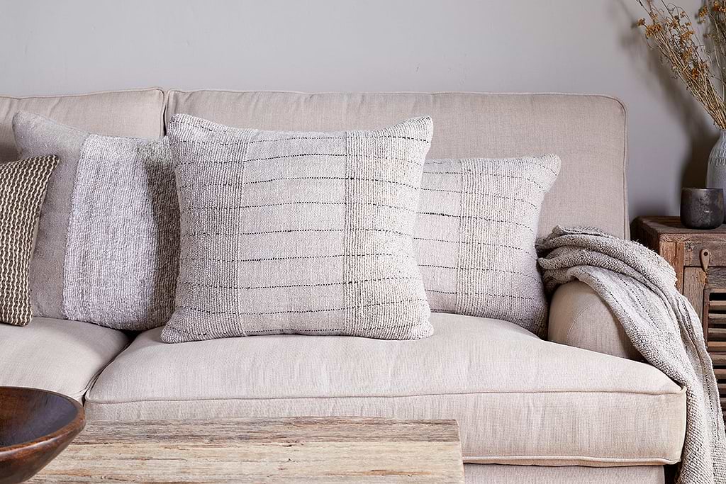
Mayla Cushion Cover
Soft hand-textured cover, instant warmth on linen sofas or chairs.
View at Nkuku →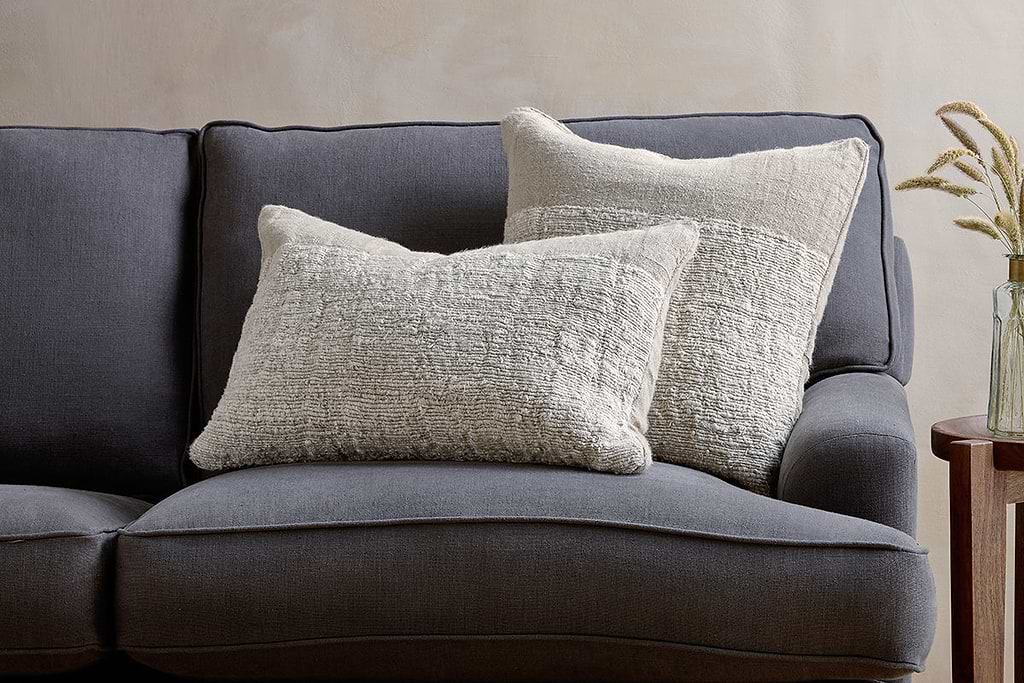
Puli Linen Cushion
Recycled linen in natural, pairs with woven textures and aged wood.
View at Nkuku →Some links above are affiliate links. If you buy through them we may earn a small commission at no extra cost to you. We only suggest pieces we think fit a calm, lived-in home.
Free guide
The Calm Shelf
12 styling ideas to help you compose calm, balanced shelves in natural texture homes.