

Most homes end up using mantelpiece decor ideas as a catch-all, layering in too many textures and small things until everything on the shelf competes for attention. Bold art, seasonal garlands, family photos, a flicker of brass, a jumble of dried stems, all good objects, but somehow the room still feels off. In homes with a working fireplace, or where the mantel is the main feature wall, the wrong mix can feel busy and leave you wondering what to remove.
It doesn’t have to be complicated. One clear anchor, fewer objects, and a calm group of materials, especially when jute, rattan, linen, and wood are involved, settle the whole look down. This works especially well in a rental living room when there’s limited control over the built-in fireplace because unfussy choices and a softer palette can mute awkward colors and help the eye relax. Today’s guide is about removing the extras, choosing a focal point, and setting the right materials in order, so your mantel always looks finished, not stuffed.
The short version: The best mantelpiece decor ideas start by choosing one large anchor, like a mirror or single artwork, then layering in a few natural textures of varying heights and always leaving clear space between objects. Grouping by size and palette keeps the arrangement calm and lets each piece add warmth without creating clutter.
- How do you start styling a calm mantelpiece?
- Where this works best
- Which natural materials look right together?
- What’s the odd-number rule, and does it actually matter?
- Styling and placement
- How do you layer heights so nothing feels crowded?
- How do you change your mantel for each season, without starting over?

How do you start styling a calm mantelpiece?
Start by clearing the whole shelf, then place one large object in the center, this becomes your anchor. Everything else works around that one focal point, making the rest of the arrangement easier and softer to the eye.
A bare mantel can look cold, but piling on too much at once only adds noise. The best way to begin is by removing every object and wiping the shelf clean. Instead of guessing what will fit, pick out one large piece, an overmantel mirror with a thin black frame, a single framed art print, or a chunky wooden bowl.
That anchor then sets the rules for the rest. A large mirror bounces light and helps the room feel less closed in, while a dark-framed artwork adds a sense of weight to the center. Design guidance recommends building out from a central focal point. Every other object should feel like a support, never fighting to be the main show.
Unlike a row of small matching frames, a single big piece instantly quiets the wall and makes it clear where the eye should land. Once that’s decided, everything else naturally falls into place. This first move works just as well in a low-light apartment as in a bigger room with lots of windows. Place your anchor slightly leaning against the wall or hanging just above the shelf for a sense of relaxed stability.
Where this works best
Calm, layered mantel styling works best in rooms where the fireplace is a natural focal point, especially when space or color limits keep you from making big changes elsewhere.
Living rooms with plain walls or older hearths are ideal for this approach. In small apartments, especially when the original surround is dark or a strong color, using a calm neutral palette and fewer objects keeps the space from feeling closed in. Rental homes benefit because the materials stand out without drilling or painting.
This method applies even if you don’t light a fire. Organic home decor, especially neutral home decor ideas in natural materials, take over the role of color and pattern. A narrow hallway with a shallow mantel, or a high-ceilinged living area, both benefit from one anchor and a few raw textures.
Avoid overpowering a tiny bedroom or home office mantel with thick, glossy finishes, everything looks heavier and more crowded in a tight space. Mantelpiece decor ideas that work here lean on woven home decor and pale linens rather than anything highly polished. In open-plan rooms, stick to a muted palette that links to the larger space and repeat one natural texture from elsewhere.
Which natural materials look right together?
Pairing jute, linen, and pale wood with small touches of rattan and stone brings warmth without crowding. Combining rough and smooth materials layers in comfort, not chaos.
Jute and linen feel dry and soft at the same time. If both are used, a jute-framed table mirror, a folded linen runner, the mantel feels simple and layered. Add just one fine rattan box or a shallow tray to break any risk of monotony.
Clay vases or stone bowls anchor the look, especially next to paler, lighter objects like a loose-weave basket or stack of raw wood books. If all materials lean too close in color or finish, the shelf flattens out. Using both a high-texture piece (like a burlap-wrapped candle) and a smooth surface (ceramic, glass, or bleached wood) keeps the look varied but easy.
Compared to glossy lacquer or crystal, raw materials feel soft and understated. Repeating woven home decor details, even as small as a single seagrass mat under a vase, connects the mantel to the rest of your organic home decor. Place your main accent (such as a stoneware vase) near the anchor and repeat the secondary textures once on each side.
What’s the odd-number rule, and does it actually matter?
Grouping pieces in threes or fives usually looks more natural and less rigid than neat pairs or even lines. Objects arranged in odd numbers draw the eye without making everything match.
The most common advice from interior stylists is to keep mantel displays in groups of three or five because it helps the arrangement look relaxed but finished. One anchor, then two smaller items on each side, keeps things balanced but not stiff.
In a wider room, try the odd-number approach with hand-thrown pottery: a tall jug, a short bowl, and a textured vase. Vary the shape and height for each, and keep them close in palette, earthy beige, off-white, straw, or soft clay. The spacing is key: leave most of the shelf clear rather than filling every inch.
Unlike straight lines of matched pairs, odds look softer and less staged. If you find the shelf starting to look busy, remove one object. Three items leave space for the mantel to breathe, while five small pieces only work if at least half the shelf is open. Place groups spaced a few inches apart, not pressed side-by-side.

Styling and placement
Calm mantel styling means giving each item clear space, working in soft transitions, and making the focal point the starting place for every other choice. Simple, restrained placement lets the materials speak.
Set the main anchor in the center or slightly off to lead the rest. If it’s an overmantel mirror, rest it just at the base, behind everything else. For a single artwork, hang or lean it at a slight angle for a subtle, unforced look.
Placement works best when each object is grouped by both type and material: a pair of brass candle holders to the left, one small ceramic bowl to the right, each not quite symmetrical. A common mistake is lining everything up as though it’s on a mantel clock display, this reads dated and heavy.
Use a quick process: clear the shelf, anchor one piece, add a secondary item at a different height, then stop and check for empty space. Negative space is your friend, most mantels look better when about two-thirds of the shelf is left open, as noted in expert fireplace mantel decorating guides.
Quick calm checklist:
- Start with one big anchor piece, mirror or art, not both.
- Choose only 2 to 3 secondary items, spaced apart, not touching.
- Stick to 1-2 main textures: jute, linen, pale wood, or smooth ceramic.
- Leave plenty of empty space to avoid crowding.
- Keep palette soft, beige, stone, white, muted green.
Floating candle holders or a cluster of dried stems work well at the edge if they don’t touch the main anchor. For more on combining shapes and heights, the shelf styling formula is a helpful next step.
How do you layer heights so nothing feels crowded?
Use tall and short pieces together, one at each end, one in the center, each staggered. Height variation keeps the eye moving gently along the mantel.
Instead of arranging everything at one level, start with a single tall candlestick or vase on the left. Add a low, flat tray or book pile near the center and a mid-height object on the right, a clay jug or dried stems clipped short. This keeps the eye from stopping in one place.
The cause and effect: flat rows look dull and out of balance, while staggered heights make the wall feel more alive. If you use dried flower stems, trim them so they reach just above the highest art frame but never overwhelm the anchor.
Compared to lining up identical candle holders, mixing objects at different heights feels lighter. Paired with natural material home decor, like bamboo candle stands and a linen-covered stack of books, this approach adds interest without clutter. Place taller items toward the outside edges to keep the center open.
How do you change your mantel for each season, without starting over?
Swap out just one or two accents each season, keep the anchor piece the same. This avoids spending on a whole new look while helping the shelf feel fresh and current.
Most people think updating for a season means buying new art, but the easiest way is to pick one object to switch, such as dried eucalyptus in autumn, a branch of spring blossom, or a stone bowl filled with pine cones in winter. The main anchor, like a framed print, stays put.
Following a neutral, earthy home decor palette underneath means any new accent will fit. Dried stems, a pale linen cloth, or a muted green vase all work through the year. Compared to vibrant colors or holiday trinkets, swapping only materials keeps the look easy and relaxed.
Now and then, even a candle change is enough, a taller, ribbed candle for winter or a soft white beeswax taper for spring. If your mantel sits above a working fire, keep fresh greens away from open flame, sticking to dried stems or ceramic details. For more on safely adding warmth, interior stylists recommend using elegant holders high, with thicker candles at the hearth.
Decision moments sneak up: You walk past the mantel and pause. Something isn’t right. The shelf feels crowded, there are too many small things, no clear leader, or the textures fight instead of helping. This is usually when you realise the palette zig-zags, rather than anchoring the room.
The practical shift comes down to reducing variety. Pick one natural material to lead, a soft anchor piece, then let everything else support that choice. The improvement is real: the mantel stops shouting and starts settling the whole room together.
One of the biggest mistakes is lining up too many mismatched objects or using every color you like at once, which leaves the room feeling restless. Most people crowd in more than needed, thinking empty space is a problem when it’s actually what a shelf needs to look finished. Once you remove the extras and group by natural texture, the result feels softer, more relaxed, and lasts through every season.
Save this idea for later.
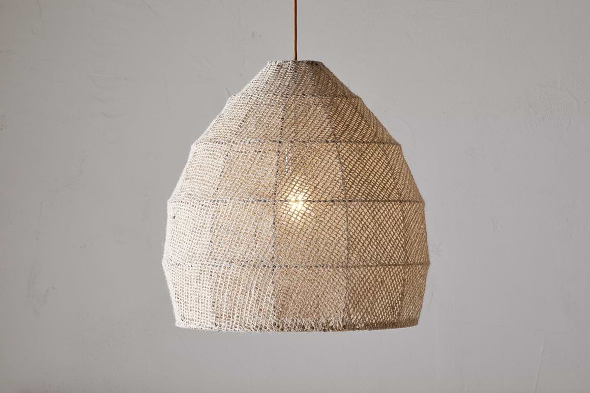
Jahari Woven Jute Pendant – Natural
adds quiet structure and warmth while keeping the room balanced.
What tends to hold up with mantelpiece styling using natural materials
Looking across many living rooms and reader submissions, the best results happen when one item is given room to lead. Mantels styled with matte ceramics or soft linen feel less rigid than those layered with shiny metals. Matte finishes get recommended again and again for shelves near windows, because they don’t catch glare the way a glossy tray does.
Common fixes like sticking to three grouped objects or matching the shelf’s tone to a nearby wood piece show up in designer advice often. Most rooms also look calmer with at least two-thirds of the mantel empty, even though it feels bare at first, this is what sets apart organic home decor that lasts all year.
, Mara, Loom & Glow
Common questions
What looks nice on a mantelpiece?
The best look for a mantelpiece is one large anchor like a framed art print or a mirror, plus two or three small accents such as candlesticks, bowls, or vases in natural finishes. Combining smooth and textured objects makes the shelf feel relaxed rather than crowded. Leaving clear space between items keeps everything looking intentional.
What decor should you put on a fireplace mantel?
Decor for a fireplace mantel should include one main feature, a mirror or artwork, plus a mix of groupable accents like holders, ceramic vases, stacked books, or dried stems. Choose neutral, natural materials so the shelf connects easily with the rest of the room. Avoid crowding, less usually feels better.
How do you arrange things on a mantelpiece?
Arrange mantelpieces by anchoring one big piece at the center, then add a small group of accessories at different heights on each side. Keep to a simple palette and leave most of the shelf clear. Mixing heights and repeating one or two textures make the arrangement feel natural, not busy.
How do you style a mantelpiece in 2026?
Styling a mantelpiece in 2026 focuses on layering just a few natural textures, think woven jute, pale wood, matte ceramics, and avoiding over-filled displays. One standout piece, a couple of subtle accessories, and open space are the new calm formula. Soft colors and organic shapes help the shelf last through seasons and trends.
Explore more calm combinations inside our Shop The Look .
Shop the Look
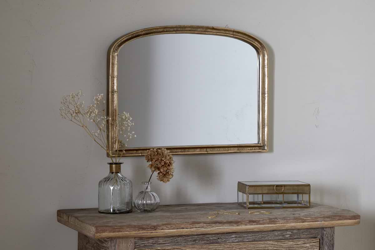
A mirror and candlestick that hold their own on a mantel and anchor the year round.
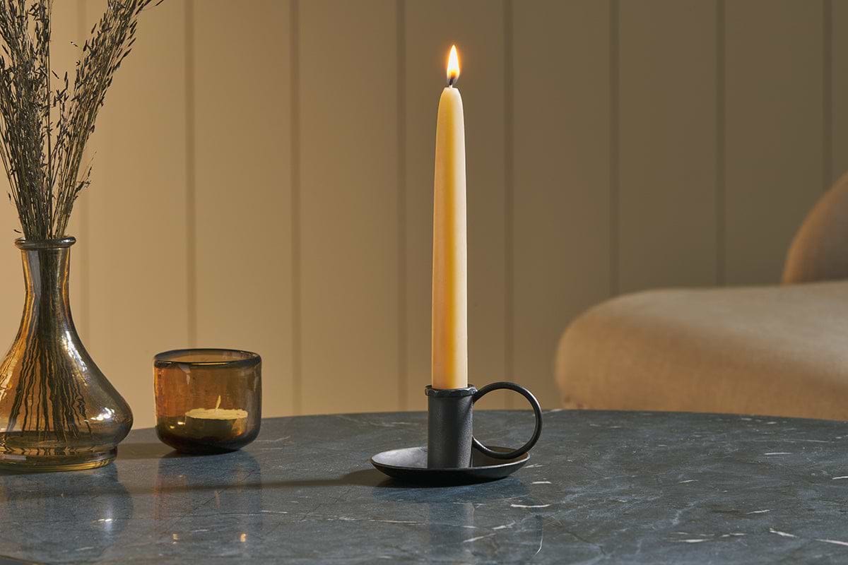
Amri Iron Candlestick
Slender iron with quiet presence, works alone or in clusters of three.
View at Nkuku →Some links above are affiliate links. If you buy through them we may earn a small commission at no extra cost to you. We only suggest pieces we think fit a calm, lived-in home.
Free guide
The Calm Leaf
12 quiet ways to bring dried botanicals, stems, and natural textures into calm spaces.