

Busy rooms often feel tight and restless, especially when every wall tries to carry its own story. A single dark abstract piece can seem intimidating, a black swirl, a crisp geometric, a moody gradient, but placed wrong, it easily clashes with furniture or fades away entirely. Many homes struggle to get this balance right; either the wall feels empty or suddenly too heavy, as if the art absorbs all the light or draws focus where it shouldn’t.
Today is about choosing well, removing visual clutter, picking one strong statement, and allowing room to breathe. By the end, you’ll know how to size, place, and style dark abstract art in real rooms, what to avoid, and the key moves that make a piece feel grounded rather than tacked on. This works especially well for a small living room when the walls are pale and the furniture is soft because a dark anchor cuts the confusion and lets every piece feel more deliberate.
The short version: A single dark abstract artwork grounds a room best when its scale and shape match open wall space and the palette stays tight. Prioritising fewer, stronger choices keeps the room calm and shifts focus where you want it, no more blank or crowded walls.
Key takeaways
- A dark abstract piece draws the eye when placed on a blank, uncluttered wall.
- The best size for art usually spans about two-thirds of the sofa below it.
- Cool dark tones read more formal, while warm versions feel softer and less stark.
- Thin black frames can make bold art look unfinished on pale walls.
- Minimal accents and repeated textures help dark art feel settled in a room.
- What defines dark abstract art (and what it is not)
- Where this works best
- How do you pick the right scale for your wall?
- Building a colour palette around one dark piece
- What materials and frames suit dark abstract art?
- How to avoid chaos: placement rules that always work
- How to find bold, affordable dark abstract prints

What defines dark abstract art (and what it is not)
Dark abstract art uses colour, shape, and texture, often black or deep gradients, without a clear subject, making mood and balance its main impact.
Unlike a photograph of a city or a portrait, a dark abstract piece works with pattern, swirl, or blurred 3D shapes, sometimes spread across a moody background. The main focus is not the thing pictured but the shapes, tones, and how they hang on the wall. You might see cosmic swirls, bold geometric forms, or blocks of colour gently bleeding together. According to One4Wall, dark abstract visuals show up often in minimal and cosmic themes, that’s why they suit uncluttered rooms best.
Abstract art is not just “anything modern,” nor does it always mean splatters or wild lines. A soft charcoal gradient or a simple off-black curve can be just as abstract, especially if you cannot name what the image shows. A clear rule: abstract wallpapers and art play with shape, colour and surface instead of a defined subject, look for that before buying. A sofa wall covered with family photos has a clear story; a gradient or geometric print asks you to slow down and read the room differently.
Flat posters with text or digital icons, meant as phone wallpaper, aren’t the same. Abstract art works because it floats, drawing you in but not telling you how to think. In a hallway or living room, a good dark abstract keeps you pausing for detail instead of scanning past. Unlike busy murals or themed decor, it gives open wall space a place to rest without feeling empty. Place a dark geometric print behind a pale dining table and the room reads more anchored, while cartoon prints on the same wall fight for attention.
A dark abstract art anchored above a wood console can break up pale blandness in a minimal space, while a pattern too crowded or bright on textured wallpaper feels noisy and unsure. Choose pieces where the shapes or gradients actually fade toward the edge or hold your gaze softly, instead of high-contrast text.
Where this works best
Dark abstract art works best in uncluttered living rooms, entryways, and bedrooms with light walls or open negative space.
Homes with pale walls and simple, open furniture, think low sofas and neutral rugs, are strongest for this style. A shared main room set up for slow mornings or an entry that catches late afternoon light makes the most of bold dark art. Rooms where clutter or storage furniture eats up half the wall often feel crowded if you add more pattern or shape.
Extra care helps in small apartments where every wall does double duty. Placing a bold piece above a bench or console, spaced from shelves or hooks, gives the room a single anchor and lets everything else fall into place. An overfilled hallway or busy kitchen rarely benefits, a dark, moody print here can feel abrupt or lost as the eye skips past coats and daily mess. This is where something like dark colour palettes help, reducing furniture or switching to a pale wall brings the right tension between the grounded art and the rest of the space.
Avoid hanging dark abstract work behind cluttered desks, on crowded gallery walls, or where strong colours or graphic patterns already compete. A grid of smaller prints keeps a quiet focus; a large bold abstract dropped into a patchwork of mixed decor only makes a room feel shorter and heavier. Soften with empty space, wood, or linen nearby for the best shift in mood.
For a side room, this could mean a single print over a long bench. In a master bedroom, a dark abstract above the headboard replaces two bright lamps or shelves and keeps the whole zone feeling restful.
How do you pick the right scale for your wall?
The best size for a dark abstract artwork spans roughly two-thirds the width of the furniture below it and leaves open wall space all around.
Sizing is the most common stumbling block. If your dark abstract piece is too small, it looks like a lost stamp, especially on high open walls or above long sofas. Choose a piece that holds its own: above a sofa or console, a good size usually stretches across most of the length but stops short of the edges. Too large, and the black or deep shapes swallow the room.
Most floating shelves sit about as deep as a paperback, but wall coverage with art is about width. A rule decorators use: let art fill about two-thirds of the furniture below. This keeps the negative space clean and the eye anchored without stretching the dark field across too much light wall. A bare wall, even in a rental, changes character with a single big piece done right, while three or four small black prints will always look choppy and unplanned.
Compared to a gallery wall of mixed pieces, a lone large dark abstract takes more confidence, the payoff is a calming zone that doesn’t fight with the rest of your decor. Look for HD, royalty-free prints when you want to size up cheaply; platforms like Unsplash have downloadable options for affordable at-home printing with plenty of size flexibility. Placing too many small prints or leaning unframed canvases makes a small living room look less tidy and draws the eye around instead of in. One strong, well-sized piece settles a wall instantly.
| Art Approach | Best for | Common Pitfall |
|---|---|---|
| Single large abstract | Open or pale walls, above sofa/bed | Looks heavy if too big |
| Small grouped prints | Desk corners, long narrow hallway | Gets lost if too small |
| Gallery wall (mixed) | Mismatched art types | Feels busy, no focal anchor |
One dark abstract art piece can give a sense of calm in a dining room if it lands centred above the table, not pushed up to the edge or broken into pieces.
Building a colour palette around one dark piece
A limited palette, repeating just one or two accent colours from your dark abstract art, helps the whole room feel calm and complete.
Pile too many colours on top of a dark abstract and everything looks jumbled. Instead, take a single tone from the print, the ochre in a cosmic swirl, the deep green in a geometric, or a faded grey edge, and echo it in one small pillow, a clay vase, or the rug across the room. The rest can stay neutral; soft cream, putty, pale wood. This tight palette gives breathing room and keeps dark art from crowding light furniture.
Unlike bright or warm decor, a dark abstract works just as well with cool or warm undertones. According to One4Wall, cool dark tones tend to feel more formal or sharp, think navy, steel, or charcoal, while warmer darks like umber and deep olive look grounded and soft. Pick up your palette choice from the feeling you want; a living room with metal legs and grey throws suits cool, while a leather chair and tan accents ask for warm darks.
Many decorators use the two-colour accent rule: limit the room to two strong hues plus the main neutral, repeating each only once or twice across soft furnishings. Black and white geometric abstracts hold up best with pale walls and natural woods; cosmic or gradient prints fit next to simple glass or polished surfaces.
Grouping too many dark accents next to dark art flattens the space, keep the darks in the art, the lights and textures everywhere else. If you’re not sure, start plain: one anchor colour from the art, one echo, plus the rest pared all the way back.

What materials and frames suit dark abstract art?
Matte frames in oak, soft black, or subtle metal surround a dark abstract print without pulling attention or giving glare from windows.
The frame quietly shifts the mood of any abstract art. Thin black frames can look lost on a pale wall, especially when the print’s own black edges blur at the margin. Instead, try an oak or pared-back wood frame if you want warmth, or brushed metal for crispness. Frames wider than a thumb start to overpower most abstract work, so stick to slender borders for open, rental-friendly rooms.
Many decorators warn that reflective glass over a dark print often catches daylight and hides the art; matte (non-glare) glass or even no glass is common for digital or vector prints. Large, dark abstract pieces survive wear best when printed on heavyweight paper or canvas, which resists bending and stays crisp looking longer. Gallery matting, giving two or three finger-widths of space around the image, can soften a very bold or colour-block print, making it share the wall instead of dominating it outright.
Compared to ornate gold or glossy black frames, oak or beech makes the art less formal and more anchor-like, especially next to woven throws or linen curtains. A flat black frame, meanwhile, suits rooms with plenty of metallic accents or very pale backgrounds. Often it’s the subtlety that lets a statement piece hold the room: skip any frame that looks shinier or heavier than what you see on the art gallery wall.
Pairing a dark abstract in a simple oak frame over a clay-topped console settles the entry and echoes natural textures elsewhere. Works equally for a home office, where matte glass avoids reflection from nearby lamps.
How to avoid chaos: placement rules that always work
Keep a single dark abstract artwork centred over furniture, with clear wall on every side, and break up open walls with texture.
The safest rule is to hang art with its center about 57 inches from the floor, but this should bend if the sofa or console is unusually high or if the ceilings slope. The main cause of chaos is art that floats too high, making the room feel stretched, or too low where it gets covered by daily mess. Instead of scattering several small prints, use one large dark abstract above a sofa, bed or bench, with enough breathing room left and right for the wall colour to show through.
Grouping multiple pieces can quickly skew visual balance. A three-piece gallery, all with heavy black backgrounds, often feels blocky and heavy. Matting and spreading each by one open hand’s width softens the look, while a lone dark abstract artwork pins the whole room and lets everything else ease back. Check your spacing: furniture that touches or crowds the art from below tightens the look, while anchoring with a rug or lamp nearby keeps it feeling balanced. See lighting a dark space for what works if natural light isn’t available, fewer distractions hold up best.
Clutter is another risk. A good rule: a wall looks calmer when two-thirds is left blank around the art, and all other accents repeat the same soft texture somewhere near, linen, wool, beech. Grouping glossy planters or high-shine tables under a black-and-white abstract usually throws off the softness. Compare this to a single woven basket or matte ceramic, which gives a gentler landing spot.
Quick calm checklist:
- Use matte frames: oak, beech, or soft-finished black.
- Let empty wall show around the piece, never fill an entire space edge-to-edge.
- Limit surrounding decor to matching or repeat textures (linen, clay, rattan).
- Echo no more than one accent colour somewhere else in the room.
- Keep furniture or console just below, but not crowding, the artwork.
A single centred dark abstract over a low bench or pale sofa keeps visual noise to a minimum in any small living room, and avoids a cluttered look in shared spaces.
How to find bold, affordable dark abstract prints
Platforms like Unsplash, One4Wall, and Magnific offer free and royalty-free dark abstract visuals, while print-on-demand options keep big sizes within budget.
Original art is costly. Many design pros use dark abstract visuals found on trusted wallpaper and digital print platforms, where quality HD images are easy to download for home or phone. On Unsplash, search “abstract” and filter by dark or minimal for a catalogue of cosmic, swirling, or vector-based options, most in sizes fit for framing. For a graphic approach, or if you want to fill a desktop or wallpaper background, Magnific has downloadable options that can be printed affordably at local shops. Royalty-free pieces mean you can try a few sizes without commitment or licensing headaches.
Compared to buying framed prints at high-street stores, print-on-demand lets you size dark abstracts to fit your space, from wide rectangles for sofa walls to tall prints for narrow entryways. Some affordable online services will frame and ship to your door, but using a local print shop avoids extra fees and lets you choose heavier paper or canvas. Many sites show their files in minimal, pale rooms, a good nudge to keep the rest of your design stripped back and calm.
A free download won’t work if the file isn’t high-resolution, so always choose “HD” or “large” for prints to avoid pixelation. A room that needs only a quiet anchor will do well with any of the darker, texture-rich options widely available online; crowdsourced libraries expand every season. For more advice on mixing with furniture, see living room ideas that match dark art with soft finishes.
Print a dark abstract swirl or minimal gradient at local copy shops for a bedroom, or download HD fluid patterns for hallway refreshes that don’t need a full design overhaul.
You notice it first in the evenings, a sense that the room feels unanchored, or the art pulls too hard. The palette may look confused, or there’s too much happening around one corner. Even a new piece can seem “off” if the size or tone is wrong for the space.
The shift happens best when you strip the wall, pick one focal piece, and repeat one colour or material in the room. Suddenly, the space feels deliberate and less restless. A dark abstract artwork holds the eye, keeps the rest of the wall still, and brings a quiet focus often missing in busy, trend-filled homes.
A common mistake: filling every patch of wall with pictures, hooks, or shelves, leaving no space for one strong art piece to settle. Instead, rooms start to feel busy or heavy, making it hard to relax or notice what you love. Most rooms look unfinished when small prints are scattered or when bold art is set too high, flattening the effect.
When you get it right, a single dark abstract print soothes the view and gives everything room to breathe.
Save this idea for later.
Materials and placements that stand the test of time
Over years of watching rooms change, some principles always last. Matte finishes for frames and heavyweight paper for prints are recommended again and again because they handle sunlight and accidental bumps without losing their edge. Reviewers say dark abstract art in pared-back settings outlasts trend-led gallery walls, especially when paired with repeating natural textures like wool or clay. Oak and pale woods also resist yellowing and work with both black-and-white and coloured abstract prints.
Decorators often suggest hanging a single, well-sized piece over groupings. Most find the room easier to live with and simpler to clean, a win for spaces where calm lasts. Keeping a tight palette and repeating textures holds up, no matter how furniture trends shift.
Mara, Loom & Glow
Common questions
What defines dark abstract art?
Dark abstract art uses colour, shape, and texture, often black or deep gradients, without a clear subject, making mood and balance its main impact.
Where does dark abstract art work best in a home?
Dark abstract art works best in uncluttered living rooms, entryways, and bedrooms with light walls or open negative space.
How do you pick the right scale for dark abstract art on your wall?
The best size for a dark abstract artwork spans roughly two-thirds the width of the furniture below it and leaves op
Explore more calm combinations inside our Shop The Look .
Shop the Look
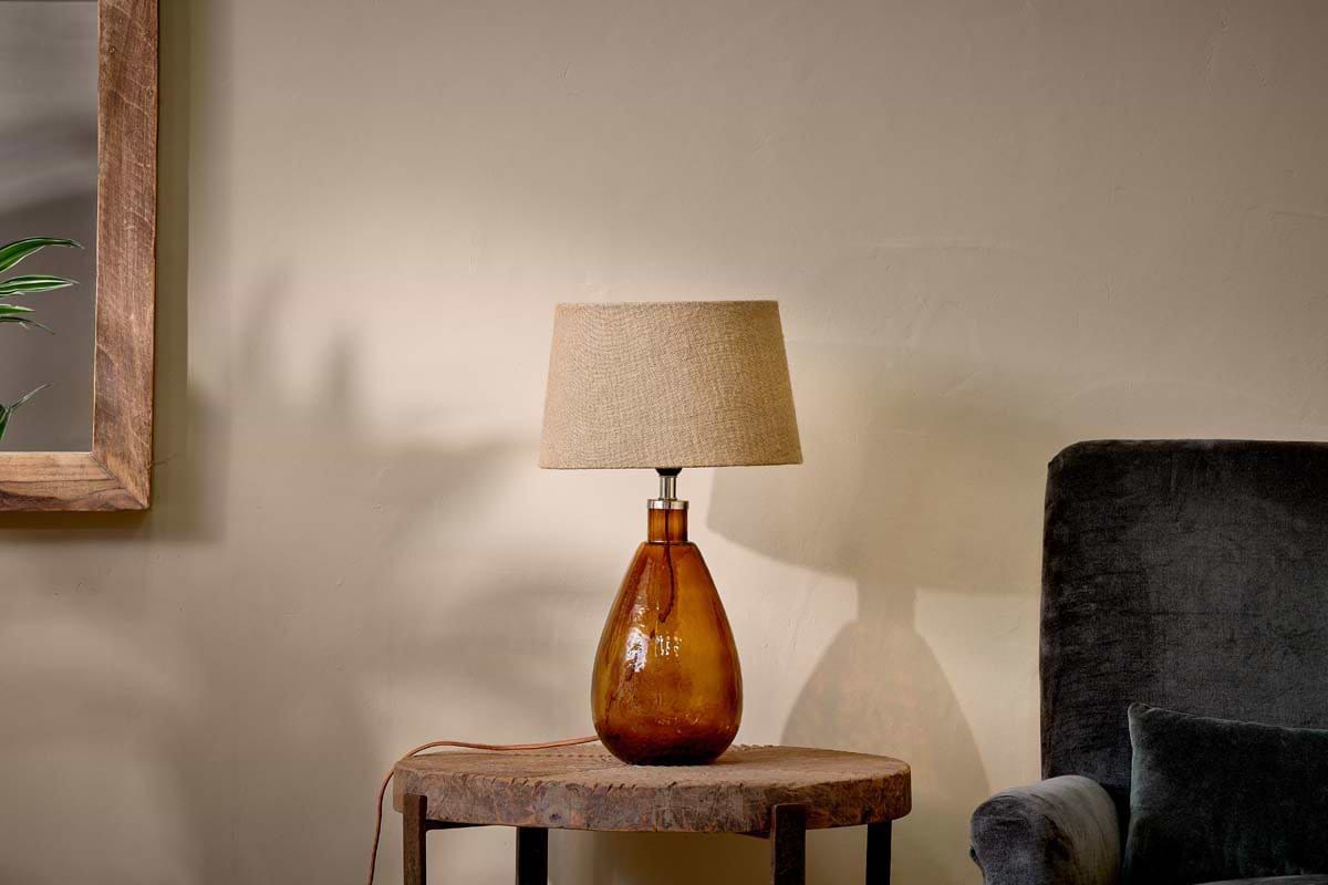
A handful of Nkuku accents that soften deep tones and bring warmth to a moody scheme.
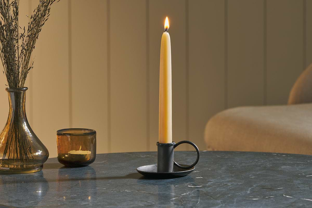
Amri Iron Candlestick
Slender iron with quiet presence, works alone or in clusters of three.
View at Nkuku →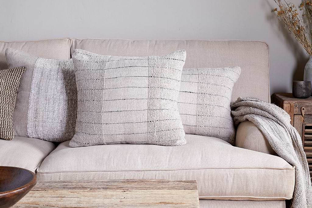
Mayla Cushion Cover
Soft hand-textured cover, instant warmth on linen sofas or chairs.
View at Nkuku →Some links above are affiliate links. If you buy through them we may earn a small commission at no extra cost to you. We only suggest pieces we think fit a calm, lived-in home.
Free guide
The Calm Shelf
12 styling ideas to help you compose calm, balanced shelves in natural texture homes.