

Many people with small flats want the warmth and interest of retro decor but worry their space will end up looking cluttered. Strong patterns, playful shapes, and bold colors can quickly feel crowded or busy, especially when storage is tight and every surface matters.
Today you’ll see how to use retro touches in a way that stays calm and fresh. You’ll learn which materials, colors, and shapes work best together in a small room, what to leave out, and how to style a few standout pieces so your home feels both collected and soothing. This works especially well in a living room with low light when you anchor one main retro piece because it lets the rest of the room breathe.
The short version: The easiest way to use retro decor without visual noise is to focus on a single standout piece and keep the surrounding space simple. Selecting authentic materials and limited patterns keeps your home feeling open and inviting, instead of busy or kitsch.
Key takeaways
- Retro decor feels calm when you pick one main feature and avoid mixing many patterns or colors.
- Mango wood, linen, and stoneware work well for retro-style rooms because their textures look natural and soft.
- Most retro lighting is sculptural or curved rather than busy, which draws attention without looking crowded.
- On eBay, you can filter retro decor by condition, price, and room for clearer choices (source: eBay).
- Keeping extra surfaces clear, about two-thirds empty, prevents retro touches from overwhelming a small space.

Where this works best
Retro decor works best in rooms where storage is slim, traffic flows easily, and you want charm without noise. Start with spaces you use most, like a lounge or entryway, and keep the number of retro pieces low.
Flats with narrow halls, small bedrooms, or open living kitchens can take on vintage shapes easily if you set clear boundaries. A single sideboard or a statement lamp often gives enough character. Adding too much, especially in a tight spot, can look busy, one piece is often enough.
In a breakfast nook with a retro teak table, light streaming from a nearby window softens strong lines. Swap a plastic fruit bowl for a small fluted ceramic dish and leave the rest of the table clear so the era’s style stands out without taking over. Warm wood against a plain linen tablecloth feels collected, not cluttered. Compared to bright plastic, wood and neutral textiles make the space read calmer under natural light.
Avoid stuffing every corner with memorabilia or mixing too many colors at once. A room with more than two bold patterns can start to feel like a jumble sale, especially when soft furnishings overlap. Instead, focus on one retro element, the frame of a mirror, the legs of a chair, or a playful sputnik chandelier, and let blank space support it.
In a lounge with a single mid-century armchair, the clean lines become a feature. Don’t layer in extra throws or too many small trinkets. If your hallway is small, one vintage coat hook keeps the look light, while a row of hooks clutters the view.
How do you keep retro decor calm in small spaces?
A small flat looks calmer with retro decor if you anchor just one focal piece and echo its color or texture nearby. Less is always more here.
In a compact living room, a low, mango wood media unit sets the tone. If you echo the same wood in a picture frame or a single vase, the flow feels gentle. Add a Laura Ashley floral print pillow, but leave the sofa’s main cover neutral so nothing fights for attention. Unlike layering several patterns or styles, keeping one clear thread holds the room together.
Too many accents, like several colored glass vases or piles of retro books, break up sightlines and draw the eye everywhere at once. A room works best when there’s one thing to look at and space to rest your gaze. If you set a group of ceramics on an open shelf, keep the rest of the shelf mostly empty, which looks fresh and tidy even when the pieces themselves are bold shapes or colors. According to Homes to Love, retro decor means style, not age, so you can find new pieces that simply follow these rules.
Natural light helps, but if your flat faces north or only gets soft daylight, aim for simple lines and fewer items. Even a dark corner benefits from a single arc lamp in brushed steel, which brings in retro form without the fuss of extra parts. A glass sputnik shade diffuses light, keeping shadows soft around the edges.
When you pare back to just one bold motif, the other quieter details, a plain wool rug, a cream curtain, let that retro touch shine. Unlike busy maximalist rooms, you get just enough personality without any chaos to tidy or fix later.
What are good materials for retro style?
Materials such as teak, walnut, mango wood, ceramic, linen, and wool are ideal for calm retro looks because they add gentle texture with a vintage feel.
Living rooms and bedrooms benefit most when you swap out shiny plastics for wood, stoneware, or natural fibers. Mango wood, for instance, has a rich, straight grain, less orange than teak, but still very warm. It pairs well with simple wool throws and linen cushions.
Instead of using a melamine table, pick a lightly oiled mango wood or walnut one. According to mango wood furniture styling ideas, where the grain pattern shows through, the whole space feels both softer and deeper. A bare plastic chair tends to look colder, but pale oak, matte-finish ceramics, or even a muted stoneware vase bring out the warmth in natural daylight.
Bedroom textiles work best when you use linen and wool in quiet tones, pale sand, olive, or clay. A wool bed throw on a plain duvet never looks busy, even with a bold side-table lamp nearby. Unlike acetate or polyester mixes, which show wear quickly and reflect harsh light, washed linen curtains easily filter soft daylight and never look fussy.
Mixing stoneware mugs or textured ceramics on an open kitchen shelf keeps your display interesting, but stays pleasingly quiet. Compared to glass or plastic, unglazed stoneware takes on a gently aged look over time. If the rest of your palette is muted, a single colorful vase won’t overwhelm, especially with most of the shelf left open instead of filled corner to corner.
Does pattern always make a room look busier?
Bold retro patterns can be used calmly if you balance them with large areas of plain color and avoid mixing many prints together.
Dining rooms with 1970s floral wallpaper look collected, never noisy, when the table and chairs are a solid walnut or teak, and the textiles and wall art are barely patterned or plain. Instead of using both patterned curtains and a bold rug in the same room, choose just one and keep the rest soft and low-key.
In a kitchenette, a geometric tiled splashback feels fresh if the worktop and cabinets stick to one or two plain shades. A checkerboard floor that fills a narrow galley space can draw the eye too much if you also use colorful mugs or a bright patterned tablecloth nearby. The flat comes across more peaceful if pattern is contained in just one area.
A graphic Laura Ashley print on a cushion or vintage roller blind won’t look busy if other soft furnishings are quiet. For many flats, skipping a patterned wallpaper entirely in favor of a painted accent wall is a safer option. Unlike an all-over pattern, a single splash of color focuses attention where you want it and lets your retro furniture stand out. To check if a room is too busy, step back, and let your eyes rest on the largest untouched area, if there isn’t one, you’ll need to scale something back before adding another print.

Styling and placement
Retro decor sits best when it acts as a focal point and is placed with lots of clear space around it, never crowding shelves or surfaces.
Entryways work well for one attention-grabbing lamp or a sculptural vase. Set that piece on a plain console, leaving the rest clear except maybe a linen runner or a bowl for keys. Surfaces stay lighter and lines unbroken, so the retro shape actually looks special.
Unlike crowding with piles of books, one stoneware platter or a tapered candlestick on a sideboard feels deliberate. A wool runner underfoot in a tiny hallway softens echoes and stops things feeling hard. Place a single framed abstract print in a small dining spot, half a wall above eye level, it pulls the eye upward, giving the illusion of space.
Quick calm checklist:
- Use one retro focal piece per area, a lamp, chair, or platter, to anchor the look.
- Keep shelves two-thirds empty, filling only with natural textures like mango wood, linen, or ceramics.
- Limit the color palette to two main tones plus one accent, for example, olive and cream with gold or clay.
- Balance busy patterns with large plain surfaces, if you use a print, keep walls or floors simple.
- Group objects in odd numbers, one or three, but never fill a whole surface corner to corner.
Surrounding your main retro piece with neutral materials lets it keep its shape and color without crowding. Columns of open air beside furniture make even chunky items feel less heavy. Compared to old-school clustering, this way keeps lines crisp, and dusting simple, with less to tidy at the end of the week.
How do you pick retro lighting that doesn’t feel kitsch?
Choose retro lighting with simple shapes, like arc lamps or sputnik chandeliers in matte finishes, to bring in vintage style without adding clutter or glare.
In a low-ceilinged bedroom or lounge, a sputnik chandelier brings playful form without overloading the room with detail. Compared to brightly colored plastic lamps, brushed metal or glass shades throw softer, more diffuse light and don’t catch the eye with every movement. Wall-mounted arc lamps are practical when you have little space for floor lamps, just one curves overhead, lighting a reading chair or corner table with no fuss.
Look for lighting with sculptural lines, not fussy details. Curved brass stems, globe glass, and matte black finishes stay quiet in the background during the day and glow softly at night. According to neutral foundations guidance, keeping major materials subdued helps the lighting feel like part of the room, not just another accent.
Avoid adding more than one sculptural lamp per room. Unlike layering several statement lights together, choosing just one stops the room from feeling staged or chaotic.
| Lighting Type | Result in Small Flat | Best Placement |
|---|---|---|
| Sculptural Arc Lamp | Gentle curve, makes corners soft | Next to reading chairs |
| Sputnik Chandelier | Draws eye upward, spacious feel | Centre of low lounge ceiling |
| Colored Plastic Pendant | Distracts, can look childish | Rarely suits calm spaces |
Bathrooms benefit from a simple globe wall sconce rather than a busy retro bar light. Kitchens do well with one washed-metal pendant over the table, skip colorful cords or patterned shades and use a soft white bulb for gentle, clean light.
Where to find collected retro homewares in the UK
For calm retro finds, look to eBay filters, local vintage shops, and small online makers who focus on authentic materials and simple shapes.
eBay lets you filter retro homewares by room, condition, and price, under £25, £25 to £55, or over, making it easier to stay on budget and limit searches. Check the “Small” or “Medium” size filters for pieces that won’t dominate your flat, or look for “Any Room” to spot adaptable finds, according to eBay.
Besides the bigger resale sites, Etsy is strong for British and EU makers turning teak or walnut offcuts into unique shelves, trays, or small sculptural items. Local charity shops sometimes stock stoneware, linen, and ceramic pieces that fit a collected look, but it takes a careful eye to avoid picking things that belong in a themed pub rather than a calm home. Unlike buying job-lot bundles, sticking to single, well-made pieces means you choose exactly what fits, not just what’s available in bulk.
Market stalls in city neighborhoods or small retro fairs sometimes feature stands with hand-thrown pottery, restored arc lamps, and the odd Laura Ashley lamp base. Different to “vintage” or “antique,” retro simply means designed in the style of past decades, so many pieces are new but suit older rooms (see Homes to Love). When you stay with real materials and classic shapes, your home never tips into kitsch, and you keep the calm feel you started with.
Sometimes you step back and notice the room feels somehow “off.” Maybe the sofa looks busier than you meant it to, the shelf line feels heavy, or strong colors from different decades clash rather than blend. These little moments show up most often near a bold patterned cushion, a busy display, or when too many shapes and textures share the same tight space.
Choosing one clear focal point and letting neutral areas breathe always solves this. As soon as the rest of the room steps back, your chosen retro piece stands out and the sense of clutter melts away.
Save this idea for later.
What tends to hold up with calm retro styling
Reviewers and decorators agree: retro elements last best when they’re anchored by good materials and not overused. Rooms with matte surfaces and quiet, grounded shapes, think mango wood, heavy linen, stoneware, stay cleaner and reflect daylight gently, without streaks or glare. Matte finishes get recommended again and again for shelves near windows, because they don’t catch glare the way a glossy tray does. Crowding small spaces with bright plastic or busy prints quickly looks dated or overwhelming, especially once real life brings in daily clutter. Consistency in material and restraint in placement are what keep retro touches looking considered instead of chaotic.
, Mara, Loom & Glow
Common questions
What does ‘retro decor’ mean?
Retro decor refers to furniture, art, and accessories in the style of past decades like the 1950s or 1970s, whether they are old or newly made. Unlike vintage or antique pieces, retro items focus on the look and shapes from a given era, not their actual age. The term covers both genuine finds and modern designs that echo older trends.
What are the trends in vintage decor for 2026?
Vintage decor trends for 2026 lean toward warm wood tones, simple organic shapes, earth-toned textiles, and statement lighting inspired by mid-century design. Buyers seek out mango wood and sculptural ceramics, as well as gentle geometrics and warm neutrals. The overall mood is less about collecting and more about highlighting one or two special older pieces per room.
What are some retro decor ideas for my home?
Good retro decor ideas include adding one mango wood sideboard, a statement sputnik chandelier, a floral-printed cotton cushion, or a hand-thrown stoneware vase in earthy colors. Many people combine a neutral linen curtain with a sculptural lamp for a subtle effect. Keeping most surfaces clear and picking just one standout piece helps these ideas work well in small spaces.
What is the difference between vintage and retro home decor?
Vintage home decor is made from original items at least a generation old, while retro decor means new or old things designed in past styles. Antique items are usually older still. Retro focuses on recreating a look, such as bold shapes or colors, rather than the actual age or provenance of each object.
Explore more calm combinations inside our Shop The Look .
Shop the Look
A few Nkuku pieces that hold their own beside vintage finds.
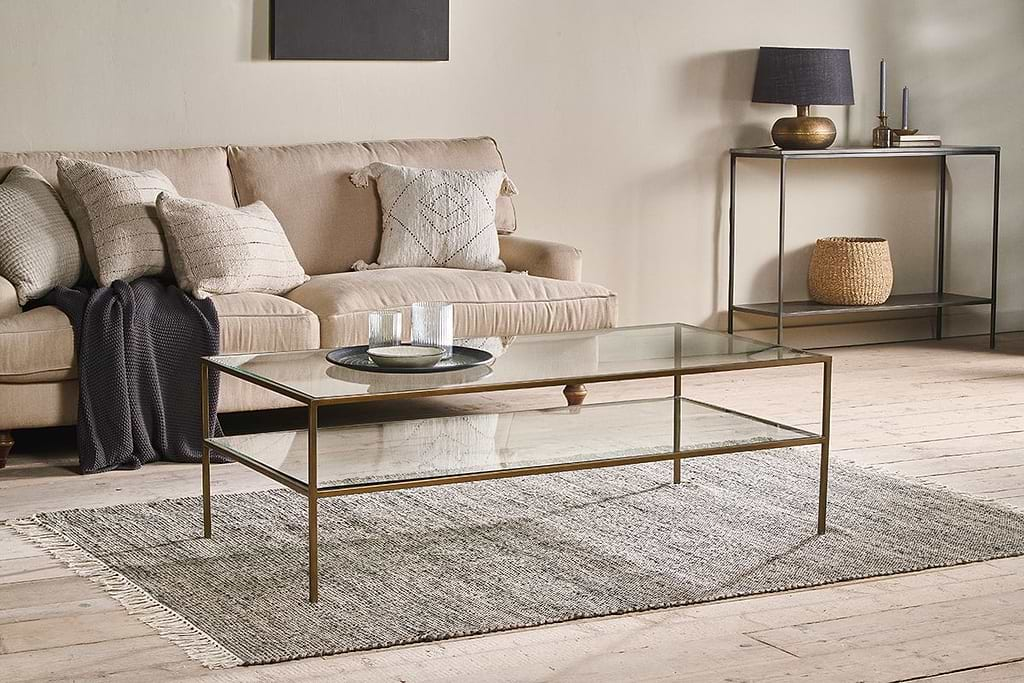
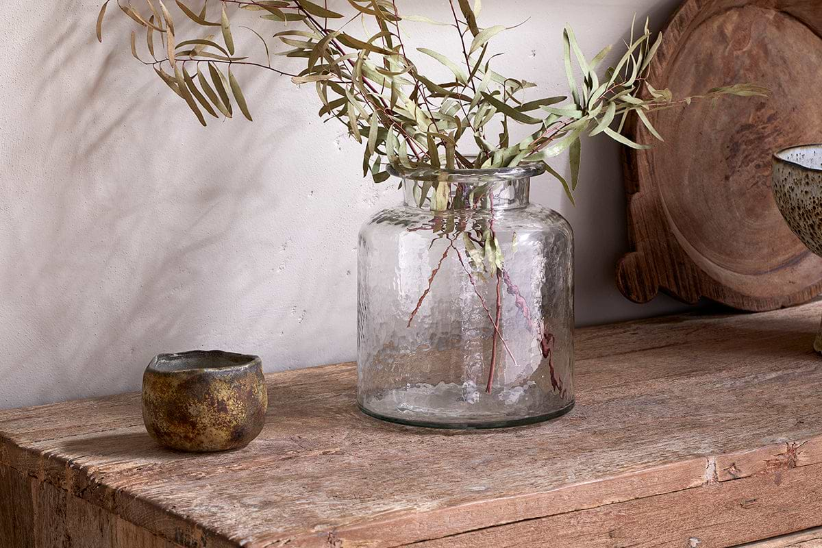
Akra Recycled Glass Vase
Clear cylindrical glass, pairs with stems or sits empty as a quiet accent.
View at Nkuku →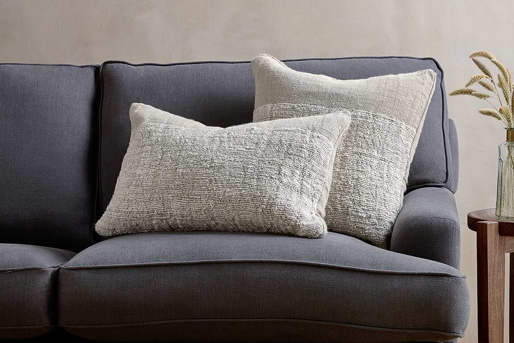
Puli Linen Cushion
Recycled linen in natural, pairs with woven textures and aged wood.
View at Nkuku →Some links above are affiliate links. If you buy through them we may earn a small commission at no extra cost to you. We only suggest pieces we think fit a calm, lived-in home.
Free guide
The Calm Shelf
12 styling ideas to help you compose calm, balanced shelves in natural texture homes.