

Shelves can seem tidy at first, but shelf ornaments often tip a room from calm to crowded in less than a minute. Mixed shapes, clashing colors, or just too many little pieces make a living room shelf look busy, no matter how often you rearrange.
The difference comes from knowing what belongs out, what is better stored away, and how many objects truly work in one view. This works especially well in a small apartment living room when storage is limited because each piece pulls double duty as both decor and clutter control.
The short version: Shelf ornaments look calmest when you display a few textured objects—like stone or wood—instead of cramming many small styles together. Choosing what to hide and what to leave out sets a focused tone and helps shelves feel finished, not chaotic.
Key takeaways
- Shelf ornaments made from natural materials offer texture and weight, which help a shelf feel anchored instead of scattered.
- Most shelves look calmer when about two-thirds of the surface is left empty.
- Mixing horizontal and vertical shapes creates a flow that feels relaxed rather than stiff.
- It’s better to display one focal piece per shelf than several competing objects.
- Avoid identical small collections, which can look cluttered even when grouped neatly.

What makes shelf ornaments look calm instead of cluttered?
Shelf ornaments look calm when you limit the color palette and use fewer, larger pieces with tactile weight like stone or unglazed ceramic.
A shelf in the entryway often collects whatever comes through the door: keys, mail, tiny souvenirs. The surface fills up before you notice. One pale stone bowl keeps keys contained, while keeping the shelf itself mostly clear of distractions.
Grouping too many colorful vases or figurines in a cramped corner makes the whole unit feel busy. Compared to using a single, tall wooden sculpture, the line of sight breaks up and the shelf loses its outline. A heavy, grounded base—like a round wood vessel—stops the eye and sets a sure focal point.
Most homes rely on small trinkets or catch-all boxes, but textured, simple materials—clay, raw oak, or linen-lined baskets—settle the composition and help everything feel sorted. This works because natural textures absorb light, softening the shape and preventing harsh glare, especially under daylight.
In practice, start by removing anything with a shiny or plastic finish; leave one prominent vessel to see if the space relaxes. A shelf feels lighter within hours of making the swap.
Where this works best
Simpler shelf ornaments fit best in places with low light or limited space, where mess collects fast and every item stands out.
Kitchens often have open shelving filled with spice jars and mugs. Restricting visible pieces to one wooden bowl and a neutral vase lets the other necessities blend in instead of fighting for attention. The same approach clears the living room media unit, letting a woven basket gather stray remotes.
In a rental hallway, where you may not want to drill or paint, a small metal tray and a ceramic sculpture bring softness without fuss. These surfaces can be cleaned easily, and the weight gives the shelf a sense of purpose rather than a random drop zone.
Avoid placing delicate glass pieces or complicated clusters in busy or high-traffic areas. Unlike solid accents, which survive a bumped elbow, fragile and lightweight items break the sense of ease and risk becoming clutter. Storage baskets with a low profile fare better.
In these situations, a simple deck of shelf ornaments works as a quiet backdrop, letting other room elements—rugs, artwork, or curtains—stand out.
How to choose what to keep visible
Keep only shelf ornaments that have useful weight, a plain shape, and a visible texture; hide or rotate anything small, plastic, or shiny.
The living room often starts with a mixture of gifts, old souvenirs, and seasonal pieces. It helps to handle each object and ask if its texture and color fit with the shelf’s background or stand out. A pale clay bowl or a matt white ceramic apple grounds the row according to Pretty Little Home.
If a decorative piece looks overly glossy or carries a cartoon pattern, it tends to read as “visual noise” from across the room. Subtle, handmade items—like a soapstone sculpture or a single turned-wood bowl—stay calm even under shifting light.
A bare shelf reads colder than one with a single woven basket or a plain stone tray. If you keep children’s trophies or old birthday cards on hand, consider tucking those behind smooth-edged objects or inside closed boxes, only bringing them out for special moments.
Displaying only what’s needed means cleaning takes less time; the shelf needs a soft wipe, and each object feels more valuable when it isn’t lost in a crowd.
Styling and placement
A shelf looks composed when you mix vertical and horizontal objects, place the largest item off-center, and group by color or texture—not theme.
Shelves set near windows catch strong daylight. Mixing one tall vase with a shorter, heavy stone or wood piece breaks up the hard edge. Swapping the usual straight row for an offset group—say, basket at left, bowl at right—draws the eye but doesn’t feel staged.
Compared to lining up odd trinkets and frames, repeating one or two favorite textures calms the view. Three objects spaced out, each with a distinct silhouette, fill the shelf without closing off air and light. Negative space lets the shelf’s grain or paint color show through.
A good starting point is to leave part of every shelf empty. Most shelves in shops show about two-thirds of the space open, making each accessory easy to see and dust. Natural materials like clay, jute, or pale linen leave a soft edge against white or wood-toned backdrops.
Quick calm checklist:
- Stick to just one or two materials per shelf—wood, stone, or ceramic work well.
- Leave gaps between objects so the shelf’s surface shows through.
- Keep color choices within a single, muted family or palette.
- Vary the shape: mix one upright (tall vase) with one flat or low object (woven basket).
- Use no more than three items per view to avoid crowding.
Using these guidelines, a living room shelf feels less busy and easier to style even on days when new objects want to sneak in.

What should you hide from view?
Hide small, shiny trinkets, plastic collectibles, and objects that repeat without variation—these pull the eye and make a shelf noisy.
Bookshelves in children’s rooms or studies often fill with action figures, medals, and old mugs. These groups can feel overwhelming fast. A better approach is to stow the bulk of such collections in a closed basket or behind a natural-fiber curtain, leaving just one out as a quiet nod.
Unlike a single framed photo, a whole set of matching figurines tends to flatten the look, turning shelf decor into a row of similar shapes. Even neat stacks of paperback books with bright covers can disrupt an otherwise laid-back display.
Collections of magazine clippings, notes, or tangled chargers break the sense of calm no matter how well-styled the rest of the shelf is. One woven basket, like the “Nkomi Basket,” gives both cover and texture, blending with stone or ceramic accents for a softer mood.
Every time you hide a fussy or glossy piece, the items that remain look fuller and more relaxed. As a rule, the fewer types of objects in view, the easier each shelf is to keep looking neat.
Why not all “neutral” shelf ornaments work
Neutral shelf ornaments only work if the materials and finishes offer real texture or visual depth, not just a plain color.
A beige plastic frame beside a matt white ceramic vase can show the difference: the plastic goes flat and feels cheap, while the ceramic picks up soft shadows and catches the eye differently throughout the day. According to Pretty Little Home, gentle matte finishes are especially grounding near both books and framed prints.
The effect holds in bedrooms, too, where fabric-wrapped or woven trays give a subtle contrast to paintwork. Compared to faux-leather boxes or synthetic ornaments, real wood or stone provides irregular texture that changes with the light, warming up the whole vignette.
Unlike bold brights or saturated colors, pale and natural tones can still clash when the finish looks artificial. A shelf stacked with similar-sized plain objects but in glossy or laminated materials will always seem busier than a shelf with one simple textured piece.
To test, set two “neutral” ornaments side by side; the one with uneven glaze, chipped stone, or visible weave tends to win attention in a quiet way and stands up better over time, especially on shelves viewed daily.
Three clear rules for calm shelf vignettes
A shelf vignette looks calmest with no more than three items, a mix of heights and negative space, and just one repeated texture or finish.
Rule one: limit what lives on each shelf to three to five objects at most—less is usually better. Most decorators suggest one focal piece and two supporting accents. This cuts down on crowding and creates a pause for the eye to rest.
Rule two: always mix at least one vertical and one horizontal shape, so the shelf holds both open area and movement. A standing vase beside a round bowl uses contrast, while empty space between items keeps things from feeling jammed together.
Rule three: keep to a single material family or matching colors, so nothing pulls the eye sharply away from the group. If you place a dark stone next to a pale ceramic, make sure one repeats somewhere else on the same shelf. Repetition in palette, not in shape, creates calm.
For evening styling, soft LED lights inside ceramic houses can add gentle warmth to shelves without introducing glare or harsh points, according to Pretty Little Home. These rules keep every type of shelf simple and liveable for daily use.
What tends to hold up with shelf ornament editing
Over years of reviewing new shelf styles and homeowner photos, one thing keeps surfacing: pieces with a substantial, tactile surface—wood touched smooth at the rim, stone that stays cool, a thick-glazed ceramic—always feel more at home than lightweight or themed trinkets. Reviewers often point out that when shelves are restyled using only three to four substantial items, rooms look finished even if nothing else changes.
One common decorator tip is to use matte or unfinished textures for shelves near windows or light sources, since they won’t cast harsh reflections or look fake after a few months. This holds up in most homes: subtle texture is friendlier to the eye and less likely to show marks or dust.
— Mara, Loom & Glow
Common questions
What are some good ornaments to put on shelves?
Good shelf ornaments include stone bowls, wooden sculptures, ceramic vases, and simple woven baskets. Natural materials and neutral colors keep shelves feeling easy and uncluttered. Choose objects that have real weight and visible texture for the most calming effect.
What are some good things to decorate my shelves with?
Decorate shelves with a small mix of vases, sculptural objects, smooth stones, and short stacks of books. A popular method is to add a single tall element, like a clay vase, beside a softer basket or linen tray for contrast. Natural and matte finishes work best.
What are some decorative things I can put on a shelf?
Decorative items for a shelf include ceramic figures, glass jars, vintage bowls, and simple wood or stone objects. Items that anchor a shelf and make use of negative space tend to look calm. Keep accessories within one palette for a connected look.
How can I decorate a shelf in a stylish way?
Style a shelf by choosing three varied pieces—a vertical item, a low bowl, and a textured basket or tray. Leave gaps so the shelf itself is visible. Using fewer items with similar colors or materials gives even small shelves a tidy, welcoming feel.
Explore more calm combinations inside our Shop The Look .
Shop the Look
Quiet sculptural pieces that anchor a shelf vignette without visual clutter.
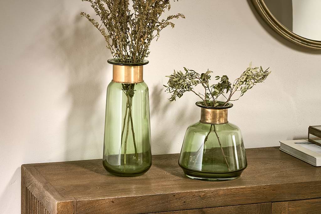
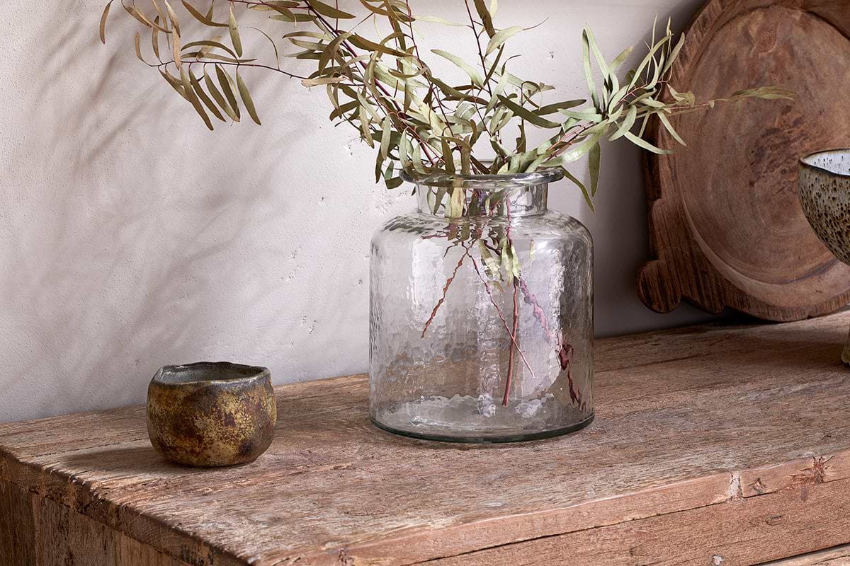
Akra Recycled Glass Vase
Clear cylindrical glass — pairs with stems or sits empty as a quiet accent.
View at Nkuku →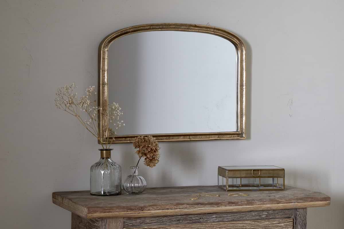
Some links above are affiliate links. If you buy through them we may earn a small commission at no extra cost to you. We only suggest pieces we think fit a calm, lived-in home.
Free guide
The Calm Shelf
12 styling ideas to help you compose calm, balanced shelves in natural texture homes.