

Styling a console table is often trickier than it should be. Half-done surfaces, piles of stray mail, and unbalanced shapes make it hard to see how to style a console table so it actually looks ready and calm, not just “decorated.” Awkward corners and tight entryways make it easy to give up and let these tables attract clutter.
This guide will show how to reset your console surface so it feels part of your home. You’ll learn which pieces to use, what to move elsewhere, and how to pick the right anchors for your setup. This works especially well in a narrow hallway when there’s not much wall space because a clear layout makes even a small area feel finished.
The short version: The simplest way for how to style a console table is to start with one anchor piece, like a mirror or artwork, then layer in objects of different heights, shapes, and textures. This keeps the table looking tidy and useful, not fussy. Every step here breaks down how to make it work in real spaces.

Why are console tables so easy to get wrong?
Console tables land in awkward spots, by the door, in narrow hallways, behind sofas, where clutter or imbalance easily shows. Getting the scale and layout right matters more here because these are high-traffic areas.
Entryway and hallway surfaces often turn into a drop zone of keys, post, bags, and whatever doesn’t quite have a home. A console table that tries to do too much quickly looks busy, while one that’s bare reads cold or unfinished.
Trying to style a console table by copying catalog pictures misses how real homes work. Unlike staged images, daily life brings movement and clutter, and most spaces deal with tighter dimensions, stricter rental rules, or lower light. The table doesn’t have to be the focus, but it does set the first impression.
In open-plan spaces, especially living rooms with a console behind the sofa, the wrong choice of lamp or artwork can make the whole area feel off-kilter. Anchoring the space through the main piece above the console works because it draws the eye to one spot and gives everything else permission to sit in the background.
A console stuck between functions, too decorative to be useful, too practical to look calm, pulls a home out of rhythm. Compared to a purposeful layout, a scatter of objects with no anchor leaves even beautiful pieces looking out of place. Placing a clear focal point above the table, then filling only what’s needed below, works far better for most homes.
Console surfaces especially benefit from sticking to a plan: a primary anchor plus just a few pieces to hold essentials. This method works in tiny apartments, busy houses, and even renters’ spaces where walls cannot be drilled or repainted, making a major impact out of a small change.
Where this works best
Console tables work in entryways, hallways, or living spaces where wall and floor area are tight. Small rooms and awkward corners benefit most from a clear, limited setup.
In a rental entryway or narrow corridor, a well-placed console table becomes that link between the outside and the rest of the home. These tables often sit opposite the front door or in transition points, which makes every detail more visible than in back rooms or bedrooms. Limited space, high foot traffic, and lack of built-in storage all shape which solutions fit best.
Setting up a console for everyday use means picking one or two functions, drop spot for keys, mail tray, sometimes a small lamp, and letting the rest of the tabletop breathe. Daily arrivals and departures are easier when there’s a fixed spot for each thing. If a table sits behind a sofa, it’s often chance to show artwork, lean a mirror, or hide a tangle of plugs using a basket below.
Avoid crowding small consoles with too many ornaments or oversized storage baskets. Large planters, tall lamps, or multiple trays can make a surface in a narrow hallway feel overwhelmed instead of practical. One tall item plus a small group of smaller pieces, with space left clear, softens sharp corners and keeps movement easy. This is especially true in apartments where every bit of space matters.
How do you pick the main piece for your console?
Start with a single anchor: a mirror or artwork above the console helps the space feel finished and keeps everything beneath it grounded. Size matters more than style here.
When a mirror hangs above a console table, it sets both height and style for everything that follows. Most designers use the “two-thirds rule”, the mirror or art should cover about two-thirds the width of the table, with a gap above the tabletop of fifteen to twenty-five centimeters. This scale draws the eye but doesn’t overpower.
Art is a solid alternative to a mirror, especially where extra light from a mirror adds glare or reflection isn’t needed. Either way, what works is clear: centering one focal piece stops the display from drifting sideways or looking piecemeal. Compared to hanging several smaller frames, one larger piece feels calmer and less busy. For reference, the two-thirds rule is a designer staple for keeping console tables in proportion.
Choosing artwork in muted tones or a mirror with a soft-edged frame helps prevent the space from feeling too formal. On an outdoor-themed console, a round natural-fiber mirror or a linen-framed photo keeps a small balcony entry area grounded and user-friendly, especially as part of calm outdoor space inspiration. Once you have an anchor, picking other pieces falls into place.
Styling and placement
Place larger, taller items to one side and fill with smaller accents that step down in size. Group objects in threes for a setup that looks planned but not stiff.
On top of most console tables, the layout that works best is classic for a reason: a tall lamp or vase on one end, a mix of small accents across two-thirds of the surface, leaving some visible tabletop. Unlike a symmetrical arrangement, an asymmetrical console naturally draws the eye along the display, not just to the center.
Entryway styling works best when objects vary in height and texture, stopping the top from reading flat. Mixed pieces, like a ceramic bowl paired with a recycled glass vase or a mango wood tray, help break up a matchy-matchy feeling. Compared to displays where everything is level, adding height at one end keeps energy moving across the table.
A reliable way to decide what comes next: follow the “rule of three.” Odd-number groupings and stepped heights always look more relaxed and easier to live with. A bare console feels cold, while a tidy set of three objects grouped at different levels looks both natural and considered. Place a lamp, a short stack of books, and a candle, leaving gaps between them.
Quick calm checklist:
- Pick a group of three objects in varied heights and materials
- Leave sections of the tabletop open, don’t fill every gap
- Keep colors either all neutral or limit to one accent shade that ties to the wall piece above
- Use one focal anchor (mirror or art), not a gallery
- Mix wood, glass, ceramic, or woven pieces for texture

What should actually go on top?
Start with essentials, lamp, bowl, tray, then add just one or two accents for interest. Objects gain presence when surrounded by empty space, not more objects.
Table lamps, artwork, small ceramics, and decorative trays are the core pieces seen on styled consoles. A tray acts as a landing zone for keys or mail, the lamp adds warmth (especially in low-light spots), and a bowl or lidded container takes care of small odds and ends. It’s a short list, but it covers daily needs.
In a small apartment, too many small items can turn the surface into a “catch-all” and make it feel messy. Compared to shelves, consoles show everything up close: grouping three pieces together, two practical, one decorative, looks deliberate and stays useful. For renters, a non-slip bowl or tray can anchor loose items without risking marks on furniture.
Every item should feel like it has a reason to be there. Swapping in a natural fiber tray or a stone bowl adds subtle texture without making the setup fussy. A bare surface feels neglected, while too many baskets or bowls end up looking like storage overflow. A single ceramic vase holding one leafy stem pulls light into a dark corner and is easy to swap out through the year.
Stacking two or three books or magazines under a candle gives some height without shouting for attention. In line with current shelf styling formula ideas, mixing textures, wood, glass, woven, makes each object stand out. By limiting quantity, even busy entryways can feel put together with less, not more.
How do you use the space underneath, without visual mess?
Leave some space open under the console, then add just a single basket or box for closed storage. This keeps things tidy without drawing the eye to the floor.
The lower shelf or under-table area of a console is often forgotten or, worse, crammed with bags, shoes, or extra storage bins. If this space reads as busy, it can make the whole entryway feel cramped. A single lidded basket or a neatly folded blanket gives the area warmth and texture, especially if the top of the console is already calm.
Most woven baskets that fit under consoles cost between $20 and $40, and can last years if they’re used for light items like scarves, slippers, or tech chargers. This option is usually better than stacking magazines or boxes, which look like clutter in a small space. A closed basket below picks up daily mess and adds a layer of softness to hard flooring. Compared to bare legs, one basket makes the area feel finished rather than empty, but avoids a heavy look.
In rental apartments or shared spaces, sticking to removable storage, baskets, soft bins, means you never have to drill or alter furniture to get all the function you need. Brands now carry baskets in blends of jute, water hyacinth, and cotton, which stand up to daily use and layer in subtle pattern under the clean lines of a typical entryway console.
A mix of hidden and open space underneath signals to the eye: “There’s a home for everything.” If your hallway is particularly tight, one open bin for spare shoes or a rolled yoga mat keeps the surface clear and the floor usable. For more details, see our narrow hallway guide for small homes.
What makes a display feel calm instead of cluttered?
A calm display uses a limited color palette, repeats one or two textures, and leaves empty space between groups. More air between objects makes everything look lighter.
Mixing materials is key: a wooden bowl next to a glass vase, a linen runner beside a woven basket, or a ceramic lamp holding its own at one end. Sticking to neutrals and pairing warm and cool tones gives a display depth but not confusion. Matching sets flatten the setup, while too many colors in a small spot can look scattered.
Every piece should serve a purpose, either visual weight, function, or both. Compared to ornate table decor, a few natural-finish items in soft tones help the space feel more open. Balancing a tall, heavier object on one end with a low, lighter piece on the other feels relaxed and makes movement around the area easier.
If your console sits in the entry, repeat a material, such as a linen shade on a lamp and a linen-effect tray, to pull the look together. Use white, cream, pale wood, and a single accent shade for a setup that’s neither plain nor loud. Texture makes the surface interesting, and negative space keeps the arrangement from getting heavy or overwhelming.
Setting a limit on the number of objects and keeping everything organized to one side lets more of the table’s surface show, which helps even a cramped or dark hallway look brighter and more open. This focus on restraint brings out softness and calm, especially when anchored by one strong piece above, like the coffee table styling approach with less clutter.
There’s always a pause after putting everything in place. For many people, this is the moment when the table still doesn’t quite sit right, something pulls the eye in the wrong direction, or too many things fight for attention.
Most homes run into the same snag: too many small items with no clear anchor leave the surface looking scattered, while not enough presence or height on one side feels unfinished. Failing to mix textures, or sticking to objects all in the same color, can make a display feel flat or like a matching set. These mistakes matter now because they slow you down in the space you use most, every day. When you get the anchor and the balance right, the setup is easier to live with, no constant straightening or hunting for keys.
Choosing one strong piece and mixing natural textures improves the look and works harder for you each day.
Save this idea for later.
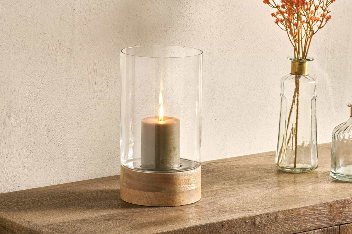
Idha Hurricane Lantern – Straight
anchors the setting without overwhelming the surface.
What tends to hold up with console table setups
Looking at hundreds of styled console tables and hearing from readers and decorators, the layouts that last feature restraint and clear focus. Designers consistently suggest using the “two-thirds rule” for mirrors or art and grouping objects in odd numbers for relaxed energy. Mixing materials, especially wood, glass, ceramic, and natural fiber, brings quiet interest that wears well across seasons and trends.
Matte finishes get recommended again and again for consoles near entryways, since they resist fingerprints and don’t reflect harsh hallway lights the way high-gloss finishes do. Simple shapes and a gentle palette hold up best, especially in busy transitional spaces or rentals, where durability and visual warmth matter most.
, Mara, Loom & Glow
Common questions
How do you make a console table look good?
Use one main anchor piece (like a mirror or artwork), then group three objects of different heights, shapes, and textures on the surface and leave some space empty. This method blends visual interest with practical function so the table looks planned, not busy, but still serves you well every day.
What is the rule for a console table?
The most cited guidelines are to use the “two-thirds rule” for art or mirrors above the table and group surface objects in odd numbers, adjusting heights across the arrangement. These rules help spaces feel balanced and less cluttered, especially in entryways or narrow hallways where every detail is on show.
What do you put on top of a console table?
Lamps, trays for keys and post, bowls, candles, and a few decorative pieces like vases or framed photos are the usual picks for console table surfaces. Limit the selection to functional basics and one or two accents in varied textures to keep everything easy to use and visually calm.
What do you put on the bottom of a console table?
A lidded basket, soft box, or neatly folded throw are good options for the space under a console. These give extra storage and texture without making the area look busy. Leaving part of the space open lightens the look, especially if the surface above has larger items.
what is the difference between a console table and an entryway table?
A console table is a catch-all term for a narrow, long table often placed behind a sofa or in a hallway, while an entryway table is a specific type of console table placed in an entryway to function as a drop spot for keys and mail and set the first impression of a home.
Explore more calm combinations inside our Shop The Look .
Shop the Look
An Aasha console with mirror and vase to anchor an entryway with calm presence.
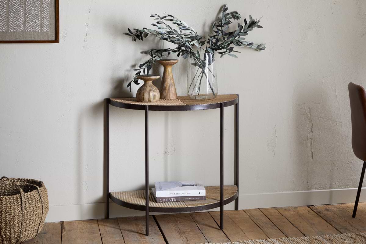
Aasha Console Table
Half-moon silhouette in mango wood; anchors entryways and narrow walls.
View at Nkuku →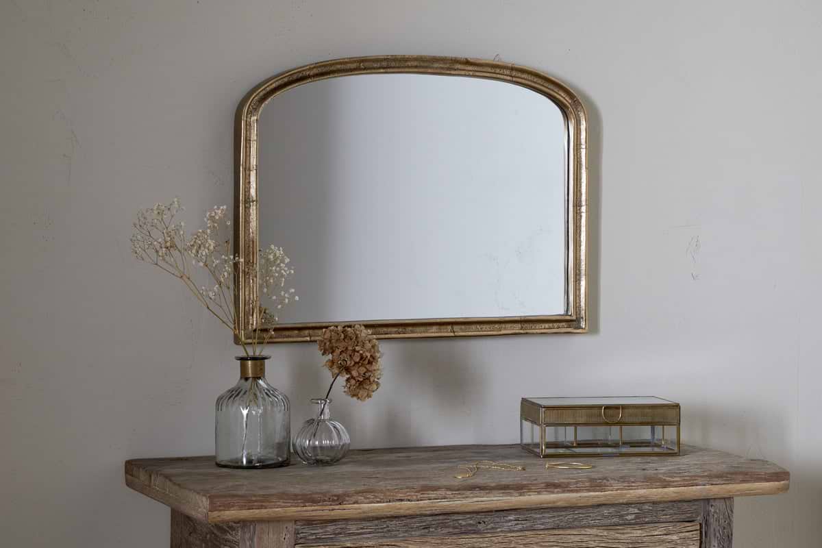
Some links above are affiliate links. If you buy through them we may earn a small commission at no extra cost to you. We only suggest pieces we think fit a calm, lived-in home.
Free guide
The Calm Leaf
12 quiet ways to bring dried botanicals, stems, and natural textures into calm spaces.