

Too much decor crowds a room, and too little makes it feel unfinished. Most UK homes struggle with pieces picked separately, a basket here, a print there, hoping it will add up to calm. Instead, the space often feels unsettled, with corners that nag at you and surfaces that ask for constant tweak or tidy.
Today, you will learn how to spot what unsettles a room, and how to choose decor that settles it. You’ll see exactly what to move, what to keep, and how to make each piece do more with less clutter. This works especially well in a small sitting room when there’s limited daylight because each item has to work harder for a feeling of rest.
The short version: Decor that lasts and calms a home is chosen for its material, shape, and placement, not just its photo. The shift is choosing fewer, tactile pieces that anchor a space and reduce visual noise. Every choice today will quieten a room rather than fill it.
Key takeaways
- A single natural material, like jute or linen, gives storage baskets and planters a gentle, grounded look.
- Decor works best when each piece earns its spot by solving a need or adding texture, not just filling gaps.
- Generic decor shop photos don’t show how items behave with light, dust, or heavy use day to day.
- For long-term calm, avoid new trends and focus on neutral, tactile pieces that age well over years.
- Most floating shelves are about a hand’s depth, so choose objects that don’t crowd the edge.

Why do generic decor pieces feel off at home?
Generic decor often feels out of place at home because it’s designed for a catalogue, not for real rooms with shadows, marks, and lived-in corners.
A room with plain shelving or a rented living space usually sees new pieces added for convenience, cheap glass vases, printed wall art, mass-market candle holders. At first they seem harmless: a quick browse at a chain shop, a simple checkout. But at home, most generic decor draws more attention to itself than to the room. A metal planter shouts next to a cotton sofa. A plastic tray shows dust at every angle. The effect is nervous and busy, never quiet.
One hidden cause is that most generic picks are chosen based on photos, not handling. On screen, everything glows: glassware is streak-free, cotton looks thick, each candle sits unburned. But these props are arranged for a studio, not a lived-in hallway where fingerprints stand out, or a family table where water rings appear within a day. The mismatch is felt after the first week at home, a vase that scratches, a basket that warps.
Compared to the soft presence of a woven or glazed piece, generic decor keeps reminding you it’s new and out of place. This constant sense of novelty quickly feels out of step with the way a home actually functions.
Swapping in one well-chosen piece, like a simple clay bowl or a timeless wooden bowl, can quiet a surface instantly and settle the whole mood in rooms that once felt scattered.
How do you spot visual noise in a room?
Visual noise in a room shows up as restless corners, uneven color, and too many small shapes competing for attention.
Busy living rooms often have scattered candle holders, overlapping trays, clashing cushion covers, and a half-filled shelf. Too many finishes, glossy, matte, patterned, make it hard to settle the eye. Blank spaces, on the other hand, can feel cold but rarely overwhelm.
You can check for visual noise by standing in the doorway and scanning the edges: does anything stick out too far? Are five things fighting for notice on one shelf? If so, the space feels taller, busier, and heavier than it needs to be. A group of trinket dishes in different colors draws more attention than a single plain vase or a neutral pot in a calm color.
Natural materials dull extra glare and soften outlines, so a set of glass jars with bamboo lids absorbs light instead of reflecting it at every angle, something Pretty Little Home proves with their best-selling storage jars.
Bringing these choices together allows a shelf or dresser to breathe. Fewer, larger objects, anchored by one shape or color, immediately calm things down in a room that felt slightly out of tune.
The first principle: one focal point, one texture
A room feels settled when you choose one shape or one texture to repeat across your decor, not scatter many types in one space.
A round lamp, a coiled rope basket, a pillar candle, these add weight if kept in the same family. Mixing glass, metal, and plastic in the same line of sight leaves the room looking unsettled. “A shelf works best when one texture sets the mood,” as decorators often say, which helps the eye rest.
One focal point, for example, a thick linen cushion or an engraved mirror, gives a reference point for the whole room. Unlike grouping three patterned vases next to each other, using a single larger bowl or one strong wall decor piece absorbs visual energy and keeps the space from feeling busy.
Choose one area, a window ledge, coffee table, or entry shelf, as the anchor spot. Repeating texture here lets every piece in that zone look like it belongs. This lets even small apartments feel calm and purposeful.
For comparison, here’s how texture and focal point shape a room’s tune:
| Approach | Result | Downside |
|---|---|---|
| Repeat one texture (e.g. linen) | Settled, soft look | Can feel plain if palette is too narrow |
| Mix several small finishes | Busy, scattered | Harder to clean, harder to tweak |
| Choose one object as focal | Eye rests easily, room feels anchored | Needs restraint not to add more |
Where this works best
Choosing and styling thought-out decor works best in plain, practical rooms with space for a single strong accent and little floor space for clutter.
Rental flats, small city homes, and open-plan living rooms all benefit from this approach. Wall decor, like a minimal frame or a shallow picture shelf, pulls the eye without taking up precious surfaces. In a narrow hallway, a single soft rug or a simple clock works better than three competing pieces. Window sills and entryway benches are sensible places for one sculpted vase or a practical basket with a natural weave.
Kitchens with limited storage work well with this kind of calm decor. A storage jar or hand-thrown bowl sits on the counter, blending in yet standing out just enough to look thought-out rather than forgotten. Bedrooms with little daylight or twin beds feel warmer with a single textured planter instead of several small plastic pots.
Avoid cramming multiple statement pieces, like bold artwork, a mirrored clock, and patterned trays, into the same area. The effect is not restful. It leans toward busy and uncertain. Let each item do its job, giving enough breathing space around it.
Try one woven basket beside the sofa for blankets or a neutral plant pot on the windowsill to set a calm note in a room with low storage or an awkward corner.

Styling and placement
Styling calm decor means giving each object space and using it for a practical reason, not just as a gap-filler.
The simplest way to avoid clutter is to set rules about what goes where. Place a basket only where you’ll use it; let a plant pot sit by a window that really gets light. If a shelf is deep enough, try a round lamp and one wooden bowl, never three scattered glass vases. Each piece should work where you place it, not float alone.
Mixing objects at the same level and stacking them breaks the flow. A rug that pushes against all the sofa legs or a tray that barely fits the side table looks cramped and tacked on. On a windowsill or shelf, leave at least two-thirds of the surface open. Most floating shelves are about a hand’s depth, so skip objects that overhang the edge. Let space do the work with you.
Quick calm checklist:
- Natural materials, a linen runner, jute basket, or clay vase, work best in high-use spots.
- Leave empty space next to each piece; crowding reads messy, not full.
- Limit color to one light neutral, one dark, and a single accent tone across close pieces.
- Group by shared use or texture, wooden bowls with wooden hooks, never metal and glass together.
- Keep shelves and counters two-thirds clear for ease and cleaning.
Use a woven tray as a catchall for keys in the entryway, or let a single glass vase draw just enough light in a dim hallway. These simple pairings work with the proportions of real rooms, not just in product shoots.
How can you tell if a piece is built to last?
A decor piece is built to last when its material feels solid, its finish is even, and its joints or seams are sturdy to the touch.
Checking product photos isn’t enough. Touch the surface, does the glaze feel thick on a clay bowl? Is the weave tight in a seagrass basket? Press a drawer knob: does it flex? Many mass-market pieces use thin plastic disguised as wood, with seams that split with one season’s use. By contrast, a real wooden bowl gains warmth and dents gracefully.
Sites like IKEA’s home decor category list items from solid wood, thick glass, and natural fibers, but you’ll need to check actual joinery or the way a frame hangs when possible. Weight matters, too, an object that feels too light rarely holds up. A good jute basket runs about the cost of a takeaway dinner, anchored by real handles and an even stitch across the top edge.
Compared to trend-led acrylic trays or seasonal prints, a hand-dipped vase or stoneware planter will keep its shape, even after years in steamy kitchens or sunlit sills. The proof is in the feel and in the way the finish hides or reveals marks. Pottery, for example, mutes scratches over time, while painted metal shows every bump.
Keep pottery on kitchen shelves exposed to steam or place a thick-woven rug by the door where foot traffic is heavy, a hard-wearing spot to test a material’s claims.
How to style your decor edit without starting over
Styling your current decor edit smoothly means removing anything that distracts and anchoring the space around one strong, useful object.
Start by stripping the area, a shelf, coffee table, or mantel, down to bare. Remove all decorative items. Only return what earns its place: one linen cushion, a woven tray, a pale clay jar. This lets each piece breathe and supports the main use of the space, whether it’s reading, resting, or eating.
Don’t scatter candles, tiny bowls, and picture frames along one ledge. Instead, cluster by texture and spread visually heavier objects at natural stopping points, corners, table edges, next to a sofa arm. A wooden bowl as an anchor piece can balance out soft textiles or break up a set of small glass vases.
When adding new pieces, pair by use and feel. For example, a set of favorite mugs belongs on a coffee table styled for calm, while storage jars with wood tops suit the kitchen best. Swapping fast trends for natural finishes, linen, clay, glass, wood, makes a room look ready without repeating the same idea in every area.
Try resetting your shelf with a single large vase in the middle, a folded runner, and one or two personal keepsakes for a space that feels both polished and lived-in.
What tends to hold up with thoughtful decor choices
Over time, rooms that rely on one grounded piece, like a strong basket, wooden tray, or thick pottery, keep their shape and calm better than those filled with collectibles. Reviewers point out that matte finishes, especially on tableware and plant pots, draw less attention to smudges and daily marks than gloss finishes. Decorators back these choices because natural materials weather well and pick up softness with age, rather than looking scratched or faded out of trend.
Simple edits remain most reliable, especially for homes with tight space or heavy use. Letting surfaces stay partly clear and repeating one tactile finish for storage and display typically wins over time and survives fickle trends.
, Mara, Loom & Glow
Common questions
What is the definition of decor?
Decor means the arrangement and choice of objects, materials, and colors used to make a room look and feel a certain way. Everyday examples include wall art, rugs, lamps, and storage baskets. The point is to make a living space both useful and pleasing.
How do you spell decor in British English?
The correct spelling in British English is “decor”, without any accents. Both UK and US English use this form for talking about home style, furnishings, or room accessories. The pronunciation in the UK is usually “dee-cor”.
What is another word for decor?
Another word for decor is “furnishings” or “room accessories”, though people sometimes use “homeware” or “ornaments”. In shops and magazines, “finishing touches” often describes the same types of items, useful and decorative things that round out a room.
What does the term decor originate from?
The word “decor” comes from the French “décor”, itself based on the Latin “decorus”, meaning “beautiful” or “proper”. It first described theatre backdrops and later expanded to mean the way rooms and homes are arranged. Now, it covers nearly all choices that give a home its mood.
Explore more calm combinations inside our Shop The Look .
Shop the Look
A quiet edit of pieces that bring calm texture and warmth to styled spaces.
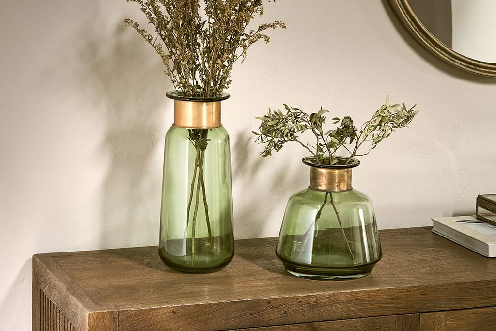
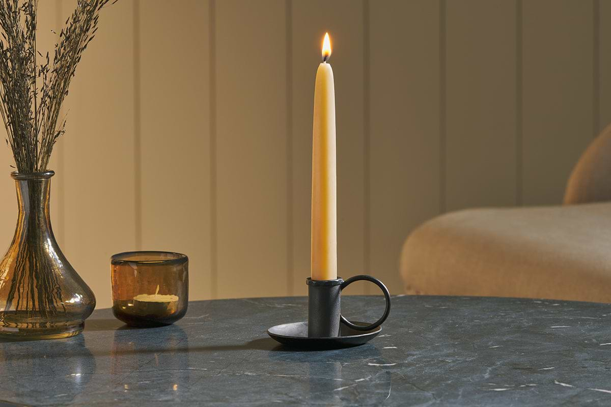
Amri Iron Candlestick
Slender iron with quiet presence, works alone or in clusters of three.
View at Nkuku →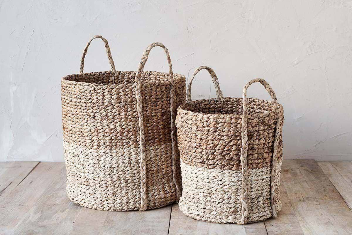
Nkomi Basket
Woven storage with a calm silhouette, works open or tucked under a console.
View at Nkuku →Some links above are affiliate links. If you buy through them we may earn a small commission at no extra cost to you. We only suggest pieces we think fit a calm, lived-in home.
Free guide
The Calm Shelf
12 styling ideas to help you compose calm, balanced shelves in natural texture homes.