

Even after sorting and cleaning, shelves can still look crowded. Many Pinterest users find shelf accessories decorating leaves their open shelving feeling busy, not calm, especially when mixes of vases, bowls, and framed prints compete for attention. The shelf itself fades behind stacks and scatterings, so even minimalist homes end up with a restless display.
This guide focuses on removing what weighs your shelves down and choosing accessories that settle into the background, not steal every glance. Today you’ll learn what to keep, what to shift, and what to remove. This works especially well in small living rooms when shelving sits opposite a window because every piece counts more in a bright, narrow space.
The short version: Shelf accessories decorating works when you limit color, repeat textures, and leave gaps so the shelf feels settled, not packed. Choosing fewer, quieter items means your shelves look calmer and more considered without daily fuss. This guide gives practical rules for arranging a shelf that looks peaceful even in a busy room.
Key takeaways
- A floating shelf feels calmer when about a third of its surface is left clear.
- The rule of thirds in shelf styling helps set a natural visual rhythm.
- Natural materials like wood and clay soften sharp shelf lines and avoid a cold look.
- A single vertical object stops a shelf from feeling flat or empty.
- Shelf sitters in warm colors add softness to a neutral base according to buying guides.

Why does my shelf look busy even after tidying?
A shelf often looks crowded even when organized because too many small or bright objects fight for attention and break up the flow. Less is almost always more when styling open shelves.
In living rooms with floating shelves, people often stack books upright and pack decorative pieces right beside them. Even a neat arrangement can feel impatient if dozens of colors and shapes compete for notice. A shelf needs a few pauses to feel visually settled.
A plain wall shelf reads colder than one with a single wooden bowl and an empty space beside it. Too many “statement” objects side by side pull the eye in every direction rather than letting it rest. The result is shelves that stay tidy but never feel finished.
Using neutral-toned pieces and grouping in odd numbers, such as three, can reduce this scattered feeling. Letting at least a hand’s width of shelf remain clear on both ends resets the mood and makes daily dusting easier.
Most people skip this last step, but it makes a shelf blend into the room rather than draw attention to gaps.
Where this works best
Shelf accessories decorating is most effective in open-plan or small rooms where shelves are both display and storage. Limited space means every object is noticed more.
Shelf restraint works in places like entryways, kitchens, or small bedrooms where floating shelves double as décor and catchalls. If a shelf floats above a console or doubles as a bedside, the wrong accessory selection can swamp the view or feel unfinished. Such shelves often lack behind-door storage, so storage objects risk becoming clutter if not chosen thoughtfully.
In practice, keeping just a trio of items on a narrow hallway shelf, maybe a stack of books, a clay bowl for keys, and a vase, lets each object stand out. The rest of the shelf can breathe, which settles the look and fits well with slow living spaces that call for pause and comfort.
Avoid filling every shelf on a tall bookcase with decorative bowls or catchall trays. When every open spot is crowded, shelves feel congested instead of useful. Stick with restraint, especially above eye level, to keep the shelf from dominating a calm room.
A kitchen shelf above the sink, for example, works best with a small group of wooden spoons in a tumbler and a single potted herb. Anything extra distracts from the easy to maintain feel open shelves should give.
How can I map shelf zones for a calm look?
Dividing a shelf into clear visual zones helps every object feel intentional and gives the eye a place to rest. Each zone should contain only one or two items by material or height.
Think of long wall shelves in a living room. Without some zoning, bowls, books, and frames drift into each other, making the shelf read as one noisy line rather than three gentle groupings. By splitting a shelf into three areas, left, center, right, you direct where the focus falls.
Unlike arranging a mantel, a shelf’s objects can sit directly in line or with slight gaps. Bookend one side with a weightier vase, stack books in the center, then leave room at the end for a soft item like a candle or linen-wrapped box. The spacing between zones keeps each type of object from tumbling visually into the next.
Mapping zones doesn’t demand perfection. Letting some overlap (a trailing plant overhanging books) invites texture, while clear breaks between dense and airy sections stop visual noise.
Most shelves looked cramped when there’s no rhythm or pattern at all. This simple zoning approach fits best on longer floating shelves or bookcases with wide, open faces, an easy upgrade before you decide to hang more art or add storage elsewhere.
The rule of thirds for shelf accessories (and when to break it)
A shelf styled using the rule of thirds, leaving about a third empty, a third for tallest objects, and a third for low or stacked accessories, feels balanced and never heavy.
The rule of thirds is borrowed from both photography and display design. For shelves, it means keeping one third of each shelf clear, grouping accessories to one side, and leaving low items or negative space in the rest. This sets a gentle rhythm that is easy to scan from across a room.
Unlike a kitchen counter, which can safely fill up with small appliances, shelves quickly look weighed down by too much. Placing your tallest item just off-center and anchoring it with a bowl or horizontal stack prevents the top-heavy “totem pole” effect that often happens when everything stands upright.
Some rooms, like vintage-inspired libraries, look better when the rule is bent, letting books pile in one half with only a single sculptural object offset in the other. Compared to a pure minimalist shelf, this slightly unbalanced version feels more relaxed but still avoids chaos.
Most decorators find that following the rule of thirds gives the best results in modern or small apartments, especially when shelf display is limited by short wall runs or tight footprints.

Styling and placement
Arranging shelf accessories by material, height, and spacing creates a calmer display than lining everything up or clustering similar sizes. Placement builds comfort more than the objects themselves.
Wood and woven baskets do best as anchors near ends, while a metal or ceramic accent gives the middle of the shelf a touch of substance. Pleasing placement means not just spreading items but deciding where quiet and visual pause will sit.
Placed too close together, even beautiful objects race for attention; spaced too far apart, the shelf reads cold and unfinished. Aim for small, repeatable gaps, about the width of a hand or a single book spine, between accessories. This keeps a gentle tempo across the shelf.
Compared to filling every corner, leaving empty shelf at both ends brightens the whole wall. In a narrow hallway shelf above coat hooks, a single mid-sized vase with a sprig of greenery beside a folded linen towel makes the shelf look deliberate, not haphazard.
Mix at least two textures in a row, a ceramic bud vase, stacked linen napkins, a rough-woven basket, to break up flatness. The difference between a shelf that looks busy and one that looks settled is almost always the placement, not the price or trendiness of the items.
Decorating floating shelves can show how the spacing principle applies when shelf brackets are exposed or wall space is tight. Testing your shelf arrangement in real light often reveals where objects feel crowded or lost.
Quick calm checklist:
- Limit color palette to two base tones, with one subtle accent.
- Repeat natural materials, wood, clay, linen, for softness.
- Keep at least a hand-span clear at both ends of the shelf.
- Vary height so no two objects beside each other sit at the same level.
- Use one vertical object (vase, candlestick) for every two flatter items.
Which materials make shelves feel softer?
Shelves feel softer and less busy when you use natural materials like pale wood, stone, or unglazed ceramics instead of metal or high-gloss décor.
Naturally finished wood, lightly textured ceramics, and woven baskets warm up a shelf in a way that painted or mirrored surfaces never do. A pale oak shelf stacked with clay bowls and linen-covered books reads as quiet, not cold. These textures soak up light, making even a north-facing wall feel gentle.
Unlike smooth metal trays or plastic bins, rough clay and jute baskets wear in, not out, so they look better with age and use. According to buying guides, shelf sitters in warm colors or soft finishes are recommended for a natural, lived-in feel. Spread them across the shelf, not stacked, for best results.
Mixing woods, ceramics, and soft textiles achieves calm with less fuss than cycling through trend colors or glossy metallics. The hard edge of a bare shelf is softened by just one basket or linen runner, especially in high-traffic rooms like a family kitchen or mudroom.
Most shelving systems benefit from these soft textures, since they cut the cold mood that glass, synthetic, or shiny accents often give.
How do you layer shelf textures without visual noise?
Layering shelf textures without clutter means mixing a few matte and smooth surfaces, then echoing a material or color in one other spot. Let negative space count as part of the texture.
Shelves work best with contrast, not chaos. Pair a woven bowl with a soft-gloss vase and leave empty space beside them; the shelf’s own wood or wall color acts like a “soft gap,” helping the eye rest. Too many similar surfaces, like rows of glass, flatten the look and can even give glare, especially near a window.
Compared to mixing five materials, sticking to two, the shelf plus one each of wood, ceramic, or linen, settles the whole arrangement. Repeat a texture with a smaller accent further along the same shelf, such as a clay bowl and a second, smaller pottery cup. This avoids randomness and sets a visual rhythm.
The absence of objects or the shadow they cast can make the display as interesting as the items themselves. A shelf full of objects quickly reads busy, while a deliberate pairing with a gap reads both softened and finished.
Trying a warm-metal accent, like a small aged brass bowl, once per shelf is enough. Shelves feel softer and more personal if you can see both object and negative space side by side.
For more visual shelf inspiration, shelf styling ideas are a useful way to see texture and spacing in real user rooms.
There comes a point, often just after tidying, when the shelf stops feeling calm. You notice there’s no empty space, only rows of pieces touching, each demanding its own bit of attention. The mood falls flat or even slightly tense, no matter how nice the accessories.
This is usually the moment you realize you need to take one thing away and let what remains breathe a little. The shift is simple: group by texture, pull back on color, and keep the focus on one or two clever pieces rather than a gallery of small things.
Save this idea for later.
What tends to hold up with shelf accessories decorating
Rooms that feel most settled use texture, empty space, and repetition more than novelty or expensive objects. Reviewers and decorators alike lean toward matte finishes for shelves near windows, since they soak up glare better than shinier accents. Woven baskets, natural wood, and quiet ceramics last season after season, while highly decorative or synthetic pieces often date a display or require constant re-styling.
One thing seen in hundreds of reader-submitted rooms: the shelves looking calmest almost always have something left out, not squeezed in. Leaving space, anchoring with one heavier piece, and repeating a favorite material sets the right tone. A new accessory rarely fixes a busy shelf, but removing one almost always helps.
, Mara, Loom & Glow
Common questions
What are some good, intentional things to put on a shelf?
Good shelf accessories include natural wood bowls, simple ceramic vases, linen-covered books, and woven baskets. Objects that serve a small purpose, like a key dish or a storage box, double as practical display. Pastel or neutral pieces stay easy on the eyes and suit many interiors.
What is a stylish way to layer objects on a shelf?
A stylish shelf layers a mix of heights and textures, like a stack of books, a clay pot, and a woven tray, leaving clear gaps between. Use groups of three for rhythm, and repeat one material (such as wood) to link separate items. Let negative space count as part of the arrangement.
What shelving trends are timeless, not temporary?
Simple floating shelves, matte-finished wood, and woven baskets are timeless according to most designers. These materials blend naturally into new color schemes over time. Accessories like unglazed ceramics and minimal brass accents also outlast trend cycles and avoid looking dated quickly.
What are some good things to put on a shelf to decorate it?
Good decorative shelf items include a mix of books, pottery, small potted plants, framed prints, and natural-texture trays or bowls. The best displays use objects with meaning and a soft palette. Avoiding too many collectibles or souvenirs prevents shelf clutter and gives a calmer look.
Explore more calm combinations inside our Shop The Look .
Shop the Look
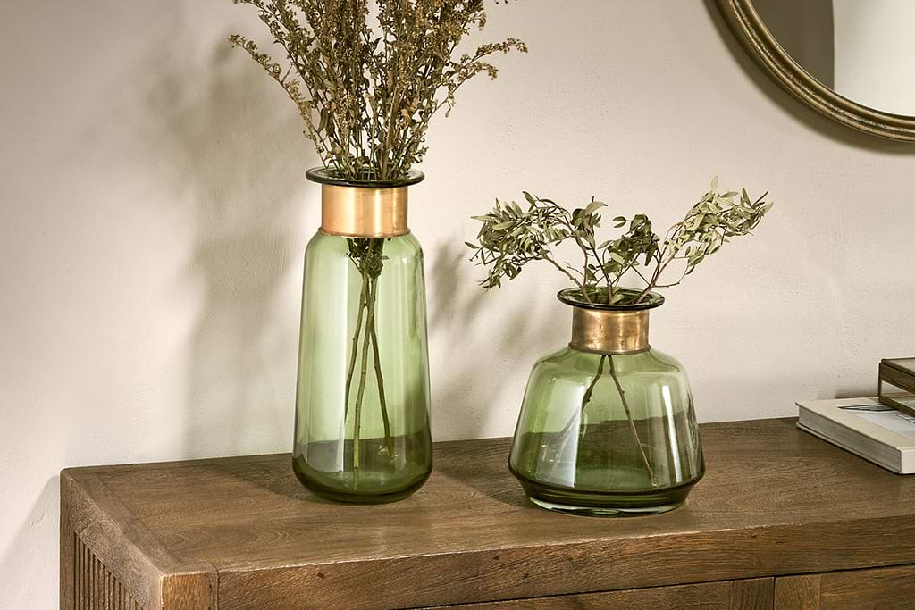
A few Nkuku pieces that help shelves feel layered and calm.
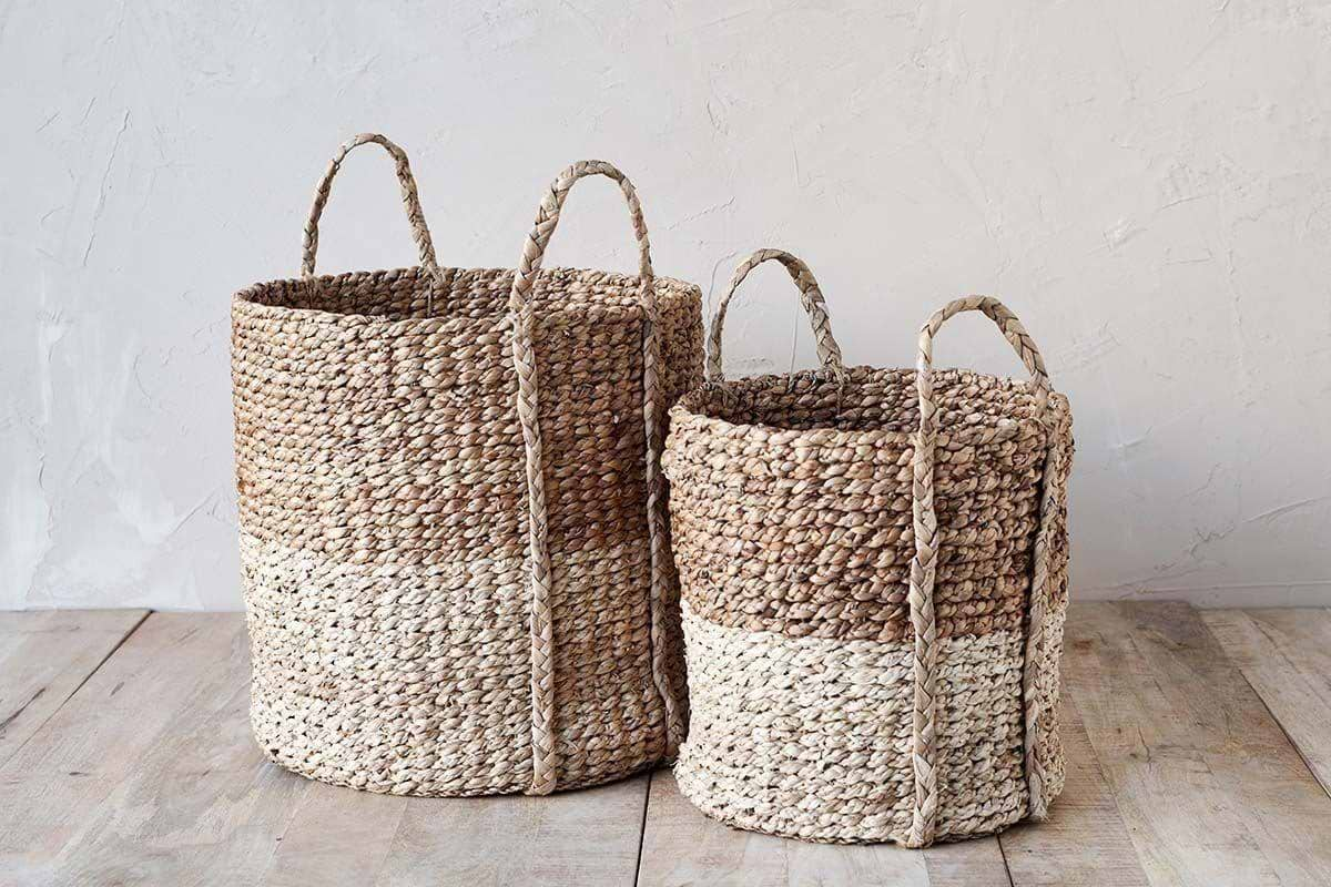
Nkomi Basket
Woven storage with a calm silhouette, works open or tucked under a console.
View at Nkuku →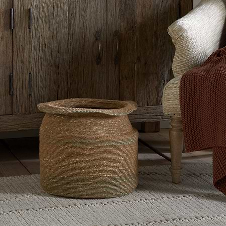
Some links above are affiliate links. If you buy through them we may earn a small commission at no extra cost to you. We only suggest pieces we think fit a calm, lived-in home.
Free guide
The Calm Shelf
12 styling ideas to help you compose calm, balanced shelves in natural texture homes.