

Many front rooms struggle with finding the right balance between calm and interest. Searching for front room ideas often leads to a flood of busy patterns or crowded shelves, which can easily overwhelm a space, especially in rooms with changing light or odd layouts.
This guide gives plain strategies for using colour, texture, and layout so your front room feels steady and layered, not hectic. You’ll learn what to keep, what to let go, and how to work with what your room gives you now. This works especially well for a small apartment’s front room when natural light shifts through the day because it allows you to highlight good corners without filling every inch.
The short version: The most reliable front room ideas for UK homes are to choose one calm colour palette, repeat two similar textures, and limit pattern to one small area. With this approach, a room stays soft, avoids mess, and light feels steady throughout the day.
Key takeaways
- A front room reads calm when the colour palette is limited to three tones.
- Shelves hold interest best with odd numbers of objects, using the 3-5-7 layout rule.
- Soft natural textiles, cotton, linen, wool, keep the space inviting even with plain walls.
- Changing one wall colour is often the fastest way to update a living room, according to John Lewis suggests.
- Low storage furniture suits awkward layouts by reducing clutter in shared spaces.

Front room ideas that start with a calm colour palette
A front room always feels gentler when you use a small range of colours from the same family, rather than one shade on every wall. This keeps the room from feeling choppy as daylight shifts and helps furniture and decor fall into place.
Most UK front rooms get light from multiple directions, so bold paint can look patchy in some spots and dull in others. Picking a calm colour palette, such as muted greens, dusty pinks, or soft taupes, keeps the room steady from morning to evening.
Unlike trying to match every cushion to your walls, layering three related tones on walls, trim, and textiles gives the room depth without making anything stand out too much. Rooms with low ceilings benefit most when wall and skirting colours are similar.
Wall paint sets the mood more quickly than accessories can. John Lewis suggests a new wall colour as an instant way to update the space, which reshapes how all other pieces read.
Applying this in a rental is easy, use removable wallpaper or neutral curtains to pull similar tones across the room and keep everything feeling steady.
How do you choose colours for different light levels?
Choosing colour for changing light is simpler if you sample the paint or fabric in the actual room for a full day’s cycle. Neutral tones with a warm base tend to stay even from morning to evening.
Some front rooms get direct sunlight only for a short stretch, and then fall into shadow, while others glow all day. A cool blue paint may turn icy in shade; a yellow tone can go gold at dusk and beige at dawn. According to Farrow & Ball, deeper tones like ‘London Clay No. 244’ handle changing daylight by grounding the whole room, even in late afternoon.
The reason this works: using one backdrop with more than one undertone means both ends of the room never look out of sync. Compared to high-contrast walls, a single warm base with two lighter accents (like clay with oat and cream) reads even in all corners.
One grounded colour behind the sofa calms the eye, while a paler version near windows keeps the space from closing in. Curtain fabric or a wool throw that echoes your wall tone keeps everything reading together, even on dull days.
Updating the main wall with a stronger colour, then repeating it in the trim or a rug, helps open-plan spaces hold together from end to end.
Where this works best
These slow, layered front room ideas fit especially well in rooms that struggle with less-than-ideal shape or patchy daylight. Small or awkward layouts benefit from this gentler approach, making the space feel intentional.
Square or rectangular front rooms with low furniture and long windows handle calming strategies best. Small apartments or spaces with doors at both ends often feel busy fast; a narrow hallway living area, for example, is calmer with trimmed-down palettes and a mix of materials.
Bringing in one large rug and keeping three colours across shelves, curtains, and walls makes the most difference in rooms that can’t hide clutter behind doors. Open shelving and mid-height storage keep the floor clear, letting your eyes travel smoothly from side to side.
Avoid using loud pattern or high-gloss paint in rooms with shifting light, it can make hard corners stand out and leave the rest looking unfinished. Instead, anchor with one textural piece and keep everything else soft or matte.
To try this in a living room that doubles as a home office, use a calm wall colour and pair with woven or linen accessories to break up visual monotony.
How to layer textiles without visual noise
Layering textiles works best when you repeat one texture in different weights, like wool blanket, cotton throw, and linen cushion, across the room. Limiting pattern keeps the look gentle, not busy.
Sofas with neutral fabric or a warm slipcover set a simple base. Adding one thick wool blanket and two cotton cushions (with no more than one patterned) changes how the seat feels without turning it into a patchwork. In a damp UK winter, these materials warm up quickly and hold their shape.
Flatweave rugs suit houses with kids or pets because they’re easy to shake out and don’t pull attention from walls or shelves. A bare sofa, by contrast, can look cold, just one textured cushion or a draped throw relaxes the feel of the room.
Repeating the same texture once more, say, linen at the window and on a stool cushion, anchors everything. Unlike using four or five different weaves, this approach keeps a room flexible when you want to change colour highlights later.
Adding a small wool footstool or cotton pouffe at the end of the sofa finishes the look and offers hidden storage on a tight footprint.

How do you mix pattern without clutter?
Mix pattern best by limiting pattern to one focal area on a main surface, a single cushion, framed print, or small rug. This draws the eye without creating mess.
Front rooms often end up with patchwork-looking textiles because too many small prints compete. Instead of layering stripes with florals and checks, use a plain base on the sofa or rug, then add just one area of fine pattern. For example, a patterned curtain against plain walls, or a single hand-printed cushion, is enough to give a point of interest.
Unlike a room where every part fights for attention, choosing one patterned blanket or a basket with a woven band pulls focus gently. A plain storage ottoman grounds the busy area and supports calm elsewhere.
A single area of pattern keeps the room open for updates, change a cushion and the space feels new, without the cost or stress of repainting.
When working with lots of plain pieces, a soft patterned shade on a table lamp or a small printed vase near the window is enough to wake up a corner.
Styling and placement
Front rooms feel most intentional when key objects are grouped by odd numbers on shelves and surfaces, and open areas are left clear for movement.
Shelves look busy when every space is filled. Following the 3-5-7 rule, three, five, or seven objects per shelf, keeps visual weight even without looking staged. A plain ceramic jug, a stack of two hardcover books, and a small plant fill a shelf without needing more clutter.
Compared to scattering objects the full width, grouping by shape and height pulls the eye to a natural centre. Low storage coffee tables with a single bowl or tray hold up to daily use (keys, remotes) yet look finished, not messy.
In a shared lounge, leaving the corners empty and anchoring the sofa to the longest wall makes weekday traffic easier. A basket under a side table hides blankets or toys and fits in tight spaces without crowding doorways.
Quick calm checklist:
- Repeat the same wood tone for two main pieces (coffee table, shelf).
- Limit total objects on open surfaces to 3, 5, or 7 per area.
- Stick to one strong colour accent per sitting area.
- Mix two natural textures, such as linen and rattan, avoiding three or more at once.
- Keep walkways clear and group heavier items at the room’s edge.
Building out your front room shelf? Our guide to living room shelf decor covers more styling ideas for tight surfaces.
Bringing nature into your front room
Plants and natural accents add freshness to a neutral room, especially near windows or low corners. Using a few strong pieces keeps things settled rather than busy.
Potted plants, such as a trailing ivy or sturdy snake plant, soften hard tables and awkward corners. Timber planters or simple terra cotta pots play well with most palettes, warming up grey or beige walls. Living green draws the eye up, helping vertical spaces feel taller and softer.
Unlike dense clusters of small pots, one or two larger plants anchor a corner, making the room feel open but not sparse. A clay bowl with fruit on the coffee table adds gentle colour and gives a lived-in feel.
Adding a small vase with fresh stems in spring or cut greenery in winter is enough to give movement and life. Herbs on a window ledge offer scent and utility without overfilling the view.
If a room lacks natural light, choose dried grasses or a thick woven basket by the sofa to echo nature’s shapes without relying on living plants.
Sometimes, you notice a front room just does not feel restful. Maybe colours clash where sunlight changes, or the shelf feels unsettled no matter what you add or remove. The trouble often hides in too many textures or no clear place to land the eye.
Many homes end up with scatter-cushions in every shade or stacks of mismatched books and baskets, which makes daily living a little too chaotic. The result: a room that feels unfinished, heavy, or cramped, even when tidy.
Bringing a clear system, choosing one focal point, a narrow palette, and repeating materials, quietly makes mornings feel steadier and evenings more relaxed.
Save this idea for later.
What tends to hold up with layering calm front rooms
In reviewing front room ideas and recent product launches, the most lasting looks come from repeating two textures and keeping colour to three tones maximum. Reviewers consistently mention that the rooms they return to are those with plain walls, a single statement rug, and minimal pattern, especially when the light shifts through the day.
Matte finishes get recommended again and again for shelves and sideboards near windows, because they don’t catch glare like a glossy surface does. Natural materials soften corners and help a space age well, even when trends come and go.
, Mara, Loom & Glow
Common questions
What is the 3-5-7 rule in decorating and how do I apply it to my front room?
The 3-5-7 rule means grouping objects in odd numbers, three, five, or seven, when styling shelves or tables. This creates a sense of balance and helps avoid cluttered, random displays. In your front room, use this for books, ceramics, or small plants to keep open areas calm and easy to scan.
What practical things can I do with my front room to make it feel more intentional?
Limiting your colour palette to three tones and repeating one or two textures makes a front room feel intentional. Remove excess pattern and only display your favourite objects. Furniture grouped for flow, and good lighting, help every area connect without looking thrown together.
What are the current trends for living rooms that avoid looking dated quickly?
Current trends focus on neutral colour bases, matte finishes, and natural materials like rattan or linen, elements that hold up over time. Adding greenery and keeping patterns minimal avoids trends that date quickly. Browse House & Garden for rooms with these steady looks.
What common mistakes make a home look cheap, and how can I avoid them in my front room?
Too many mismatched patterns, shiny plastic accessories, or bare corners often make a home feel cheap. Instead, choose well-made essentials with subtle textures, and keep bold colour or pattern to one area. A calm layout and a sense of space matter more than expensive objects.
Explore more calm combinations inside our Shop The Look .
Shop the Look
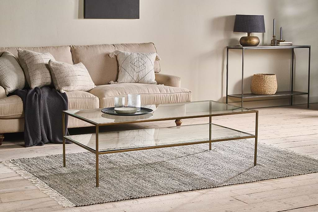
Pieces that layer naturally into a calm front room – light, texture, and a quiet focal point.
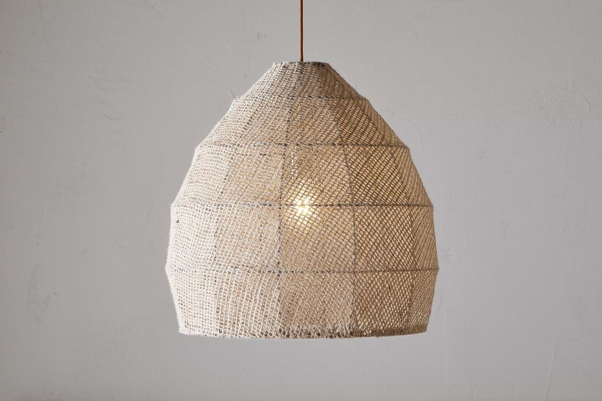
Jahari Jute Pendant
Natural woven jute, adds texture overhead without darkening the room.
View at Nkuku →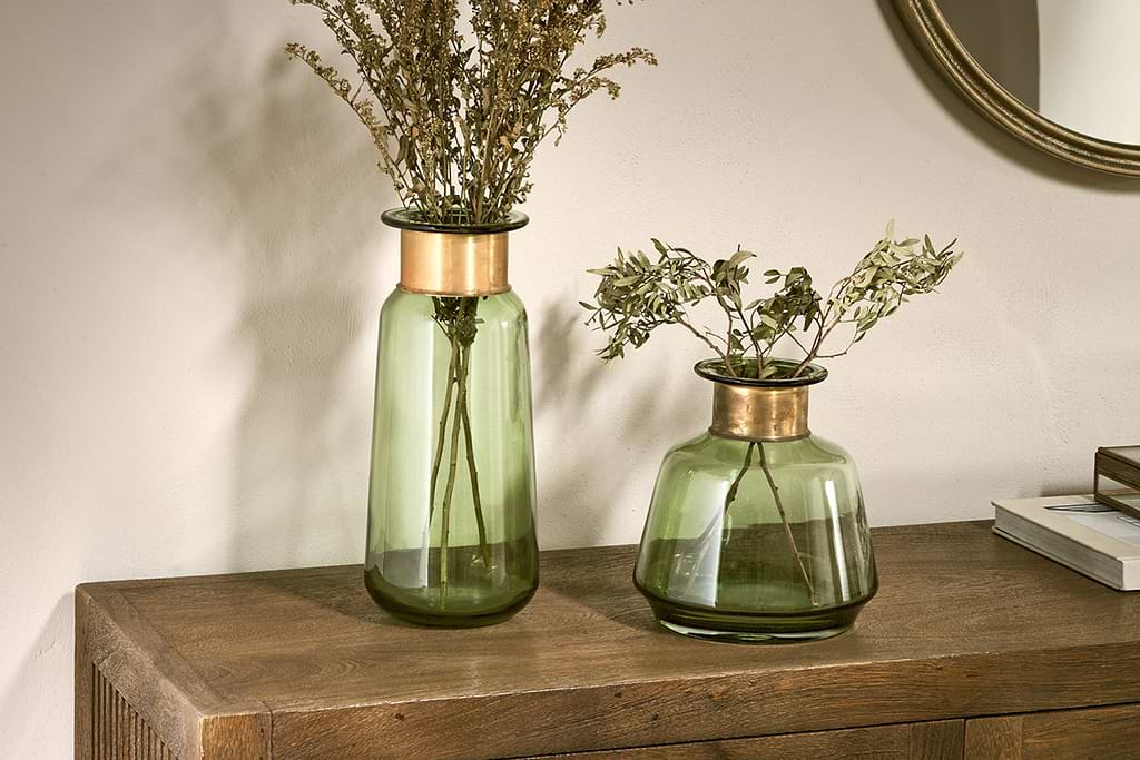
Some links above are affiliate links. If you buy through them we may earn a small commission at no extra cost to you. We only suggest pieces we think fit a calm, lived-in home.
Free guide
The Calm Shelf
12 styling ideas to help you compose calm, balanced shelves in natural texture homes.