

Many homes with busy hallways, small windows, or odd corners seem impossible to calm — everything competes for attention. A dark aesthetic can feel too risky. Picking deep colours and textured materials feels bold, sometimes heavy, and most guides skip the awkward questions: Where does it actually work? How do you keep it from looking gloomy?
The goal here is not to follow a trend, but to find simple changes that make a room feel more settled. If you’re drawn to moodier interiors, this guide will show which elements to try (and which to skip), especially in small rooms or rentals. This works especially well in a low-light bedroom when sleep is tricky because the darker colour palette softens daylight and makes harsh bulbs less jarring.
The short version: The dark aesthetic works by swapping pale surfaces for deep, calm colours and rich textures, then balancing them with lighter accents and gentle light. This switches the mood of a room from bright and restless to settled and focused. Most homes only need a few small shifts—one dark wall, new lighting, or textured throws—to see the change.
Key takeaways
- A dark aesthetic uses rich, muted colours and soft matte textures instead of glossy or bright surfaces.
- Layered lighting with warm dusk tones works better than overhead white bulbs for calm, moody rooms.
- A small change—like painting only one wall—can show if a room supports a deeper palette.
- A dark aesthetic looks most settled when grounded by at least one lighter surface or reflective element.
- Mixing too many textures or finishes can make a dark room feel busy instead of restful.
- What does “dark aesthetic” mean in home decor?
- Dark aesthetic vs grey aesthetic: how to tell the difference
- Where this works best
- How do you build a dark colour palette without making a room look cold?
- Styling and placement
- How can you test a dark aesthetic on a small budget?
- What mistakes turn a dark room into a cave?

What does “dark aesthetic” mean in home decor?
A dark aesthetic in home decor uses deep, muted colours and natural materials to create a moodier, softer room, instead of relying on stark white or bright shades. This style uses matte surfaces, layered lighting, and limited palettes to keep a space calm but not gloomy.
Dark aesthetic in interiors is not just painting everything black or charcoal. It means using rich shades—think deep greens, plum, navy, and walnut—balanced with natural textures and soft lighting. Unlike bright minimalism, it doesn’t aim for a blank canvas. Instead, it focuses on subtle contrasts, cocooning corners, and heavy textures like velvet or rough linen.
This look draws from trends like dark academia but stays practical: you’ll see matte black picture frames, a stack of old books, a bowl made from clay, a single velvet chair, maybe a linen throw with a frayed edge. A room feels more settled because matte and soft textures stop harsh glare and let your eyes rest.
In some spaces, flat white walls bounce light and energy, while dark aesthetic controls light—muting daylight through thick curtains, or bouncing lamp glow off a painted wall. The effect is less noisy and more grounded.
Choose one or two elements (a dark rug, a walnut bench, or black window frames) and let the rest stay simple. This makes sure the room doesn’t feel weighed down or harsh in daily life.
Dark aesthetic vs grey aesthetic: how to tell the difference
A dark aesthetic uses rich, warm tones and textured materials, while a grey aesthetic sticks to cooler, lighter shades and smooth finishes. Both look calm, but the feel in a room is very different.
Even a beginner can see the shift: dark aesthetics bring in deep colour, velvet, tarnished metal, or walnut wood—each element has weight and texture. The grey aesthetic is lighter, focused on pale greys, clean lines, maybe brushed steel or lightly textured concrete. A dark aesthetic room feels cocooning; a grey one looks airy.
Unlike the almost blue undertone in some greys, deep green, plum, or charcoal in the dark color palette softens the room and reduces glare. This is especially true at night during dusk colors—dark walls mute lamp light, while grey or white walls reflect it harshly.
For anyone hesitating, the grey aesthetic is the lowest-commitment entry point: swapping a white bedspread for a soft grey one or painting a small wall in greige. It’s quick, rarely jars with existing decor, and works in most rentals.
If you live in a shared space or an open-plan apartment, it’s smart to test the grey palette first to see whether you prefer that calm clarity or the mood of a true dark aesthetic.
| Feature | Dark Aesthetic | Grey Aesthetic |
|---|---|---|
| Main Colours | Charcoal, plum, deep green, matte black | Greys, off-whites, pale taupe |
| Texture | Velvet, linen, walnut, rough clay | Smooth finishes, brushed steel, light concrete |
| Lighting | Layered, warm, soft glow, candlelight | Daylight, cooler LEDs, open windows |
| Mood | Moody, cocooning, settled | Airy, bright, calm |
A living room with a pale grey couch and white rug reflects every bit of sunlight. Switching to a charcoal sofa and a walnut coffee table instantly absorbs light, grounds the space, and makes it feel less exposed.
Where this works best
The dark aesthetic works best in rooms with steady but limited daylight, awkward corners, or small spaces where movement and noise feel distracting. These settings let deeper shades create calm instead of gloom.
Bedrooms with tricky light patterns, a windowless entry, or an open kitchen with odd nooks respond well to a dark aesthetic. Small city apartments tend to handle darker shades smoothly because shadows fall naturally and the space already feels close.
Think of common city layouts: a narrow hallway, a sun-starved bedroom, or a rental with bland built-ins. Adding deep green or charcoal on one wall, a dusk-hued throw, or even swapping lamp bulbs for amber tones cuts harsh reflections and stops the eye from bouncing off every surface.
Avoid putting deep colours in north-facing rooms where low ceilings and limited light already make the space feel heavy. These rooms need at least one large light surface—like a cream rug or pale curtains—to act as a relief from the darker shades.
A hallway that used to feel stark with off-white paint can look more settled with a warm walnut console and a mirror to catch stray light. In each case, the effect is less about making a dark room look smaller and more about controlling busy energy.
How do you build a dark colour palette without making a room look cold?
To keep a dark aesthetic from feeling cold, combine deep colours like charcoal or plum with one or two warm accents, natural wood, and textured throws. This blend stops a space from looking flat or severe.
Start with dusky tones—deep green, plum, navy—on one wall or as an anchor piece. Mix in matte finishes (such as a painted table or a ceramic lamp base) and offset them using a soft cream or pale tan cushion, or a brass bowl. The top-ranking Pinterest board for dark aesthetic collections mixes black, walnut, and hints of ochre or clay, not just grey and black.
Layer in textiles like thick linen, velvet, or even a worn wool rug. A velvet chair can soak up light, while a medium-tone wood shelf keeps the mood from turning harsh or cave-like. Mixing too many dark materials, or only using shiny black, can tip a room toward feeling cold—even aggressive—instead of quiet.
Compared to an all-grey palette that can slip into blandness, a dark aesthetic room stays warm with just one or two light points—a clay vase, a pale lampshade, or a birch stool. This small contrast is all it takes to set off deeper shades and keep the room comfortable for daily living.

Styling and placement
Styling a dark aesthetic works well when one textured object or deep accent anchors a corner, and smaller surfaces stay uncluttered and pale. Limit busy arrangements so each material stands out instead of fighting for attention.
Start by choosing a single area—a reading corner, one end of the sofa, or the entry shelf. Anchor the space with one clear dark element: a matte black lamp, a velvet pillow, or a walnut clock. A dark object looks heaviest when placed low (like a rug or stool), while lighter pieces on top keep the room from feeling top-heavy.
Give dark shelves or tabletops breathing room. Instead of filling every surface, leave some open, then add a pale ceramic bowl or a stack of linen-covered books. This stops the area from looking cluttered and breaks up strong colour blocks.
Unlike maximalist styling, which stacks colour on colour, dark aesthetics feel cleaner when you repeat a single finish—like black, walnut, or sage velvet—across two or three things in one room. Scattering too many shades around the space will muddle the effect and pull the eye.
Quick calm checklist:
- Pick natural textures first—linen, velvet, clay, walnut.
- Give each dark object space: skip heavy groups, clear at least half a shelf.
- Limit the palette: use two or three base shades, then pause.
- Balance every deep accent with one light or reflective piece nearby.
- Edit surfaces: clear small bits often to keep things looking calm, not crowded.
In a small apartment entry, one black bench under a pale mirror with a single linen cushion keeps the area grounded and breezy—not blocked off. This makes a heavy colour feel deliberate, not haphazard.
How can you test a dark aesthetic on a small budget?
Testing a dark aesthetic before committing your whole room is simple—start with one throw or art print, swap out small decor, or try a peel-and-stick dark wallpaper on a powder room wall. These trial steps work in rentals and avoid big mistakes.
It’s common to want a moodier space without buying all new furniture or repainting every wall. Many renters or busy families get quick wins by adding one or two deep-texture accessories—a bedspread, cushion, or lamp shade in navy, charcoal, or plum. Items like velvet throws or dark wood trays often run around the price of a week’s groceries, making them accessible experiments.
For those watching every penny, start with a small tub of sample paint and cover just a poster board or a closet door. According to a second high-ranking Pinterest board, most users source mood images before buying products, showing there’s value in visual testing first. Swapping light bulbs to warm (amber or “dusk”) shades is low-cost and instantly changes the feel at night.
Unlike a full room overhaul, this approach lets you back out or try new shades as seasons shift or as life changes—without wasting money. Testing a single piece in natural daylight and at night shows how the colour and texture really behave in your actual home.
Switching throw blankets on a grey sofa for a chunky dark green knit quickly reveals whether deep tones settle the space or make it feel cramped. Start small and build only on what works best in your own space.
What mistakes turn a dark room into a cave?
Dark rooms feel heavy or oppressive when too many colours, shiny finishes, or overhead lights crowd the space. A calm, moody room only needs a few deep tones, matte materials, and warm scattered light.
One of the most common mistakes is leaning too heavily into black paint, glossy finishes, or covering every surface in dark decor. This collects shadows, bounces little light, and makes a room feel small and boxed in—often called “the cave effect.” In busy living rooms, too many dark pillows, a black rug, and matching glossy tables fight for attention and make movement feel awkward.
Overhead lighting makes things harsher. Instead, warm accent lights, lamps with amber bulbs, or even candles soften the space and ensure the room remains inviting at all hours. Layering the lighting and limiting strong contrasts helps prevent harsh corners and “dead zones” around edges.
Compared to well-styled moody rooms, those that skip a lighter surface (like a cream rug, glass bowl, or reflective side table) end up looking unfinished or stark. Rooms that hide all natural wood and ignore small pops of softness can start to feel tired, cluttered, or just off in day-to-day life.
Next time a bedroom feels closed-in after painting a wall deep blue, try adding a pale natural-fibre rug or a sheer curtain—see how the effect settles the whole space and returns balance.
Most people sense something is off once all the deep colours are in—a room that should feel calm instead looks crowded or weighed down, and the energy feels blocked. This usually happens after adding too many dark or heavy items without breaks, or ignoring lighting altogether.
The shift that works is choosing a single focal piece or one deep wall, reducing the number of colours, and swapping strong white lights for layered warm ones. This anchors the mood and lets the room breathe.
Many homes miss the mark by pushing every trend at once: black walls, dark velvet, metal, and moody art on every surface. This makes for a space that is busy, overwhelming, and hard to settle into—no single area to rest the eye. Right now, it matters because so many images online push a full makeover, skipping the practical step of keeping one lighter surface and layering gentle light.
Once you add the right focal piece or edit the palette, the entire mood lightens and becomes usable, not just pretty in photos.
Save this idea for later.
What tends to hold up with dark aesthetic rooms
Consistent feedback from reviewers and designers shows that matte finishes and natural wood usually look better long-term than glossy black or lacquered furniture. Matte or rough textures handle fingerprints and dust well, which keeps rooms looking softer through daily use. Decorators almost always recommend using a mix of warm and cool tones—a fine-grain walnut shelf against a charcoal wall, paired with cream or sand—because pure black or all-dark schemes feel restrictive over time.
Layered lighting, especially with “dusk” bulbs or candlelight, is another fix that appears in actual room guides and photos—the rooms that age well are the ones with at least two gentle light sources, not just overheads. These patterns show up again and again in reader questions and gallery images, matching what high-ranking inspiration boards promote.
— Mara, Loom & Glow
Common questions
What does “dark aesthetic” mean?
“Dark aesthetic” means using deep, muted colours and rich textures to create calm, moody spaces at home instead of bright or pure white rooms. This style often mixes matte finishes, layered lighting, and a few pale or reflective accents. It’s about balance, not darkness for its own sake.
What are the four types of aesthetics?
The four types of aesthetics are often listed as minimal, classic, maximal, and dark. Each has their look, from pared-back and clean (minimal), to ornate and rich (maximal), to the dusky, cocooning dark aesthetic popular online. Many people mix formats to suit their mood or space.
How do you get a dark aesthetic look in photos versus in a real room?
A dark aesthetic in photos is done with controlled lighting, moody shadows, and saturated colour editing, making the room look dramatic. In a real room, the effect comes from actual deep colours, natural textures, and layered light, so it needs more balance with pale or glowing accents to avoid gloom.
Is dark aesthetic still popular?
Dark aesthetic is still popular, especially online and in decor shops, but it has changed in recent years. Most top-ranking Pinterest and Instagram feeds now focus on deep, muted colours mixed with pale materials and gentle lighting, showing that the trend continues but is moving away from pure black-only looks.
what is the most popular home decor right now?
Dark aesthetic home decor, which uses deep, muted colours like charcoal, plum, deep green and navy balanced with natural textures and soft lighting, is currently popular for creating moody, calm spaces. The style works by swapping pale surfaces for rich colours and matte textures, then balancing them with lighter accents; most homes only need a few small shifts, such as painting one dark wall or adding textured throws, to feel more settled and focused.
Explore more calm combinations inside our Shop The Look .
Shop the Look
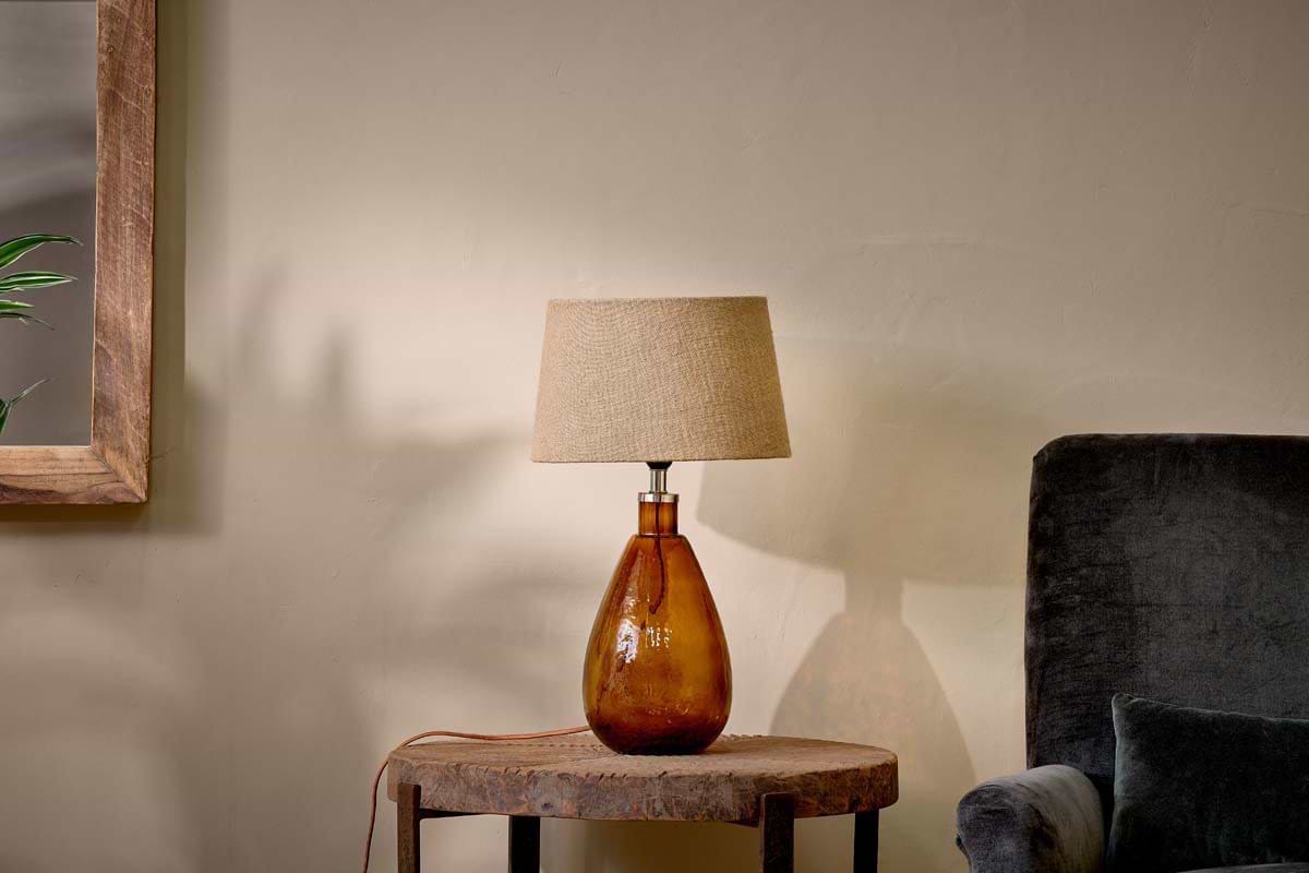
A burnt amber lamp, slender iron candlesticks, and soft green glass anchor a dark aesthetic that feels restful rather than severe.
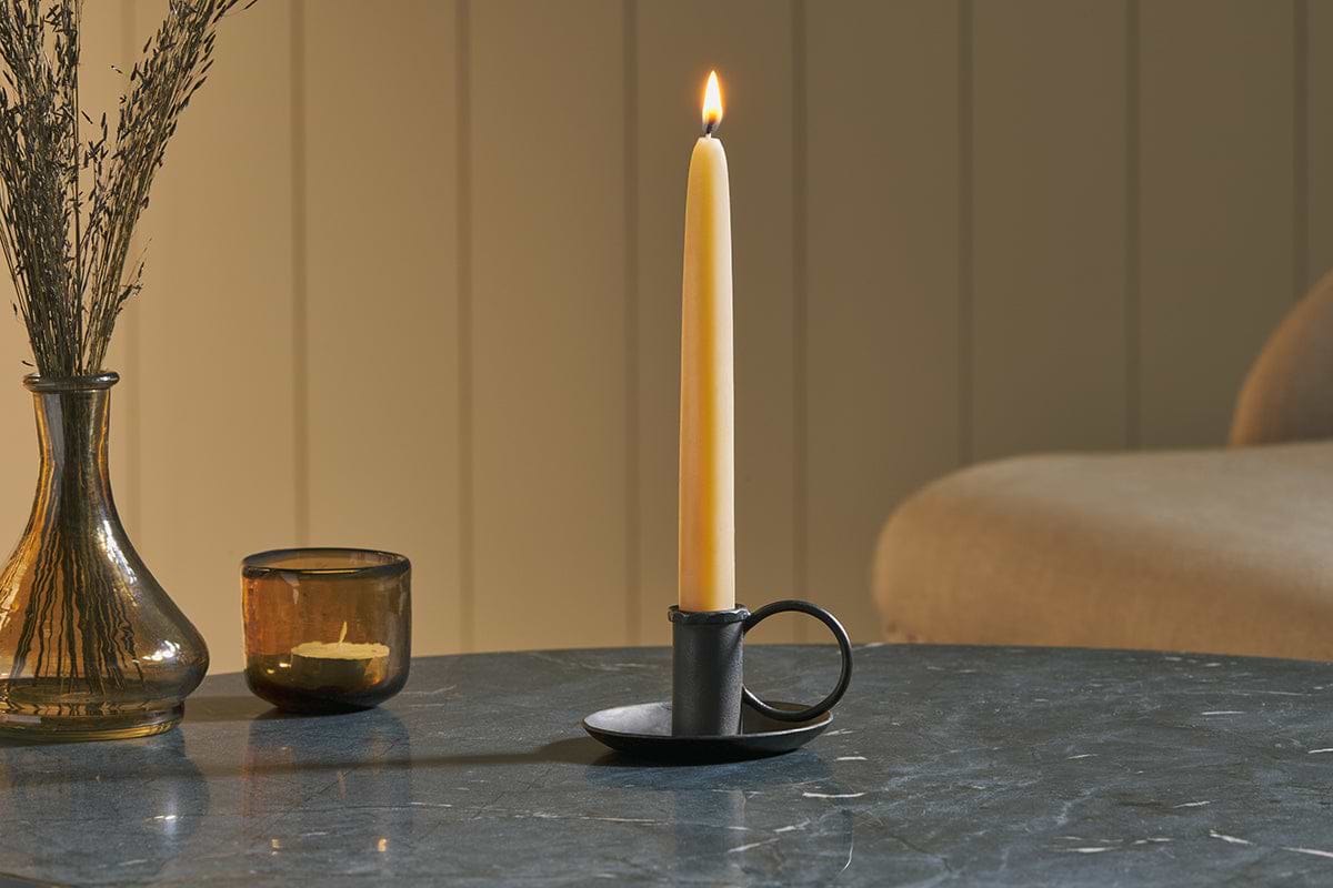
Amri Iron Candlestick
Slender iron with quiet presence — works alone or in clusters of three.
View at Nkuku →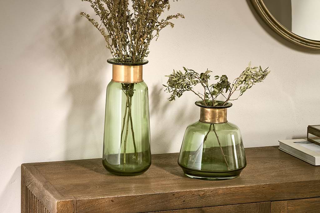
Some links above are affiliate links. If you buy through them we may earn a small commission at no extra cost to you. We only suggest pieces we think fit a calm, lived-in home.
Free guide
The Calm Shelf
12 styling ideas to help you compose calm, balanced shelves in natural texture homes.