

Choosing bedroom paint ideas for a small space can feel like a trap. Bright whites seem clinical or dingy, while greys or beige might read dull or cramped once the sun dips. The right colour can change a tired box room into somewhere you want to slow down, if you know what works—and what gets in the way.
Tidy up the wall palette, set aside loud accents, and focus on one calm hue—then let natural texture or bedding carry the rest. This works especially well in a small bedroom when you’re battling stubborn shadows and little floor space because the right warmth keeps things feeling open but soft. Today, find out which paint to pick, how to try before you commit, and what commonly makes rooms feel smaller instead of restful.
The short version: The best bedroom paint ideas for small rooms use warm, soft neutrals or gentle greens that don’t close in the space. Letting one colour flow across walls and trim keeps your bedroom open and calming, while pale, warm tones help sleep feel more natural and less chilly.
Key takeaways
- Warm neutral shades like cream, beige and taupe keep a small bedroom from feeling cold or boxy.
- Light changes undertones, so always test paint in your own bedroom lighting before making a decision.
- Avoid crisp cool greys or heavy charcoals in small, low-light bedrooms to prevent a cramped feel.
- Sage green creates a gentle mood in a bedroom with wood or rattan and is easy to pair with natural linens.
- Crown Paints promotes test pots and A5 swatches so you can see real colour before painting the whole room.

Why does bedroom colour matter for rest?
A calming bedroom colour works by lowering visual noise, making it easier for your mind and body to slow down at the end of the day.
Many bedrooms in real homes double as storage or work zones, but harsh or artificial colours jolt the senses when you want rest. On a practical level, soft, warm neutrals reduce hard colour contrast, so your eye moves more gently from wall to floor, and light rests more evenly across surfaces.
One reason professionals recommend warm tones is that they don’t fight with the changing daylight, but settle into a background that feels natural. According to Farrow & Ball, bedroom mood matters for rest more than any statement wall or accent.
Compared to a cool grey or a sharp blue, a washed cream or gentle beige keeps the room feeling cared for, not clinical. If little ones nap during the day or someone wakes at night, that lowered visual contrast is a small, steady comfort.
To make this shift, choose a paint shade just warmer or more muted than a plain bright white—using the softer edge to signal “down time.”
Where this works best
Warm neutral bedroom paint ideas work best in rooms lacking morning light or where furniture needs to sit close to the wall.
Small bedrooms with only one window, or shaded by neighbouring houses, are especially sensitive to colour. Too-dark or blue-based paints make the limits of the space stand out, while dry, pale neutrals keep things feeling open and settled. Low ceilings or alcoves next to wardrobes also benefit from these shades, blending awkward lines and softening harsh corners.
In practice, painting both walls and trim in the same warm shade stops choppy transitions, so your eye drifts rather than jumps at each border. Layering in natural finishes—an oak bedframe or rattan lamp—lets the calm tone do its work without extra effort. For anyone renting, stick-on testers or large swatches can help dodge rule-breaking but still offer control.
Avoid using a strong, saturated wall colour in any bedroom under low or artificial light, as it tends to draw the walls in and amplify clutter. Instead, repeat one soft neutral and echo its shade in bedding or throws for unity, especially for shared rooms or small guest spaces with mismatched furniture.
This approach especially suits rooms where scale, light, or rental rules set the limits—you get simplicity, but don’t surrender warmth.
What are the best warm neutrals for calm, not cold?
The best warm neutral bedroom paint ideas use soft beige, creamy white, or muted taupe, each with a subtle yellow or pink undertone for gentle warmth.
Flat greys and stark whites often look too hard for small bedrooms, making corners feel closer together. Instead, shades like Farrow & Ball’s Cornforth White or Little Greene’s Rolling Fog edge warm but never orange, so the room doesn’t look washed out.
DIY.com’s recent bedroom colour guide ranks warm beige as a go-to for uncluttered bedrooms, while taupe or mushroom reads soft even in artificial light. For tenants, these tones rarely clash with old carpet or built-in wardrobes, keeping the look subtle and rental-friendly.
Unlike icy pale blue, which can leave a bedroom feeling empty, a cream with a hint of yellow makes towels, bedding, and even clothes in the corner blend rather than stand out. Small bedrooms with sensitive sleepers often do best with this palette set on all four walls, including behind radiators or beneath low sills.
Use a warm neutral right up to the ceiling for a gentle “cocoon” effect without closing the space in; this is especially good for very small bedrooms where visual clutter builds up fast.
How do you avoid making a small bedroom feel smaller?
Using one pale colour for both walls and woodwork helps a small bedroom feel larger, as there are fewer visual breaks to catch the eye.
Painting your trim or doors the same shade as your walls is a trick decorators use to hide lines that would otherwise chop up space. The effect is simple: fewer interruptions, so the whole room feels wider and taller.
If you use a starkly different trim, the lines jump out every time you move past—and the room starts to feel even smaller. Instead, a subtle flow of one colour calms the room, especially when you limit the palette to two or three shades throughout your soft furnishings.
Some people still hang onto the myth that white ceilings open up a room. In reality, a softer, matching tone on the ceiling removes the sense of a box, blending out the boundaries. Compared to a two-tone wall and ceiling, this method reads less chopped up and suits sleep areas best.
Setting the floorspace clear near the door and using wardrobes or drawers in a similar finish to your paint helps small bedrooms look less busy, a detail that makes small bedroom ideas feel more practical day to day.

How light changes your colour: north-facing vs south-facing
Natural light direction changes how a bedroom paint colour looks: north-facing rooms make colours cooler, while south-facing adds warmth to the same paint.
In a small north-facing bedroom, even a cream or beige can suddenly turn flat or slightly grey. Quick fix: go for a warmer, slightly richer shade than you’d use in a sun-filled space. Rooms facing south can take a muted or sandy beige without it looking drab by evening.
Sliding wardrobes, dark furniture, or old carpets underneath windows also shift colour. Daylight carries a blue tint from the north, while southern sun draws out yellow, so match-test in different corners before deciding. This rule of thumb comes up again and again: A bedroom paint works best when sampled at different times of day, not just in the morning or with artificial light on.
Unlike open-plan spaces, bedrooms change mood fastest with outside weather. Testers stay truer to real conditions, saving hassle later when a colour feels off at night.
To avoid surprises, paint a large card or section near both your window and your wardrobe in any small or shaded bedroom; what appears pale beige in store may lean pink or grey after sundown.
How to test a colour before painting your room
Testing colour in your own bedroom by painting A5 cards or using manufacturers’ matchpots shows how the shade shifts with your light and your textures.
Flat sheets and small paint testers make sense in bedrooms, where artificial overhead lights or low morning sun skew undertones. According to Crown Paints, they offer matchpot deals and A5 cards precisely so you can try before you commit a whole weekend to painting.
Let your trial patch sit beside your bed, under a lamp, and opposite the window to see how the colour behaves all day. A shade that’s perfect at noon might feel too dull by dusk, especially in rooms with heavy blackout curtains or thick carpet.
Choose a finish to test too. Farrow & Ball’s Dead Flat or Estate Emulsion cut reflection compared to glossier paints; this makes sense in small bedrooms where a glossy finish bounces harsh light off wardrobes or flatpacks.
If you share your bedroom, invite the other person to live with the patch for a few days before the big change. Sometimes, a “neutral” for one person reads peach, while for another it’s pure vanilla—test together before buying a full tin.
| Tester Method | Pros | Cons |
|---|---|---|
| Painted Card (A5) | Easy to move, no mess on walls | Doesn’t show wall texture |
| Direct on Wall | Shows true colour on real surface | Need to repaint if not chosen |
| Order Large Swatch | Quick and removable | Often costs more, may not match finish |
Using test pots or sample cards gives you confidence that the colour supports neutral bedroom decor without tricky surprises.
Styling and placement
Styling a small bedroom works when you anchor a light, warm wall colour with simple bedding and limit visible patterns or dark wood.
Once you pick a paint, the rest falls into place: go for linen or washed cotton bedding in similar tones, small oak or birch nightstands, and limit clutter on shelves or dressers. The basic rule: A warm wall colour works best when repeated in at least one other fabric or piece of furniture in the room.
Unlike bold, high-contrast accent walls, layering a single pale neutral with a handful of soft textures creates a space that feels open and lasting. Avoid busy patterns, and use woven baskets or clay pots instead of metal trays; these absorb light and keep edges soft. A pale wool rug under the bed catches bare feet and repeats the wall’s warmth without dominating the space.
To keep the calm, keep bedside lighting gentle and shade-covered. A small, unfinished wood lamp on a low stool works better than a bright spot or chrome base. Placing window dressings—linen curtains, soft shades—in the same neutral tones as the wall stops the window from reading as a bold “frame” and makes the flow gentle, especially at bedtime.
This styling is especially helpful in rooms that double as a workspace or laundry drop zone; order and repeat give a sense of calm even when life piles up midweek.
Quick calm checklist:
- Limit palette to two or three soft tones inspired by your wall colour
- Choose bedding in linen, cotton, or washed percale in matching neutrals
- Add a natural texture—oak, birch, jute, or clay—near the bed or on a shelf
- Keep 60–70% of tabletops and shelves visually clear
- Use soft window dressings, not sharp blinds, to keep light gentle
What tends to hold up with warm neutral bedroom paints
Reviewers and designers often agree that matte and low-sheen finishes—such as Farrow & Ball’s Dead Flat—work better than glossy paints for bedroom walls, especially where natural light shows every mark. A pattern that comes up often: too many accents or shiny surfaces can undo the soothing effect of a well-chosen wall colour, even in the smallest space.
Another point that comes up again is that soft, warm neutrals suit changing trends and bedding, so fewer touch-ups are needed year to year. Simple, gentle shades continue to work, whether the room holds a single bed, a workspace, or shared storage.
— Mara, Loom & Glow
Common questions
What is the best colour to paint a bedroom?
The best colour to paint a bedroom for calm and rest is a soft, warm neutral such as cream, beige, or gentle sage green. These shades reduce harsh contrast and help small bedrooms feel soothing without closing them in. Light, muted tones promote sleep and work across many styles.
What are the top 3 bedroom colours?
The top 3 bedroom colours for most homes are warm beige, creamy white, and sage green. These options keep the space feeling restful, light, and easy to style. Each works well with natural textures and both modern or traditional bedding and furniture choices.
What are the bedroom colours for 2026?
Bedroom colours for 2026 focus on warm neutrals—especially sandy beige, soft cream, and muted leafy green. Brands like Farrow & Ball and Dulux highlight these shades for their adaptability and sense of calm. New paint releases often appear in lighter, fresher hues for bedrooms.
What are the 2026 bedroom trends?
The 2026 bedroom trends lean towards gentle neutral walls, natural wood finishes, and quiet layered textures in bedding, rugs, and storage. Cosy neutral bedroom ideas mix warmth with simplicity, avoiding high-gloss or cold “gallery” looks. Texture—like linen, jute, or clay—adds interest and comfort.
Explore more calm combinations inside our Shop The Look .
Shop the Look
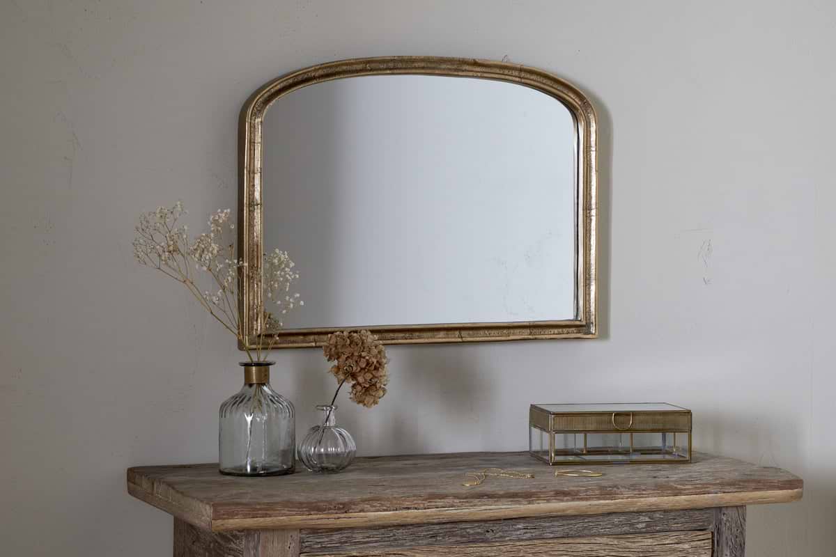
These Nkuku pieces sit quietly alongside warm neutral walls and bring texture without clutter.
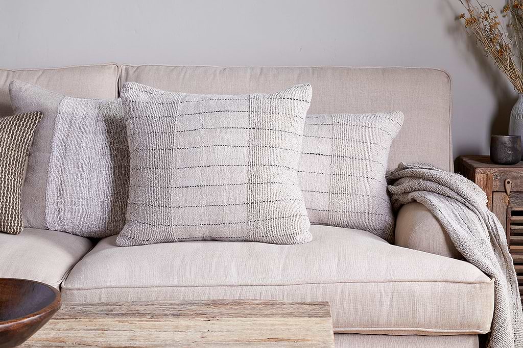
Mayla Cushion Cover
Soft hand-textured cover — instant warmth on linen sofas or chairs.
View at Nkuku →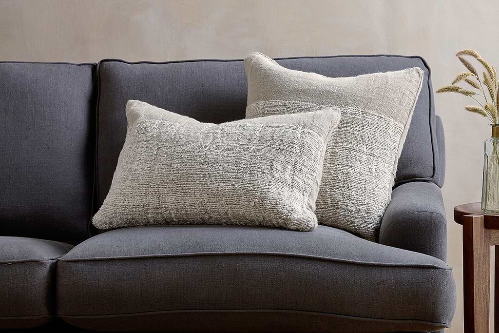
Puli Linen Cushion
Recycled linen in natural — pairs with woven textures and aged wood.
View at Nkuku →Some links above are affiliate links. If you buy through them we may earn a small commission at no extra cost to you. We only suggest pieces we think fit a calm, lived-in home.
Free guide
The Calm Shelf
12 styling ideas to help you compose calm, balanced shelves in natural texture homes.