

A boho shelf wall often becomes a spot for clutter, not calm. It starts simply, maybe dried grass in an old vase, a woven basket, a favorite clay mug, but the mix can quickly spill over into a crowded mess. Shelves set against rental-white walls or short on space feel busy fast, especially once bold ceramics and tan jute tumble together.
There is a way to reset. Today, you will see how to group objects, edit out the excess, and keep a limited palette that lets each piece breathe. This works especially well in a small apartment hallway when floor space is tight because a single focused shelf delivers impact without chaos.
The short version: A calm boho shelf wall groups dried botanicals, woven textures, and ceramics using fewer colors and more open space. To keep the look tidy, place one focal item, use natural materials, and keep two-thirds of each shelf clear.
Key takeaways
- A shelf styled with a natural palette looks calmer than one packed with different colored decor.
- A floating shelf works best when you group pieces by height and texture instead of spreading them out evenly.
- Most rental walls stay brighter when you keep dried botanicals away from direct sunlight, which fades color quickly.
- Jute, clay, and matte ceramics each absorb and scatter light differently, changing the shelf’s look throughout the day.

Where this works best
A boho shelf wall fits best in rooms with limited floor space or corners that feel empty and cold. Shelves create a soft focal point in small living rooms, hallways, or bedrooms with little natural light.
Many renters use a single floating shelf above a low radiator or as the only display option in a studio. Shelves hung near the front door can hold keys in a shallow carved wood bowl, while narrow hallways need shelves with a shallow profile so you don’t bump loose vases. Open-plan living rooms depend on a wall shelf to separate zones, storage on one end, relaxed display on the other.
In these spaces, a mix of tactile objects, such as a woven basket or a matte ceramic cup, anchors the eye and keeps the wall from feeling empty. Shelving lets you use vertical space where bulky storage doesn’t fit, making the most of awkward layouts and blank corners.
Avoid overloading the shelf with small, dark items that blend together and read as clutter. Heavy, shiny wood can look out of place in low-light bedrooms, compared to natural wood or whitewashed finishes that lighten the wall.
Place your shelf in a spot where you often walk past or pause. In daily life, a grouping of dried stems with one simple piece, like a jute basket or clay planter, gives the room a clear focal point without extra clutter.
How do you balance textures and materials?
Mixing textures, like smooth ceramics, coarse jute baskets, and wispy botanicals, keeps a shelf interesting while preventing it from looking flat. Use just three materials for your first layer.
Many shelves look busy when different patterns compete: for example, a glossy vase next to a woven tray can feel fussy. Instead, group similar textures near each other. Place a rough basket beside dried stems to soften the sharp lines of a small stack of books, while a matte ceramic bowl helps lighten a heavy carved wood base.
Grouping pieces by texture and height works because the eye can spot differences more easily, according to color theory from Britannica. A jute basket’s roughness sits well below the gleam of glazed pottery or the lightness of linen, breaking up the shelf surface without making it look cluttered.
Unlike single-material displays, mixing texture adds warmth. Instead of using only smooth objects (like all-white ceramic), pairing different textures, matte, woven, rough, creates interest in daylight and softens hard shadows.
A shelf behind the sofa or at the end of a hallway especially benefits from this mix of finishes. Place one tall piece (like a bottle full of dried reed grass) beside a low, heavy item so the shelf keeps its balance.
Styling and placement
A clean shelf display starts with one anchor piece, a few accents, and plenty of blank space left open. Spacing each object apart keeps the arrangement light and easy to read.
Pile up too many small items and everything turns muddled. Step back after each piece goes up, if the shelf feels heavy or uneven, take one thing down. In small flats, shelves above a desk or sofa often feel the most crowded, especially if every surface fills with plants and small board books instead of one steady centerpiece.
Visual calm comes from restraint. Place one big object, like a tall vase of dried botanicals, then group two smaller items (a woven basket, a low bowl) close together. The rest of the shelf can stay empty, and the open space lets the eye rest. Most stylists swear by leaving about two-thirds of a shelf clear for the best balance.
Compared to all-over ornament, a few well-spaced accents give your decor weight without chaos. Instead of scattering too many objects all along the shelf, keep things tight and let each one have breathing room.
Quick calm checklist:
- Pick three main materials (jute, clay, wood)
- Group by height: tallest at one end, lowest in the middle or opposite
- Limit base colors to two or three, plus accents from natural botanicals
- Choose one anchor piece (like a basket or statement vase)
- Leave at least a hand’s width between objects
This works in a rental bedroom, a guest bathroom shelf, or above a hallway shoe rack, wherever you want a quick refresh that feels calm and lived-in.
What is the right number of objects for a shelf?
Most boho shelves work best with three or five objects, never packed edge-to-edge. Odd numbers feel less formal and help the eye move naturally along the shelf.
A row of identical candle jars quickly grows flat. Instead, arrange one group of three: a vase, a carved wood bowl, and a cluster of dried grass. In long entry halls or under steep stairs where space and height are limited, fewer objects means faster tidying, no daily knock-overs or race to dust each tiny piece.
The “rule of three” appears everywhere in design for a good reason; groupings look less forced and more natural. Place a statement vase (maybe filled with pampas or eucalyptus) slightly off-center, then cluster a shorter jute basket and a clay mug together at one end.
Unlike lining up five tiny succulents, leaving gaps creates negative space, which keeps the display from feeling tight. Compared to shelves crammed full, an airy grouping reduces visual weight and feels more relaxed.
On a shelf above your bed or an arched shelf unit in the kitchen, anchor your look with no more than five items. Any more and the shelf starts to look chaotic, especially under bright midday light.

How can you use dried botanicals without mess?
Dried botanicals look best in a wide-mouth vase that keeps loose stems from shedding across the shelf. Trim stems to stagger the heights so each bunch stands apart.
Some people worry that dried flowers are crumbly or dusty. Keep them off radiator tops or window sills, where direct heat and sunlight break down color and strength according to the Royal Horticultural Society. Use a thick bottle or clay pot to catch stray seeds and shards. Cut pampas and reed grass shorter than glass vases to maintain structure and avoid drooping.
Unlike plastic stems, real dried botanicals scatter bits when bumped, so skip spots at hand or elbow height. Place them high, or behind larger objects like a carved wood bowl. Unlike fresh flowers, dried arrangements breathe better in open air, closed cabinets trap dust.
A tall shelf or window ledge with indirect light brings out the natural golds and beiges of dried flowers and reduces brittle edges. Try one bunch at a time and swap the arrangement seasonally without crowding the shelf.
For more inspiration, see our wall shelf decorating ideas, especially the examples with trailing plants and pampas stems. Place a tall vase on the far end of your shelf to soften the view as you enter the room.
What role does lighting play on a boho shelf?
Indirect lighting, like a lamp tucked nearby or daylight skipping across the wall, makes natural textures and muted colors stand out without harsh shadows. Soft light stops a shelf display from looking stark or washed out.
Open shelves in rental flats often sit under ceiling bulbs or near small windows, which can throw strange, strong pools of light. A well-aimed table lamp, pointed away from eye level, bounces warmth across clay, woven, or whitewashed objects and keeps the effect gentle. The glow highlights texture, jute looks more golden, ceramics more matte, carved wood more detailed.
Unlike strong overhead lights, soft sources add depth to the shelf without blinding glare. Instead of installing built-in LEDs, bring in a portable plug-in lamp or knot a string of fairy lights up the wall. Warm bulbs (with a yellowish tint) give the most lived-in look, according to most stylists. Avoid cold blue lights, they turn clay and linen objects pasty.
Compared to shadowy corners, a shelf brushed with daylight or low lamplight makes each textured piece pop. For more practical layout tips, check our neutral shelf styling guide, especially how indirect lighting highlights woven finishes.
Set a lamp on a nearby side table, or run cable lighting along the wall above the shelf for a subtle, non-permanent solution in a rental. The right light source means your boho shelf wall reads warm and layered all day, not flat or cold.
How do you pick a calm colour palette?
The most restful palettes center on two or three base hues, such as white, taupe, and clay, plus the natural tones of jute or dried grass. Limiting colors quiets the shelf and brings out the detail in each item.
Many boho shelf walls look busy because objects come from all over: one bright blue jar here, a red bowl there. Instead, borrow a trick from stylists, edit out everything that doesn’t fall into a narrow color family. Anchor the look with white wood or pale natural wood, then add accents in sandy beige, off-white, or muted blush.
Natural materials already come in soothing colors. Jute baskets glow gold in daylight; unglazed ceramics and linen show subtle earthy notes. According to color theory, calm rooms use repeated tones to tie parts of a space together, so a repeated neutral thread helps the whole wall hang together.
Unlike rainbow-hued displays, a muted color scheme feels steadier and makes cleaning easier. Instead of swapping in dozens of bold pots, stay with a gentle palette and add a single accent piece if you crave change, a dark branch, or a print in a pale wood frame.
At home, start by removing anything that stands out harshly. Lay your items out on the floor and pick the three tones that show up most. Use those on the shelf and move the rest elsewhere. For more tips, explore our shelf styling formula, which breaks down palette-building step by step.
Often, the moment a boho shelf wall feels “off” comes just after you finish arranging. The color blocks don’t sit together, or a vase sits awkwardly above a heavy basket. Rooms feel more restless when every piece fights for attention at eye level, making the display hard to ignore rather than easy to live with.
Most homes pile on too many mismatched objects, dark colors, or doubles of the same shape, muddying the effect and making shelves hard to clean. Fixing this matters because a shelf you actually like looking at gets dusted and updated, instead of turning into permanent storage.
A shelf styled with fewer, bigger objects and a narrow palette feels lighter and makes the room easier to keep tidy day-to-day.
Save this idea for later.
What tends to hold up with mixing dried botanicals, woven textures, and ceramics
Most people find that texture lasts longer than trends. Reviewers notice that woven baskets hold their shape and color for years when kept away from damp corners, while matte ceramics hide dust better than slick, shiny vases. Decorators often recommend repeating one core material, like using jute both in a basket and a wall hanging, so the shelf doesn’t read overly busy. Shelves using natural wood, clay, or linen wear softer over time, especially above radiators or near windows. Matte finishes get recommended again and again for shelves near windows, because they don’t catch glare the way a glossy tray does. Mixing tactile materials, and limiting the palette, is what seems to keep boho shelf walls looking fresh the longest.
, Mara, Loom & Glow
Common questions
How do you balance textures and materials on a boho shelf?
Mixing textures, like smooth ceramics, coarse jute baskets, and wispy botanicals, keeps a shelf interesting while preventing it from looking flat. Use just three materials for your first layer. Many shelves look busy when different patterns compete: for example, a glossy vase next to a woven tray can feel fussy.
What is the right number of objects for a boho shelf?
Most boho shelves work best with three or five objects, never packed edge-to-edge.
How can I keep a boho shelf from looking cluttered?
A clean shelf display starts with one anchor piece, a few accents, and plenty of blank space left open. Spacing each object apart keeps the arrangement light and easy to read. Pile up too many small items and everything turns muddled.
What kind of lighting works best for a boho shelf wall?
Place your shelf in a spot where you often walk past or pause. In daily life, a grouping of dried stems with one simple piece, like a jute basket or clay planter, gives the room a clear focal point without extra clutter.
Explore more calm combinations inside our Shop The Look .
Shop the Look
A few Nkuku pieces that suit a calm, textured shelf.
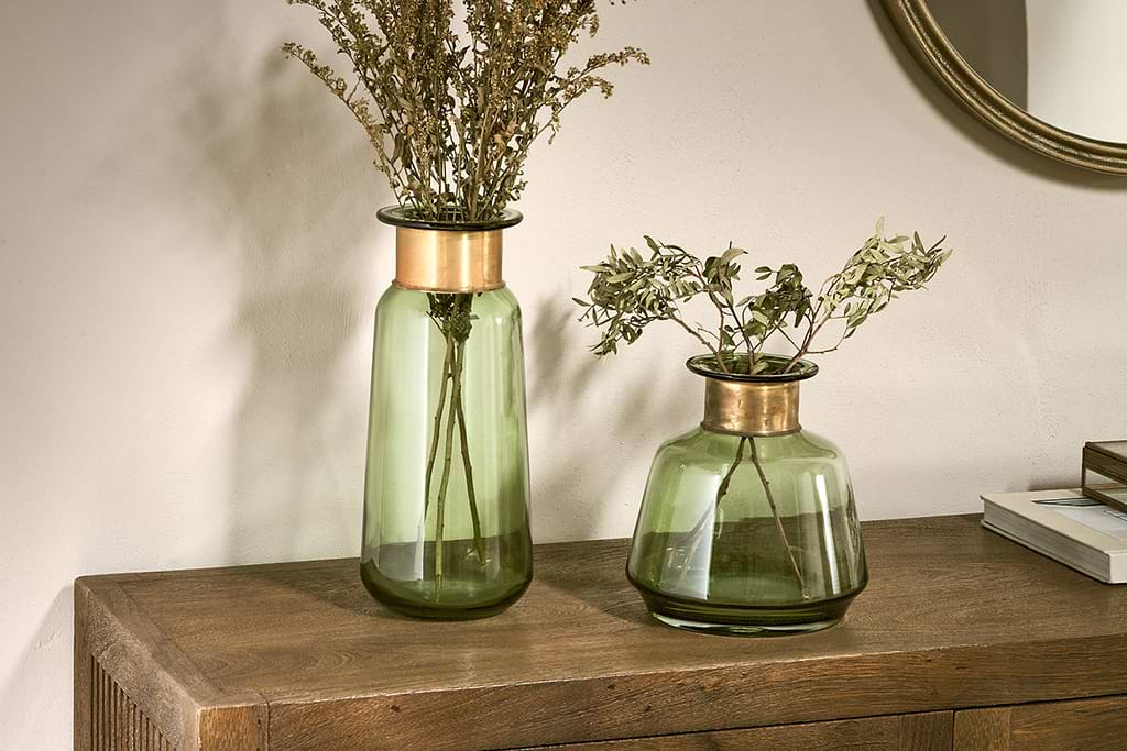
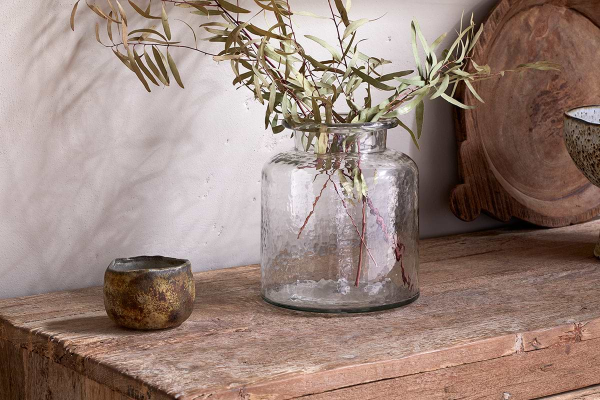
Akra Recycled Glass Vase
Clear cylindrical glass, pairs with stems or sits empty as a quiet accent.
View at Nkuku →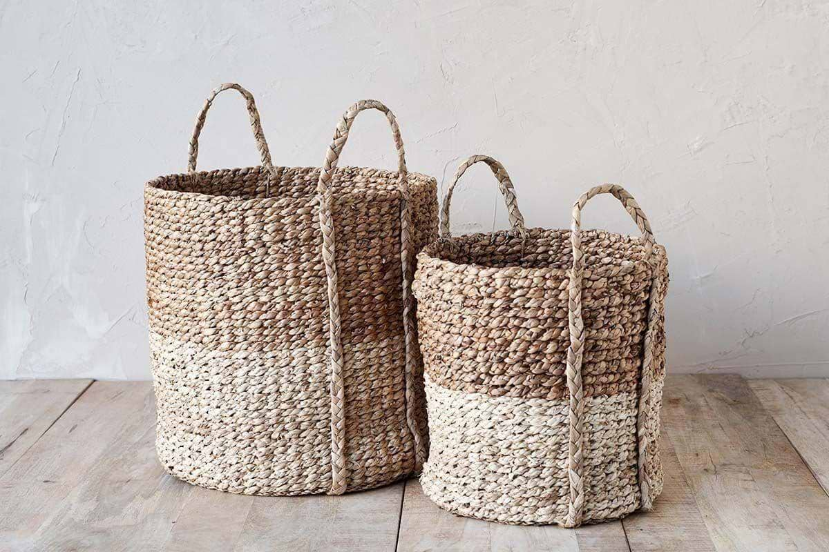
Nkomi Basket
Woven storage with a calm silhouette, works open or tucked under a console.
View at Nkuku →Some links above are affiliate links. If you buy through them we may earn a small commission at no extra cost to you. We only suggest pieces we think fit a calm, lived-in home.
Free guide
The Calm Shelf
12 styling ideas to help you compose calm, balanced shelves in natural texture homes.