

Open shelves can go from inspiration to eyesore with surprising speed. You gather objects you love, but the result often looks scattered, more storage than style. Most wall shelf decorating ideas make it look simple, yet reality brings piles of mismatched things and a restless room.
There’s another way. By choosing fewer, better, and placing them with space in mind, shelves turn quiet and focused. This works especially well in a small apartment living room when your shelves hold both essentials and display pieces because it keeps things visual but never busy. Today, you’ll see how simple changes, subtracting and grouping, make your shelves look thoughtful and calm, not just less full.
The short version: Wall shelf decorating ideas work best when you edit what’s displayed, group by texture, and leave open space for rest. Most rooms feel less chaotic when a shelf shows clear gaps, one vertical piece, and repeating natural textures.
Key takeaways
- The rule of three helps shelf decor feel collected instead of random or crowded.
- Grouping items by surface feel, matte, shiny, rough, gives shelves a finished look.
- Leaving a third or more of a shelf visibly clear signals intention and creates calm, according to Magnolia.
- Using a single tall item anchors the shelf and prevents the eye from bouncing around.
- Floating shelves from IKEA come in different finishes and are easy to update in rental homes.

The problem with most wall shelf decorating ideas
Most wall shelf decorating ideas shown online fill every inch with objects, but real rooms need breathing room to feel calm and settled.
In a busy hallway or small living space, inspiration photos suggest layering books, vases, trinkets, and plants. The result in real homes is visual noise. You see a crowded row, not any one piece. The eye can’t rest anywhere and the shelf becomes background clutter, not a point of interest.
When you fill a floating shelf to its edge, the room absorbs the mess even when each object is nice on its own. A matte ceramic vase loses its calm effect when squeezed next to glossy picture frames and a dish full of keys. Grouping too many colors or shapes together makes shelves feel loaded, while spacing them out changes the look entirely.
Unlike a styled photo, your daily scene includes phone chargers, unopened mail, or souvenirs that don’t match. Instead of copying every idea, focusing on materials, height, and empty space leads to a livable result. One calm shelf is more striking than two packed ones. Try clearing one shelf to half-full and let the rest wait.
Where this works best
Shelves hung above eye level in a living room or bedroom keep essentials handy without adding clutter or costing floor space.
Wall shelves work in narrow hallways, next to a bed, or above a radiator, anywhere you need storage but can’t spare floor room. In small kitchens, a single shelf holds spices or mugs, while in bedrooms, it can display your favorite books and a plant. Floating shelves from IKEA are especially popular because they come in finishes suited to many rental types and color schemes.
A bedroom shelf can hold reading glasses and a stone tray for jewelry. In a bathroom, a low shelf might keep cotton pads neat in a glass jar. Kitchens often use open shelves instead of bulky cabinets, highlighting a stack of plates, a wooden bowl, and one trailing plant for color.
Avoid stacking too many objects or using a deep, chunky shelf in a very narrow room, this can make the wall feel heavy and the walkway cramped. A thin, pale shelf visually recedes and creates a lighter feeling, especially when the wall color and shelves are similar. Firm wall mounting is key if shelf loads will change seasonally.
How can you keep shelves from looking cluttered?
Keeping a shelf from looking cluttered means leaving clear space, repeating a texture, and editing out unrelated items right away.
In an entryway, the temptation is to add baskets, bowls for keys, sunglasses, plants, and art all together. The eye doesn’t know where to land, especially with different shapes and colors. Leaving gaps between items, so at least one-third of the shelf is bare, gives everything air and signals what matters.
Shelf decor works best when you hide small, messy items in a closed box or drawer nearby. Display one wooden bowl or stone pot, hide the extra cords and mail. Unlike lined-up books or a tight row of frames, grouping by material (wicker, terracotta, linen) keeps the shelf from feeling like a storage overflow.
According to Magnolia, leaving part of every shelf empty is the single biggest shift for a calm look. Place objects with a hand’s width between, and match rough and soft textures for balance. This works well over a sofa or desk, where the shelf is in your sightline.
Why start with one vertical element?
One tall object, like a vase or candlestick, gives the shelf height and draws the eye, making everything around it feel intentional.
Most people try to balance shelves by putting several taller items at each end. This makes the shelf feel like a bracket, not a relaxed display. Choosing one tall item, placed just slightly off center, creates a gentle “anchor” and keeps the rest of the arrangement from looking flat.
A single dried palm, glass bottle, or tall pottery piece pulls your focus up and breaks a long horizontal. On a living room wall, this rule stops the shelf from fading into the background. If you want to add another tall shape, keep it smaller and grouped nearby so it feels connected, not like bookends.
Compared to a row of same-height frames, one vertical piece gives even a short shelf visual energy. The rest of the decor should step down in height: a medium pot, then a small bowl. This approach works in any room, living zone, dining corner, or office, because it sets the theme at a glance.

How do you group by texture for shelf styling?
Grouping shelf objects by texture, matte, rough, shiny, gives a natural, relaxed mix that feels finished instead of busy.
A jute basket beside a glazed ceramic bowl adds both softness and shine. When you repeat the same wood in a frame and a small box, the shelf feels collected. Grouping objects by how they feel to the touch, clay, wood, soft textiles, keeps the look unified, even if shapes or shades vary.
Unlike matching all items by color, which can read as flat, mixing a rough seagrass tray with a smooth glass vase adds interest without making things loud. Only one shiny piece, like a brass tray or a lacquered candleholder, is needed to brighten the shelf. This follows the “one shiny object rule”, too many and the whole shelf reflects light unevenly, making it feel restless.
Keep rough textures near the edge to soften straight shelf lines, and place any reflective or metallic object where it catches daylight. This natural grouping works best in rooms with lots of soft furnishings nearby, like a living room or bedroom, where tactile materials echo the room’s feel.
Styling and placement
A shelf looks settled when objects are spaced unevenly, a color repeats, and the largest piece sits close to eye level or just below.
Shelving above a kitchen counter should not crowd you while cooking, so limit decor to one or two pieces per shelf, with rest space between. The best visual calm comes from repeating one type of material but shifting the placement: for example, oval baskets on two shelves, but never stacked right above each other.
Avoid lining everything up in a straight row or placing every item at the same depth. Instead, stagger pieces: one closer to the wall, one near the front, another slightly tucked back. This depth changes how shadow falls and softly breaks up the shelf’s line.
Quick calm checklist:
- Pick one surface texture (clay, jute, glass) to repeat in different object types.
- Keep two-thirds of shelf space clear if you have small objects, or half if larger.
- Choose three color accents maximum for each shelf zone.
- Place the tallest object off center; let other pieces step down in size.
- Mix heights and depths so nothing forms a straight line.
This approach works for neutral shelf styling and colorful rooms alike, just ground each group with a repeated shape or finish so it doesn’t float apart.
What is negative space in shelf decor?
Negative space on a shelf is the open area left unfilled around items; it makes the objects stand out and the shelf look clear and planned.
On most Pinterest boards, negative space gets skipped, there’s a fear empty spots will look unfinished. In reality, a shelf looks more intentional when at least a quarter of the width is left empty, as Magnolia recommends. This gives your eye a place to pause, and draws attention to the objects that remain.
Leaving space between groups of decor means each one can be seen on its own. A bare area between a stone planter and a stack of linen-bound books keeps both from blending together visually. Negative space is an active design choice, not an accident. It signals you meant to show only what’s there.
The difference between a shelf that feels messy and one that feels minimal is often just one or two removed pieces. Unlike shelves packed with identical jars or art, those with open gaps are easier to keep dusted and less likely to collect unrelated clutter over time. This works especially well for open shelving in kitchens and main living zones.
At some point, many people stand back from their shelves and feel a low unease. The pieces are nice, but something fails to settle. It’s usually the overcrowding, every new object squeezes out the effect of the last.
The solution is a clear decision: remove most of what doesn’t belong to a single group, repeat one material, and anchor with one strong vertical. Leave the rest open.
Most homes end up with shelves that look busy or half-finished because there are too many random pieces and not enough space between them. The room feels unsettled and draws your eye to clutter before anything else. In kitchens, the shelf becomes a landing zone for odds and ends; in bedrooms, it eats light and makes mornings feel busy.
With the right mix and some gaps, the shelf feels purposeful and calming.
Save this idea for later.
What tends to hold up with styling small shelves
Looking across many styled spaces and reader questions, the most consistent theme is that shelves support calm when the owner is brave enough to leave some areas empty. Reviewers praise matte finishes for looking quieter in daylight than glass or gloss, and natural textures, linen, stone, jute, build a subtle interest that doesn’t shout.
Decorators often recommend following the rule of three for accessories, grouping objects so your eye moves easily instead of jumping between a scattered crowd. Many point out that floating shelves with too many varied colors or finishes feel heavier and demand more attention than rooms meant for rest.
, Mara, Loom & Glow
Common questions
How do you properly decorate a shelf?
To properly decorate a shelf, choose objects with different heights and textures, group them by material or purpose, and leave visible gaps between items. Avoid overfilling, one strong piece, a smaller accent, and open space look finished. Mixing hard and soft materials often works best for a relaxed style.
What is the bookshelf rule for styling?
The bookshelf rule for styling is to arrange objects in groups of three, varying size, height, and texture within each group. This approach breaks up straight lines and creates natural stopping points for the eye. Books can be stacked, stood, or anchored with one decorative element alongside.
What is the rule of three for decorating shelves?
The rule of three for decorating shelves means placing objects in odd-numbered groupings, often in threes, because this looks balanced but informal. According to The Living House, grouping by three draws attention and avoids the stiffness of even-numbered pairs. Use this with accessories for a calm result.
What should you avoid when styling floating shelves?
You should avoid crowding floating shelves with too many unrelated items, using only one texture, or placing everything in a straight line. Mixing sizes, leaving negative space, and repeating at least one color or material keeps floating shelf styling from feeling unplanned or overwhelming.
Explore more calm combinations inside our Shop The Look .
Shop the Look
Three Nkuku accents that bring texture and soft reflection to a balanced shelf.
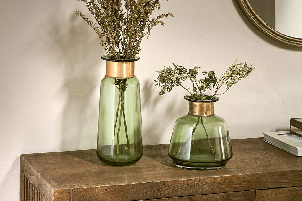
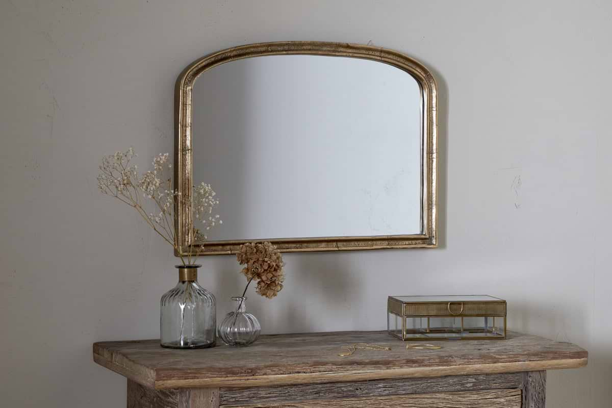
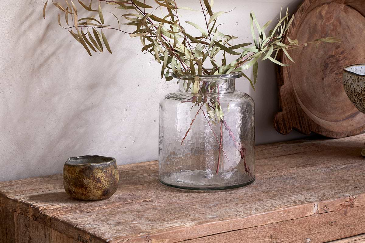
Akra Recycled Glass Vase
Clear cylindrical glass, pairs with stems or sits empty as a quiet accent.
View at Nkuku →Some links above are affiliate links. If you buy through them we may earn a small commission at no extra cost to you. We only suggest pieces we think fit a calm, lived-in home.
Free guide
The Calm Shelf
12 styling ideas to help you compose calm, balanced shelves in natural texture homes.