

Many people want a warm, autumn look but worry a dark red candle will clash with their calm, pale rooms. In a neutral home, one strong colour can stick out, especially if the finish is glossy or too bright. Choosing wisely matters most when clutter or small space limit your options.
A good dark red candle can add depth without noise, drawing attention in a quiet way. Today you’ll see how to pick the right candle for your palette, when to avoid certain textures, and how simple placement can make the effect intentional. This works especially well in a rental living room with cool walls when you want a sense of autumn warmth because the deep tone pulls things together without shouting over the rest.
The short version: A dark red candle with a matte or textured finish adds gentle autumn warmth to a pale room without overpowering it. The key is using only one deep colour accent and placing it alongside soft, neutral textures for balance.
Key takeaways
- A dark red candle works best when paired with calm, textured backgrounds like jute, wood, or linen.
- Bright red candles often look too strong in rooms designed around neutrals and pale finishes.
- Matte and ribbed candle finishes help tone down bold colours, making placement less tricky.
- Pillar, taper, or jar shapes each suit different rooms, pillars for shelves, tapers for tables, jars for cosy corners.
- John Lewis sells a pack of 10 red tapered dinner candles for £5.50, useful when styling on a budget.

Why is a dark red candle calmer than a bright red one?
A dark red candle is less visually aggressive than a bright red one because the deeper colour absorbs more light and sits quietly in a pale space. The result is warmth without a sense of visual noise.
In a living room with pale bookshelves and soft grey seating, a bright red candle easily becomes the main thing people see. Instead, a deeper red looks softer and less insistent, especially against textured backgrounds. This difference becomes clear as soon as you place both side by side under evening light, bright red stands out, while dark red settles in.
A simple switch to a darker shade is effective because the eye reads bright red as urgent, but dark red as steady. Interior decorators often recommend this trick for homes where the goal is to add warmth, not a shock of colour.
Compared to a high-gloss or neon red candle, deep shades pair naturally with the wood and woven elements already popular in calm spaces. This way, a dark red candle anchors a surface without the sharp contrast that makes a shelf or table look busy.
How to choose a dark red candle for your palette
Choosing a dark red candle means matching the tone to your existing neutrals and limiting other strong colours in that corner. This decision keeps the look relaxed and avoids visual clutter.
When shelves or tables hold mostly muted creams, tans, and oatmeals, even a small pop of dark red can be enough. The trick is looking at your background: white and cool grey rooms usually suit a browner red, while beige or warm stone shades take a purplish or berry undertone best.
Bring home a few samples or even swatch candles against your wall or linens. A good rule of thumb is: “A dark red candle works best when the rest of the accent items are simple and not glossy.” If in doubt, remove other bold pieces and use just the candle to avoid colour fights.
On open-plan shelves, avoid mixing too many candle styles in one sightline. According to Amazon UK, there are hundreds of dark red candle options but the biggest difference comes from using just one per vignette.
Texture and finish: smooth, ribbed, or crackle?
A ribbed or crackle finish on a dark red candle breaks up the solid block of colour, making it easier to blend into a calm room. Texture diffuses harsh light and softens the look.
Bedrooms and living rooms with flat surfaces benefit most from a candle with clear texture. A ribbed pillar or a matte-finish jar pulls less focus than a shiny, smooth candle; reflected light can make even a dark colour look louder. Wood or woven trays beneath these finishes add another layer of subtlety.
Unlike smooth, glossy candles that catch the eye and sometimes show fingerprints, ribbed and crackle styles tend to look better for longer. This is especially helpful if the candle will stay out all season.
Many shops, such as Dunelm, stock both ribbed and crackled jar candles in red tones. This makes it easy to find something that suits a natural or quiet living area, sometimes even with a slightly mottled surface that hides small marks.
Shape, size and scent: when does it matter most?
Pillar candles fit best on open shelves, tall tapers suit dining, and scented jar candles fill corners without feeling heavy. The right shape and scent depends on where you want subtle focus.
Pillars give weight to a sideboard or the centre of a low table, especially when grouped in threes or paired with simple bowls. Taper candles add height and a line of interest, often working well at the end of a mantelpiece or running down a dinner table. Jar candles, especially those with wood wicks, bring both scent and a little shine to reading corners or window ledges.
Homeowners often ask if size matters. It does, but only in relation to what surrounds the candle. A large pillar works on its own, filling space without needing extra objects. Tapers work best in pairs or threes, where their thin lines accent but don’t dominate. One pattern experts mention is: “A dinner candle taller than your tallest glass looks out of place.”
WoodWick sells scented dark red candles like Cinnamon Chai and Dark Cherry, which fit naturally into autumn layouts and bring a soft, cosy scent to contained spaces.

Where this works best
A dark red candle works best in rooms where the background is calm and the lighting is soft, such as living rooms, bedrooms, and study corners. The effect is clearest in neutral or pale surroundings.
In rooms with lots of daylight and pale furniture, one deep accent, like a dark red candle, gives a space a sense of season. A rental living room or small apartment with light walls handles a single bold accent well, especially if shelves and tables are open rather than deep or heavy. Candles above soft rugs work well, especially with wood or jute baskets nearby.
On a desk or in an entryway, a dark red taper in a clay holder is enough. Bedrooms benefit from a short pillar on the nightstand, away from busy fabrics or shiny metals. If the room is small, pair the candle with a tactile item like a stone or wood trivet to reduce the sense of formality.
Avoid dropping a dark red candle into a space filled with other bold items, like heavy throws, patterned cushions, or a vivid rug. Too much contrast pulls the eye everywhere instead of letting it rest. For rooms already full of colour, clear out two or three small objects and leave only the candle for autumn.
Styling and placement
A dark red candle sits quietly when set against natural textures and surrounded by soft materials, never placed dead centre or next to other bold colours. The material and spacing are as important as the candle itself.
Place a pillar on a woven tray with space around it or use a taper at one end of a mantel. A dinner table looks calmer if the candle sits next to plain ceramic dishes or a linen placemat. Bookshelves with pale books benefit from a jar candle set off to one side, close to a jute basket or a stack of magazines.
Compare a table filled with glass and metal to one that holds just a dark red candle next to a clay bowl: the latter feels softer and more grounded. The candle should be far enough from other bold pieces that each element gets noticed, not lost.
Coffee table styling ideas that rely on one central item translate well to candle placement, using a single accent prevents the cluttered look that comes from mixing too many shapes or finishes.
Quick calm checklist:
- Pick one natural background: wood, jute, or linen are best.
- Leave space around the candle; don’t surround it with small, bright items.
- Keep the palette tight: one deep accent only.
- Use matte, ribbed, or slightly textured candles for less glare.
How to avoid common mistakes with dark red candles
A dark red candle feels right when everything around it is quiet and light, and there’s no other strong colour on view. Overcrowding or mixing bold reds is the fastest way to lose the calm effect.
One easy mistake is letting a dark red candle share a shelf with another statement piece. Unlike a pale basket or off-white vase, a second deep tone can fight for attention and break the flow. For open shelving, keep about two-thirds of the space clear, the result is an object that feels anchored but not crowded.
Another common error is using multiple candle finishes together. Mixing shiny with matte, or smooth with ribbed, breaks up the sense of calm. Instead of that mix, repeat a single finish for a subtle but finished look, like using ribbed pillars at each end of a mantel.
Even seasoned decorators forget to check natural light. A shiny candle in a sunlit spot can throw harsh reflections, overpowering the setup. Go matte or ribbed near windows, or tuck candles into corners with filtered light for a richer effect.
Many people only notice something feels slightly off after they’ve added their new candle and stepped back. The room can feel a bit off balance, heavier than before, or the candle stands out too much for the space to feel calm.
The practical shift is to let the candle set the accent, rather than layering in more strong colour. Pick one strong shape and one quiet background, the right piece does more on its own than a mix of smaller, brighter items. Removing extras often leaves the room gentler and clearer.
Homeowners often realise what’s wrong right as they set the candle down, especially when the rest of the room feels organized but something small is still jarring. This happens most when every surface feels “almost right,” but never quite calm enough for cosy evenings or easy mornings.
A common slip: putting one strong candle right next to another bold object, like a patterned throw or shiny lamp, and hoping they’ll work together. Instead, they just compete and the intended quiet is lost. Letting each accent breathe and giving a single colour the lead turns a busy corner into something welcome.
The upside when you fix it is a room that feels finished, not busy, and a gentle autumn mood that works any day.
Save this idea for later.

What tends to hold up with mixing autumn colours and quiet styling
Reviewing calm autumn setups again and again, the best rooms limit strong accents to a single main colour or texture, most often a dark red candle or a woven storage basket. Matte finishes get recommended repeatedly, especially by professional stylists, as they blend better with soft linens and open shelving than glossy options. Many readers mention the instant mood shift after removing one or two extra colourful details instead of adding more. Simple textures and a limited palette remain the clearest sign of a room that feels calm through autumn and beyond.
, Mara, Loom & Glow
Common questions
What does a dark red candle symbolise?
A dark red candle typically symbolises warmth, comfort, and lasting energy rather than bold excitement. The deeper colour often stands for a steady mood and cosy evenings, especially in autumn and winter. This symbolism makes dark red a popular choice for those who want to signal a shift in season without bright flashes.
What is the three candle rule for styling?
The three candle rule means grouping three candles, often of different heights or shapes, in one spot for an easy, natural look. Most stylists use this rule to add interest without clutter. Three is enough to look arranged, but not so many as to feel forced or busy.
How do you stop a dark red candle from overpowering a room?
You stop a dark red candle from overpowering a room by surrounding it with pale colours and soft textures, and by limiting other strong accents nearby. Using only one deep candle and keeping other décor quiet makes a big difference. Natural backgrounds like linen, jute, or pale wood help soften the effect.
What does a dark red candle mean?
A dark red candle is often seen as a sign of warmth, depth, and understated richness in a room setting. Unlike lighter or brighter reds, dark tones set a gentle focal point that works well with many neutral palettes. This meaning sits well in homes aiming for both comfort and order.
Explore more calm combinations inside our Shop The Look .
Shop the Look
A couple of pieces to deepen the mood when candlelight matters most.
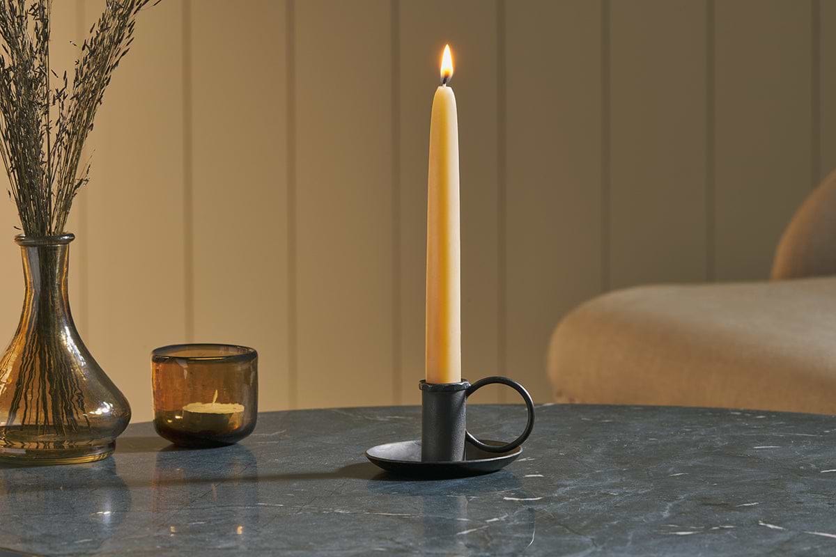
Amri Iron Candlestick
Slender iron with quiet presence, works alone or in clusters of three.
View at Nkuku →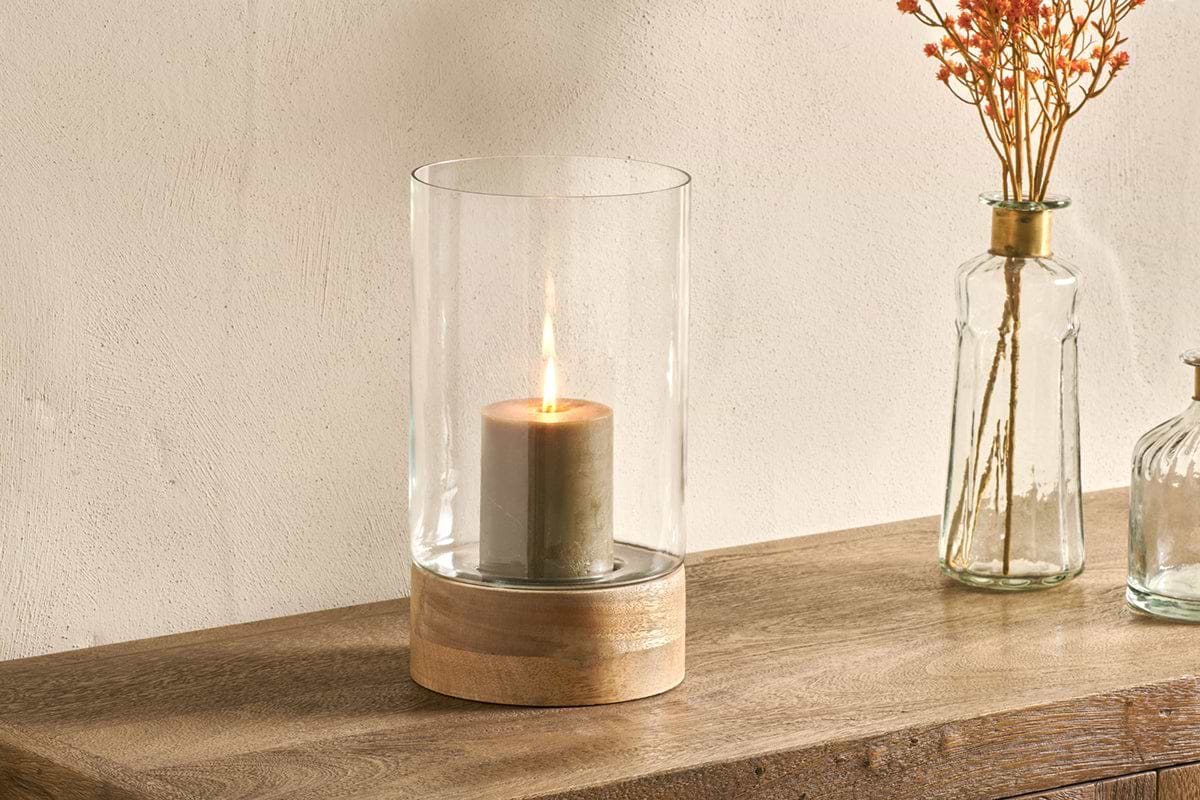
Idha Hurricane Lantern
Straight-sided glass, for candles indoors or sheltered patios.
View at Nkuku →Some links above are affiliate links. If you buy through them we may earn a small commission at no extra cost to you. We only suggest pieces we think fit a calm, lived-in home.
Free guide
The Calm Shelf
12 styling ideas to help you compose calm, balanced shelves in natural texture homes.