

In a bedroom with neutral tones, things can quickly look cold or unfinished. Rugs, curtains, and cushions made from different natural fibers often get stacked together, but the space still ends up feeling off—sometimes busy, sometimes flat, never quite restful. One piece too many and it’s hard to settle.
The good news is, there’s a practical way to stop that from happening. By choosing one main material, anchoring the room with it, and pairing just two or three subtle textures, you can make a neutral bedroom feel lived-in but calm. This works especially well in small bedrooms when storage is tight because every detail stands out more.
The short version: Neutral bedroom decor feels calm—not cold—when you anchor the room with one main tactile material and keep other textures as accents. Limiting the color palette and mixing just a few natural elements stops clutter and creates a space that feels both simple and natural.

Where this works best
Neutral bedroom decor works best in rooms with good natural light and limited built-in features, because each color and texture stands on its own. A bedroom with low light or a small footprint benefits even more from a focused material approach.
Bedrooms with blank walls, basic carpet, or no overhead features are the easiest place to start. In these spaces, adding a single woven rug or rough linen curtain makes a difference you see and feel right away. Even bedrooms with just a simple bed frame and side table can look strong with this method.
It’s often bedrooms with awkward layouts or old, glossy wardrobes that need the most help. A single woven home decor piece —like a broad basket or an earthy lamp—can help settle the energy of the room by drawing the eye to a soft texture instead of sharp corners.
Avoid pairing lots of busy patterns with several types of wood in the same small bedroom. Too many glossy finishes next to heavy knits or bumpy jute can look mismatched and make the space feel closed in rather than calm. A better approach is to keep wood tones similar and patterns very low-contrast.
Even just one section of blank wall becomes more interesting and restful with a linen panel or straw tray hung simply. This is easiest to maintain, even in a rental or family home.
What type of natural materials create warmth?
Jute, linen, raw wood, and rattan bring physical and visual warmth to a space in different ways. Rough textures trap light and soften hard edges, so rooms with these materials feel less empty.
When you want an earthy home decor effect, jute and rattan work for baskets, rugs, and plant holders. Linen brings a relaxed wrinkle to curtains or pillow covers, never shiny and always soft under hand. Even a light wood side table with a matte finish adds comfort without weight.
Unlike cold stone or plastic, rattan and jute feel warm in both color and touch. The way natural fibers break up light means that in the morning, a woven rug doesn’t glare—it glows quietly. Small spaces without built-ins or much trim especially benefit from this grounded warmth.
This matters because materials with some give and grain help your eyes rest. Bumpy jute underfoot or a slightly gathered linen drape makes a spot to land visually. A smooth, plastic lamp base in the same spot can look out of place and compete with a soft theme.
Adding a sand-colored jute rug or loose linen curtain improves a spare room instantly, especially near a window. In places where storage is tight, a sturdy woven basket next to the bed also does the job of warming up the floor.
How do you mix jute, linen, rattan, and wood?
Mixing natural materials well starts with picking one to dominate, like an oversized jute rug or a solid oak bed. Use others as accents, keeping the overall number of textures low and the palette very close in shade.
Choose a single anchor piece—maybe a jute rug or a broad rattan shade—then add no more than two small natural elements nearby. For example, if your rug is jute, layer a plain linen pillow on the bed, with a slim raw wood tray on a nightstand. This three-piece limit usually keeps the look organized, not scattered.
If every texture fights for attention (jute, linen, rattan, plus busy-grained wood), the room feels noisy. Restraining the number and size of pieces creates a clear order; a linen throw over a wood bench cleans up visual flow much better than five mismatched baskets all in one corner. Instead of using four visible fibers, bring in one woven, one soft, and one solid.
This approach works because too many slightly different browns or beiges can look like clutter instead of layers. A room anchored by a main natural texture is easier to keep neat—on busy days, even an unmade bed looks deliberate if the base palette is steady.
Try using the biggest material (like jute underfoot) as your baseline, with secondary textures (linen, rattan) only repeated once or twice. This steadies the look in shared bedrooms or guest rooms that get rearranged often.
How do you keep neutral bedroom decor from looking boring?
Even a neutral bedroom feels lively if you bring in small contrasts—like matte against rough, or one pattern on a flat field. Varying textures and a hint of tone difference are enough; skip both and it will fall flat.
One reason people call neutrals “boring” is because everything matches too tightly. If your bed, floor, and walls are all the exact same beige, there’s nothing for the eye to land on. Adding a nubby ottoman, a pale clay lamp, or a folded wool throw gives just enough difference to keep things interesting, without needing bright accents.
Compared to adding a print or bold artwork, a small, slightly darker wooden stool by the bed, or a neatly hand-thrown vase, brings interest with almost no visual noise. Bringing in even the smallest color shift—a sandy jute basket, a pale tan linen shade—offers a focal point.
If every surface is smooth and similar, the bedroom loses depth and feels like a showroom. Mixing in one piece that changes the light, like a woven shade or a coarse runner, gives the room something human and warm. Texture matters most on days you don’t want to fuss with accessories.
To fight flatness, add only a couple of things that are rougher or softer than the rest—think a thick curtain on a plain wall or a low basket by a tidy bed. That’s enough to break up sameness.

Styling and placement
Place the biggest natural piece where you first look on entering, then build around it with space between each accent. Most bedrooms feel better with one strong grounded feature and a few low-key details.
Start by anchoring the bed wall. Hang a loose linen curtain from ceiling to floor if possible, or set a sturdy jute rug under the foot of the bed. From this base, let the next largest piece—maybe a woven basket on the floor or a smooth wooden bench—sit away from the first anchor, not right against it. This spacing keeps the eye moving in a calm way.
Mixing textures works best when each is easy to see. Lumped all together, a pile of baskets and covers blend into mess. Instead, let a single rattan cube sit near the bed, with a linen-covered seat across from it, not touching. The distances between soft, rough, and smooth pieces matter more in a smaller room.
Quick calm checklist:
- Limit main visible surfaces (rug, bedding, curtains) to one or two textures.
- Keep at least a hand-width of space around woven pieces so they read as accents, not storage overflow.
- Pick a palette of two gentle tones, with all wood and woven accents within that range.
- Anchor one hero piece—like a large jute or linen focal item—and don’t crowd it with smaller details.
- Let plain walls or windows offer breathing space between textured items.
This works for all kinds of bedrooms, but especially ones with low ceilings or only a couple of windows. Focus placement on what draws notice as you enter, and don’t stack or overlap too many types of storage in one spot.
How do earth tones affect bedroom calm?
Earth tones—greige, sand, muted taupe—soak up harsh daylight and send off a soft glow at dusk. Rooms using these colors with real fiber and wood textures avoid glare and feel easy on the eyes.
Bedrooms in new-build rentals or rooms with overhead LEDs tend to look washed out with flat greys or stark whites on every surface. Using sand or oat shades in woven home decor pieces (curtains, baskets, shelves) softens artificial light and lessens sharp contrast at night.
Short winter days make earth tones especially useful, since browns and beiges bring out warmth even in cool or gray light. Rooms done in all pale white can “read” as harsh, particularly when the artificial light is cold. The addition of a linen curtain or thick jute rug instantly brings the color temperature down to a level that’s more welcoming, as supported by insights on how color works.
Choosing earthy home decor for the biggest items—like bedding or the largest rug—creates the main impression you get when you’re tired or first waking up. Strong light will feel gentler when it hits these materials, making for a less jarring start or end to the day. Even one sand-colored basket makes a difference in a corner that gets a lot of sun.
Keep the lighting simple and indirect to help these colors show at their best. Avoid bright, bluish LEDs in bedrooms focused on earthy materials, since the subtle tones are most effective in soft, diffused light.
How to avoid visual clutter with organic home decor?
Keep visible objects to a minimum and group by texture, not color. Leaving clear surfaces and repeating just one or two organic shapes stops neutral bedrooms from looking halfway finished.
Most bedrooms get visually crowded by accident—laundry piles, bent paperbacks, mismatched baskets all in corners. Instead of lining every wall with a different color or shape, pick one material—say, linen—and use it for nearly all textile items. Any baskets or boxes should be the same tone as the main feature instead of mixing light and dark.
Grouping similar textures (like two jute baskets together, or a pair of linen pillowcases) reads as organized rather than busy. Compared to shelves with scattered objects of every kind, a plain wooden tray with two clay dishes and one woven bowl looks deliberate, not thrown-together. Balancing groupings by feel—smooth, rough, soft—matters more than matching colors.
Rooms with few built-ins or open storage especially benefit from this confident restraint. Too many types of baskets or visible containers look heavier, not lighter, even if all are neutral. Keeping the palette close and avoiding lots of small details makes daily cleaning easier too. Most floating shelves, for example, feel open when about two-thirds of the length is left clear—only a couple of essentials really need to be out.
The result: a bedroom that welcomes you at night, but never nags for more rearranging or adds background noise.
What tends to hold up with layering natural textures in bedrooms
The pattern that most reviewers and decorators repeat: matte, textured finishes keep their calm effect longer than any glossy or synthetic substitute. Woven jute and true linen develop small shifts and softness with use—they don’t become slippery or shiny, and they lose the factory-new look in a good way.
Cotton can yellow, lacquered woods can glare, but rough fiber and natural grain just get better as months pass. This is one reason decorators usually suggest them for bedrooms meant for rest. The advice stands up over time because the right natural texture keeps making a space feel settled, long after the first arrangement.
— Mara, Loom & Glow
Common questions
How can I make neutral bedroom decor feel warm instead of cold?
Jute, linen, raw wood, and rattan bring physical and visual warmth to a space in different ways. Rough textures trap light and soften hard edges, so rooms with these materials feel less empty.
What’s the best approach to mixing jute, linen, rattan and wood together?
Mixing natural materials well starts with picking one to dominate, like an oversized jute rug or a solid oak bed. Use others as accents, keeping the overall number of textures low and the palette very close in shade.
How do I prevent neutral bedroom decor from looking boring?
Even a neutral bedroom feels lively if you bring in small contrasts-like matte against rough, or one pattern on a flat field. Varying textures and a hint of tone difference are enough; skip both and it will fall flat.
Explore more calm combinations inside our Shop The Look .
Shop the Look
Warm, neutral pieces that feel calm and grounded in a bedroom.
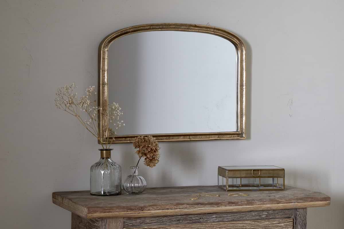
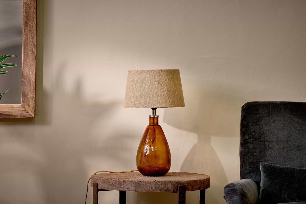
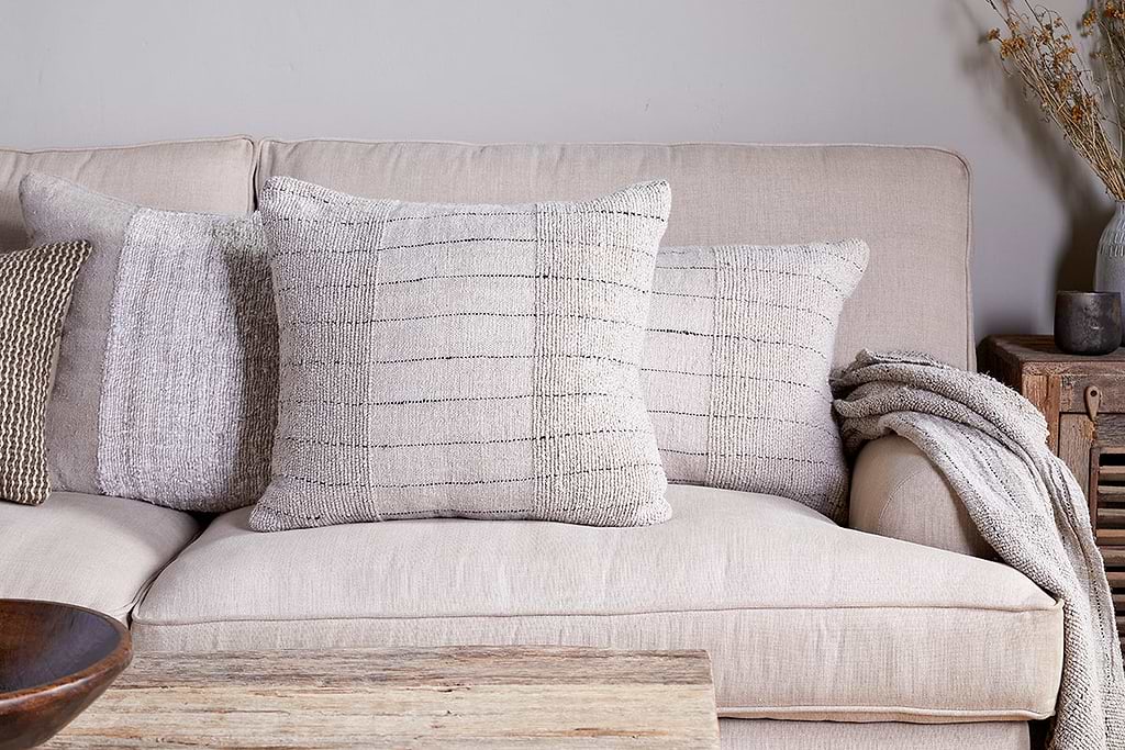
Mayla Cushion Cover
Soft hand-textured cover — instant warmth on linen sofas or chairs.
View at Nkuku →Some links above are affiliate links. If you buy through them we may earn a small commission at no extra cost to you. We only suggest pieces we think fit a calm, lived-in home.
Free guide
The Calm Leaf
12 quiet ways to bring dried botanicals, stems, and natural textures into calm spaces.