

It is easy for a small bedroom to feel tight and busy, especially if you are not sure how to make a small bedroom look bigger with paint. Heavy furniture, mismatched walls, and odd color choices can shrink a space visually before you even add bedding or storage baskets. Rental rules and limited light add extra limits, making it feel impossible to open the room up.
This guide shows what to swap, what to avoid, and how to use paint finishes and palettes to get a calmer, more open space. This works especially well in a low-light or oddly-shaped bedroom when you keep to three colors or fewer because too many shades make the room look cluttered.
The short version: The most reliable way for how to make a small bedroom look bigger with paint is to use similar tones on walls, ceilings, and trim to blur lines and expand the room visually. This simple shift removes distractions and helps small, awkward, or dark bedrooms feel more peaceful and open.
Key takeaways
- A single paint color across walls and ceiling makes a small bedroom look taller and broader.
- Painting the skirting board darker than the wall gives a sense of floating and airiness.
- Combining tonal variations of one hue creates depth and stretches wall lines.
- Gloss paint can make a space feel lighter by reflecting natural light, according to House & Garden.
- Vertical stripes increase visual height in rooms with low ceilings.

Why does paint change how big a bedroom looks?
A paint color shapes how the eye reads a room, either stretching or shoving lines closer together. Similar colors used on walls, ceiling, and trim erase hard edges, making a small bedroom appear larger and calmer.
Shifting from many paint shades to one gentle, repeated color lets walls blur into ceilings, so you lose those hard “corners” that stop the eye. In a small bedroom where the skirting, trim, and ceiling all contrast, the eye bounces around and notices where the walls start and end. Using one color (or close shades) softens every edge, which quietly pushes the “walls” outward.
This works in tiny flats and older houses with low light, where breaking up a wall with different colours can make it feel shorter or make the ceiling drop visually. A simple background prevents the room from feeling chopped up. Most people think adding color means adding drama, but done simply, it takes energy out of the corners instead.
A bare wall in a hallway or bedroom usually looks boxy and flat, while a room painted in one blurred tone feels far less cage-like. The cleaner the color scale, the gentler the room reads day or night. Bedrooms get the most from this shift because you see them first thing in the morning and last thing at night, so small changes echo more.
The one rule for choosing space-expanding colours
A paint scheme works best when you stick to two or three related colours from the same family, either all cool or all warm, which hides corners and lifts light levels.
Unlike in larger rooms where a bold accent can anchor a space, small bedrooms profit from a limited palette. Choose two to three shades (for walls, ceiling, and woodwork) from a single part of the color fan: all green-grey, all pale sand, or all gentle blue. This causes less contrast and gives your eye a slower, softer landing on every plane, preventing the space from closing in.
In practice, selecting from the same colour card keeps the focus on finish and surface texture, not on bright or dark surprises. Cooler colours like pale blue or soft sage usually reflect more light and are less likely to look muddy by night, but warm off-whites or pink-influenced beige can also spread daylight well. Mixing warm and cool or throwing in an unrelated accent often makes the space feel smaller, especially under artificial light.
Compared to five or more different colours, sticking to a handful keeps even the busiest room feeling quiet and spare. This rule is particularly useful in flats or rentals where other changes are off limits, as it brings visual unity without major works.
How can you use undertones to create depth?
Using wall paint with subtle undertones, like muted red or green, creates gentle shifts on different walls and gives depth, so a small bedroom looks more layered without heavy colour jumps.
In a narrow or awkward room, plain white can flatten everything out, while a very vivid colour often draws attention to odd angles. Picking a paint with slight complexity (think clay pink rather than chalk white, or blue-grey instead of paper white) lets light bounce more softly at sunrise and dusk. The eye catches these slight changes and reads the space as larger than it is because each wall reacts a bit differently to natural and lamplight.
Combining tonal variations of one colour can elongate a space, according to Little Greene. When two adjacent walls use slightly lighter and darker tones of the same family, the transition is invisible but the effect is a sense of depth, like a soft shadow. Instead of marking every corner, you blur visual boundaries.
Accent walls in a strong colour often close a bedroom in. Using undertones distributes the effect gently and avoids a blocky look. For anyone who wants nuance but still wants a peaceful space, this trick works in both rental and owned homes.
Where this works best
Colour-based space-expanding tricks for bedrooms work best in small, low-light rooms or anywhere ceilings feel too close, as well as in boxy or irregular spaces.
Small bedrooms with a single window, attic rooms with a slanted ceiling, and guest rooms with awkward built-ins all benefit from softened wall and ceiling lines. This is also the smartest choice in flats or rentals where you cannot move walls or build in storage, since paint is easily reversed and approved by most landlords. When closets eat up one end of the room and the bed sticks out oddly, calming the paint scheme makes those hard shapes melt at the edges.
To get the most from subtle paint tricks, use them in spaces with little natural light or awkward layouts. An L-shaped room or one where the bed sits tight to a wall shows the effect quickly. For broader impact, extend the approach into adjoining hallways or alcove spaces off the bedroom; this brings quiet flow through each space and blurs small differences between rooms.
Avoid strong accent walls or sharp trims if the space is already crowded or has lots of doorways. High-contrast details can cut the room into bits. Instead, play with quieter, linked shades from the same palette. In most rentals or homes with sloped ceilings, going too bright or breaking up the ceiling line draws attention to what is off in the room rather than blending it away.

Styling and placement
Paint placement matters: take one calm colour up walls and across the ceiling for visual height, and keep trims soft or only a touch darker for gentle framing.
The first step for any small bedroom is deciding what you want to pull forward and what you want to hide. Letting a single wall color move up across the ceiling keeps the eye rising, while painting all trim a close shade means windows and doors do not break up the space sharply. The fewer lines you see, the bigger the space reads. Mats, baskets and cushions all work best when they do not shout against the wall colour.
Furniture placement plays a role, too: float the bed just away from the wall if possible, so paint colour runs behind and around it unbroken. A shelf or peg rail in the same tone disappears visually, while a bare white shelf on a dark wall snaps into focus. For those moving into a new flat, try placing a soft area rug in a matching or slightly lighter tone in the centre so the floor flows softly to the edge, rather than creating dark borders along the skirting. If you want more support for planning furniture or storage, see small bedroom ideas for layout shortcuts that work with paint tricks.
Pale colours carry more visual “air,” but sometimes a mid-depth natural shade will hide marks and still read calm. In a household with pets or kids, a slightly richer tone shows less wear over time. Compared to brighter accent walls or high-contrast window frames, this approach looks neater and less busy, day or night.
Quick calm checklist:
- Pick two or three colours from the same side of the palette: all cool or all warm.
- Flow one wall colour up and over the ceiling for height.
- Paint trims just lighter or darker than the wall, not white unless the whole room is white.
- Keep furniture and soft goods close to wall tones; avoid high contrast.
- Use low-gloss or eggshell finish on walls so light diffuses softly.
Should the ceiling and walls be the same colour?
Painting the ceiling and walls the same colour erases boundaries and visually stretches height, removing the “lid” effect and making a small bedroom feel more open.
Most people treat the ceiling as a separate surface, often painting it bright white, but in small bedrooms, this line can make the ceiling feel closer and draw attention to the size of the room. Colour drenching, where you use the same colour (or very close tones) across all surfaces including the “fifth wall” (the ceiling), creates a sense of unbroken air. Even with richer or darker shades, the effect is softness, not heaviness, as there are fewer lines breaking up the view. According to Little Greene, drenching every surface in one colour maximises a space by erasing visual boundaries.
If you use a medium-strength blue, clay, or pale green, the room feels taller and more continuous, especially at night with soft uplighting. Avoid using a dark ceiling if the walls are much lighter as this can squash the look and make everything lower. Instead, keep ceiling and wall tones close, or let the ceiling be just a touch lighter if you want a hint more daylight reflection.
For rooms that get little daylight or face a wall, matching the ceiling and walls prevents stark shadows and cuts across the top edge of the room, so the eye glides up and away. Whenever the ceiling is broken up with another colour, you notice the room size far more.
How do stripes and finishes create optical illusions?
Vertical stripes painted subtly on bedroom walls draw the eye up and add height, while a gloss or eggshell finish bounces light, making a narrow room feel wider and brighter.
Introducing vertical stripes, even two tones of the same colour, stretches the wall upward and increases the sense of height, as confirmed by Little Greene. This is especially valuable for bedrooms with low ceilings or where a bed nearly touches the ceiling light. The trick is to keep the stripes close in tone and finish, so the eye registers a soft shift, not a sharp barcode effect. Using matte or eggshell paints prevents the stripe pattern from shouting and keeps things calm. For guidance on how much paint is needed for stripes or wall effects, find current info at how much paint.
Paint finish matters as much as color. Light-reflecting paint, such as a gentle eggshell or not-too-glossy finish, bounces available light across furnishings and walls. Using gloss paint on skirting or around window frames reflects not just daylight but also light from lamps, making the wall line recede and giving the impression of more space, supported by insight from House & Garden. A dark but shiny skirting lifts the walls upwards, while flat finishes anchor them heavily. When picking finishes, balance ease of cleaning and softness of light.
Accent walls (one wall a different shade or sheen) work in big spaces but steal width in small or narrow rooms. A single tone throughout feels broader and less visually chopped up. For ideas on picking colour, balancing stripes, or sourcing calming palettes, the bedroom paint ideas page offers more calm-first tips.
| Technique | Main effect | Watch for |
|---|---|---|
| Vertical stripes (soft contrast) | Increases perceived height | Too much contrast feels busy |
| Monochrome colour drenching | Erases boundaries, room feels bigger | Strong darks can feel heavy if room lacks light |
| Gloss or eggshell trims | Reflects light, makes edges recede | Overly shiny looks cold or surgical |
If you are tempted to try stripes or shifts in finish, start on one wall behind the bed or wardrobe to see the effect before committing to the whole space.
Most people realise something is “off” in their bedroom when the space looks busier after every change, yet feels heavier at night. The shift often comes when you notice accessories and bedding do not sit quietly, the room feels chopped up, even as you’ve added storage and colour. This is usually a case of too many visual lines competing for focus.
The moment you cut back to one main wall colour and let edges blur, things settle. Visual noise falls away and the room starts to hold a softer, lighter look.
Rooms often feel awkward because most homes mix too many paint finishes, trim shades, and stripe widths. The result is distraction: the room looks pieced together, or new paint looks unfinished or patchy. This matters now because smooth visual flow sets the backdrop for better sleep and less mental clutter.
Once the right shade and finish are in place, the walls feel continuous and the room gains breathing space, even before you move a single piece of furniture.
Save this idea for later.Choices that feel right five years from now
Looking at hundreds of real bedrooms and reading what designers and homeowners prefer over time, the quietest schemes seem to last longest. Paint finishes that bounce light but do not glare (like eggshell or soft gloss) are frequently recommended, since they show less dust and hold up with daily cleaning.
Reviewers and decorators both point out one detail: rooms with trims, ceilings, and walls close in colour never look trendy or dated. This is especially true of sage, blue-grey, and natural earth tones, which shift with different bedding or rugs but never fight for attention. A soft finish blends away most everyday scrapes and gives wear marks a blurred, lived-in look over years.
Mara, Loom & Glow
Common questions
How should I paint a room to make it look bigger?
The best way to paint a room to make it look bigger is to use the same or similar paint colour over the walls, ceiling, and trim, reducing visible lines. This erases hard room boundaries so the eye travels around smoothly. Light finishes and careful paint placement help, and a simple palette keeps things peaceful.
What is the best colour to make a small bedroom seem larger?
The best colour for making a small bedroom seem larger is a soft, light neutral or a cool pastel in one gentle shade, used on all walls and the ceiling. Blues, greens, or pale earth shades spread light better. Using related tones rather than several distinct colours prevents sharp lines that make the room feel tight.
Can dark colours make a small bedroom look bigger?
Dark colours can make a small bedroom look bigger if used across all surfaces, blurring edges, especially with colour drenching techniques. If dark paint is restricted to one wall, the room may look smaller. Layering sheen, such as satin trims, can also stop dark tones from feeling too heavy.
What color is replacing gray in 2026?
In 2026, warm neutrals and gentle earth tones are beginning to replace gray, according to current color trend reports. Sage green and sandy beige are leading choices as main wall colours. These shades work with both light and dark woods and shift well through seasons.
Explore more calm combinations inside our Shop The Look .
Shop the Look
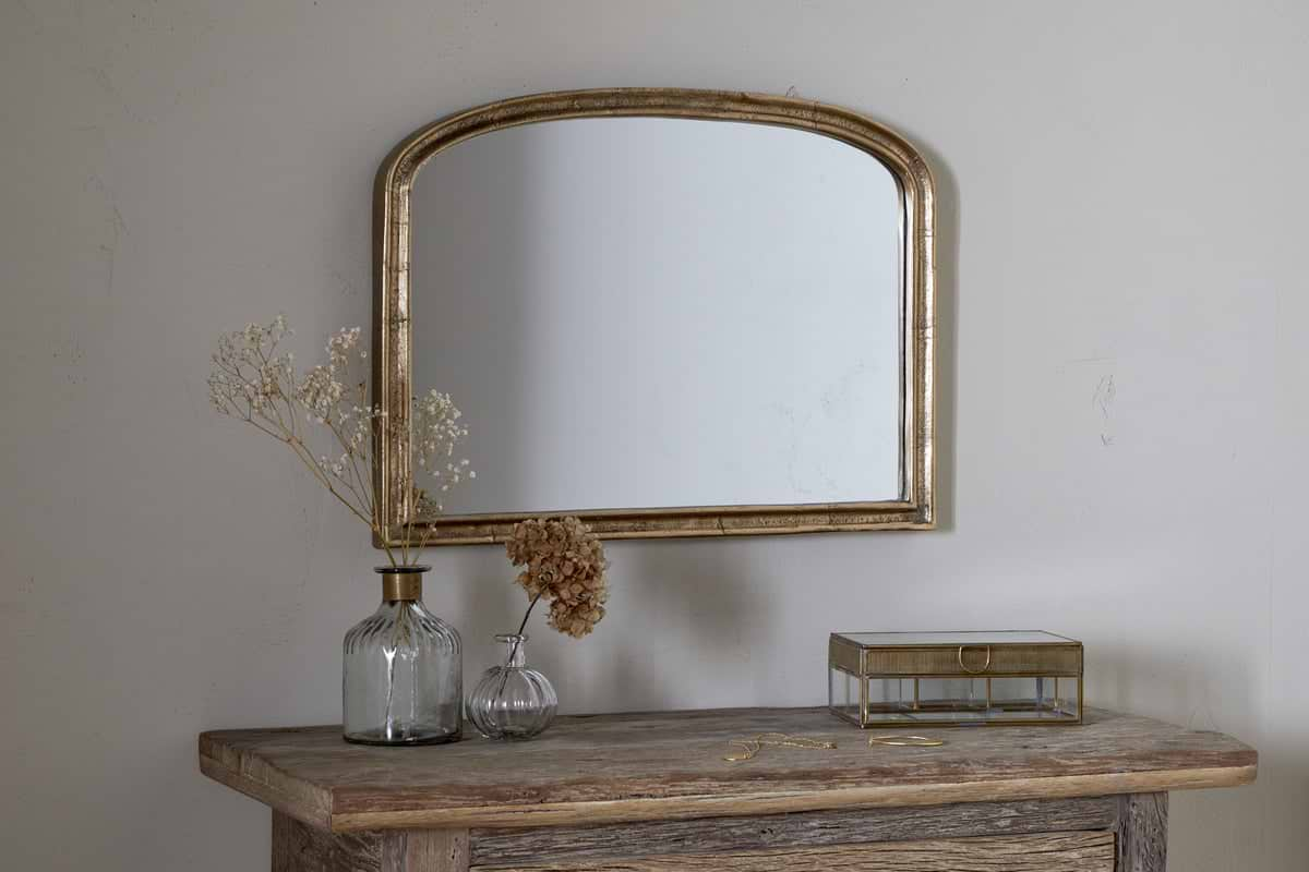
A few Nkuku pieces that keep a small bedroom feeling open and light.
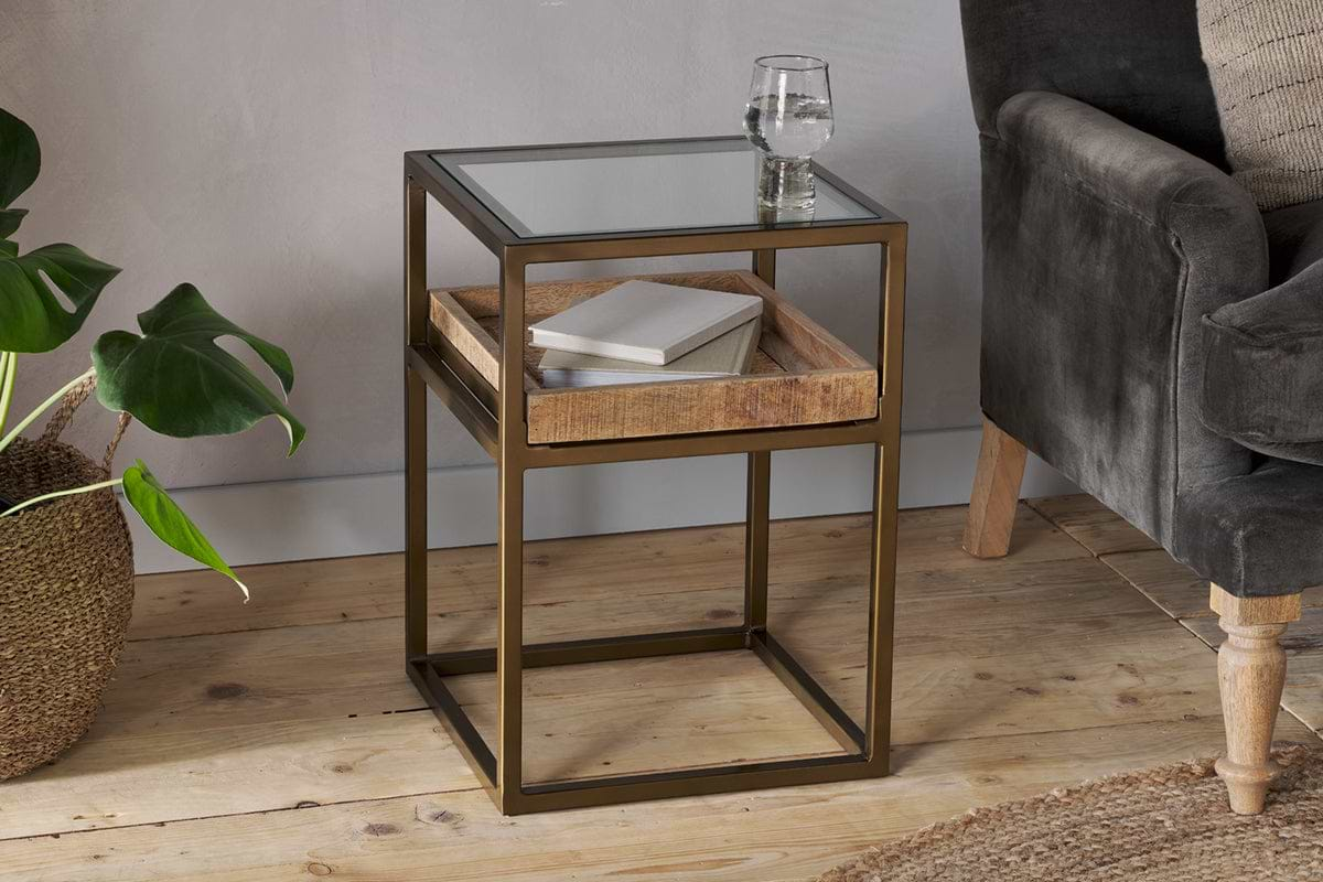
Luzon Side Table
Iron and mango wood with display shelf, small footprint, double function.
View at Nkuku →Some links above are affiliate links. If you buy through them we may earn a small commission at no extra cost to you. We only suggest pieces we think fit a calm, lived-in home.
Free guide
The Calm Shelf
12 styling ideas to help you compose calm, balanced shelves in natural texture homes.