
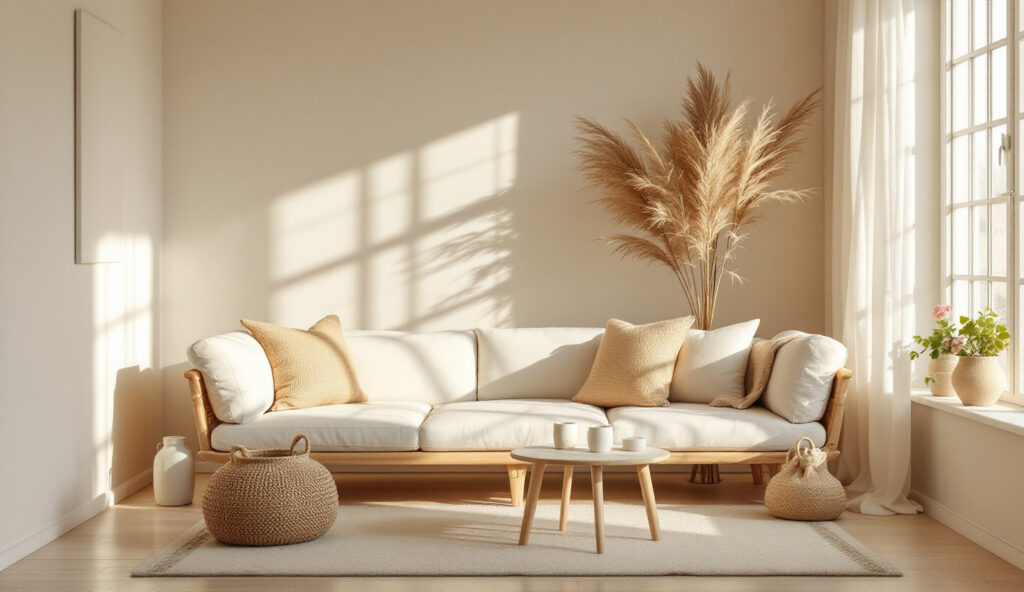
In many homes, a south-facing bedroom is filled with light, but finding the right colours for these rooms can be difficult. The main problem is that south facing bedroom colours often look harsh or washed out once the sun is high, which makes the space feel both exposed and flat.
Choosing a palette that fits today’s needs means picking colours that mute the glare, reduce heat, and soften the daylight. This works especially well in bedrooms with big windows when privacy is limited because lighter, matte shades keep the space restful and never harsh.
The short version: The best south facing bedroom colours are soft, muted cool shades that balance strong sunlight and prevent a room from feeling overly bright or warm. Choosing these shades settles the space, evens out intense daylight, and helps the bedroom stay restful year-round.
Key takeaways
- South facing rooms get the most direct, warm light across the day, which changes how colours appear and feel.
- Cool bases such as blue-greys and soft greens keep a sun-drenched bedroom visually calm, not hot or glaring.
- Pale neutrals with a grey or stone undertone absorb excess light better than bright whites or strong yellows.
- Sampling paint on the north wall shows how a shade reacts to all light conditions before you commit to the colour.
- Material textures, linen curtains, cotton throws, help reduce visual noise and soften strong daylight.

How does light change wall colours in a south-facing bedroom?
South facing bedrooms get daylight that is both strong and warm, which can make colours appear more yellow or faded than expected. This means many shades that look good on a chart will read very differently on the wall.
In a sun-filled bedroom, the amount and angle of sunlight can shift the look of a colour through the day. Soft blue walls in the morning may look greenish by late afternoon. Pinks and whites take on a golden glow that can feel too intense by midday.
Paint with a cool base helps prevent the space from feeling overly warm. According to Benjamin Moore, choosing paint colours for a room depends heavily on its direction and the quality of light it receives.
A bare, white-painted wall under this sunlight can look stark. A soft neutral with a hint of stone reads gentler and less echoing. A matte or eggshell finish misses some of the glare that a gloss would catch, making it a better fit by the window or above the bed.
For a small bedroom with one good window, stick with finishes and colours that even out the brightness. The space will feel much more comfortable all day.
Colours to cool a sun-drenched room
The most effective colours for a south-facing bedroom are soft greys, muted greens, and pale blue tones, which calm the direct sunlight and help keep the room feeling restful. These shades absorb more light and reduce glare compared to bright whites or creams.
In a south-facing space, cool shades put a gentle brake on yellow daylight. Furniture and bedding in dusty blue, sage green, or gentle grey help anchor the palette so the room never feels harshly bright.
Strong natural light paired with a warm undertone can make some colours read almost fluorescent. Using muted versions means less risk of ending up with walls that shout rather than soothe.
Compared to vivid whites and golds, blue-based and green-based paints hold their depth instead of turning brash. That’s one reason specific paint colours like Farrow & Ball French Gray and Dulux Heritage Drab are listed as top choices for these rooms.
Applying a soft green or pebble grey to the headboard wall makes a bedroom feel fresher and less overwhelming by afternoon.
Where this works best
Muted, cool palettes are most helpful in rooms that get strong midday and afternoon sun, especially medium-to-small bedrooms with hard flooring or simple window treatments. These colour choices help balance glare and soften edges in the space.
Bedrooms with big windows and few curtains often feel bright enough to seem bare, no matter how much furniture is inside. Cool tones and simple patterns handle that brightness better than strong primary shades. Living with little storage, opting for baskets and natural textures along with the right colour keeps things from getting hot or crowded.
Avoid mixing several bold colours in a bright bedroom; the strong natural light will make them clash rather than blend. Instead, use one soft shade for most surfaces, adding texture and shape with materials like raw linen or clay for balance.
A typical south-facing bedroom with pale oak floors and tan baskets feels less warm when the walls run in a blue-grey or sage green. The result is a space where sunlight is gentler and much easier to live with throughout the day.
Which colours should you avoid in a south-facing bedroom?
Deep reds, orange-based earth tones, and strong yellows often look heavy or brash in south-facing rooms, because sunlight here brings out their most intense side. Choosing milder, cool-based colours creates a steadier, easier-on-the-eye space.
Sunlight streaming through south-facing windows exaggerates warm colours quickly. Reds become more glaring, and yellow-cream can end up looking nearly gold, which makes a small bedroom feel even closer and busier.
Compared to pale blues or muted greens, warm browns and orangey peaches throw back extra heat and look more saturated as the sun moves over the room. Avoid overusing these colours on large surfaces in a bedroom with a lot of sun.
For renters, off-whites with a grey undertone are a safer choice than classic magnolia or yellow-based creams. Opt for cool bases on walls, and keep the strongest colours to a single small detail, like a plant pot or cushion.

Why do blue-greys and muted greens work so well?
Blue-grey and muted green paint colours counteract the golden light typical of south facing bedrooms, so walls read calmer and less yellow. These tones also stay consistent as the sun shifts, making the space feel settled all day long.
Warm sun will hit any surface hard, but greyed-down blues and greens have undertones that absorb a lot of this warmth. These are the colours most often recommended by decorators for sunny rooms, and they fit both classic and simple styles easily.
A pale blue-grey wall behind a bed head softens daylight and keeps bedroom furniture from looking washed out. Unlike a true white or an orange-warm beige, these shades rarely turn stark or harsh by early afternoon.
The lived-in look of blue-greys and gentle greens also hides scuffs better, so these colours are practical for rooms that double as occasional workspaces or have young children. As a result, surfaces and textiles last longer between touch-ups.
Use soft, muted bedding, linen, heavy cotton, or washed percale, in similar shades to carry the palette through. The whole bedroom ends up feeling unhurried and much easier to settle into, even on summer afternoons.
How to test and choose your final paint colour
Testing a sample pot directly on a bedroom wall, especially the north wall, is the only accurate way to see how a colour shifts with changing light in a south facing bedroom. Sampling avoids surprises when the paint is dry.
Bedrooms change character fast as the sun moves. A sample pot painted on one wall, ideally the north wall, which gets less direct sun, lets you watch the colour at different times across the day. This is the simplest, most reliable filter for picking shades.
Compared to relying on a paint chip or an online swatch, actually seeing the shade in place shows how undertones read in both daylight and artificial light. According to Decorating Centre Online, south facing rooms get the most direct, warm light throughout the day, which makes accurate testing essential.
Most sample pots are affordable and cover a patch about the size of a pillow. Paint one area near a window and another nearer the floor for the best view. Wait for both morning and late afternoon sun before deciding.
For a small bedroom, avoid committing to a colour until you’ve checked that it still looks good with closed curtains, too. The extra step is worth it.
Styling and placement
Soft fabrics, simple patterns, and matte textures work best with calm palettes in a south facing bedroom, because they prevent the space from feeling busy or cold. Placement matters, anchor furniture away from the harshest sun to keep the mood gentle.
Furnishing a sun-washed bedroom is as much about what you leave out as what you bring in. If the walls are a muted cool colour, bedding in a single deeper tone and a plain linen curtain block direct glare without adding weight. A woven basket or two not only gives storage, but the texture breaks up wide, light walls.
Too much glass or chrome reads colder than ceramic or oiled wood. Instead of shiny surfaces, use a clay lamp, a smooth natural rug, and organic shapes in a dull finish. These hold the line against both visual noise and sunlight bouncing around.
Quick calm checklist:
- Choose matte paint finishes, avoid gloss or high shine.
- Limit the palette to two or three connected colours, with one main neutral.
- Use real linen or washed cotton for bedding and curtains, to soften the look.
- Space furniture so nothing crowds the window or blocks natural light.
- Add one tactile accent, like a rattan chair or stone bowl, to ground the look.
In apartments with low storage, a simple bench under the window or a tall plant in a rough clay pot fills space without making it feel dense.
Many people notice something is off in their south-facing bedroom right after midday, the light feels too sharp, surfaces start looking yellow, and even tidy rooms begin to look overly exposed. There’s often a sense that the room is bright but not restful, no matter how clean or ordered it is.
The shift comes from narrowing down to just one soft, cool-based colour for the walls, and echoing that with texture instead of extra pattern or tone. When the daylight settles, the whole room pulls together without needing more stuff or extra technology.
Most homes struggle at this point: picking warm whites or bold hues to “brighten up” a naturally sunny room only makes it feel too intense by afternoon. The result is a space that’s hard to relax in and impossible to keep looking finished, sunlight turns everything yellow or stark, especially with the wrong wall colour.
Once you switch to cool, muted wall colours and add natural, matte texture, the bedroom feels better every hour, not just at dusk.
Save this idea for later.
Colours and finishes that suit sun-filled bedrooms
From reviewing both decorator advice and buyer reviews, the simplest solutions last longest in sun-filled bedrooms. Matte finishes get recommended again and again for walls near strong windows, because they don’t reflect extra glare the way a glossy finish will. Pale wood furniture works well in these spaces and rarely shows sun-fading as quickly as darker stains do.
Stone and cream neutrals hold up because they counterbalance strong yellows from the sun. Decorators consistently note that if a colour looks just right on a sample card, it may still read much warmer or brighter in real life, sample testing on the wall is treated as non-negotiable. Simple, honest materials last best, both in look and in how they age.
Mara, Loom & Glow
Common questions
How does light change wall colours in a south-facing bedroom?
South facing bedrooms get daylight that is both strong and warm, which can make colours appear more yellow or faded than expected. This means many shades that look good on a chart will read very differently on the wall. In a sun-filled bedroom, the amount and angle of sunlight can shift the look of a colour through the day.
Which colours should you avoid in a south-facing bedroom?
Deep reds, orange-based earth tones, and strong yellows often look heavy or brash in south-facing rooms, because sunlight here brings out their most intense side. Choosing milder, cool-based colours creates a steadier, easier-on-the-eye space.
Explore more calm combinations inside our Shop The Look .
Shop the Look
A few Nkuku pieces that suit a calm, sun-washed bedroom.
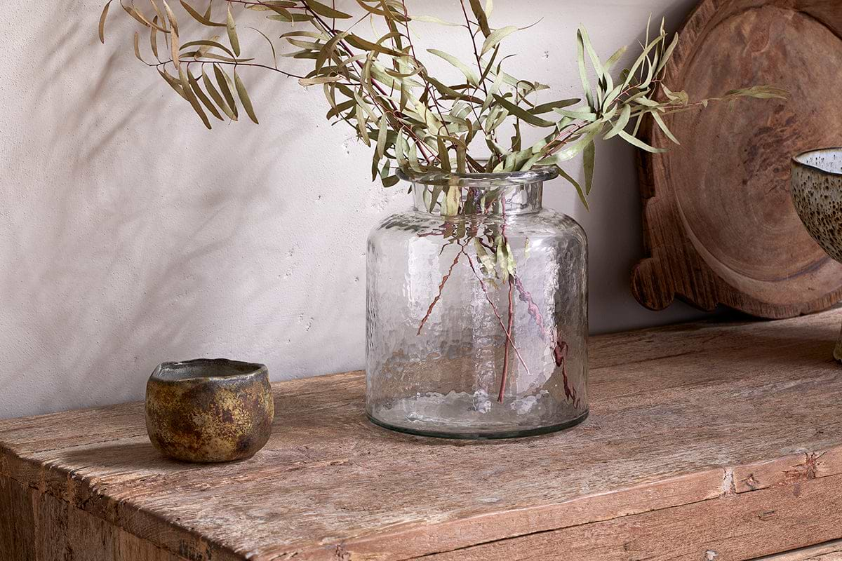
Akra Recycled Glass Vase
Clear cylindrical glass, pairs with stems or sits empty as a quiet accent.
View at Nkuku →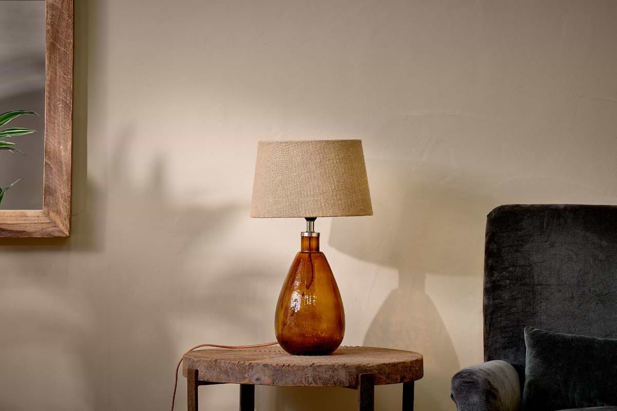
Some links above are affiliate links. If you buy through them we may earn a small commission at no extra cost to you. We only suggest pieces we think fit a calm, lived-in home.
Free guide
The Calm Shelf
12 styling ideas to help you compose calm, balanced shelves in natural texture homes.