

Media wall shelf decor often causes frustration in living rooms. The television pulls focus, while open shelves quickly become busy with mismatched objects or stay bare and cold. Screens, cables, and clutter compete for attention, making it tough to create balance.
This guide gives you a clear set of steps to fix that feeling. You’ll learn which pieces to choose, what to remove, and how to place objects to cut down on visual stress. This works especially well in a small apartment living room when the media wall is the main anchor because it helps every item on the shelf work together, not against each other.
The short version: Resolving media wall shelf decor means using one textured, natural anchor and a clear grouping formula to avoid competing with the television. Focused choices and less mixing mean less clutter, calmer shelves, and a space that feels finished without visual stress.
Key takeaways
- A media wall shelf looks best when each shelf has just one clear focal object anchored near the screen.
- Grouping by texture (not colour) reduces visual noise and keeps shelves calm in multifunction living rooms.
- The seven-item formula helps avoid both clutter and blank space on open shelving.
- Most floating shelves sit about 25-30 cm deep, which shapes what objects fit and how they sit on display.
- Media wall panelling and cable management keep both shelves and screens tidy, according to Panelling Direct.

The problem with media wall shelves (and the quiet solution)
The biggest issue with media wall shelf decor is letting the screen and shelf objects compete for attention. A single clear anchor piece quiets that conflict and simplifies the view.
Many living rooms have a built-in media wall that holds both the television and a few open shelves. Adding lots of small items makes the area feel crowded, while leaving the shelves bare makes the wall look unfinished. Both extremes pull the eye in awkward directions and add to the sense of mess.
The main cause is having two main focal points fighting each other: the television’s black rectangle and a busy shelf just above or beside it. Instead of working together, the objects fight for attention each time you walk into the room. This makes the space feel busier than it is.
A clear solution is to place one natural-textured object, like a large bowl, a single wood sculpture, or a woven tray, next to the screen. Unlike a row of small trinkets, this focuses the eye and reduces competition. The shelf starts to feel on purpose, not accidental.
A media wall will always pull the gaze first, but a single, grounded object holds its own and won’t fade into the background. If you use a plant, pick a neutral pot and let the leaves fall naturally. A big clay bowl works better than three tiny frames. Use weight and texture instead of bright color or patterns if the screen is on all day.
One rule of thumb: “A media wall shelf works best when the main focus is either the screen or a single, tactile object.” For rooms with built-in shelves, this small shift makes a big difference.
Most people realise something is off when the media wall feels unsettled, neither styled nor clear. The fix is to remove extras and keep only what makes sense right next to the screen.
Where this works best
Media wall shelf decor works best in living rooms and open-plan spaces where the television is visible from many angles. Fewer objects mean less distraction and more focus for both screens and shelves.
Small apartments, open-plan living rooms, and any home with built-in TV shelving benefit from a focused approach. Living rooms usually have competing demands, entertainment, display, and sometimes storage all on one wall. A calm shelf plan keeps these jobs from crashing into each other.
Near the television, practical placement matters. It can be hard to find objects that don’t reflect the screen’s light or create glare. A matte finish or natural basket sits quietly in the corner, while a shiny tray or mirrored frame brings in extra flashes that aren’t needed.
Avoid loading up the shelf with too many plant pots, photo frames, or small trinkets. This is the most common mismatch. Shelves meant for display become messy when filled up like extra storage. One solid, bigger object or a grounded vessel keeps the space clear and simple.
Most homes built in the last few years now include some form of media wall, usually with shallow, floating shelves. According to Panelling Direct, adding wall panelling behind shelves increases texture and provides a creative base for display, making this approach especially useful where the wall surface looks flat or bland.
This method works best when the distance between the screen and the shelves is small, as it unifies the whole feature wall. The result is a living space that feels settled and easy to use, not visually scattered.
What to put on media wall shelves: the 7-item guide
The simplest formula for media wall shelf decor is choosing just one from each essential group, texture, books, wood or stone, plant, art, scent, story object, to guide your choices and avoid excess.
Open shelves next to a television can quickly turn into a holding zone for odds and ends. Instead, use this list to guide every decision. Start with one item from each group, then remove anything that repeats a material or color.
1. One textured vessel (not three small ones): Choose a jute basket, rough ceramic pot, or low woven tray. This brings natural fiber and depth, unlike glossy or plastic containers that can clash with the screen’s finish.
2. A stack of books with intentional spines: Pick muted tones or plain covers. Books with shiny, loud jackets distract from the shelf itself. A small pile (two or three) gives structure and a place to layer a smaller item, like a candle or a stone.
3. A single piece of sculptural wood or stone: Set one driftwood branch, hand-carved box, or smooth river rock on the shelf. Unlike multiple small statues, these shapes add grounding weight and feel finished.
4. A trailing plant in a neutral pot: Use a pothos or string-of-pearls in clay or matte white. This softens the hard lines of the screen. The pot’s texture matters more than color, a rough finish feels more stable than glossy.
5. A small, framed artwork or textile: Choose a single piece that fits under the shelf, not leaning up against the screen. Fabric or print frames work best to break up the vertical flatness. A living room shelf looks warmer with tactile art.
6. A candle or diffuser for scent and soft light: Pick a mellow, woody or herbal scent. The goal here is to add a gentle touch for evenings, nothing overpowering to distract from the screen.
7. A personal object that tells a story: One heirloom, travel find, or pottery piece is enough. Unlike stacking several souvenirs, this lets one memory show through without crowding everything else.
Group only a few objects per shelf. Most floating shelves are about 25-30 cm deep, giving you just enough space for these items to sit forward instead of pressed against the back wall.
If you want to see what other people put on their media wall shelves, Etsy UK has over a thousand ideas in their current listings.
How do you stop shelves from looking cluttered?
To cut shelf clutter, use a strict limit, one big object or two grouped by height and texture. Remove anything that repeats color, shape, or shine already found nearby.
Shelves right beside the TV often fall victim to “just one more thing.” Those last few objects, an extra candle, yet another piece of pottery, are usually what sends the shelf from balanced to busy.
Unlike a coffee table or a corner console, shelves at eye-level next to a screen show off every object, every day. Each repeated finish or color shouts for attention. Instead of lots of small matches, pick one statement object. A pale clay vase with a soft curve draws the eye without creating clutter.
The quickest fix is to subtract, not add. Start by clearing everything, then put back only the things with sensible contrasts, a light stone against a darker wall, a round bowl to break up a line of books. Always leave breathing room between objects. Empty space feels calm, not unfinished, when placed with purpose.
Unlike closed cabinets, open shelves can’t hide disorder. Grouping by a single material, like all natural woods, works better than mixing glass, metal, and plastic. The difference is immediate: the shelf quiets, the eye relaxes, nothing jumps out.
One last check before calling it done: step back and see if any item pulls the eye up away from the screen for no good reason. If so, swap it for something quieter or set it aside.

Styling and placement
The smartest way to style media wall shelves is placing the boldest object closest to the television, and letting space remain around everything else.
Shelves can be high, low, left, or right of a screen. The best move is to tie shelf contents to the TV’s visual weight, not clash with it. Place your largest object either directly beside or just below the screen; work outwards from there.
Backing the shelving with panelling adds quiet depth, especially on plain walls. Panelling also hides small wall flaws and stops objects from floating awkwardly. Panels in natural hues ground displays better than paint, according to Panelling Direct.
Avoid placing two or more strong colors side by side. Mixed palettes create a sense of chaos, especially above the television. Use quiet tones, clay, wood, or soft green, to let the screen and shelves blend instead of fight.
Quick calm checklist:
- Use only natural, matte materials (wood, clay, basket, stone).
- Leave empty space on at least half the shelf’s length.
- Keep no more than one “stand out” color, and pair with two quiet neutrals.
- Place the largest piece closest to the screen for visual balance.
- Repeat one texture (such as woven or raw ceramic) across all objects.
The clearest difference is that the eye now rests beside the screen, not bouncing from one object to the next. This feels easier to live with and resets the energy of the whole wall.
What’s the rule of three for shelf styling?
The rule of three means grouping shelf items in odd numbers for a more natural look, usually one bold, one medium, one small object, never three of the same kind.
In media wall shelf decor, the rule of three steers you away from rigid, matching pairs or scattered, even clusters. Place one anchor (a basket or large vase), then add one smaller object (book stack or art) and, if needed, one piece with a contrasting height (plant or rock).
Unlike even-numbered groupings, which look forced, odd numbers give the eye a starting point, a mid-stop, and an end. On shelves flanking a TV, three items set in descending size from screen inward creates a relaxed, finished look.
The vertical, horizontal, and diagonal rules are a natural extension. If arranging three pieces, use one tall (vessel), one wide (book stack), and one lower, unique piece (candle or bowl). Place the tallest furthest from the screen if you want to quiet the shelf; closest, for more drama.
| Grouping | Best For | Effect |
|---|---|---|
| Single Statement | Minimal setups | Clear, focused, low visual noise |
| Odd Number (3) | Balanced, layered shelves | Relaxed, natural, softens sharp lines |
| Even Number (2 or 4) | Symmetrical frames | Formal, sometimes stiff or forced |
Try this first on the most visible shelf next to your media wall. The area feels more intentional and easier to keep styled over time.
How to use texture and material to reduce visual noise
The easiest way to quiet shelf decor is repeating one natural texture, like basket, clay, or unglazed wood, across every object, instead of mixing shiny and dull finishes together.
Open shelving beside the TV often looks choppy when materials fight: glass next to brass, metal with wicker, pottery mixed with glossy plastic. The simple swap is to pick one main material, or at most two, and let them run the length of the display.
Unlike matching by color, grouping by feel gives each shelf depth and calmness that lasts. A shelf lined with woven baskets feels grounded, neutral pottery blends into the background, and wooden boxes absorb excess light. You’ll notice how matte finishes take glare off the wall, while shiny pieces double the distractions.
A plant in a ceramic pot, a linen book spine, or an oak frame all absorb and scatter light. In rooms with side windows or evening lamplight, these textures soften the reflection from the screen. Choosing unpolished finishes and solid shapes helps keep things visually steady.
The main reason this works is that the eye reads texture as one unit, while a mix of metals, glass, and plastic splits it up. Texture first, color second, keeps the shelves steady without trying to match every shade.
To keep the shelf from sliding toward monotony, swap out one item each season, a spring ceramic changes for a darker wood in autumn. The rest stays in place, so styling never becomes a chore.
Try this on the lowest shelf where it catches the least sun. The area becomes softer, the display feels quieter, and the wall feels more complete with less effort.
Sometimes the homeowner stands back after styling and feels that something is “off.” The shelf may be tidy, but the screen still grabs all the focus or, worse, an odd mix of objects creates a heavy look that never quite settles. That’s because the wrong balance, color grouping, or too many small pieces quickly build visual clutter. Picking one clear anchor and then editing tightly is what turns clutter into calm.
Most media walls start out with too many objects or too much sameness. Shelves either disappear into a line of forgettable decor or fight every day to hold their own.
Once you make these small changes, anchoring to one strong piece, limiting the palette, and sticking to one texture at a time, the whole wall feels lighter and easier to live with.
Overfilling shelves with random bits or mixing bright, shiny objects is a typical mistake. Even when the space is technically neat, it can still feel busy or out of balance, all day long. The room is harder to relax in and looks unfinished at a glance.
With a calm shelf plan, the area near the screen feels less messy and much easier to style. Household rhythm shifts; dusting and re-arranging become quick tasks since every object has a reason to be there.
Save this idea for later.
What tends to hold up with media wall shelf styling
Reviewing dozens of client before-and-afters and design guides, one thing holds up: shelves by the TV need fewer, stronger pieces and a more consistent surface texture than shelves in other parts of the home. Matte finishes get recommended again and again for shelves near windows, because they don’t catch glare the way a glossy tray does. Reviewers often mention that using a single woven basket or raw pottery bowl near the television makes the shelf feel both calmer and easier to care for.
Another pattern: the homes people liked best rarely matched colors across the TV wall, texture did the lifting, not paint swatches. This applies whether you lean maximalist or minimalist. What endures is subtle repetition and simple, tactile materials over clutter and visual noise.
, Mara, Loom & Glow
Common questions
What are the latest trends in wall shelves?
Neutral materials like wood and stone, matte finishes, and woven baskets are the top trends for wall shelves now. People are choosing fewer, bigger objects and grouping by texture rather than matching colors. Natural shapes like curved bowls and soft, trailing plants are often used for gentle interest without creating clutter.
What is the rule of three for shelves?
The rule of three means styling shelves with groups of odd-numbered objects, especially three items of varying shapes or sizes. The setup feels balanced without being stiff or overly matched. Start with a big object, add a medium and a small item, letting space remain between for ease and calm.
How can you dress a media wall on a budget?
Start with a single woven basket or matte ceramic from a thrift shop, then add a used hardcover book with a neutral spine. Plants from the supermarket and family photos in simple frames also help. Many options, like upcycling, DIY paint, or shopping secondhand, keep the look calm and affordable.
Are media walls still a fashionable choice for living rooms?
Media walls remain a practical and fashionable choice for modern living rooms, as confirmed by many home design sites. They provide both storage and display in a single area. The trend is toward subtle panelled walls, hidden cables, and well-chosen shelving, making them easy to adapt over time.
Explore more calm combinations inside our Shop The Look .
Shop the Look
A small edit of Nkuku vases and a shelf that suit a carefully styled media wall.
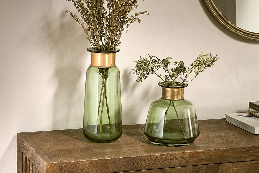
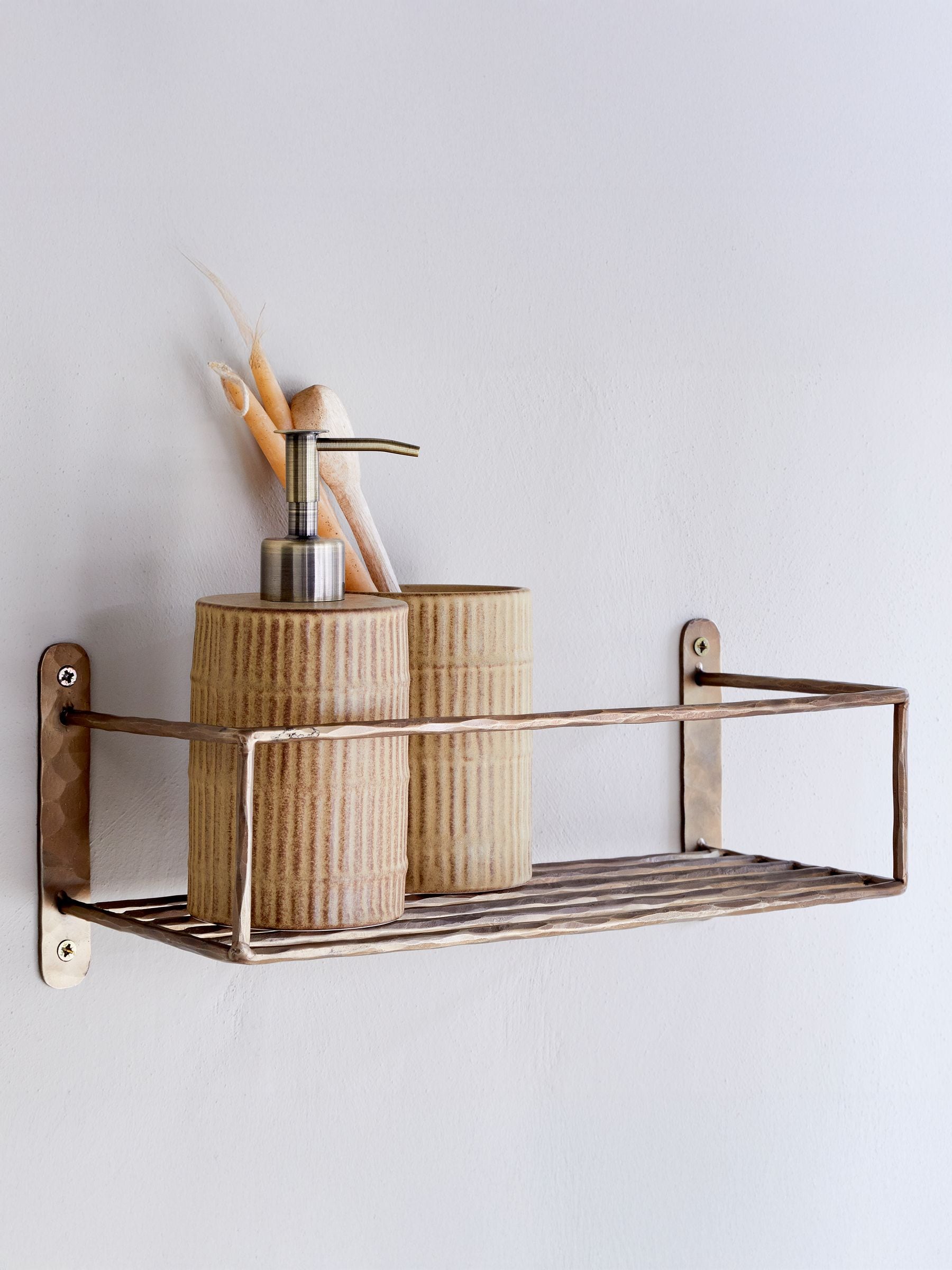
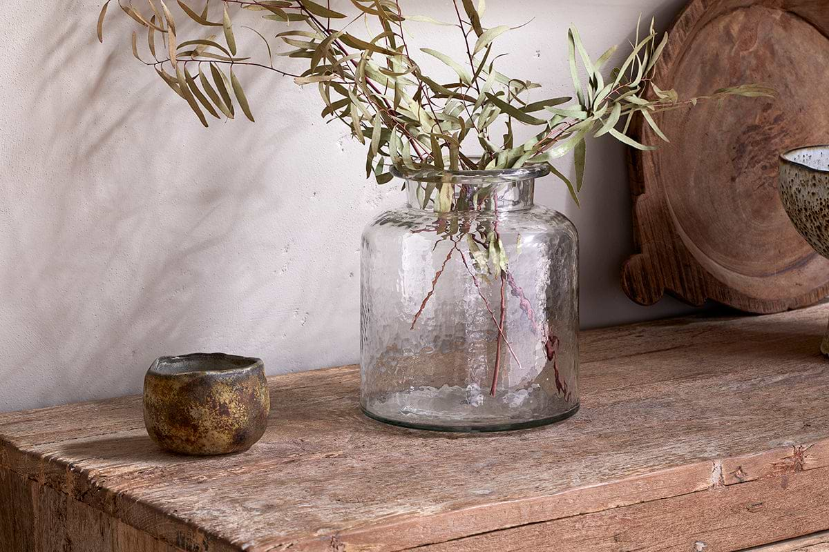
Akra Recycled Glass Vase
Clear cylindrical glass, pairs with stems or sits empty as a quiet accent.
View at Nkuku →Some links above are affiliate links. If you buy through them we may earn a small commission at no extra cost to you. We only suggest pieces we think fit a calm, lived-in home.
Free guide
The Calm Shelf
12 styling ideas to help you compose calm, balanced shelves in natural texture homes.