

Most fall decor is designed for big, bright rooms with lots of open shelves, so it often ends up crowding small flats or busy family spaces. In real homes, bulky throws pile up, extra cushions leave nowhere to sit, and shop-bought pumpkins fill every corner until the room feels heavy. Clutter makes it hard to relax, especially when the daylight gets shorter and you need your home to work as both a retreat and a workspace.
The best way to keep things calm is to remove a few tired pieces, then add just enough to catch the light and soften any hard lines. This works especially well in a shared living room when the sofa faces the TV and the sideboard sits under a window, because the eye gets a clear resting spot and surfaces stay usable. Today, you’ll learn how to do a simple seasonal edit, so your rooms feel inviting without losing space or adding mess.
The short version: The calmest fall decor relies on replacing, not piling, so surfaces stay clear and each room feels soft without clutter. Start with a small edit, use natural textures, and limit your colour palette for spaces that look finished and easy to live in.
Key takeaways
- Simple fall decor works best when you focus on three main areas and keep the rest plain.
- Replacing everyday objects with seasonal ones keeps rooms tidy and makes each accent feel more special.
- Natural materials like linen, jute, and clay add warmth without looking busy.
- A useful rule is to leave at least one empty spot on every styled surface to avoid clutter, according to Ivy Grey Interiors.
- Grouping small seasonal pieces together gives more impact than scattering them singly across a room.

Why does autumn decorating often feel cluttered?
Autumn decorating feels cluttered fast because most people add new items without taking old ones away, filling every open spot. Choosing what to remove is as important as what you bring in.
Often, shelving and coffee tables fill up with tealight holders, small pumpkins, fake foliage, and thick throws all at once. Over time, nothing stands out, and the eye jumps from one thing to the next until the room feels fussy. Even a beautiful object can add to the feeling if there’s nowhere for the eye to rest.
Instead of layering more on top, swap out older pieces, replace a summer vase with a clay bowl, or put away a pale cushion to make space for a waffle-texture one. A bare mantel can read colder than one with a single lantern and a sprig of dried beech, but too many accents weigh down the look.
Balancing a few seasonal textures with enough open surface helps a family room stay flexible for everything from reading to remote work. According to Ivy Grey Interiors, leaving at least one spot clear on every styled surface helps the space feel calm and not overdone. Placing a thick knitted pumpkin on the sideboard looks warm, but only if the rest of the surface isn’t already busy.
Rooms with open shelving or large coffee tables often collect seasonal clutter fastest. It helps to focus on editing what you already have instead of spreading more pumpkins everywhere.
Start with a seasonal edit, not a shopping spree
A seasonal edit means removing some existing decor before adding autumn touches, so every new piece has space to stand out. This keeps your room from looking crowded or unfinished.
Many people begin fall decorating by buying new accessories and placing them around the room without clearing away earlier ones. This habit makes surfaces look cluttered and blocks the quiet feeling that autumn textures can bring. In a small flat, too many layers can even make it harder to use your space efficiently.
Instead, empty one or two key areas first: the entryway table or the living room shelf are good places to start. Removing a bright summer print or tucking away extra ceramics gives a clean foundation. The result is more satisfying because it looks like a calm shift, not just another stack of objects.
The ‘replace rather than add’ guideline, as shared by Ivy Grey Interiors, keeps rooms practical and tidy. For renters especially, this avoids extra holes in the wall or tripping over baskets. Taking one throw away before folding a new ochre blanket on the sofa lets the fabric stand out and leaves space to relax.
Choosing what to remove is just as key as selecting what to add. Doing a quick edit before reaching for new decorations helps your new fall decor feel gentle and supportive, not overwhelming.
Where this works best
Focusing your autumn decor on living rooms, entryways, and open-plan kitchens gives the most impact, especially where daily routines cross over. These areas benefit most because they get used all day and anchor the mood of the rest of the home.
Living rooms that double as workspaces or host more than one person need a clear surface to stay comfortable. Entryway tables gather keys, mail, and bags, a wreath or foliage-filled vase can soften these edges without blocking access. Kitchens with only one free worktop look better with a single pumpkin or a clay mug set; too many pieces here make cooking or making tea more complicated.
Avoid scattering autumn accents into bedrooms or bathrooms if the space is tight or full already. A sideboard weighed down by too many bowls and dried branches loses its simplicity; one arrangement in the living area feels more intentional than five small ones in every corner. Unlike a shop display, a home needs empty spaces to signal rest and function.
For most flats with small entryways or galley kitchens, editing to just two or three spots is enough. This keeps the rest of the home open for everyday use, letting you highlight the season without making the space feel smaller.
How do you pick a fall palette that feels calm?
A calm fall palette uses warm neutrals and muted greens, browns, or ochre, and limits the number of dominant colours. This makes new seasonal accents feel connected to your existing space.
Renter-friendly spaces with beige walls or grey sofas work especially well with a few soft, earthy shades. Choosing a single warm neutral as your base, such as camel or clay, helps autumn accents from pumpkins to throws blend in without shouting. Adding just one muted secondary colour, like olive or dusty rust, creates interest without making the room busy.

Many guides suggest using only three main colours for a seasonal look: this helps patterned or bold pieces feel more intentional and less like leftovers. Compared to a bright orange or dark green, a softer wheat or gentle olive sits quietly next to cream ceramics and wooden trays.
If your kitchen already has blue or black accents, choosing one element (like a knitted pumpkin or a linen runner) in a similar tone keeps the transition to autumn fresh but familiar. According to Ivy Grey Interiors, focusing on three main areas in a muted palette keeps rooms calm, especially in small homes.
No need to match every cushion or candle. Limiting your tones helps even mismatched pieces feel finished, especially in open-plan or rental spaces with mixed furniture.
Styling and placement
Styling autumn decor works best when you keep surfaces simple, use natural textures, and put statement pieces where they get the most light or traffic. This approach draws attention without getting in the way.
In a living room, putting a rough clay lantern next to a linen cushion on the sofa or arranging a trio of gourds on a coffee table creates focus. A jute basket warms up a shelf, especially if you leave part of the space clear beside it. Edges matter: placing a wreath on the door but keeping the hallway bench open leaves room for bags or boots.
Surface spacing helps the eye, crowded pumpkins or tea lights blend into clutter, but one statement piece on a mostly-empty sideboard looks deliberate. Grouping by texture (ceramic, basket, dried stems) instead of by colour avoids the flatness of mass-produced matching sets. Natural materials absorb and reflect soft light, which helps on cloudy days or in north-facing rooms.
Quick calm checklist:
- Pick two or three natural textures (linen, jute, clay) and repeat them across the space.
- Leave at least one-third of any shelf or table empty, especially if space is tight.
- Limit your palette to three main colours, one neutral, one muted accent, and one deep note.
- Place larger pieces (lantern, basket, foliage vase) where natural light or movement draws attention first.
This approach works well for open shelving, mantelpieces, and hallway tables, the goal is to let each autumn item stand out without fighting for space. For more shelf ideas see shelf styling ideas for practical inspiration.
What makes one statement arrangement work?
A single eye-catching autumn arrangement works because it draws attention and defines the room’s style, while leaving the rest of the space open and usable. Clarity beats quantity for seasonal impact.
A practical example is using a group of dried eucalyptus, a clay bowl of small gourds, or one large pumpkin on a blank coffee table, this sets a visual anchor for the room. Compared to scattering several mini-pumpkins all around, one striking piece gives more focus. Lighting helps: placing a lantern or tealight holder alongside draws out the different textures as the day changes.
The trick is to frame this display with empty space on both sides, or underneath for shelves, so nothing competes with it. According to Ivy Grey Interiors, focusing on one standout area makes the room feel planned and easy to use.
Unlike rooms filled with small accents, a single strong arrangement doesn’t crowd out everyday living, there’s still space to eat, work, or relax. For mantel inspiration, try mantel decor as a starting point for simple groupings.
A statement arrangement works best on a central surface, a coffee table, mantel, or shelf that everyone passes or sees when entering the room. Low-maintenance materials like dried foliage or a heavy bowl stand up to daily use, making this approach easy to keep up through the season.
How do you group small autumn items without mess?
Grouping small autumn decorations together creates a stronger impression and keeps surfaces tidy, according to Ivy Grey Interiors. Scattered items look like clutter, but combining them makes the overall effect feel intentional.
A kitchen sideboard often ends up with loose tealights, acorns, or mini pumpkins spread out awkwardly. Placing them on a tray, in a shallow basket, or grouping three to five pieces close together is a simple trick that works for both large and small spaces. Unlike spreading decorations across every open spot, grouping gives the eye a place to pause.
Using a solid tray or bowl contains the loose items, which helps when cleaning or moving things for everyday use. A narrow hallway benefits from just one cluster of textures (wool, clay, dried seed heads) by the door rather than trying to fill every ledge. Compared to randomly dotted accents, a group with different heights and textures draws attention without noise.
| Approach | Visual impact | Practical effect |
|---|---|---|
| Scattered singles | Looks busy, hard to focus | Tough to clean, room feels smaller |
| Grouped in one spot | Clear focal point, feels calm | Easy to tidy, space feels open |
Placing grouped decor near a main path or sink keeps the look fresh but lets you use the space. For small rooms and rentals, this approach trades clutter for comfort and presence.
There’s a pause, often while you tidy or sit down at the end of the day, when something just feels unsettled, like the room has too many things competing for attention, or you can’t find a clear spot for your tea. Most homes fall into this trap during seasonal refreshes because it’s easy to add but harder to edit, and the result is a sense of restlessness, not warmth. It matters now because the shortest days need the most comfort.
Choosing to swap out just one or two things and group accents safely on one surface calms the room and keeps it practical every day.
Save this idea for later.
Simple approaches that still work year after year
Natural finishes wear gracefully: jute baskets, cotton throws, and clay bowls do not date quickly or show every mark. Reviewers consistently mention that soft, warm materials do not feel out of place as the season changes, they look cosy in October and still welcome in February. The rule decorators most often recommend is to focus on one main surface per room, letting even budget-friendly autumn finds look more expensive by keeping the area around them clear.
Matte and tactile finishes (like linen and wool) get favourable comments for not showing stains or pet hair, especially on pieces that see daily use. Heavy glass lanterns or flat-woven rugs also handle daily life and autumn boots gracefully, compared to slippery, glossy objects that need constant straightening. Over time, the simplest autumn decor, one grouped arrangement, a limited palette, and empty space around each object, proves the most satisfying.
Mara, Loom & Glow
Common questions
How do I start fall decor in a small flat?
Start with one surface, not the whole room. Pick the coffee table, a shelf or the entryway and swap two or three items for autumn versions: a linen runner, a small pumpkin, a matte ceramic candle holder. In a small flat a single styled area reads as intentional, while decorating everywhere at once reads as clutter. Keep the rest of the room as it is.
What is the cheapest way to make a room feel autumnal?
Change texture and colour before buying anything new. Move an existing throw and cushion into warmer tones, put branches or dried leaves from a walk in a plain glass jar, and switch your lamps to warm white bulbs. These moves cost almost nothing and shift the whole mood. Spend only on one small piece you will keep beyond the season.
Which colours work for calm autumn decor?
Warm neutrals do most of the work: oat, clay, rust and soft brown. Add one muted green or olive for a natural feel, then stop at two or three colours in total. Bright orange and heavy reds read loud in a small space, so keep them as small accents at most. Pair the palette with wood, linen and unglazed ceramic for a calm effect.
Explore more calm combinations inside our Shop The Look .
Shop the Look
A few understated Nkuku pieces that bring warmth and a sense of calm to an autumn edit.
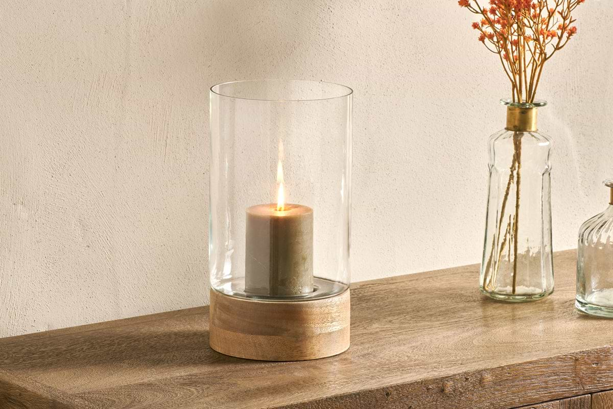
Idha Hurricane Lantern
Straight-sided glass, for candles indoors or sheltered patios.
View at Nkuku →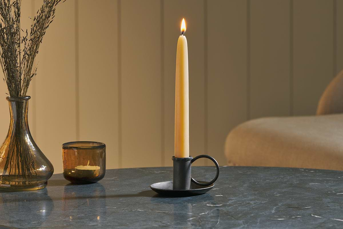
Amri Iron Candlestick
Slender iron with quiet presence, works alone or in clusters of three.
View at Nkuku →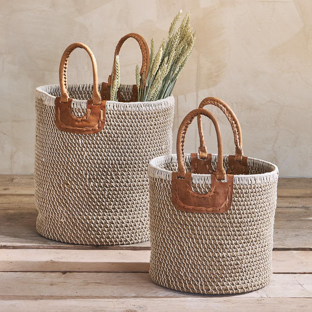
Indra Coil Basket
Natural coil weave, neat enough to leave out, large enough to hide clutter.
View at Nkuku →Some links above are affiliate links. If you buy through them we may earn a small commission at no extra cost to you. We only suggest pieces we think fit a calm, lived-in home.
Free guide
The Calm Shelf
12 styling ideas to help you compose calm, balanced shelves in natural texture homes.