

Most homes collect piles—books, magazines, random small things—leaving many searching for fresh ideas for decorating bookshelves that don’t slide into mess or matchy sameness. A shelf can feel busy and uneven when natural materials are mixed at random or stacked all in a row.
Today you’ll see how to group, pare down, and place each object so your bookshelf acts as a calm backdrop, not a source of visual noise. This works especially well in an open-plan living room with limited wall storage when you want a sense of order without making anything feel boxed-in.
The short version: The most reliable ideas for decorating bookshelves start by creating visual balance with groupings, space, and repeating natural textures for a loose but calm look. Staggered heights, one material per row, and large open gaps stop a shelf from reading chaotic. Any shelf layout feels easier once each choice follows these quiet, practical rules.
Key takeaways
- A bookshelf looks styled instead of stuffed when groupings leave clear negative space around each set.
- The vignette rule is to arrange objects by height, then color, for relaxed but tidy groupings.
- Layering just one material type across the shelf repeats a calm visual thread with less noise.
- Books work best as a foundation, not the entire shelf; adding organic home decor adds softness and texture.
- Most floating shelves sit roughly a hand-width deep for flexible stacking and spacing.
- What makes a bookshelf feel styled instead of stuffed?
- The vignette rule: how many objects belong in one grouping
- How do you layer natural materials for texture without clutter?
- Where this works best
- Styling and placement
- Why does negative space matter so much?
- How can books be used as a design layer, not just storage?

What makes a bookshelf feel styled instead of stuffed?
A bookshelf looks styled instead of stuffed when objects are grouped with open space between each set, rather than lining everything edge to edge. Spacing items apart helps the shelf feel lighter, even in a small apartment.
In any room, crammed shelves can make the whole wall feel restless or weighed down. This normally happens when every book and object fills each section, leaving no room to breathe. Even the prettiest pieces get lost or blend together.
The simple fix is to group things in threes, or sometimes fives, and leave a clear gap before the next cluster. A stack of two stoneware bowls beside a short rattan basket reads calmer than a full shelf of souvenirs. According to a common styling principle, groupings of objects in odd numbers with varied heights help the eye rest.
A bare shelf without this structure reads colder than a shelf where groupings create pauses for the eye. Arranging by clusters works even better with a mix of shapes and a gap left along the back row. Place groupings on a long, open shelf in the living room for a look that feels deliberate but light.
The vignette rule: how many objects belong in one grouping
Bookshelf vignettes work best with two to five objects, always with staggered heights and a mix of finishes. More than this, and groups start to compete for attention.
Few things break a bookshelf’s calm faster than too many similar objects competing for spotlights. Line up five matching vases or a string of souvenirs, and the shelf starts to feel like a trophy rack, not an inviting corner.
Follow the vignette rule: pair a tall item (like a trailing plant or upright book) with a medium accent and one smaller piece. As shared by a simple bookshelf formula, this balanced trio forms a pocket of interest and leaves open space around it. Two objects feel too lonely; too many lose the point.
Unlike busy displays, these groupings welcome the rest of the room into view. Place vignettes at either end of a shelf or offset from center for a relaxed but grounded look. This works especially well on taller built-ins or a floating shelf over a desk, where the eye skips naturally along each shelf.
How do you layer natural materials for texture without clutter?
Layering natural materials like jute, wood, and linen adds texture if you repeat one finish across shelves and break up similar tones. Grouped in this way, each piece stands out rather than blending into background noise.
Mixing natural material home decor can work both for and against you. If every shelf holds a different natural shade—one bamboo, one pine, another in pale jute—the result can become messy. Instead, echo one tone (such as pale oak or dark rattan) on every shelf, and let other pieces play a quiet supporting role.
Repeat that material once per shelf or per row. A wooden bowl up top pulls a thread through to a low bench with wooden legs. Place a jute basket or two, then add only one other textured piece like a linen cloth or soft matte ceramic. The best capsule homes rarely show more than three types of natural material in one view.
Compared to shelves filled with just books or just one type of object, this kind of layering brings enough warmth but stays in the background. Shelves work best for neutral home decor ideas and slow living decor when textures feel related, with no one material shouting above the rest. Use this approach with a plain wood shelf in an entry hall or as the visual anchor in a light-filled living space.
Where this works best
Calm bookshelf displays work best where shelves sit at eye level in living rooms, bedrooms, or relaxed home offices, and there’s enough light to show subtle textures. These shelves pull their weight as both quiet display and handy storage.
Shelving shows up everywhere: over a sofa, behind a dining table, tucked in an alcove, or flanking a bed. Sometimes space is tight—a narrow hallway, a single wall, a small apartment corner. The pressure to use every inch quickly leads to congestion or fussy placement.
In lived-in rooms, a relaxed bookshelf can frame family photos or keep daily-use items in reach without looking like storage overflow. You can swap out one bin for another, or a wood bowl for a plant, as seasons turn. Every shelf does not have to match; blending woven home decor with books on one shelf and a ceramic vase on another gives a space a relaxed but finished look.
Avoid putting heavy, dark objects high up or squeezing too many earth-toned pieces in a dim spot—shelves start to feel muddy or top-heavy. Instead, mix lighter wood or rattan near eye level, adding white or glass as needed to reflect any available light. Try this approach with a floating shelf above a reading chair, or build it onto a shared living room wall for a practical but airy zone.

Styling and placement
Styling works best when large objects anchor the bottom shelves, lighter or smaller objects land up top, and each cluster starts with only three to five pieces. Repeating materials or colors in every row settles the whole display.
Shelf styling starts with placement. Use the heaviest item at the bottom—maybe a stack of books or a closed lidded basket—then move lighter, airier objects higher as you go. If your bookcase is open on both sides, stagger heights and colors so nothing forms a hard horizontal or vertical line.
Spacing between groupings matters more than the size of the objects. Even in a short shelf, avoid filling every foot. Try setting two focal zones along each full-length shelf, leaving several hand-widths of open surface between them. The shelf looks smaller, but cleaner. Decorative bins hide cords or paperwork; a framed print breaks up books. BHG’s guide recommends shopping your home for objects that already feel familiar and calm, like a smooth river stone or color-matched photo.
Quick calm checklist:
- Repeat one natural texture—rattan, jute, or unfinished wood—in every shelf row for subtle connection.
- Leave at least a third of a shelf’s width empty for breathing space.
- Stack books both upright and flat to break up strong lines and create height variation.
- Mix in closed bins or boxes to catch loose cables, remotes, or stray papers.
- Limit display objects to three to five per grouping, changing scale but not color too often.
Try these practices in a shared shelf zone—open living-dining, study nook, rental kitchen—where you want display and storage to blend without fighting for attention. Style most naturally works when the setup feels easy to adjust week by week.
Why does negative space matter so much?
Negative space—open shelf span without any objects—keeps shelves calm by guiding the eye and softening visual weight. Each empty slot on a shelf acts as an active pause.
Negative space is the secret most organized homes rely on. The open zone between groupings means the shelves don’t fight for attention, even if you have strong patterns or lots of wood grain. According to Good Housekeeping’s roundup, leaving gaps actually makes both storage and display easier to use.
Unlike a packed bookshelf, where each layer blurs into the next, intentional gaps help books and objects stand out. The result: shelves look collected, not chaotic; rooms with narrow windows feel taller; and colors in objects look clearer against a plain space.
Place open gaps above stacks of books and at both ends of the shelf, not only in the middle. This works best with decorating with empty zones, so light can travel through and objects read as single moments, not cluttered storage.
How can books be used as a design layer, not just storage?
Books act as structure on a shelf when stacked both upright and flat, with their covers or spines as grounding color blocks. They help anchor the arrangement and set a calm visual baseline.
Books don’t have to fill every inch or stack in rows. Most shelf layouts look lighter when books form the first layer—a small upright row, a short stack as a platform for a bowl or small vase, or a few titles with the covers out if the spines are bright. Lay one or two on their side at the end, and you’ve grounded the grouping without adding clutter.
Stacking books in different ways does two things: one, it adjusts shelf height for plants, boxes, or art; two, it absorbs some of the visual weight from busier objects (like a clustered set of small décor items). One popular trick is color-blocking—turning all spines in the same color on one shelf, as seen in many organic home decor trends, so the books blend in with the rest of the vignette.
On a narrow wall, built-ins with staggered books between groupings keep storage and display fluid. Use this for styling open shelves where every inch counts, or with free-standing shelves in a bedroom or home office. Books work as both anchor and accent if each decision is made for calm, not just for storage.
What tends to hold up with working with natural textures
After reviewing dozens of display setups, one lesson stands out: matte, low-reflective finishes nearly always win for lived-in, light-filled shelves. Matte or unfinished woods and woven surfaces rarely glare or look out of place, even as light shifts or new objects appear.
Reviewers and decorators across several sources point out that too many odd finishes—one glossy, one glazed, one coarse—can tip the balance from calm into distraction. Most people find that repeating one material or color with a break or two keeps the shelf feeling right even as pieces come and go.
There’s also a reason practical items like clay bowls, jute baskets, and wood bookends show up on shelf after shelf: they hide wear, catch dust less, and soften the cold look of glass or metal nearby.
— Mara, Loom & Glow
Common questions
How do you make a bookshelf look pretty without buying new furniture?
You can make a bookshelf look pretty by grouping your existing items in clusters, leaving open space between each set, and mixing in items from around the home. Using natural material home decor—like baskets, bowls, or linen napkins—adds texture without extra cost. Play with height and color for balance.
What are the latest bookshelf trends worth following?
The top bookshelf trends this year focus on layering natural materials, leaving negative space, and using decorative bins for covered storage, according to Good Housekeeping’s roundup. Calmer colors, soft shapes, and loose groupings work better than filling every gap. Practicality guides these new trends, not just style.
What decorative items actually enhance a bookcase?
Decorative objects that enhance a bookcase most often include sturdy baskets, smooth ceramic or clay pieces, potted greenery, framed prints, and textured bowls. Repeated materials—rattan, wood, or linen—anchor the shelves visually. These items both soften lines and offer quiet storage and display in one.
Is there a fixed rule for bookshelf decor?
There is no single fixed rule, but the most common principle is to group in threes, add negative space, and repeat materials or colors for visual calm. These foundational ideas make it easier to update styles and swap decor without overwhelming the eye or starting from scratch each time.
Explore more calm combinations inside our Shop The Look .
Shop the Look
A few Nkuku pieces that bring quiet balance to a styled shelf.
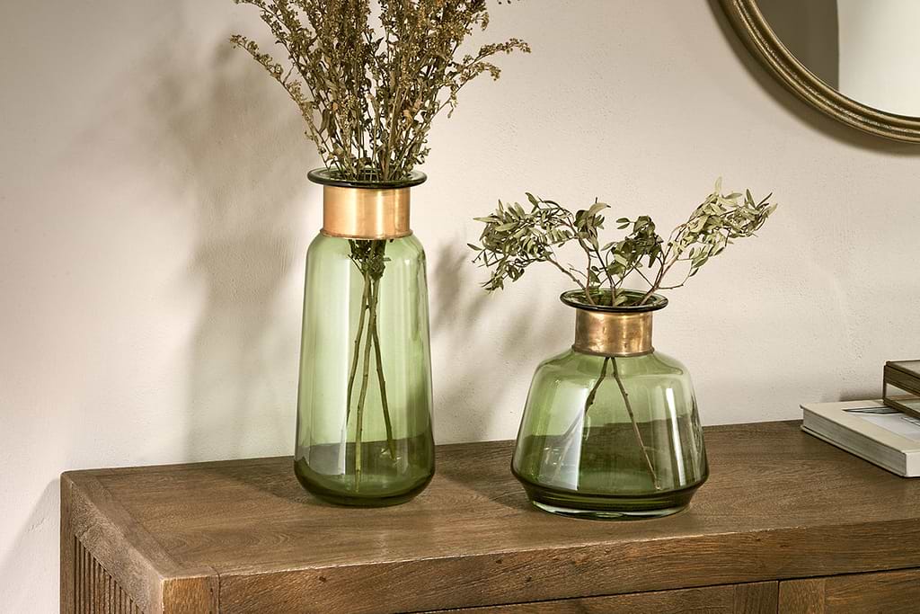
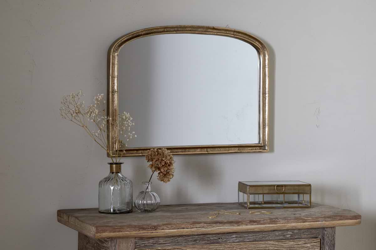
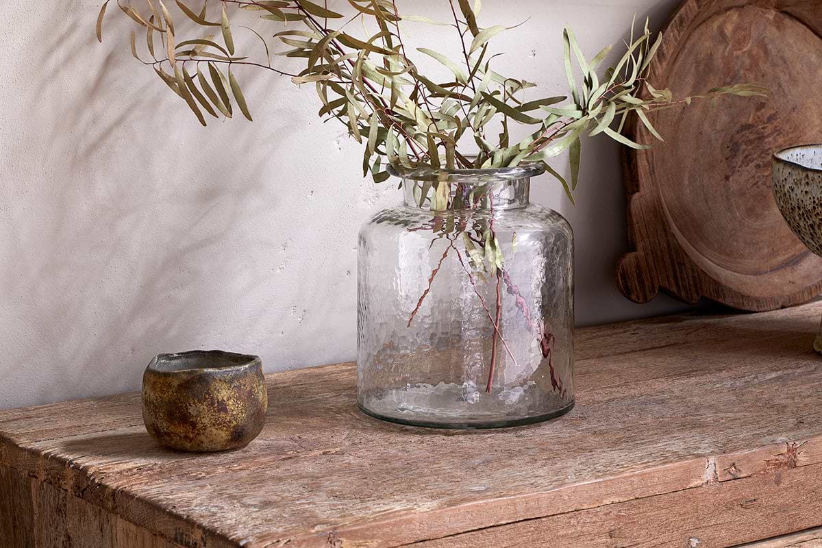
Akra Recycled Glass Vase
Clear cylindrical glass — pairs with stems or sits empty as a quiet accent.
View at Nkuku →Some links above are affiliate links. If you buy through them we may earn a small commission at no extra cost to you. We only suggest pieces we think fit a calm, lived-in home.
Free guide
The Calm Leaf
12 quiet ways to bring dried botanicals, stems, and natural textures into calm spaces.