

Most shelves end up either stacked with random objects or sitting nearly empty, leaving you wondering how to decorate a shelf so it looks calm, not messy, not bare, and above all, not accidental. This is especially true for small apartments and rental kitchens, where every open ledge tends to get filled with whatever doesn’t fit elsewhere.
With a few clear steps, you can set limits on what goes up, where it sits, and how much space you leave open. You’ll pair objects on purpose, pull out what doesn’t add value, and lean on neutral anchor pieces so the shelf always looks put together. This works especially well in a busy entryway when coats and bags start to pile up because clear rules make it easier to reset each week.
The short version: The key to how to decorate a shelf without clutter is using a 3-5-7 grouping formula, a pared palette, and one anchor item to limit visual noise. This approach makes a shelf feel designed, not random, and works even in small rooms with open storage.

How do you keep an open shelf from looking cluttered?
Use fewer, grouped objects with space around each set; anchor the arrangement with a single piece that pulls the eye, and avoid spreading small items across every inch.
In a kitchen with open shelf decor, it’s common for jars, cups, and cookbooks to fill every corner. Every new item added draws the eye, especially if they’re lined up along the whole shelf. Compared to leaving space, covering the shelf looks busy, even when it’s neat.
Grouping items in sets (like three mugs or five bowls) gives a shelf order, not just tidiness. Gaps on either side help the shelf breathe, so it doesn’t feel heavy overhead. Stacking mugs on one end and leaving a gap before a vase at the other makes each group matter more.
Unlike a closed cabinet where it’s fine to tuck things back to back, here, visible space is as important as what you display. Adding one anchor piece, a dark clay bowl or a brass frame, grounds the look. A bare shelf reads colder than one with a textured or metallic accent in the mix. For more ideas, see Neutral shelf styling ideas how to stop a shelf from looking busy.
Where this works best
The formula suits any open shelf, especially where storage must double as display, like in small kitchens, entryways, or bathrooms.
Open shelving is most common in kitchens, hallways, and bathrooms where closed storage is limited. Shelves here end up working hard, keys in baskets, towels stacked, bowls on display. In shared spaces, it’s easy for function to overtake style, making shelves feel crowded.
The 3-5-7 rule is clear and quick for shared areas. In a family kitchen, placing five matching bowls together under a floating shelf, then three glass canisters at the end, adds order. Leaving empty space means the shelf doesn’t feel stuffed, and it’s easier to keep clean.
Avoid treating every shelf the same. What looks right above a sofa, one large frame, some books, and a single ceramic, won’t suit a bathroom ledge filled with small toiletries. Think about which pieces matter where, and don’t force the same formula on each room type.
What is the 3-5-7 formula and why does it work?
The 3-5-7 formula means grouping objects in odd numbers (three, five, or seven) to avoid a forced look and keep arrangements balanced.
Most shelf vignette ideas that stick rely on odd-number groupings. Three glass bottles grouped together always look less stiff than four; five cookbooks lean better than six. This isn’t magic, it’s because an odd group pulls the eye to the middle, so the shape feels natural.
On a floating shelf, pairing five small plants at one end and just three ceramics at the other gives the shelf a point of view. Too many paired items can start to look like a store display. Odd numbers avoid that lined-up effect, even when everything is the same color or material.
If all your objects are spaced evenly, shelves feel more like storage than display. Separating groups using this rule creates rhythm and means there’s always one piece in the mix that draws the eye. This works for open shelf decor in both modern and traditional homes, and is a favorite for compact spaces, as noted by small-space decorating guides.
Styling and placement
Shelves look their best when objects vary in height, texture, and depth, spaced so each group stands alone but works together on the whole shelf.
To avoid a shelf that reads flat, mix taller items like a vase or stack of books with lower pieces such as a clay bowl or a short plant. Place taller items in the back and smaller ones at the front so nothing gets hidden. Varying heights helps the eye move along the shelf, adding interest.
Materials matter. Glass, wood, brass, and woven baskets break up a sequence so nothing looks monotone. If every object is glossy or all painted the same shade, the shelf feels a bit shallow; blending rough and smooth surfaces makes the shelf deeper and softer. For practical floating shelf ideas that use trays, books, and baskets, see Kitchen shelf styling neutral practical displays that still feel calm.
Leave some shelf space open. If every slot is filled, the display looks rigid. A good guide is to keep about two-thirds full and one-third open. Most floating shelves are about the depth of a cereal box; if you keep objects mainly at the front, the back edge stays clean and shadows add depth.
Quick calm checklist:
- Use natural materials: wood, linen, glass, or clay.
- Start with one anchor or focal item, then group smaller pieces beside it.
- Keep color simple, most shelves work with two or three main tones.
- Leave open space at both ends, and between groups, for breathing room.
- Mix vertical and horizontal placements (one stack lying flat, one item upright).

Why use negative space when styling shelves?
Leaving sections of shelving empty lets each group of objects stand out and prevents the whole shelf from feeling overwhelming.
Apartment shelves often feel crowded because everything gets pushed forward at once. Empty sections, negative space, stop the shelf from reading as one solid block. The open gap between a set of bowls and a photo frame makes both more noticeable.
Light plays a role here. A shelf with scattered empty spots collects and reflects more ambient light, making the zone brighter by day and less shadowy at night. Negative space also gives everyday items, keys, salt shakers, a framed print, a bit more presence, so nothing feels packed to the edge.
Compared to lining up objects along the full length, breaking up the surface with blank spots stops the shelf from becoming visual clutter. A shelf with open corners is easier to dust and means you see the wall color behind, especially if you use pale woods or white paint. For seasonal updates, see Neutral spring shelf styling light updates without extra storage.
Which anchor items give shelves a finished look?
A single, weightier piece like a brass photo frame, large ceramic, or hardcover book helps ground the whole arrangement and keeps smaller items from feeling lost.
Some shelf decor ideas just need one “anchor”, a standout object to pull everything together. The Kiko Brass Frame, for example, has a matte metal edge that catches morning light but doesn’t glare. Its weight and color add substance, so even two or three objects look finished.
Heavier items like a marble box, a thick wooden tray, or a black clay vase reinforce the rest of the display. On an entry shelf, a lidded basket does the same job, giving keys and sunglasses a home while recalling natural materials. Without an anchor, groups of smaller objects can seem to float or drift.
Instead of filling a shelf edge-to-edge, place your anchor left or right of center, then stack lighter, smaller objects next to it. Compared to spreading out only flat shapes, combining anchor and accent makes the whole shelf feel set, even with just three to five pieces.
How many colors should you use for calm shelf decor?
Stick to two, at most three, main color families with neutrals as the base; this keeps the shelf feeling steady and avoids visual chaos.
On a bookshelf, pairing green plants with white ceramic and pale oak sets a quiet palette. Too many strong colors, red, blue, striped tins, patterned jars, overwhelm even a large shelf. Neutral shelf styling is not about all grey, but about letting each object’s shape and texture come through.
Neutrals act as a background, so pops of color or metallics (like a brass frame or glazed tile) stand out more than if the whole shelf is rainbow-bright. Sticking to three or fewer color stories lets you swap things in and out seasonally without everything clashing. Experts agree that basic color rules matter in arranging shelves as much as they do in choosing wall paint; see how color works for more on palettes.
Compared to a shelf full of mismatched mugs or jars, using repeating colors through stacked towels, baskets, or jars immediately feels calmer to the eye. It’s the color repetition, not just the numbers, that makes shelf vignette ideas work.
What tends to hold up with shelf styling formulas
Looking at hundreds of real-life examples, a few patterns appear again and again. Most people find shelves look better when the same handful of colors or materials get repeated, even in a busy family kitchen. Matte finishes are particularly forgiving: they absorb glare from nearby windows, unlike glossy trays or glass vases, and make chips or fingerprints less noticeable over time.
The biggest fixes professionals suggest are almost always about spacing, leaving gaps between objects, sticking with just a few shapes, and relying on heavier, grounded pieces as visual stops. Shelves that use natural materials like linen, jute, or clay also hold up better to daily use and look right with age, as explained in detail at this overview of linen. It’s a small shift that lasts long after the first arrangement fades.
, Mara, Loom & Glow
Common questions
What is the 3-5-7 formula for shelf styling?
The 3-5-7 formula means grouping objects in odd numbers (three, five, or seven) to avoid a forced look and keep arrangements balanced.
How much of a shelf should remain open when decorating?
A good guide is to keep about two-thirds full and one-third open.
Why does grouping items in sets prevent a cluttered look?
Grouping items in sets (like three mugs or five bowls) gives a shelf order, not just tidiness.
What role does an anchor piece play in shelf decoration?
Adding one anchor piece – a dark clay bowl or a brass frame – grounds the look.
Explore more calm combinations inside our Shop The Look .
Shop the Look
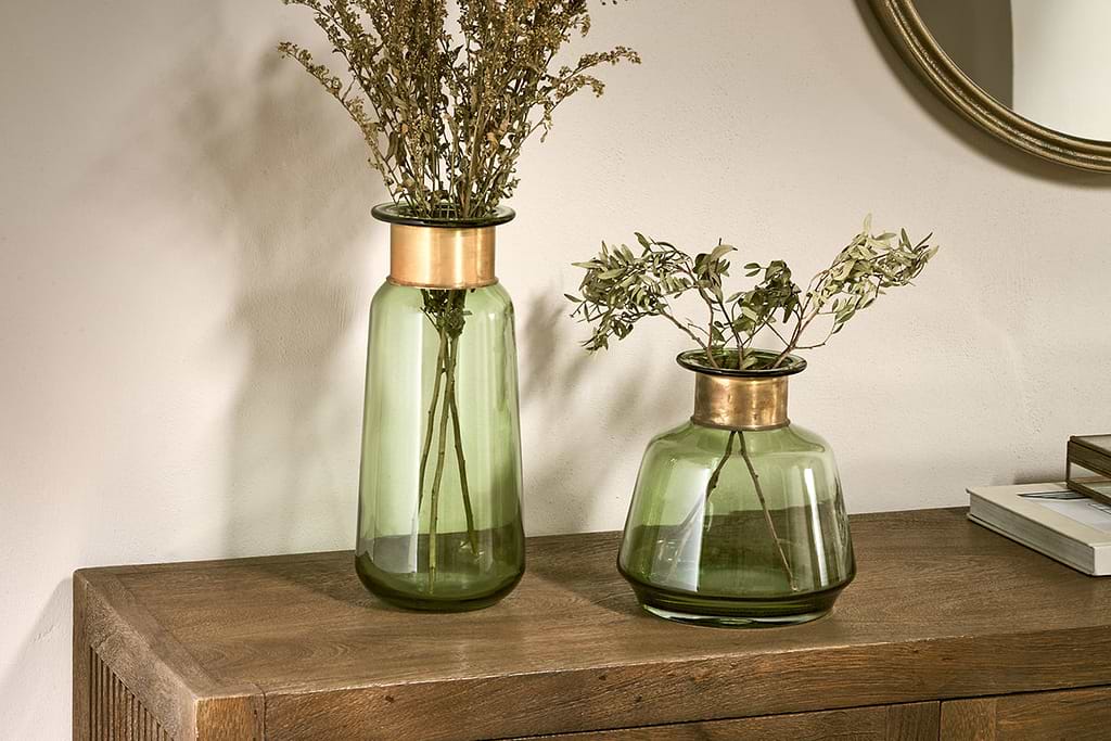
Vases and a mirror in soft, natural tones show how to furnish a shelf without crowding it.
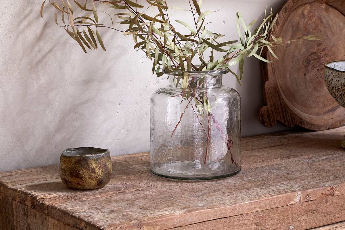
Akra Recycled Glass Vase
Clear cylindrical glass, pairs with stems or sits empty as a quiet accent.
View at Nkuku →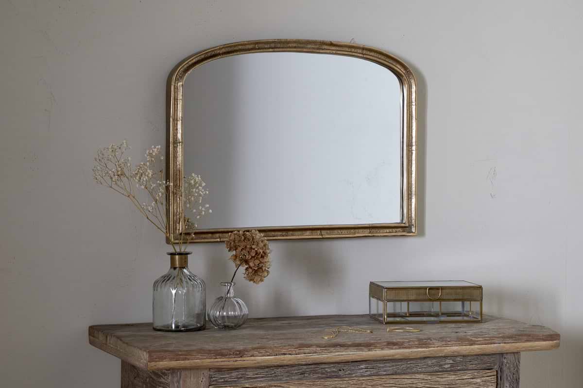
Some links above are affiliate links. If you buy through them we may earn a small commission at no extra cost to you. We only suggest pieces we think fit a calm, lived-in home.
Free guide
The Calm Shelf
12 styling ideas to help you compose calm, balanced shelves in natural texture homes.