

Most bedrooms with shared walls or tight corners end up feeling cluttered after just one small piece goes on the wall. Busy layouts, strange alcoves, or the urge to fill open space can make bedroom prints feel like more visual noise instead of calm. The problem is especially clear in small or rental rooms, where too much wall art reads heavy or crowded, even when the print itself is soft and pretty.
This guide shows what actually works: how to choose one framed print, where to hang it, and which styles really help a bedroom feel calmer. The steps help you see why less is better, when to use photography or type, and how the right width of mount and frame changes everything. This works especially well in small apartments when blank walls and awkward layouts make it hard to add interest because anchoring with a single, well-scaled print can shift the mood from scattered to restful.
The short version: Bedroom prints look and feel calm when you use one well-chosen piece in the right size with a simple frame and neutral mat. A single print, hung with spacing and scale in mind, helps a small bedroom feel peaceful—it removes clutter and makes the room feel thoughtfully anchored.
Key takeaways
- A bedroom print feels restful when it’s the only wall art on view above the bed or dresser.
- The mount width and frame style control whether a print anchors the room or adds busyness.
- Typography prints fit shared bedrooms when the text is soft and meaningful, not loud or direct.
- Gallery walls often look too busy in a small room, but a single poster with a wide mount feels calm.
- Bedroom prints from Poster Lounge, Moonshine Prints, and East End Prints start under £10 and go up to £130 depending on size and frame.
- Why does one bedroom print feel calmer than a wall full of art?
- How do you choose a print for a small or shared bedroom?
- Typography prints versus imagery prints: which option actually calms a bedroom?
- How do print size and mount width change a wall?
- Where this works best
- Styling and placement
- Where to find calm bedroom prints that don’t look craft-fair

Why does one bedroom print feel calmer than a wall full of art?
A single bedroom print lets the eye rest, while a wall filled with art can crowd the space and feel busy. One simple anchor makes a small room look bigger and more peaceful.
Many bedrooms have limited wall space, often interrupted by doors, radiators, or closets. Covering every open spot with art can overload these rooms quickly. The effect is strongest in small bedrooms, where too many posters or prints create a restless background.
Stopping at one print changes how the room works. Unlike a gallery wall, a lone framed print acts as a pause for the eye. The room doesn’t pull focus in many directions, so you settle in and stop scanning for more detail.
A single large print with a neutral mount works because it helps the wall feel tidy and intentional. The space feels open, not crowded by mismatched shapes and colors.
Try placing one gentle print centered above a bed or dresser—this anchors the wall instead of scattering attention across many smaller ones.
How do you choose a print for a small or shared bedroom?
The best print for a small bedroom uses soft colors, quiet lines, and fits the scale of the wall; in a shared room, go for themes that aren’t too personal or bold.
Bedrooms with limited space or two occupants need artwork that doesn’t overwhelm. Abstract prints with muted tones or minimal photography work especially well. A busy design or bold words can feel heavy in a compact or multi-use room.
Shared bedrooms—in flats or with a partner—bring different tastes together. Picking one print with a gentle subject, such as a botanical or a soft landscape, keeps the mood comfortable for everyone. A poster with a subtle quote or simple shape works better than anything too specific or direct.
Compared to stacking lots of art, a well-chosen single print lets you easily swap styles if needed while avoiding holes or marks. A calm art print also doubles as a subtle visual divider in a shared space, helping each person feel the room belongs to both.
Hang your chosen print at roughly eye level above a shared bed or dresser so it feels settled but not dominant.
Typography prints versus imagery prints: which option actually calms a bedroom?
Imagery prints almost always feel calmer in bedrooms than bold typography, but a small quote print with space around the text can work if the message is quiet and kind.
The choice between a quote and an image depends on scale, spacing, and the meaning of the words. Bedrooms are for resting—loud or direct text often keeps the mind “on”; a gentle, short phrase in a soft script works if you want language on the wall.
Photo and abstract prints are usually easier on the eye, especially when they use misty tones or natural shapes. Unlike a bright, graphic quote, an art print in pale watercolor or black-and-white stops the wall from looking busy. Slay My Print’s collection of typographic and quote-based designs shows this range, from playful “Namast’ay In Bed” styles to more serious reminders.
Rule of thumb: A quote print works in a bedroom when the words are familiar and the font is quiet; unfamiliar or dense text can read as clutter. By contrast, a botanical or a calm abstract drawing almost always settles the mood.
Place typography prints on a wall with few distractions nearby—over a nightstand, never mixed with another poster.
How do print size and mount width change a wall?
A bedroom print feels most restful when the width of the mount is wider than the frame, and the print fills about two-thirds of the open space above the main furniture.
The visual weight of a framed print depends as much on its mount as on the picture itself. A narrow mount or one that matches the wall color can make the artwork appear to “float,” while a thick, off-white mount sets clear boundaries.
The balance is especially important in bedrooms with low ceilings or limited wall height. Unlike a borderless poster, a print surrounded by a generous mat reads softer and less cramped. Most art shops, like East End Prints, allow you to choose wider mounts for this reason, and their prints scale in price from £23.95 up to £129.95 depending on size and frame style.
A too-small print above a bed gets lost, while one that is slightly larger than you expect brings calm by filling visual space without crowding. Here is a quick comparison:
| Type | Effect | Best placement |
|---|---|---|
| Narrow mount, borderless | Looks modern but can blend into the wall | Only in large, bright rooms |
| Wide, off-white mount | Adds a soft edge, calms the whole wall | Above the bed or dresser in a shared bedroom |
| Thick frame, small print | The frame dominates, feels heavy | Sometimes useful as a floor-leaning print, not on a narrow wall |
In rooms with patchy light or uncertain color schemes, an off-white mount and a thin wood or black frame keeps the piece grounded and the eye relaxed.

Where this works best
Using one thoughtfully chosen print works best in small or shared bedrooms with simple color schemes and minimal clutter—these rooms benefit most from one calm visual anchor.
Shared rooms or small city bedrooms rarely have big open walls. Fitted wardrobes, windows, and alcoves break up the space, so the best spots for a print are above the bed, on the wall behind a dresser, or on a wide shelf. Neutral or low-contrast rooms especially gain from adding one framed print in a subtle tone.
Sparse, mostly empty walls allow the art to breathe. In a room with white bedding, pale curtains, and lots of light, a single poster with a light mat brings visual interest. Shaded rooms, or those facing an alley, welcome soft watercolors or simple botanical prints to break up too much monotone without making the wall feel cluttered.
Avoid filling corners or hallway-style entry walls with art in small bedrooms. Prints hung too close to doorframes, radiators, or storage can look accidental and bring chaos. Instead, use open areas with room for the piece to “land”—not right up against another object or light switch.
The top of a bed wall, the space over a dressing table, or a shelf styled with a resting frame are the best placements in compact bedrooms, according to experienced interior stylists.
Styling and placement
A bedroom print draws the right kind of attention when you use natural textures around it and keep the base palette neutral—avoid crowding the print with too many items nearby.
The surface you pick for hanging art changes the visual “weight.” Plaster and painted walls absorb soft colors well. If you’re renting and can’t add hooks, try styling a framed print leaning on a floating bedroom shelf or large bookshelf.
Having a single poster with an off-white mount above the headboard or dresser keeps the room balanced. Pairing your print with tactile natural materials (like a small jute basket or woven tray on the dresser) grounds the art and keeps the space from feeling flat or cold.
Choice matters—Compared to using metallic frames or vivid accent colors, sticking with natural wood or black brings more calm, especially in rooms that already have mixed woods or lots of fabric textures.
Quick calm checklist:
- Natural or lightly grained wood frame (keeps the look warm)
- Off-white or pale cream mount at least as wide as the frame
- One piece per wall—avoid pairs in small bedrooms
- Leave clear space above and to the sides of the print
- Keep everything else on the dresser or shelf simple: one vessel, one woven tray
A print feels best when hung at eye level above the bed or dresser, with nothing directly above or beside it to crowd the frame—this makes the room read as finished without extra busy details.
Where to find calm bedroom prints that don’t look craft-fair
Affordable art prints for bedrooms are widely available online, with options in muted colors, botanical themes, or simple quotes; the difference is in framing and placement, not just the design.
Most online shops now offer bedroom prints starting below £10 unframed, with shops like Moonshine Prints and Poster Lounge selling entry options in soft colors and gentle themes. Reputable sources offer sizes that go up to large, already-mounted pieces for under £130—a number confirmed by East End Prints, where the upper range covers extra-wide frames and mounts.
The key to avoiding a “craft-fair” look is staying away from novelty prints, small canvas pieces, or bare posters tacked to the wall. Prints from retailers who specialise in room-specific art collections tend to feel more designed for the bedroom—neutral, soothing, and not crowded with too many details. Framing in wood or black, adding an off-white mount, and leaving blank wall around the art all help keep the result polished.
Swap out busy gallery walls for a single calming print, or try a simple black-and-white photographic print when the rest of your room is light or neutral. In a very small space, one print on a shelf or resting against the wall can be enough.
Hanging a single, calm art print above your bed or dresser is a quick way to finish the room without fuss or the need for extra styling. Bedroom prints fit almost every color scheme but work best when you let the frame and subject breathe.
What tends to hold up with bedroom prints for calm spaces
Neutral-tone prints with wide mounts work in almost any room because they don’t fight for attention. Reviewers say that soft botanical prints and abstract watercolors rarely look dated or out of place—even as other trends come and go. Decorators often point out that a thin black or natural wood frame grounds a print without adding heaviness. Matte finishes also come up again and again as the most forgiving, since they cut glare on walls near windows or lamps.
One rule stands out: a single piece on a quiet wall always outlasts a gallery arrangement, especially in small or shared bedrooms. Art that feels gentle and familiar wears well overtime—it’s noticed, but quietly.
— Mara, Loom & Glow
Common questions
What pictures look good in a bedroom?
The best pictures for a bedroom are soft photography, gentle abstracts, or calm botanical prints. These don’t feel busy and suit every stage of life. Pick images with muted colors or simple subjects to keep the space feeling restful, especially above the bed or dresser.
What is the best art for a bedroom?
The best art for a bedroom is a single, well-framed print with a neutral mount and a soothing design. Abstracts, quiet landscapes, and short quote prints work well. Stick to natural materials and avoid pieces that have loud colors or heavy, ornate frames for a calm effect.
How do I choose prints for my bedroom?
Choose bedroom prints by starting with the wall size and your color scheme, then picking one quiet piece that won’t crowd the room. Simple frames and wide mounts help. Try to match the scale to your bed or dresser and keep the subject restful for daily use.
What type of art works best in a bedroom?
Restful art with natural motifs or gentle abstract shapes works best in a bedroom. Framed prints with soft colors and wide mounts feel calmest, especially where wall space is limited. Avoid clutter and let each print tell its story with clear space around the frame.
Explore more calm combinations inside our Shop The Look .
Shop the Look
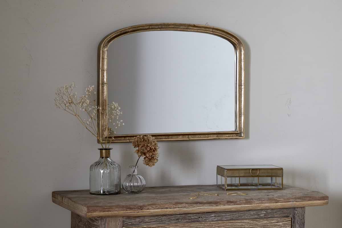
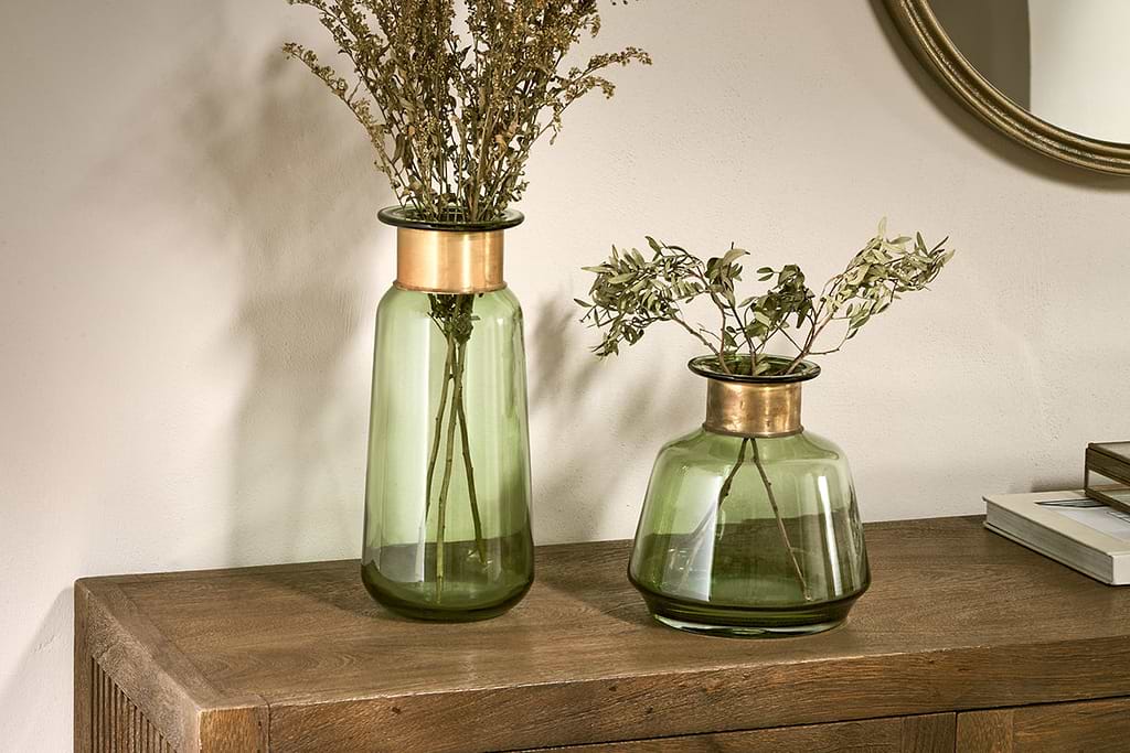
Small focussed pieces to sit on shelves or ledges alongside framed wall art.
Some links above are affiliate links. If you buy through them we may earn a small commission at no extra cost to you. We only suggest pieces we think fit a calm, lived-in home.
Free guide
The Calm Shelf
12 styling ideas to help you compose calm, balanced shelves in natural texture homes.