

A living room with too many types of natural materials can end up looking random or even crowded, not restful or inviting. Many people searching for how to make a living room look expensive are really noticing that their space feels noisy, not finished, especially when jute, linen, rattan, and wood are all mixed together with no plan.
The clearest way forward is to pick one key texture, use it in a big way, and let the others play smaller roles. This works especially well in apartments with little daylight when there are lots of mismatched surfaces because it hides visual clutter and lets the materials feel soft, not hard. Today, we’ll walk step by step through when to hold back, how to layer, and where to use each natural piece, with easy limits any room can use.
The short version: The best answer to how to make a living room look expensive is to choose one natural material to anchor the space, then add only a few simple touches in other textures. This makes even a small or busy room feel calmer and more finished, without visual clutter.

What’s the right order for layering natural materials?
Start with the largest surface, like a rug or a main seat, then layer in smaller accents made from other natural materials. This order keeps the room from feeling crowded or patchy.
In a standard living room, it’s common to see lots of different things added at once: a jute rug, a wooden coffee table, rattan baskets, and maybe even linen curtains. If these all shout for attention, the room feels busy, not calm. Instead, pick one large element, such as a thick jute or wool rug, to lead the material story.
This works because a single anchor gives the eye a place to land. A linen cushion or two will soften up a strong jute or wool base without fighting it. Compared to a pile of mixed baskets on every surface, a single woven ottoman looks more grounded.
Wood often comes next: side tables, consoles, or shelves in pale or mid-toned finishes. A heavy, dark wood shelf beside light rattan baskets can look serious, while softer-toned wood lets softer items breathe. Most floating shelves are under thirty centimeters deep, which works for stacking books and a clay bowl.
Avoid scattering small decor pieces made of every material around the room. Instead, keep one type big and visible, such as a layered neutral rug, and use the other materials only in one or two places where they can be appreciated.
Using this order helps an open-plan living and dining room feel connected instead of disjointed.
Where this works best
Small living rooms, open-plan spaces, or rental homes with lots of surface changes benefit most from clear material order. Limiting what you layer controls the chaos.
Busy apartments, townhomes with working nooks, and living rooms with oddly placed windows are all prone to looking unplanned. When you use too many materials without thinking, the difference in color and weight stands out even more in these mixed-use rooms.
In a living room that doubles as a family hangout, a strong natural base rug holds the room together. Next, wooden legs on a sofa or a low oak coffee table repeat the tone. Only then do you add a rattan tray or basket for storage, never several at once.
Avoid mixing every type of earthy home decor, like bamboo, rattan, reclaimed wood, and linen, within arm’s reach. The eye gets lost and none of the textures stand out. Instead, keep your main pieces to two or three at most for a calmer finish.
This plan works best for homes with shared spaces because the lack of hard breaks between materials makes the area blend visually.
How do you stop natural textures from clashing?
Keep to similar tones and matte finishes when mixing materials. This makes different textures work together without looking loud or unplanned.
Many living rooms end up with both shiny and rough surfaces together, which can look mismatched. Choosing matte wood next to woven baskets lets the surfaces mix smoothly. A smooth oak table with a flat finish sits more easily beside a rattan planter than one with a shiny lacquer.
Setting a dark stained wood bowl next to a pale jute pouf reads as two separate statements. Instead, let one material set the palette. Repeat that color or finish for at least one other item, such as matching a wooden tray to the frame of a neutral lounge chair.
Unlike a scattered group of objects in every shade, this simple palette pulls everything together. For palette tips, layered neutrals building depth in a minimal living room 3 covers how to work with calm contrast.
Try this approach in rooms with both modern and hand-me-down furniture to keep things from feeling too mixed up.
Styling and placement
Group similar textures, space items out, and use one strong focal point to keep a room looking simple. Placement makes all the difference in a natural material home decor plan.
Start with one main item placed where the eye lands: a jute rug under the coffee table, the Otas Teddy Cotton Armchair – Off White against a plain wall, or a low wood table set in front of the sofa. Position smaller accents off to the side, think a clay bowl on a side table or a rattan tray on a shelf. Putting too many accents together breaks the calm and makes the main item fade.
Spacing counts, too. Instead of clusters, leave gaps. This lets the eye rest and brings every piece forward. In small rooms, even a single rattan chair as a stand-alone accent can be enough, while a handful of baskets tends to blur together and lose their effect.
Quick calm checklist:
- Pick one star (rug, chair, or cabinet) that stands out for texture.
- Group same-material items, never scatter one of each everywhere.
- Leave space between accents and main furniture for breathing room.
- Keep palette to soft, natural shades with no more than one bold tone.
- Balance weight: heavy wood with light woven, but not both dominant.
Play with placement in light-starved or furniture-filled spaces where natural textures might otherwise feel crowded.

Why does a single focal material change the feel?
A strong focal point in one natural material draws attention and lets the rest of the room relax. This keeps things from feeling overdone.
One rattan chair with an interesting shape stands out more than three small woven boxes. There’s a reason designers so often pick an anchor piece and let everything else play a smaller role. It does the visual work alone, so other details can be kept minimal.
If every item is meant to be the focus, then nothing stands out, leading to a busy or restless look. A simple wood bench placed in front of a pale linen curtain stands apart because there’s breathing space around it. Most designers recommend keeping about two-thirds of a shelf clear, letting one or two pieces shine.
An anchor item also softens hard edges, like a boxy sofa or a strong window frame. For a calm effect, let one texture or shape repeat visually, and keep bright colors to a minimum.
Try this out in a low-light room where too many little objects can make shadows, but a bold centerpiece adds weight and comfort.
How do you use woven home decor without looking busy?
Stick to one or two woven pieces in each room, and avoid stacking different basket types together. This keeps texture from becoming clutter.
Mistakes happen when people add a mix of baskets, trays, ottomans, and woven lamps all in one place. The effect is more market stall than calm home. Instead, choose a single woven basket beside the sofa for throw blankets, or a rattan tray on the coffee table for drinks, never both on top of each other.
This strategy brings out the touchable quality of each item. A hand-woven cane side table looks subtle alongside a low, fabric-covered ottoman, while a group of woven bins together can look repetitive. Unlike bold tile or patterned throws, baskets should support the design, not direct it.
For small apartments, try one wide tray or bin for all loose items, rather than many narrow ones, so storage becomes part of the design. See textured corners styling small spaces with big calm for smart placement in tight rooms.
This works especially well in entry corners and transition spaces that get messy fast if bins or baskets pile up.
How to avoid a flat look with neutral home decor ideas
Layer surfaces and textures, not just colors, to add depth to a neutral room. This keeps earthy home decor looking rich, not washed out.
In a space with only whites and beiges, it’s easy for sofas and rugs to blur together. Adding a wool throw to a linen sofa, or placing a clay bowl on a wooden coffee table, breaks up the sameness. These simple steps stop the pale shades from looking cold or empty. Some decorators suggest that a large wool or textured rug is the quickest way to add warmth in a bare room.
Light plays an important role here. Matte finishes scatter light softly, while glossy or metallic pieces reflect it in a way that can read harsh. How color works in light makes a big difference in a room with very pale walls or floors, so small differences in surface are noticeable.
Layered materials, like a rough woven pouf next to a smooth oak table, help stop the room from feeling monotone. In comparison, spaces with only flat, pale fabrics often feel stripped down.
Try mixing rough (jute, rattan) and smooth (clay, glass) in places that catch daylight, such as the coffee table or next to a window, for easy depth.
The moment many people sense the room feels “off” is when they walk in and their eye jumps from one texture to another, or lands on none at all. A sofa with a linen cover sits next to a rattan basket, but there’s no sense of connection, just bits and pieces. It’s frustrating when a room feels both unfinished and too full.
The most workable shift is to pick one anchor material, let it take up real space, and pull back on the number of small, competing objects. Suddenly the eye calms and the living room feels more put together.
Once the focus shifts to one main piece, the rest fades into the background. The arrangement feels easy, and every surface holds its shape.
But most homes fail here because it’s tempting to add baskets, throws, and trays just because they’re pretty. The result is often a look that seems unfinished and a little too random. Rooms like this often end up feeling crowded or never quite finished.
Once you swap cluttered accents for one bold textural piece, the whole space feels easier on the eye.
Save this idea for later.
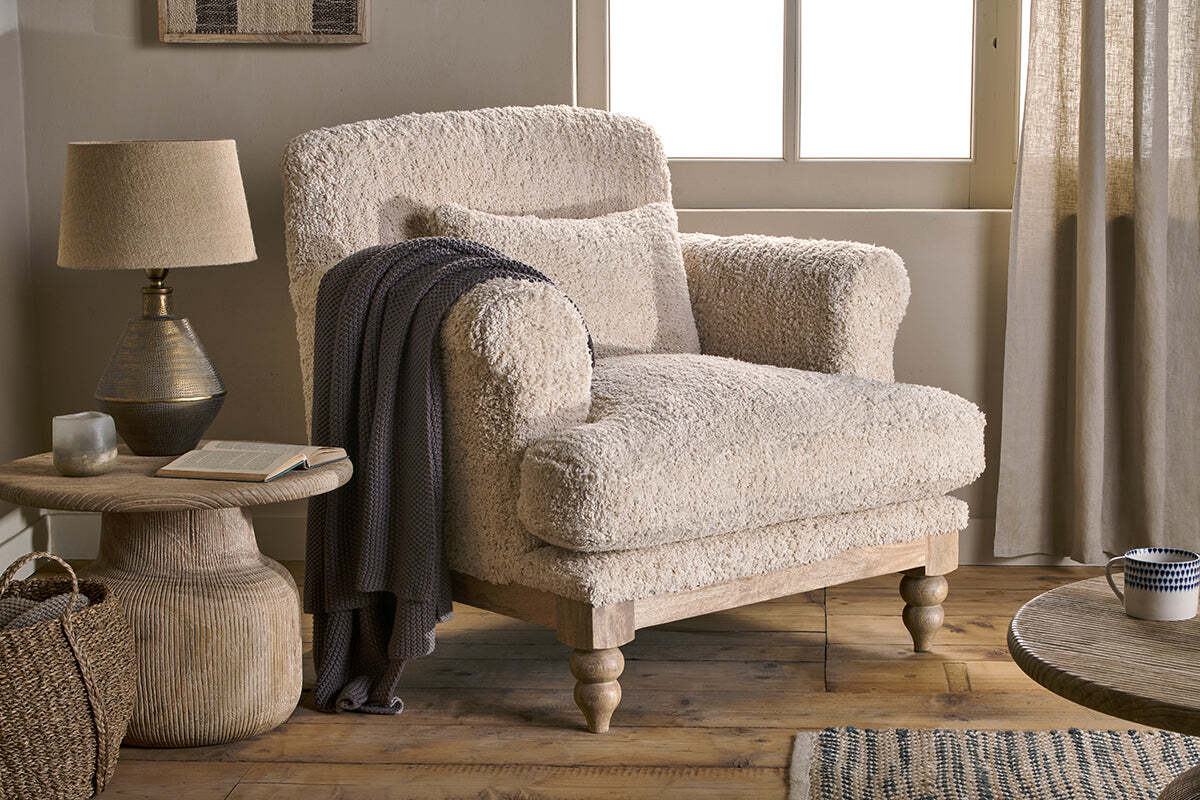
Otas Teddy Cotton Armchair – Off White
adds quiet structure and warmth while keeping the room balanced.
What tends to hold up with natural material mixing
Reviewers and stylists keep coming back to the same patterns: letting only one major natural material lead, while the rest act as support. Matte finishes get recommended again and again for shelves near windows, because their softer look never glares even when the sun comes in. Designers often mention that not every space needs all four main textures in the mix; sometimes just two, the right rug and one good wooden surface, do all the work.
Linen is praised for the way it folds and drapes, muting the shape of chairs or benches that might otherwise look too angular. The benefit of this approach is that even in rooms with odd angles, or quirky rented spaces, a clear material hierarchy gives you order without much cost or effort.
, Mara, Loom & Glow
Common questions
What is the best way to make a living room with natural materials look more expensive?
The best answer to how to make a living room look expensive is to choose one natural material to anchor the space, then add only a few simple touches in other textures.
How should I order layering when combining jute, wood, and rattan?
Start with the largest surface-like a rug or a main seat-then layer in smaller accents made from other natural materials.
How do I prevent natural textures from clashing in a living room?
Keep to similar tones and matte finishes when mixing materials.
Explore more calm combinations inside our Shop The Look .
Shop the Look
Pieces in natural materials that quietly signal care and restraint.
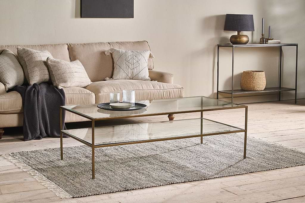
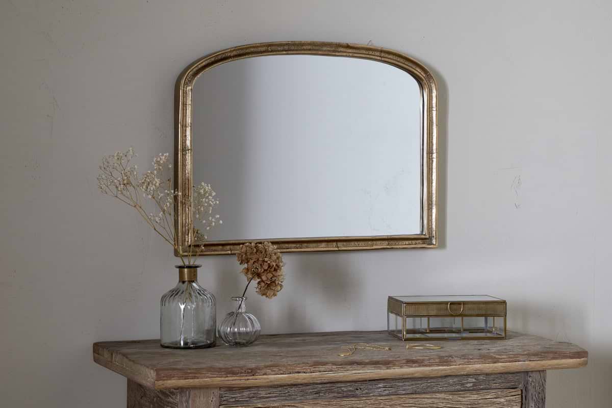
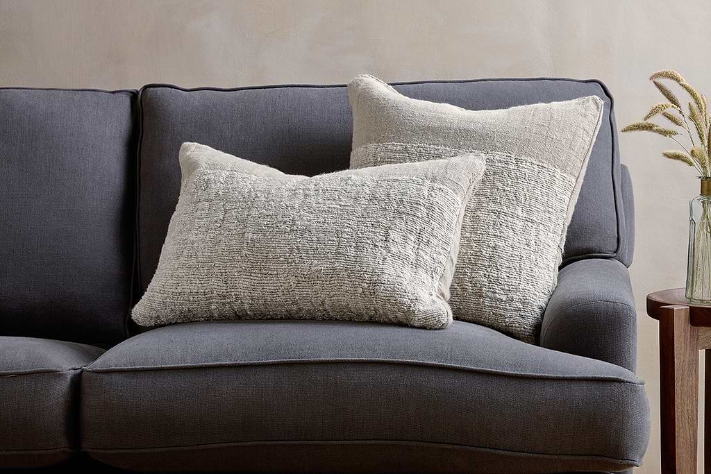
Puli Linen Cushion
Recycled linen in natural, pairs with woven textures and aged wood.
View at Nkuku →Some links above are affiliate links. If you buy through them we may earn a small commission at no extra cost to you. We only suggest pieces we think fit a calm, lived-in home.
Free guide
The Calm Leaf
12 quiet ways to bring dried botanicals, stems, and natural textures into calm spaces.